


所使用的的数据集
链接:https://pan.baidu.com/s/1LW-km_5nGh6SVFm7kgnxCQ
提取码:nyhd
导入相关的包 Load Necessary Libraries
import matplotlib.pyplot as plt
import numpy as np
import pandas as pd
Basic Graph
1.plot折线图
#plot折线图
# 创建数据
x=[0,1,2,3,4,5];y=[0,2,4,6,8,10]

# Resize your Graph(dpi specifies pixels per inch. When saving probably should use 300 if possible)
# 调整图的大小
plt.figure(figsize=(5,3), dpi=100)

## Line 1
# Keyword Argument Notation plot 相关参数
plt.plot(x, y, label='2x', color='green', linestyle='dashed', linewidth = 2, marker='o', markersize=12, markeredgecolor='blue')

# use shorthand notation 简化画图
# fmt = '[color][marker][line]'
# plt.plot(x,y,'b^--',label='2x')

## Line 2
# select interval we want to plot points at选取点
x2= np.arange(0,4.5,0.5) # x2=[0,0.5,1,1.5,2,2.5,3,3.5,4]

# Plot part of the graph as line 取一部分画成直线
plt.plot(x2[:6],x2[:6]**2,'r',label='x^2')
# Plot remainder of graph as dot 取另一部分画成点线
plt.plot(x2[5:],x2[5:]**2,'r--')

# Add a title (specify font parameters with fontdict) 标题
plt.title('My first Graph',fontdict={'fontname':'Comic Sans MS','fontsize':20})

# X and Y labels 横纵坐标
plt.xlabel('X Axis',fontdict={'fontname':'Arial','fontsize':10})
plt.ylabel('Y Axis')

# X, Y axis Tickmarks (scale of your graph) 横纵坐标的刻度
plt.xticks([0,1,2,3,4,5])
plt.yticks([0,2,4,6,8,10]) #横纵坐标轴的刻度显示

# Add a legend 添加图例
plt.legend()

# Save figure(dpi 300 is good when saving so graph has high resolution) 保存图片
plt.savefig('mygraph.png', dpi=300)

# Show plot 显示图片
plt.show()
运行结果:

2.bar条形图
labels = ['A', 'B', 'C']
values = [1,4,2]

bars = plt.bar(labels, values)

patterns = ['/', 'O', '*']
for bar in bars:
    bar.set_hatch(patterns.pop(0))

#bars[0].set_hatch('/')
#bars[1].set_hatch('O')
#bars[2].set_hatch('*')

plt.xlabel('X Axis',fontdict={'fontname':'Arial','fontsize':10})
plt.ylabel('Y Axis')
plt.title('My Second Graph',fontdict={'fontname':'Comic Sans MS','fontsize':22})
plt.figure(figsize=(6,4))

plt.show()
运行结果:

Real World Example导入真实数据进行分析
【以fifa_data.csv 和 gas_prices.csv 为例】
Load Fifa Data加载数据
gas_prices.csv:
gas = pd.read_csv('gas_prices.csv')
print(gas.head(6))

fifa_data.csv:
fifa = pd.read_csv('fifa_data.csv')
fifa

Plot折线图
gas = pd.read_csv('gas_prices.csv')

plt.figure(figsize=(8,5))
plt.plot(gas.Year, gas.USA, 'r.-',label='USA')
plt.plot(gas['Year'], gas['Canada'], 'b.-',label='Canada')

# Another Way to plot many values!
#countries_to_look_at = ['Australia','USA','Canada','South Korea']
#for country in gas:
#    if country in countries_to_look_at:
#        plt.plot(gas.Year, gas[country], marker='.',label=country )

plt.title('USA vs Canada Gas Prices', fontdict = {'fontsize':18})
plt.ylabel('Dollar/Gallon')

#plt.xticks(gas.Year)
plt.xticks(gas.Year[::3])
#plt.plt.xticks(gas.Year[::3].tolist() + [2011])

plt.legend()

plt.savefig('Gas_price_figure.png', dpi=300)
plt.show()

Histograms直方图
bins=[40,50,60,70,80,90,100]

plt.hist(fifa.Overall,bins=bins,color='#83f442') #color picker

plt.xticks(bins)

plt.xlabel('Skill Level')
plt.ylabel('Number of Players')
plt.title('Distribution of Player Skills in FIFA 2018')

plt.yticks([0,100])

plt.show()

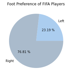
pie饼图
left = fifa.loc[fifa['Preferred Foot'] == 'Left'].count()[0]
right = fifa.loc[fifa['Preferred Foot'] == 'Right'].count()[0]

labels=['Left','Right']
colors=['#abcdef', '#aabbcc']
plt.pie([left,right], labels = labels, colors = colors, autopct = '%.2f %%')

plt.title('Foot Preference of FIFA Players')

plt.show()
print(fifa.Weight)
fifa.Weight = [int(x.strip('lbs')) if type(x)==str else x for x in fifa.Weight]
print(fifa.Weight)

plt.style.use('ggplot')

light = fifa.loc[fifa.Weight < 125].count()[0]
light_medium = fifa.loc[(fifa.Weight >= 125) & (fifa.Weight <150)].count()[0]
medium = fifa[(fifa.Weight >= 150) & (fifa.Weight <175)].count()[0]
medium_heavy = fifa[(fifa.Weight >= 175) & (fifa.Weight <200)].count()[0]
heavy = fifa[fifa.Weight >200].count()[0]
labels = ['Under 125','125-150','150-175','175-200','Over200']
weights = [light, light_medium, medium, medium_heavy, heavy]
explode = (.4,.2,.1,.1,.4) #外扩
plt.title('Weight Distribution of FIFA Players(in lbs)')
plt.pie(weights, labels= labels, autopct='%.2f %%', pctdistance = 0.8, explode = explode)
plt.show()

box箱图
plt.style.use('seaborn')

plt.figure(figsize=(5,8))
barcelona = fifa.loc[fifa.Club == 'FC Barcelona']['Overall']
madrid = fifa.loc[fifa.Club == 'Real Madrid']['Overall']
revs = fifa.loc[fifa.Club == 'New England Revolution']['Overall']

labels = ['FC Bracelona', 'Real Madrid','New England Revolution']

boxes = plt.boxplot([barcelona, madrid, revs], labels=labels,patch_artist=True, medianprops={'linewidth':2})

for box in boxes['boxes']:
    # Set edge color
    box.set(color = '#4286f4', linewidth = 2)

    # Change Fill Color
    box.set(facecolor = '#e0e0e0')
plt.title('Professional Soccer Team Comparison')
plt.ylabel('FIFA Overall Rating')

plt.show()

参考链接:
https://www.bilibili.com/video/BV1sV411t7Gw?p=4Matplotlib 最具价值的50个可视化项目:
https://www.heywhale.com/mw/project/5f4b3f146476cf0036f7e51e


 3301
3301


 被折叠的 条评论
为什么被折叠?
被折叠的 条评论
为什么被折叠?
 到【灌水乐园】发言


