


一、自适应的椭圆
各种奇形怪状的图形: http://simurai.com/archive/buttons
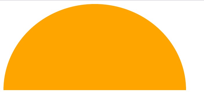
1、自适应椭圆
border-radius可以单独指定水平和垂直半径,需要用一个斜杠分隔两个值,其不仅可以接收长度值,还可以接收百分比值,百分比值基于元素的尺寸进行解析。
border-radius:50% / 50%;

//更精简
border-radius:50%;
2、半椭圆
border-radius:50% / 100% 100% 0 0; //水平
border-radius:100% 0 0 100% / 50%; //沿纵轴

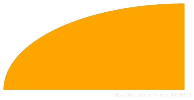
3、四分之一椭圆
border-radius:100% 0 0 0;
二、平行四边形
css变形:http://w3.org/TR/css-tranforms
css遮罩:http://w3.org/TR/css-masking
css过渡:http://w3.org/TR/css-transition
背景:用skew()的变形属性可以对矩形拉伸变成平行四边形,但其内容也会跟着容器的形状倾斜,有没有办法只让容器的形状倾斜,而内容保持不变呢?
方法一:嵌套元素方案
对内容反向应用依次skew(),但是必须用额外的HTML元素包裹内容,比如div
<a href="#yolo" class="button">
	<div> click me </div>
</a>

.button {
	transform:skewX(-45deg);
}
.button > div {
	transform:skewX(45deg);
}
方案二:伪元素方案(更好)
思路:**把所有样式(背景、边框等)应用在伪元素上,然后再对伪元素进行变形。因为我们的内容并不是包含在伪元素中,所以内容不会受到变形的影响。**伪元素要保持良好的灵活性,可以自动继承其宿主元素的尺寸,甚至当宿主元素的尺寸是由其内容决定时仍然如此。解决方法:宿主元素应用:position:relative。伪元素设置:position:absolute。**再把所有偏移量设置为0,让它水平和垂直方向都被拉伸至宿主元素的尺寸。**伪元素的生成的方块时重叠在内容上的,要设置:z-index:-1
.button {
    position: relative;
    text-decoration: none;
    color: white;

}

.button::before{
    content: "";
    position: absolute;
    width: 70px;
    top:0;
    right: 0;
    bottom: 0;
    left: 0;
    background-color: #58a;
    z-index: -1;
    transform: skewX(-45deg);
}

三、菱形图片
方法一:基于变形的方案
需要把图片用div包裹,然后对图片应用相反的rotate()
<div class="picture">
    <img src=".." alt=".."/>
</div>

.picture {
	width: 400px;
	transform:rotate(45deg);
	overflow:hidden;
}
.picture > img {
	max-width:100%;
	transform:rotate(-45deg);
}
此时的100%有问题,因为100%会被解析为容器(.picture)的边长,而我们希望的时图片的宽度和容器的对角线相等。
(1)将max-width设置为142%(√2×100%)
.picture > img {
	max-width:142%;
	transform:rotate(-45deg);
}
(2)用scale()变形将图片放大
.picture > img {
	max-width:100%;
	transform:rotate(-45deg) scale(1.42);
}
方法二:裁剪路径方案
使用 clip-path 属性 + polygon()
<img src="./1.png" alt="">

img{
	clip-path: polygon(50% 0, 100% 50%,50% 100%, 0 50%);
}
50% 0, 100% 50%,50% 100%, 0 50%是从上顶点沿顺时针方向的顶点坐标。

扩展:clip-path制作动画
要求:动画是在同一种形状函数之间进行的,且点的数量是相同的
img {
    clip-path: polygon(50% 0, 100% 50%, 50% 100%, 0 50%);
    transition: clip-path 1s;
    margin-left: 100px;
}
img:hover {
	clip-path: polygon(0 0,100% 0,100% 100%,0 100%);
}
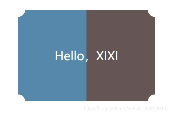
三、切角效果
方法一:css渐变
渐变可以接受一个角度作为渐变的方向,且色标的位置信息也可以是绝对值长度值,不受容器长度影响。切角处用透明色。
缺点:
- 代码繁琐冗长。常规设计中,四个切角尺寸是一致的,当我们改变这个值的时候需要改4处
- 烦琐导致我们不能让各个切角尺寸义动画的方式改变
(1)切一个角
background: #58a;
background: linear-gradient(-45deg,transparent 15px, #58a 0);
(2)切两个角
background: #58a; //回退机制
background:
	linear-gradient(-45deg,transparent 15px, #58a 0) right,
	linear-gradient(45deg,transparent 15px, #655 0) left;
background-size: 50% 100%;
background-repeat:no-repeat;
若不加 background-repeat:no-repeat;的话两层渐变回应平铺两次而覆盖

(3)切四个角
background: #58a;
background:
    linear-gradient(135deg,transparent 15px,#58a 0 ) top left,
    linear-gradient(-135deg,transparent 15px,#655 0) top right,
    linear-gradient(-45deg,transparent 15px, #58a 0) bottom right,
    linear-gradient(45deg,transparent 15px, #655 0) bottom left;
background-size: 50% 50%;
background-repeat:no-repeat;
使用预处理器:
@mixin beveled-corners($bg,$tl:0,$tr:$tl,$br:$tl,$bl:$tr){
	background: $bg;
	background:
    linear-gradient(135deg,transparent $tl,$bg 0 ) top left,
    linear-gradient(-135deg,transparent $tr,$bg 0) top right,
    linear-gradient(-45deg,transparent $br, $bg 0) bottom right,
    linear-gradient(45deg,transparent $bl, $bg 0) bottom left;
    background-size: 50% 50%;
    background-repeat:no-repeat;
}
//调用时
@include beveled-corners(#58a,15px,5px);
//左上角和右下角15px切角,左下角和右上角5px切角

(4)弧形切角(内凹圆角)
background: #58a;
background:
    radial-gradient(135deg,transparent 15px,#58a 0 ) top left,
    radial-gradient(-135deg,transparent 15px,#655 0) top right,
    radial-gradient(-45deg,transparent 15px, #58a 0) bottom right,
    radial-gradient(45deg,transparent 15px, #655 0) bottom left;
background-size: 50% 50%;
background-repeat:no-repeat;
方法二:内联SVG与border-image方案
background: #58a;
background-image: radial-gradient(hsla(0,0%,100%,.2) 15%,#58a 								45%);
background-clip: padding-box;
border: 20px solid #58a;
border-image: 1 url('data:image/svg+xml,\
    <svg xmlns="http://www.w3.org/2000/svg"\
   		width="3" height="3" fill="%2358a">\
    	<polygon points="0,1 1,0 2,0 3,1 3,2 2,3 1,3 0,2"/>\
	</svg>');
注意:
- 不加
background-clip: padding-box;的话,背景色会和切角框会在一起。 - 改变切角尺寸时只用修改一处了
- border 颜色用与内容相同的颜色时回退机制,防止有些浏览器不支持border-image;

方法三:裁切路径方案(可使用任意类型的背景)
但我们想要设置如纹理一类的背景时,方法二行不通
css裁剪路径可以同时使用百分比数值(以元素自身宽高作为基数度进行换算)和绝对值长度,提供巨大的灵活性
background: #58a;
clip-path: polygon(
    20px 0,calc(100%-20px) 0,100% 20px,
    100% calc(100%-20px),calc(100%-20px) 100%,
    20px 100%,0 calc(100%-20px),0 20px
);
三种方法的比较
- 裁剪的方法在内边距不够宽的时候会裁剪掉文本,因为他只能对元素做统一的裁剪,并不能区分元素的各个部分
- 渐变方案允许文案溢出并超出切角区域,因为其只是背景图案
- border-image方案会起到普通边框的作用,令文字折行
四、梯形标签页
(1)普通梯形
div{
    position: relative;
    display: inline-block;
    padding: .5em 1em .35em;
    width: 300px;
    height: 100px;
    font-size: 26px;
    color: white;
    line-height: 130px;  //放大了1.3倍
    text-align: center;
}

div::before {
    content: '';
    position: absolute;
    top: 0;
    right: 0;
    bottom: 0;
    left: 0;
    z-index: -1;
    background: #58a;
    transform: scaleY(1.3) perspective(.5em) rotateX(5deg);
    transform-origin: bottom; //旋转轴固定在底部
}
注意:
- 若不设置
transform-origin: bottom;,元素会以自身的的中轴线进行空间上的旋转。投射到2D屏幕上的尺寸会发生多种变化。 - 旋转过后高度会缩水,用垂直方向上的缩放程度(scaleY变形属性)在达到**130%**左右时刚好可以补足它高度上的缩水。
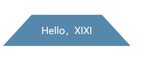
(2)标签页梯形
div{
    position: relative;
    display: inline-block;
    padding: .3em 1em 0;
    width: 150px;
    height: 100px;
    font-size: 22px;
    color: white;
    line-height: 130px;
    text-align: center;
}

div::before {
    content: '';
    position: absolute;
    top: 0;
    right: 0;
    bottom: 0;
    left: 0;
    z-index: -1;
    background: #ccc;
    background-image: linear-gradient(
    hsla(0,0%,100%,.6),
    hsla(0,0%,100%,0));
    border: 1px solid rgba(0, 0, 0, .4);
    border-bottom: none;
    border-radius: .5em .5em 0 0;
    box-shadow: 0 .15em white inset;
    transform: scaleY(1.2) perspective(.5em) rotateX(5deg);
    transform-origin: bottom;
}

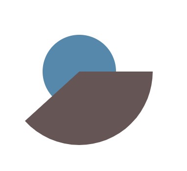
五、饼图
1、基于transform的方案
在结构层面是最佳选择,只需要一个元素作为容器,而其他部分由伪元素、变形元素和css渐变实现
(1)进度指示器
.pie {
    width: 200px;
    height: 200px;
    border-radius: 50%;
    background: #58a;
    background-image: linear-gradient(to right,transparent 								50%,#655 0);
}

@keyframes spin {
	to{ transform: rotate(.5turn);}
}

@keyframes bg {
    50% {
    background: #655;
    }
}

.pie::before{
    content: '';
    display: block;
    margin-left: 50%;
    height: 100%;
    border-radius: 0 100% 100% 0 / 50%;
    background-color: inherit;
    transform-origin: left;
    animation: spin 3s linear infinite,
    bg 6s step-end infinite;
}
注意:
- 我们希望伪元素能遮住右半部分圆,需要多少比率的扇形九八遮盖层旋转多少
- 希望遮盖层是绕着圆形的圆心旋转的,所以应设置
transform-origin: left; - 遮盖层的形状应该变为半圆,否则旋转时会出现问题
(2)不同比率的静态饼图
<div class="pie" style="animation-delay: -20s;">20%</div>
<div class="pie" style="animation-delay: -60s;">60%</div>

.pie {
    width: 200px;
    height: 200px;
    border-radius: 50%;
    background: #58a;
    background-image: linear-gradient(to right,transparent 50%,#655 0);
}

@keyframes spin {
	to{ transform: rotate(.5turn);}
}

@keyframes bg {
    50% {
    background: #655;
    }
}

.pie::before{
    content: '';
    display: block;
    margin-left: 50%;
    height: 100%;
    border-radius: 0 100% 100% 0 / 50%;
    background-color: inherit;
    transform-origin: left;
    animation: spin 50s linear infinite,
    		   bg 100s step-end infinite;
    animation-play-state: paused; //让动画停止
    animation-delay: inherit;
}
注意:
- 负的动画延时用来跳转至动画中的任意时间。负的动画延时意味动画会立即开始播放,但会自动前进到延时值的绝对值处,就好像动画在过去已经播放了指定时间一样。因此效果就是动画直接跳过指定时间而从中间开始播放
- 饼图显示的比率就是
animation-delay值在总的动画持续时间中所占的比率

2、SVG解决方案
(1)扇形绘制
circle {
    fill: #58a;
    stroke: #655;
    stroke-width: 100;
    stroke-dasharray: 120 314;
}

<svg width="200" height="200">
	<circle r="50" cx="100" cy="100"/>
</svg>
重点:
stroke-dasharray: 120 314;表示虚线长度为120且间隙长度为314,这里的间隙长度设置的是circle的周长
给svg设置样式:
-
在描边的下面绘制一个稍大的圆形,
-
然后再把描边以逆时针方向旋转90°,以便让扇形的起点出现在最顶部,因为描边默认从水平向右的方向开始绘制扇形
svg {
    transform: rotate(-90deg);
    background: #58a;
    border-radius: 50%;
}
circle {
    fill: #58a;
    stroke: #655;
    stroke-width: 100;
    stroke-dasharray: 120 314;
}

<svg width="200" height="200">
	<circle r="50" cx="100" cy="100"/>
</svg>

(2)饼图动画
@keyframes fillup {
	to { stroke-dasharray: 314 314;}
}
circle {
    fill: #58a;
    stroke: #655;
    stroke-width: 100;
    stroke-dasharray: 0 314;
    animation: fillup 5s linear infinite;
}
(3)优化代码
svg {
    width: 200px;
    height: 200px;
    transform: rotate(-90deg);
    background: #58a;
    border-radius: 50%;
}
circle {
    fill: #58a;
    stroke: #655;
    stroke-width: 32;
    stroke-dasharray: 38 100; /*可得到比率为38%的扇区*/
}

<svg viewBox="0 0 32 32">
	<circle r="16" cx="16" cy="16"/>
</svg>
重点:
- 指定一个半径,从而让周长无线接近100,这样就可把比率的百分比值指定为stroke-dasharray的长度
- svg中的viewBox指定其尺寸,不使用width和height,这样可让其自动适应容器的大小


 932
932


 被折叠的 条评论
为什么被折叠?
被折叠的 条评论
为什么被折叠?
 到【灌水乐园】发言


