


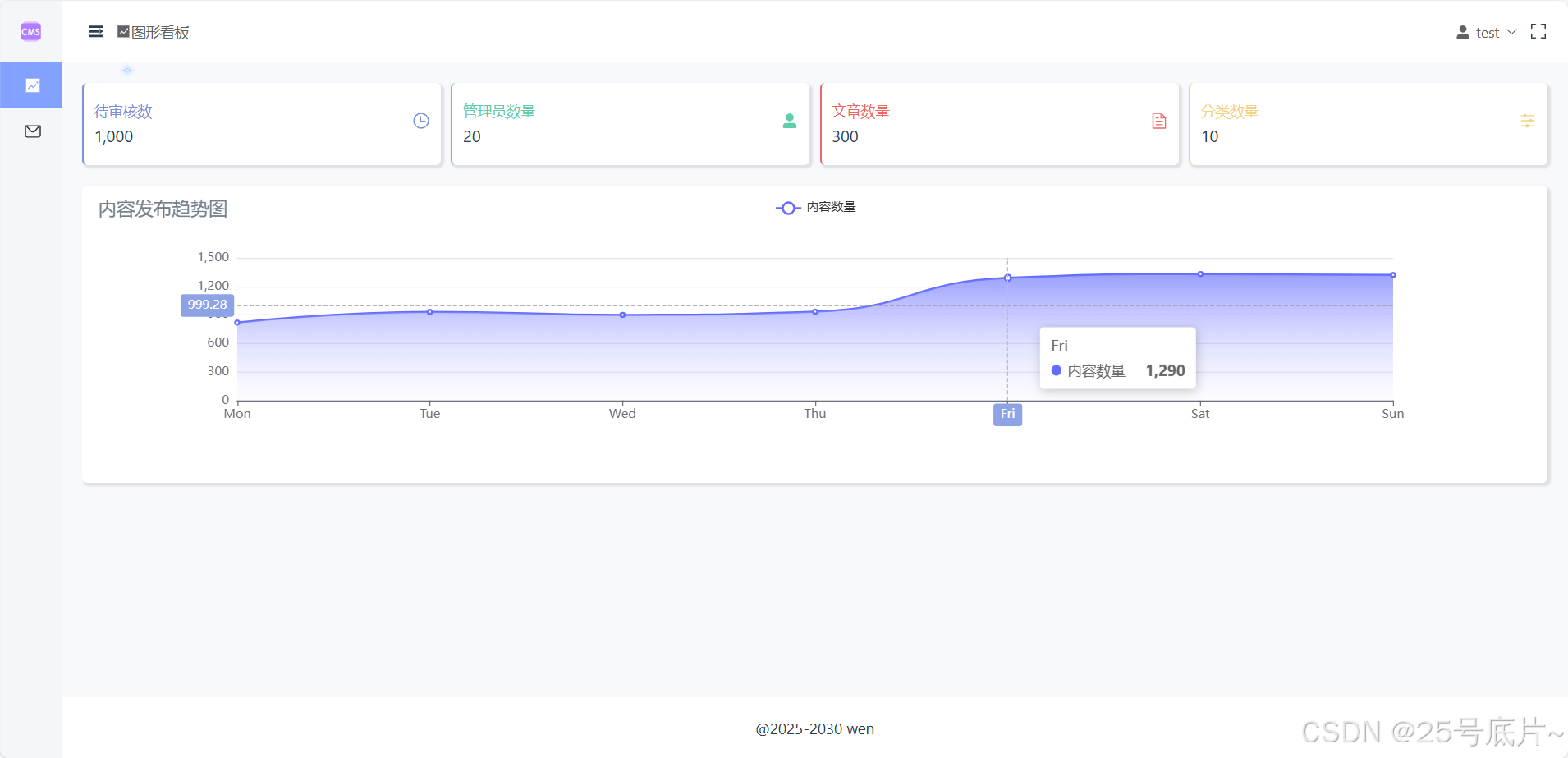
一、效果
设置第二列为一个内容发布趋势图,使用折线图展示
二、echarts安装
(1)安装
官网参考
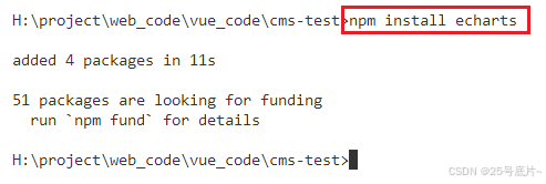
(2)使用npm安装
命令
npm install echarts终端执行命令
(3)echarts参数参考
可以参考学习echarts参数
Documentation - Apache ECharts
三、折线图
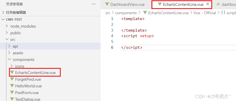
1、封装组件
建立一个专门存放内容折线图的组件EchartsContentLine.vue
2、使用echarts进行搭建
搭建效果如下图,直接在官网进行搭建
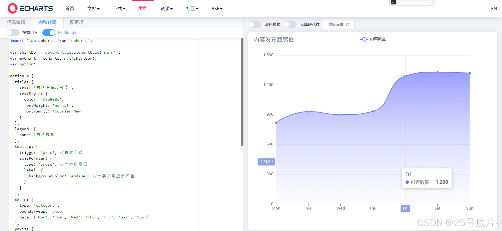
import * as echarts from 'echarts';

var chartDom = document.getElementById('main');
var myChart = echarts.init(chartDom);
var option;

option = {
  title: {
    text: '内容发布趋势图',
    textStyle: {
      color: '#75808c',
      fontWeight: 'normal',
      fontFamily: 'Courier New'
    }
  },
  grid: {
      left: '5%',
      right: '5%',
      top: '20%',
      bottom: '10%',
      containLabel: true
  },
  legend: {
    name: '内容数量'
  },
  tooltip: {
    trigger: 'axis', //触发方式
    axisPointer: {
      type: 'cross', //十字指示器
      label: {
        backgroundColor: '#8da3e5' //十字文字提示底色
      }
    }
  },
  xAxis: {
    type: 'category',
    boundaryGap: false,
    data: ['Mon', 'Tue', 'Wed', 'Thu', 'Fri', 'Sat', 'Sun']
  },
  yAxis: {
    type: 'value'
  },
  series: [
    {
      name: '内容数量',
      data: [820, 932, 901, 934, 1290, 1330, 1320],
      type: 'line',
      smooth: true,
      areaStyle: {
        color: {
          type: 'linear',
          x: 0,
          y: 0,
          x2: 0,
          y2: 1,
          colorStops: [
            {
              offset: 0,
              color: '#646cff' // 0% 处的颜色
            },
            {
              offset: 1,
              color: 'rgb(191, 191, 255,0.1)' // 100% 处的颜色
            }
          ],
          global: false // 缺省为 false
        }
      },
      itemStyle: { color: '#646cff' }
    }
  ]
};

option && myChart.setOption(option);
由于echarts提供的是原生的js和ts,所以这里的vue需要将语言进行转换,不能直接使用
3、写入vue
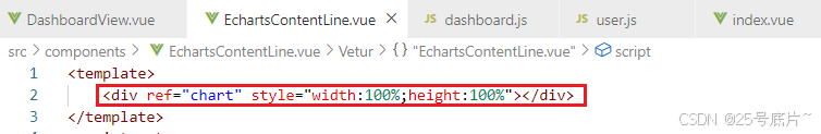
①视图层
首先定义一个div,用于存储图表,设置宽高均为100%
注:这里的宽高均需要写明,否则图表无法显示
②逻辑层
根据echarts写入逻辑进行修改
引入方法
首先将需要用到的vue方法引入,并且引入echarts方法
import { ref, onMoun 最低0.47元/天 解锁文章


 被折叠的 条评论
为什么被折叠?
被折叠的 条评论
为什么被折叠?
 到【灌水乐园】发言


