


媒体查询
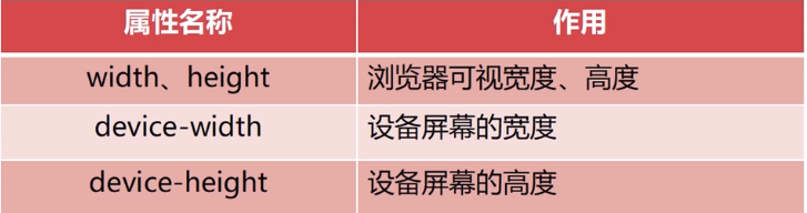
<head>
    <meta charset="UTF-8">
    <meta name="viewport" content="width=device-width, initial-scale=1.0">
    <meta http-equiv="X-UA-Compatible" content="ie=edge">
    <title>flex:1</title>
    <style>
        .box {
            width: 100px;
            height: 100px;
        }
        /* 屏幕尺寸在200px-300px 背景为红色*/
        @media screen and (min-device-width:200px) and (max-device-width:300px) {
            .box{
                background-color: red;
            }
        }
        /* 屏幕尺寸在300px-400px  背景为黄色*/
        @media screen and (min-device-width:300px) and (max-device-width:400px) {
            .box{
                background-color: yellow;
            }
        }
    </style>
</head>

<body>
    <div class="box">

    </div>
</body>

其它引入方式
<style media="(min-device-width:200px) and (max-device-width:300px)">
    .box{
        background-color: red;
    }
</style>
<style media="(min-device-width:300px) and (max-device-width:400px )">
    .box {
        background-color: yellow;
    }
</style>
<link rel="stylesheet" href="css/test1.css" media="(min-device-width:200px) and (max-device-width:300px)">
<link rel="stylesheet" href="css/test2.css" media="(min-device-width:300px) and (max-device-width:400px)">
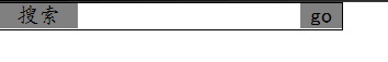
案例一:输入框label和go
<head>
    <meta charset="UTF-8">
    <meta name="viewport" content="width=device-width, initial-scale=1.0">
    <meta http-equiv="X-UA-Compatible" content="ie=edge">
    <title>flex:1</title>
    <style>
        *{
            margin: 0;
            padding: 0;
        }
        .box{
            width: 250px;
            display: flex;
            border: 1px solid black;
        }
        .box label{
        	/*label自适应*/
            flex:1;/*flex-grow,flex-shrink,flex-basis*/
            background-color: gray;
            font-family: "楷体";
            text-align: center;
        }
        .box label:nth-child(3){
            flex: 0 0 30px;/*设置go的初始大小*/
        }
        .box input{
            border: none;
            /* 获取焦点无边框 */
            outline: none;
        }
    </style>
</head>
<body>
    <div class="box">
        <label for="input">搜索</label>
        <input type="text" id="input">
        <label>go</label>
    </div>
</body>
案例二:input自适应

<head>
    <meta charset="UTF-8">
    <meta name="viewport" content="width=device-width, initial-scale=1.0">
    <meta http-equiv="X-UA-Compatible" content="ie=edge">
    <title>flex:1</title>
    <style>
        *{
            margin: 0;
            padding: 0;
        }
        .box{
            display: flex;
            flex-direction: column;
        }
        .box div{
            display: flex;
            /*让两输入框上下隔开*/
            /* height: 30px; */
            /*让两输入框上下隔开*/
            flex: 0 0 100px;
        }
        .box div label{
            flex: 0 0 100px;
            text-align: right;
        }
    </style>
</head>

<body>
    <div class="box">
        <div>
            <label for="i1">姓名:</label>
            <input type="text" name="i1">
        </div>
        <div>
            <label for="i2">输入密码:</label>
            <input type="text" name="i2">
        </div>
    </div>
</body>
案例三:js调整基准字体大小
<script>
    var c = () => {
        let w = document.documentElement.clientWidth;//获取设备的宽度
        // 20:字体基准
        // 320:计算依据宽度
        let n = (20 * (w / 320) > 40 ? 40 + "px" : (20 * (w / 320) + "px"));
        // 将计算好后的大小赋值给字体
        document.documentElement.style.fontSize = n;
        window.addEventListener("load", c);
        window.addEventListener("resize", c);
    }
</script>
案例四:js控制跳转到手机还是pc页面(不同布局)
<script type="text/javascript">
    var redirect = () => {
        //获取设备的信息
        let userAgent = navigator.userAgent.toLowerCase();
        //正则表达式,判断设备类型
        let device = /ipad|iphone|midp|rv:1.2.3.4|ucweb[android]|windows ce|windows mobile/;
        //跳转移动端页面
        if (device.test(userAgent)) {
            window.location.href = "move.html";
        } else {
        //跳转pc端页面
            window.location.href = "pc.html";
        }
    }
    redirect();
</script>
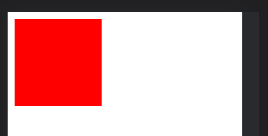
案例五:导航、内容自适应
pc

小屏幕

<!DOCTYPE html>
<html lang="en">
<head>
  <meta charset="UTF-8">
  <meta http-equiv="X-UA-Compatible" content="IE=edge">
  <meta name="viewport" content="width=device-width, initial-scale=1.0">
  <link rel="stylesheet" href="./big.css" media="(min-device-width:1000px)">
  <link rel="stylesheet" href="./small.css" media="(min-device-width:400px) and (max-device-width:1000px)">
  <title>Document</title>
</head>
<body>
  <div class="container">
    <div class="top"></div>
    <div class="main">
      <ul>
        <li>分类1</li>
        <li>分类2</li>
        <li>分类3</li>
        <li>分类4</li>
        <li>分类5</li>
        <li>分类6</li>
      </ul>
      <ul>
        <li>图片</li>
        <li>图片</li>
        <li>图片</li>
        <li>图片</li>
        <li>图片</li>
        <li>图片</li>
        <li>图片</li>
        <li>图片</li>
      </ul>

    </div>
  </div>
</body>
</html>
big.css
*{
  margin: 0;
  padding: 0;
}
li{
  list-style-type: none;
}
.container{
  display: flex;
  flex-direction: column;
  width: 80%;
  margin: auto;
}
.top{
  flex: 0 0 50px;
  width: 100%;
  /* height: 50px; */
  background-color: yellow;
}
.main{
  flex: 0 0 100%;
  display: flex;

}
.main ul:first-child{
  flex: 0 0 10%;
  background-color: black;
  color: white;
  display: flex;
  /* flex-direction: column; */
  flex-wrap: wrap;
  border-bottom: 1px solid black;
  border-right: 1px solid black;
}
/*左边导航中li样式*/
.main ul:first-child li{
  flex: 0 0 100%;
  height: 40px;
  line-height: 40px;
  text-align: center;
}
/*第二个ul样式*/
.main ul:nth-child(2){
/*因为左边占10%,所以右边占90%*/
  flex: 0 0 90%;
  background-color: black;
  color: white;
  display: flex;
  flex-wrap: wrap;
  justify-content: space-around;
}
.main ul:nth-child(2) li{
  flex: 0 0 30%;
  height: 120px;
  background-color: red;
  line-height: 40px;
  text-align: center;
  border-bottom: 1px solid black;
  margin: 10px;
}
small.css
* {
  margin: 0;
  padding: 0;
}
li {
  list-style-type: none;
}

.container {
  display: flex;
  flex-direction: column;
  width: 100%;
  margin: auto;
}
.top {
  flex: 0 0 50px;
  width: 100%;
  /* height: 50px; */
  background-color: yellow;
}
.main {
  flex: 0 0 100%;
  display: flex;
  flex-wrap: wrap;
}
.main ul:first-child {
  flex: 0 0 100%;
  background-color: black;
  color: white;
  display: flex;
  /* flex-direction: column; */
  flex-wrap: wrap;
  border-bottom: 1px solid black;
  border-right: 1px solid black;
  /* align-content: flex-start; */
}

.main ul:first-child li {
  flex: 0 0 30%;
  height: 40px;
  line-height: 40px;
  text-align: center;
}

.main ul:nth-child(2) {
  flex: 0 0 100%;
  background-color: black;
  color: white;
  display: flex;
  flex-wrap: wrap;
  justify-content: space-around;
}

.main ul:nth-child(2) li {
  flex: 0 0 30%;
  height: 120px;
  background-color: red;
  line-height: 40px;
  text-align: center;
  border-bottom: 1px solid black;
  margin: 10px;
}
希望本篇博客能帮助到你更好的理解响应式布局原理和知识点。


 827
827


 被折叠的 条评论
为什么被折叠?
被折叠的 条评论
为什么被折叠?
 到【灌水乐园】发言


