


ant-design中的Modal组件有两种用法:
第一种是用标签:<a-modal></a-modal>
第二种是用Api:Modal.info、Modal.warning、Modal.confirm......
一开始项目中这两种用法是混用的,后面UI改造,需要统一样式,步骤如下:
1、封装全局弹窗组件 src/components/ConfirmModal/index.vue
<template>
  <a-modal
    v-model:visible="visible"
    :title="props.title"
    centered
    width="400px"
    :footer="null"
    :keyboard="false"
    :maskClosable="false"
    destroyOnClose
    @cancel="cancel"
  >
    <div v-if="vNode" ref="contentRef" class="text-align-c mt-16"></div>
    <div v-else class="text-align-c mt-16">{{ description }}</div>
    <footer class="text-align-c mb-24 mt-40">
      <template v-if="(callType === 'method' && footerCancelOption) || callType === 'component'">
        <a-button v-bind="footerCancelOption?.props" class="cancel-btn long-btn" @click="cancel">
          {{ footerCancelOption?.text || '取消' }}
        </a-button>
      </template>

      <template v-if="(callType === 'method' && footerConfirmOption) || callType === 'component'">
        <a-button v-bind="footerConfirmOption?.props" class="confirm-btn long-btn" type="primary" :loading="btnLoading" @click="confirm">
          {{ footerConfirmOption?.text || '确认' }}
        </a-button>
      </template>
    </footer>
  </a-modal>
</template>
<script setup>
import { ref, render, nextTick } from 'vue'
import { Button, Modal } from 'ant-design-vue'

const AButton = Button
const AModal = Modal

const emits = defineEmits(['confirm', 'cancel'])
const props = defineProps({
  title: {
    type: String,
    default: '提示'
  },
  callType: {
    type: String,
    default: 'component'
  },
  vNode: {
    type: Object,
    default: null
  },
  footerCancelOption: {
    type: Object,
    default: null
  },
  footerConfirmOption: {
    type: Object,
    default: null
  }
})

const contentRef = ref()
const visible = ref(false)
const description = ref('')
const btnLoading = ref(false)

const openModel = value => {
  description.value = value
  visible.value = true
  nextTick(() => {
    if (props.vNode) {
      render(props.vNode, contentRef.value)
    }
  })
}

const closeModel = () => {
  btnLoading.value = false
  visible.value = false
}

const cancel = () => {
  closeModel()
  emits('cancel')
}

const confirm = () => {
  emits('confirm')
}

defineExpose({
  openModel,
  closeModel,
  cancel,
  btnLoading
})
</script>
<style lang="less" scoped>
.confirm-btn {
  margin-left: 0;
}
.cancel-btn + .confirm-btn {
  margin-left: 40px;
}
</style>
2、同级目录下新建js文件,调用弹窗组件 src/components/ConfirmModal/index.js
import { createApp } from 'vue'
import ConfirmModal from './index.vue'

export const showConfirmModal = option => {
  const div = document.createElement('div')
  document.body.appendChild(div)
  const app = createApp(ConfirmModal, {
    callType: 'method',
    vNode: option.vNode,
    footerCancelOption: option.footerCancelOption,
    footerConfirmOption: option.footerConfirmOption,
    onCancel: () => {
      option?.footerCancelOption?.onCancel && option?.footerCancelOption?.onCancel()
    },
    onConfirm: () => {
      option?.footerConfirmOption?.onConfirm && option?.footerConfirmOption?.onConfirm()
    }
  })
  const vm = app.mount(div)
  vm.openModel()
  return { app, vm }
}
3、在需要调用弹窗组件的js文件中引用 xxx.js
import { ref, h } from 'vue'
import { showConfirmModal } from '@/components/ConfirmModal/index.js'
// 强制登录提示
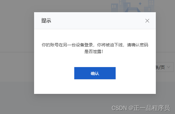
const { vm } = showConfirmModal({
vNode: h('div', { style: { color: '#333' } }, '你的账号在另一台设备登录,你将被迫下线,请确认密码是否泄露!'),
footerConfirmOption: {
onConfirm: () => {
window.location.reload()
vm.closeModel()
}
}
})
4、效果图


 1996
1996


 被折叠的 条评论
为什么被折叠?
被折叠的 条评论
为什么被折叠?
 到【灌水乐园】发言


