


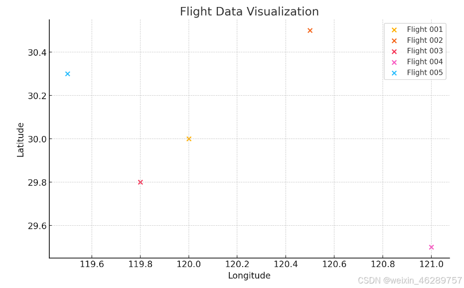
import matplotlib.pyplot as plt

# 假设飞行数据如下,包括经度、纬度、高度和航向
flights_data = {
    '001': {'longitude': 120.0, 'latitude': 30.0, 'altitude': 10000, 'heading': 270},
    '002': {'longitude': 120.5, 'latitude': 30.5, 'altitude': 12000, 'heading': 90},
    '003': {'longitude': 119.8, 'latitude': 29.8, 'altitude': 9000, 'heading': 180},
    '004': {'longitude': 121.0, 'latitude': 29.5, 'altitude': 11000, 'heading': 0},
    '005': {'longitude': 119.5, 'latitude': 30.3, 'altitude': 8000, 'heading': 45},
}

# 创建图形和轴
fig, ax = plt.subplots()

# 绘制每个飞机的位置
for flight_id, data in flights_data.items():
    ax.scatter(data['longitude'], data['latitude'], label=f'Flight {flight_id}')

# 添加图例
ax.legend()

# 设置坐标轴标签
ax.set_xlabel('Longitude')
ax.set_ylabel('Latitude')

# 设置标题
plt.title('Flight Data Visualization')

# 显示图形
plt.show()
增加航向和高度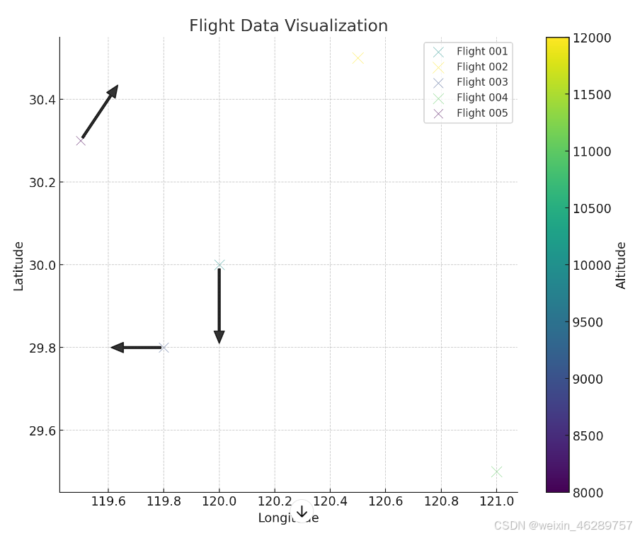
import matplotlib.pyplot as plt
import numpy as np

# 假设飞行数据如下,包括经度、纬度、高度和航向
flights_data = {
    '001': {'longitude': 120.0, 'latitude': 30.0, 'altitude': 10000, 'heading': 270},
    '002': {'longitude': 120.5, 'latitude': 30.5, 'altitude': 12000, 'heading': 90},
    '003': {'longitude': 119.8, 'latitude': 29.8, 'altitude': 9000, 'heading': 180},
    '004': {'longitude': 121.0, 'latitude': 29.5, 'altitude': 11000, 'heading': 0},
    '005': {'longitude': 119.5, 'latitude': 30.3, 'altitude': 8000, 'heading': 45},
}

# 创建图形和轴
fig, ax = plt.subplots(figsize=(10, 8))

# 设置颜色渐变范围
min_altitude = min(data['altitude'] for data in flights_data.values())
max_altitude = max(data['altitude'] for data in flights_data.values())

# 绘制每个飞机的位置
for flight_id, data in flights_data.items():
    # 使用高度来调整点的大小,使用颜色表示高度
    size = data['altitude'] / 100  # 更大的缩放比例
    color = plt.cm.viridis((data['altitude'] - min_altitude) / (max_altitude - min_altitude)) # 使用颜色映射

    ax.scatter(data['longitude'], data['latitude'], s=size, c=[color], label=f'Flight {flight_id}', alpha=0.6, edgecolors='w', linewidth=0.5)

    # 计算航向箭头的终点坐标
    angle_rad = np.deg2rad(data['heading'])
    dx = 0.2 * np.cos(angle_rad)  # 增加箭头的长度
    dy = 0.2 * np.sin(angle_rad)

    # 添加箭头以表示航向
    ax.annotate('', xy=(data['longitude'] + dx, data['latitude'] + dy),
                xytext=(data['longitude'], data['latitude']),
                arrowprops=dict(facecolor='black', shrink=0.05, width=2, headwidth=10, alpha=0.8))

# 添加颜色条
sm = plt.cm.ScalarMappable(cmap='viridis', norm=plt.Normalize(vmin=min_altitude, vmax=max_altitude))
cbar = plt.colorbar(sm, ax=ax)
cbar.set_label('Altitude')

# 添加图例
ax.legend()

# 设置坐标轴标签
ax.set_xlabel('Longitude')
ax.set_ylabel('Latitude')

# 设置标题
plt.title('Flight Data Visualization')

# 显示图形
plt.show()


 被折叠的 条评论
为什么被折叠?
被折叠的 条评论
为什么被折叠?
 到【灌水乐园】发言


