


1. CSS 的复合选择器
在 CSS 中,可以根据选择器的类型把选择器分为基础选择器和复合选择器,复合选择器是建立在基础选择器之上,对 基本选择器进行组合形成的
- 复合选择器可以更准确、更高效的选择目标元素(标签)
- 复合选择器是由两个或多个基础选择器,通过不同的方式组合而成的
- 常用的复合选择器包括:后代选择器、子选择器、并集选择器、伪类选择器等等
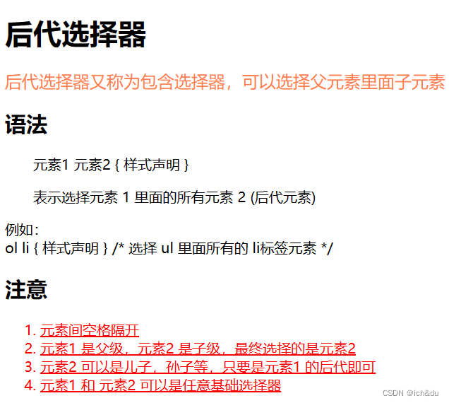
1.2 后代选择器
后代选择器又称为包含选择器,可以选择父元素里面子元素
<!DOCTYPE html>
<html lang="en">

<head>
    <meta charset="UTF-8">
    <meta http-equiv="X-UA-Compatible" content="IE=edge">
    <meta name="viewport" content="width=device-width, initial-scale=1.0">
    <title>后代选择器</title>
    <style>
        .spanp p {
            color: coral;
            font-size: larger;
        }

        /* 选择 div 里面所有的 p 标签元素 */
        div p {
            text-indent: 2em;
        }

        div ol li {
            color: red;
            text-decoration: underline;
        }
    </style>
</head>

<body>
    <h1>后代选择器</h1>
    <span class="spanp">
        <p>
            后代选择器又称为包含选择器,可以选择父元素里面子元素
        </p>
    </span>

    <h2>语法</h2>
    <div>
        <p>元素1 元素2 { 样式声明 }</p>
        <p>表示选择元素 1 里面的所有元素 2 (后代元素)</p>
    </div>

    <p>
        例如:<br>
        ol li { 样式声明 } /* 选择 ol 里面所有的 li标签元素 */
    </p>
    <h2>注意</h2>
    <div>
        <ol>
            <li>元素间空格隔开</li>
            <li>元素1 是父级,元素2 是子级,最终选择的是元素2</li>
            <li>元素2 可以是儿子,孙子等,只要是元素1 的后代即可</li>
            <li>元素1 和 元素2 可以是任意基础选择器</li>
        </ol>
    </div>
</body>

</html>
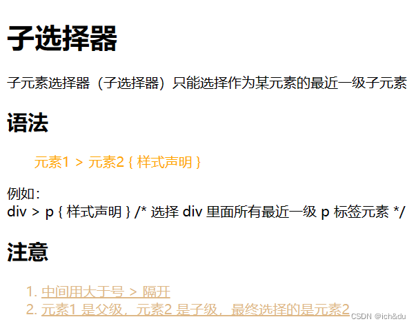
1.3 子选择器
子元素选择器(子选择器)只能选择作为某元素的最近一级子元素
<!DOCTYPE html>
<html lang="en">
<head>
    <meta charset="UTF-8">
    <meta http-equiv="X-UA-Compatible" content="IE=edge">
    <meta name="viewport" content="width=device-width, initial-scale=1.0">
    <title>子选择器</title>
    <style>
        div > p {
            color: orange;
            text-indent: 2em;
        }

        .divo > ol {
            color: burlywood;
            text-decoration: underline;
        }
    </style>
</head>
<body>
    <h1>子选择器</h1>
    <p>
        子元素选择器(子选择器)只能选择作为某元素的最近一级子元素
    </p>

    <h2>语法</h2>
    <div>
        <p>
            元素1 > 元素2 { 样式声明 }
        </p>
    </div>

	<p>
        例如:<br>
        div > p { 样式声明 } /* 选择 div 里面所有最近一级 p 标签元素 */
    </p>
    <h2>注意</h2>
    <div class="divo">
        <ol>
            <li>中间用大于号 > 隔开</li>
            <li>元素1 是父级,元素2 是子级,最终选择的是元素2</li>
        </ol>
    </div>
</body>
</html>
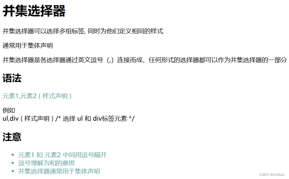
1.4 并集选择器
并集选择器可以选择多组标签, 同时为他们定义相同的样式
<!DOCTYPE html>
<html lang="en">
<head>
    <meta charset="UTF-8">
    <meta http-equiv="X-UA-Compatible" content="IE=edge">
    <meta name="viewport" content="width=device-width, initial-scale=1.0">
    <title>并集选择器</title>
    <style>
        div > span,ul {
            color: cadetblue;
            font-size: medium;
        }
    </style>
</head>
<body>
    <h1>并集选择器</h1>
    <p>并集选择器可以选择多组标签, 同时为他们定义相同的样式</p>
    <p>通常用于集体声明</p>
    <p>并集选择器是各选择器通过英文逗号(,)连接而成,任何形式的选择器都可以作为并集选择器的一部分</p>

    <h2>语法</h2>
    <div>
        <span>元素1,元素2 { 样式声明 }</span>
    </div>

	<p>
        例如<br>
        ul,div { 样式声明 } /* 选择 ul 和 div标签元素 */
    </p>
    <h2>注意</h2>
    <ul>
        <li>元素1 和 元素2 中间用逗号隔开</li>
        <li>逗号理解为和的意思</li>
        <li>并集选择器通常用于集体声明</li>
    </ul>
</body>
</html>
1.5 伪类选择器
伪类选择器用于向某些选择器添加特殊的效果
特点是用冒号(:)表示
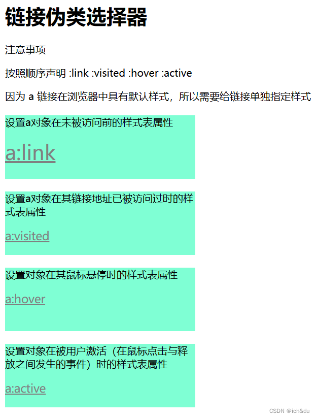
1.5.1 链接伪类选择器
<!DOCTYPE html>
<html lang="en">

<head>
    <meta charset="UTF-8">
    <meta http-equiv="X-UA-Compatible" content="IE=edge">
    <meta name="viewport" content="width=device-width, initial-scale=1.0">
    <title>链接伪类选择器</title>
    <style>
        /* a 是标签选择器 所有的链接 */
        a {
            font-size: large;
            color: gray;
        }

        div {
            width: 300px;
            height: 100px;
            margin-top: 20px;
            background-color: aquamarine;
        }

        .div1 a:link {
            font-size: xx-large;
            color: coral;
        }

        .div2 a:visited {
            color: coral;
            font-size: xx-large;
        }

        .div3 a:hover {
            color: coral;
        }

        .div4 a:active {
            color: brown;
        }
    </style>
</head>

<body>
    <h1>链接伪类选择器</h1>
    <p>注意事项</p>
    <p>按照顺序声明 :link :visited :hover :active</p>
    <p>因为 a 链接在浏览器中具有默认样式,所以需要给链接单独指定样式</p>

    <div class="div1">
        <p>设置a对象在未被访问前的样式表属性</p>
        <a href="#">a:link</a>
    </div>
    <div class="div2">
        <p>设置a对象在其链接地址已被访问过时的样式表属性</p>
        <a href="www.baidu.com">a:visited</a>
    </div>
    <div class="div3">
        <p>设置对象在其鼠标悬停时的样式表属性</p>
        <a href="#">a:hover</a>
    </div>
    <div class="div4">
        <p>设置对象在被用户激活(在鼠标点击与释放之间发生的事件)时的样式表属性</p>
        <a href="#">a:active</a>
    </div>
</body>

</html>
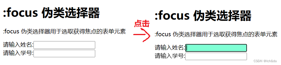
1.5.2 :focus 伪类选择器
:focus 伪类选择器用于选取获得焦点的表单元素
<!DOCTYPE html>
<html lang="en">

<head>
    <meta charset="UTF-8">
    <meta http-equiv="X-UA-Compatible" content="IE=edge">
    <meta name="viewport" content="width=device-width, initial-scale=1.0">
    <title>:focus 伪类选择器</title>
    <style>
        input:focus {
            background-color: aquamarine;
        }
    </style>
</head>

<body>
    <h1>:focus 伪类选择器</h1>
    <p>:focus 伪类选择器用于选取获得焦点的表单元素</p>

    <form action="">
        请输入姓名:<input type="text"><br>
        请输入学号:<input type="text"><br>
    </form>
</body>

</html>
2. CSS 的元素显示模式
作用:网页的标签非常多,在不同地方会用到不同类型的标签,了解他们的特点可以更好的布局我们的网页
元素显示模式就是元素(标签)以什么方式进行显示
2.1 块元素
常见的块元素有 h1 ~ h6 、p、div、ul、ol、li 等,其中 div 标签是最典型的块元素
<!DOCTYPE html>
<html lang="en">
<head>
    <meta charset="UTF-8">
    <meta http-equiv="X-UA-Compatible" content="IE=edge">
    <meta name="viewport" content="width=device-width, initial-scale=1.0">
    <title>块元素</title>
</head>
<body>
    <h1>块元素</h1>
    <p>
        常见的块元素有 h1 ~ h6 、p、div、ul、ol、li 等,其中 <div> 标签是最典型的块元素
    </p>

    <h2>特点</h2>
    <ul>
        <li>独占一行</li>
        <li>高度,宽度、外边距以及内边距都可以控制</li>
        <li>宽度默认是容器(父级宽度)的100%</li>
        <li>是一个容器及盒子,里面可以放行内或者块级元素</li>
    </ul>

    <h2>注意</h2>
    <ol>
        <li>文字类的元素内不能使用块级元素</li>
        <li>p 标签主要用于存放文字</li>
        <li> h1 ~ h6 等都是文字类块级标签</li>
    </ol>
</body>
</html>
2.2 行内元素
常见的行内元素有 a、strong、b、em、i、del、s、ins、u、span 等
其中span 标签是最典型的行内元素
有的地方也将行内元素称为内联元素
<!DOCTYPE html>
<html lang="en">

<head>
    <meta charset="UTF-8">
    <meta http-equiv="X-UA-Compatible" content="IE=edge">
    <meta name="viewport" content="width=device-width, initial-scale=1.0">
    <title>行内元素</title>
</head>

<body>
    <h1>行内元素</h1>
    <p>
        常见的行内元素有 a、strong、b、em、i、del、s、ins、u、span 等
    </p>
    <span>
        其中span 标签是最典型的行内元素。有的地方也将行内元素称为内联元素
    </span>

    <h2>特点</h2>
    <ul>
        <li>相邻行内元素在一行上,一行可以显示多个</li>
        <li>高、宽直接设置是无效的</li>
        <li>默认宽度就是它本身内容的宽度</li>
        <li>行内元素只能容纳文本或其他行内元素</li>
    </ul>

    <h2>注意</h2>
    <p>链接里面不能再放链接</p>
    <p>
        特殊情况链接 a 里面可以放块级元素,但是给 a 转换一下块级模式最安全
    </p>
    <a href="#" style="display: block;">
        <div>123</div>
    </a>
</body>

</html>
2.3 行内块元素
在行内元素中有几个特殊的标签 : img 、input 、td,它们同时具有块元素和行内元素的特点
<!DOCTYPE html>
<html lang="en">

<head>
    <meta charset="UTF-8">
    <meta http-equiv="X-UA-Compatible" content="IE=edge">
    <meta name="viewport" content="width=device-width, initial-scale=1.0">
    <title>行内块元素</title>
</head>

<body>
    <h1>行内块元素</h1>
    <p>在行内元素中有几个特殊的标签 : img 、input 、td,它们同时具有块元素和行内元素的特点</p>

    <h2>特点</h2>
    <ul>
        <li>和相邻行内元素(行内块)在一行上,一行可以显示多个(行内元素特点)</li>
        <li>默认宽度就是它本身内容的宽度(行内元素特点)</li>
        <li>高度,行高、外边距以及内边距都可以控制(块级元素特点)</li>
    </ul>

    <br>
    <br>
    <img src="" alt="#">
    <img src="" alt="#">

    <br>
    <br>
    <input type="text">
    <input type="text">

    <br>
    <br>
    <table border="1px">
        <tr>
            <td>并在一行1</td>
            <td>并在一行1</td>
        </tr>
        <tr>
            <td>并在一行2</td>
            <td>并在一行2</td>
        </tr>
    </table>
</body>

</html>
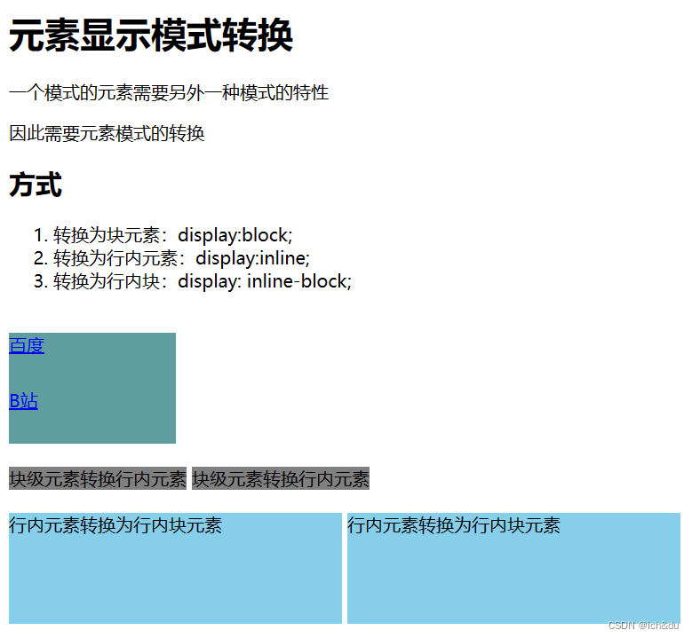
2.4 元素显示模式转换
<!DOCTYPE html>
<html lang="en">
<head>
    <meta charset="UTF-8">
    <meta http-equiv="X-UA-Compatible" content="IE=edge">
    <meta name="viewport" content="width=device-width, initial-scale=1.0">
    <title>元素显示模式转换</title>
    <style>
        a {
            width: 150px;
            height: 50px;
            background-color: cadetblue;
            /* 把行内元素 a 转换为 块级元素 */
            display: block;
        }

        div {
            width: 300px;
            height: 100px;
            background-color: gray;
            /* 把 div 块级元素转换为行内元素 */
            display: inline;
        }

        span {
            width: 300px;
            height: 100px;
            background-color: skyblue;
            display: inline-block;
        }
    </style>
</head>
<body>
    <h1>元素显示模式转换</h1>
    <p>一个模式的元素需要另外一种模式的特性</p>
    <p>因此需要元素模式的转换</p>

    <h2>方式</h2>
    <ol>
        <li>转换为块元素:display:block;</li>
        <li>转换为行内元素:display:inline;</li>
        <li>转换为行内块:display: inline-block;</li>
    </ol>

    <br>
    <a href="www.baidu.com">百度</a>
    <a href="www.bilibili.com">B站</a>

    <br>
    <div>块级元素转换行内元素</div>
    <div>块级元素转换行内元素</div>

    <br>
    <br>
    <span>行内元素转换为行内块元素</span>
    <span>行内元素转换为行内块元素</span>
</body>
</html>
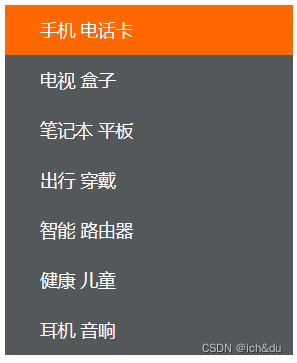
2.5 案例
2.5.1 简单版小米侧边栏
- 核心思路:
- 把链接 a 转换为块级元素,这样链接就可以单独占一行,并且有宽度和高度
- 鼠标经过 a 给 链接设置背景颜色
<!DOCTYPE html>
<html lang="en">

<head>
    <meta charset="UTF-8">
    <meta name="viewport" content="width=device-width, initial-scale=1.0">
    <meta http-equiv="X-UA-Compatible" content="ie=edge">
    <title>简单版小米侧边栏</title>
    <style>
        /* 1. 把a转换为块级元素 */
        a {
            display: block;
            width: 230px;
            height: 40px;
            background-color: #55585a;
            font-size: 14px;
            color: #fff;
            text-decoration: none;
            text-indent: 2em;
            line-height: 40px;
        }

        /* 2 鼠标经过链接变换背景颜色 */
        a:hover {
            background-color: #ff6700;
        }
    </style>
</head>

<body>

    <a href="#">手机 电话卡</a>
    <a href="#">电视 盒子</a>
    <a href="#">笔记本 平板</a>
    <a href="#">出行 穿戴</a>
    <a href="#">智能 路由器</a>
    <a href="#">健康 儿童</a>
    <a href="#">耳机 音响</a>
</body>

</html>
2.5.2 单行文字垂直居中
核心思路:让文字的行高等于盒子的高度,就可以让文字在当前盒子内垂直居中
<!DOCTYPE html>
<html lang="en">

<head>
    <meta charset="UTF-8">
    <meta name="viewport" content="width=device-width, initial-scale=1.0">
    <meta http-equiv="X-UA-Compatible" content="ie=edge">
    <title>单行文字垂直居中</title>
    <style>
        div {
            width: 200px;
            height: 40px;
            /* div居中 */
            margin: 0 auto;
            background-color: pink;
            line-height: 40px;
            /* 文字居中 */
            text-align: center;
        }
    </style>
</head>

<body>
    <div>我要居中</div>
</body>

</html>
3. CSS 的背景
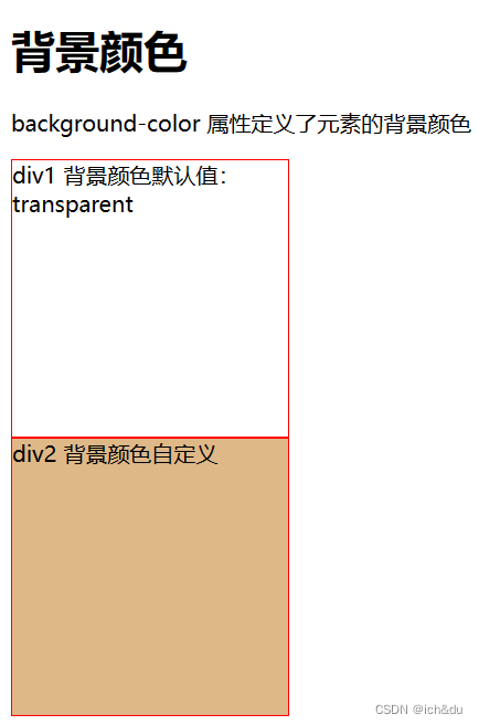
3.1 背景颜色
background-color 属性定义了元素的背景颜色
<!DOCTYPE html>
<html lang="en">
<head>
    <meta charset="UTF-8">
    <meta http-equiv="X-UA-Compatible" content="IE=edge">
    <meta name="viewport" content="width=device-width, initial-scale=1.0">
    <title>背景颜色</title>
    <style>
        .div1 {
            width: 200px;
            height: 200px;
            border: 1px solid red;
            /* 一般情况下元素背景颜色默认值是 transparent(透明),也可手动指定背景颜色透明 */
            background-color: transparent;
        }

        .div2{
            width: 200px;
            height: 200px;
            border: 1px solid red;
            background-color: burlywood;
        }
    </style>
</head>
<body>
    <h1>背景颜色</h1>
    <p>background-color 属性定义了元素的背景颜色</p>
    <div class="div1">div1 背景颜色默认值:transparent</div>
    <div class="div2">div2 背景颜色自定义</div>
</body>
</html>
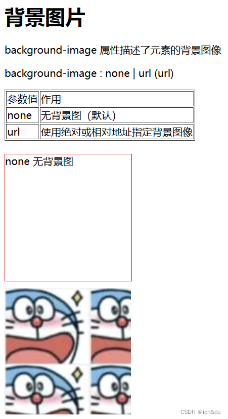
3.2 背景图片
background-image 属性描述了元素的背景图像
<!DOCTYPE html>
<html lang="en">
<head>
    <meta charset="UTF-8">
    <meta http-equiv="X-UA-Compatible" content="IE=edge">
    <meta name="viewport" content="width=device-width, initial-scale=1.0">
    <title>背景图片</title>
    <style>
        .div1 {
            width: 200px;
            height: 200px;
            border: 1px solid red;
            background-image: none;
        }

        .div2 {
            width: 200px;
            height: 200px;
            margin-top: 10px;
            /* 不要落下 url()   */
            background-image: url(../img/1.png);
        }
    </style>
</head>
<body>
    <h1>背景图片</h1>
    <p>background-image 属性描述了元素的背景图像</p>
    <p>background-image : none | url (url)</p>
    <table border="1px">
        <thead>
            <tr>
                <td>参数值</td>
                <td>作用</td>
            </tr>
        </thead>
        <tbody>
            <tr>
                <td>none</td>
                <td>无背景图(默认)</td>
            </tr>
            <tr>
                <td>url</td>
                <td>使用绝对或相对地址指定背景图像</td>
            </tr>
        </tbody>
    </table>
    <br>
    <div class="div1">none 无背景图</div>
    <div class="div2"></div>
</body>
</html>
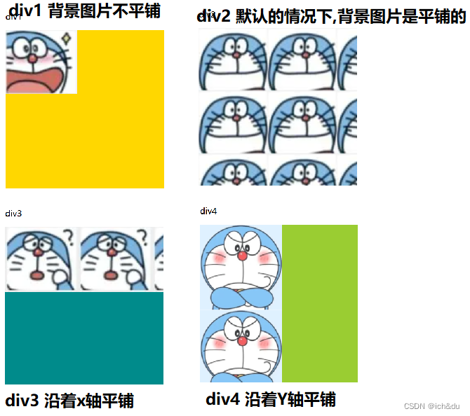
3.3 背景平铺
要在 HTML 页面上对背景图像进行平铺
<!DOCTYPE html>
<html lang="en">

<head>
    <meta charset="UTF-8">
    <meta http-equiv="X-UA-Compatible" content="IE=edge">
    <meta name="viewport" content="width=device-width, initial-scale=1.0">
    <title>背景平铺</title>
    <style>
        .div1 {
            width: 300px;
            height: 300px;
            background-color: gold;
            background-image: url(../img/1.png);
            /* 1.背景图片不平铺 */
            background-repeat: no-repeat;
        }

        .div2 {
            width: 300px;
            height: 300px;
            background-color: rosybrown;
            background-image: url(../img/2.png);
            /* 2.默认的情况下,背景图片是平铺的 */
            background-repeat: repeat;
        }

        .div3 {
            width: 300px;
            height: 300px;
            background-color: darkcyan;
            background-image: url(../img/3.png);
            /* 3. 沿着x轴平铺 */
            background-repeat: repeat-x;
        }

        .div4 {
            width: 300px;
            height: 300px;
            background-color: yellowgreen;
            background-image: url(../img/4.png);
            /* 4. 沿着Y轴平铺 */
            background-repeat: repeat-y;
        }
    </style>
</head>

<body>
    <h1>背景平铺</h1>
    <p>使用 background-repeat 属性可以在 HTML 页面上对背景图像进行平铺</p>
    <p>页面元素既可以添加背景颜色也可以添加背景图片 只不过背景图片会压住背景颜色</p>

    <h2>语法</h2>
    <p>background-repeat: repeat | no-repeat | repeat-x | repeat-y</p>

    <table border="1px">
        <thead>
            <tr>
                <td>参数值</td>
                <td>作用</td>
            </tr>
        </thead>
        <tbody>
            <tr>
                <td>repeat</td>
                <td>背景图像在纵向和横向上平铺(默认的)</td>
            </tr>
            <tr>
                <td>no-repeat</td>
                <td>背景图像不平铺</td>
            </tr>
            <tr>
                <td>repeat-x</td>
                <td>背景图像在横向上平铺</td>
            </tr>
            <tr>
                <td>repeat-y</td>
                <td>背景图像在纵向平铺</td>
            </tr>
        </tbody>
    </table>

    <br><br>
    <p>div1</p>
    <div class="div1"></div>
    <br>
    <p>div2</p>
    <div class="div2"></div>
    <br>
    <p>div3</p>
    <div class="div3"></div>
    <br>
    <p>div4</p>
    <div class="div4"></div>
</body>

</html>
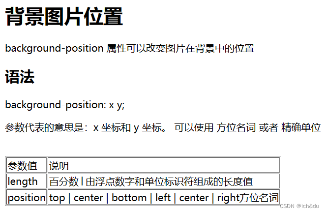
3.4 背景图片位置
利用 background-position 属性可以改变图片在背景中的位置
<!DOCTYPE html>
<html lang="en">

<head>
    <meta charset="UTF-8">
    <meta http-equiv="X-UA-Compatible" content="IE=edge">
    <meta name="viewport" content="width=device-width, initial-scale=1.0">
    <title>背景图片位置</title>
    <style>
        div {
            width: 200px;
            height: 200px;
            background-color: bisque;
            background-image: url(../img/1.png);
            background-repeat: no-repeat;
            float: left;
            margin-left: 10px;
        }

        .div1 {
            /* background-position:  方位名词; */
            background-position: center top;
        }

        .div2 {
            /* background-position:  方位名词; */
            background-position: right center;
        }

        .div3 {
            /* 如果是方位名词  right center 和 center right 效果是等价的 跟顺序没有关系 */
            background-position: center right;
        }


        .div4 {
            /* 此时 水平一定是靠右侧对齐  第二个参数省略 y 轴是 垂直居中显示的 */
            background-position: right;
        }

        .div5 {
            /* 此时 第一个参数一定是 top y轴顶部对齐   第二个参数省略 x轴 是水平居中显示的 */
            background-position: top;
        }
    </style>
</head>

<body>
    <h1>背景图片位置</h1>
    <p>background-position 属性可以改变图片在背景中的位置</p>
    <h2>语法</h2>
    <p>background-position: x y;</p>
    <p>参数代表的意思是:x 坐标和 y 坐标。 可以使用 方位名词 或者 精确单位</p>

    <br>
    <table border="1px">
        <thead>
            <tr>
                <td>参数值</td>
                <td>说明</td>
            </tr>
        </thead>
        <tbody>
            <tr>
                <td>length</td>
                <td>百分数│由浮点数字和单位标识符组成的长度值</td>
            </tr>
            <tr>
                <td>position</td>
                <td>
                    top | center | bottom | left | center | right方位名词
                </td>
            </tr>
        </tbody>
    </table>

    <br><br>
    <p>div1</p>
    <div class="div1"></div>
    <p>div2</p>
    <div class="div2"></div>
    <p>div3</p>
    <div class="div3"></div>
    <p>div4</p>
    <div class="div4"></div>
    <p>div5</p>
    <div class="div5"></div>
</body>

</html>
3.5 背景图像固定
background-attachment 属性设置背景图像是否固定或者随着页面的其余部分滚动
| 参数 | 作用 |
|---|---|
| scroll | 背景图片事随对象内容滚动 |
| fixed | 背景图像固定 |
<!DOCTYPE html>
<html lang="en">

<head>
    <meta charset="UTF-8">
    <meta http-equiv="X-UA-Compatible" content="IE=edge">
    <meta name="viewport" content="width=device-width, initial-scale=1.0">
    <title>背景图像固定</title>
    <style>
        body {
            height: 2000px;
            /* 背景图像是随对象内容滚动 */
            background-image: url(../img/2.png);
            background-repeat: no-repeat;
            background-position: center;
            background-attachment: fixed;
        }

        h1 {
            width: 5000px;
            height: 200px;
            font-size: 16px;
            font-weight: 400;
            line-height: 40px;
            background-image: url(../img/1.png);
            background-repeat: no-repeat;
            background-position: left center;
            /* 背景图像固定 */
            background-attachment: scroll;
            text-indent: 1.5em;
        }
    </style>
</head>

<body>
    <h1>背景图像固定</h1>
</body>

</html>
3.6 背景复合写法
background: 背景颜色 背景图片地址 背景平铺 背景图像滚动 背景图片位置;
<!DOCTYPE html>
<html lang="en">

<head>
    <meta charset="UTF-8">
    <meta http-equiv="X-UA-Compatible" content="IE=edge">
    <meta name="viewport" content="width=device-width, initial-scale=1.0">
    <title>背景复合写法</title>
    <style>
        body {
            background: transparent url(../img/1.png) repeat-y fixed top;
        }
        div {
            height: 200px;
        }
    </style>
</head>

<body>
    <h1>背景复合写法</h1>
    <div></div>
    <div></div>
    <div></div>
    <div></div>
</body>

</html>
3.7 背景色半透明
background: rgba(0, 0, 0, 0.3);
最后一个参数是 alpha 透明度,取值范围在 0~1之间
习惯把 0.3 的 0 省略掉,写为 background: rgba(0, 0, 0, .3);
注意:背景半透明是指盒子背景半透明,盒子里面的内容不受影响
<!DOCTYPE html>
<html lang="en">
<head>
    <meta charset="UTF-8">
    <meta http-equiv="X-UA-Compatible" content="IE=edge">
    <meta name="viewport" content="width=device-width, initial-scale=1.0">
    <title>背景色半透明</title>
    <style>
        h1 {
            background: rgba(0, 0, 0, 0.3);
            /* background: rgba(0, 0, 0, .3); */
        }
    </style>
</head>
<body>
    <h1>背景色半透明</h1>
    <p>background: rgba(red, green, blue, alpha);</p>
    <p>alpha 透明度,取值范围在 0~1之间</p>
    <p>可以把 0.3 的 0 省略掉</p>
</body>
</html>
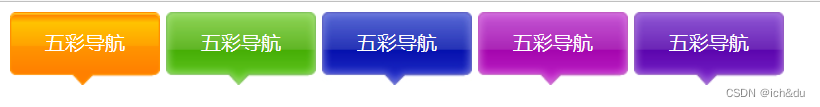
3.8 综合案例-五彩导航
- 涉及知识点
- 链接属于行内元素, 但是此时需要宽度高度,因此需要模式转换
- 里面文字需要水平居中和垂直居中. 因此需要单行文字垂直居中的代码
- 链接里面需要设置背景图片.因此需要用到背景的相关属性设置
- 鼠标经过变化背景图片,因此需要用到链接伪类选择器
<!DOCTYPE html>
<html lang="en">

<head>
    <meta charset="UTF-8">
    <meta name="viewport" content="width=device-width, initial-scale=1.0">
    <meta http-equiv="X-UA-Compatible" content="ie=edge">
    <title>综合案例-五彩导航</title>
    <style>
        .nav a {
            display: inline-block;
            width: 120px;
            height: 58px;
            background-color: khaki;
            text-align: center;
            line-height: 48px;
            color: #fff;
            text-decoration: none;
        }

        .nav .bg1 {
            background: url(../img/bg1.png) no-repeat;
        }

        .nav .bg1:hover {
            background-image: url(../img/bg11.png);
        }

        .nav .bg2 {
            background: url(../img/bg2.png) no-repeat;
        }

        .nav .bg2:hover {
            background-image: url(../img/bg22.png);
        }

        .nav .bg3 {
            background: url(../img/bg3.jpg) no-repeat;
        }

        .nav .bg3:hover {
            background-image: url(../img/bg1.png);
        }

        .nav .bg4 {
            background: url(../img/bg4.png) no-repeat;
        }

        .nav .bg4:hover {
            background-image: url(../img/bg5.png);
        }

        .nav .bg5 {
            background: url(../img/bg3.png) no-repeat;
        }

        .nav .bg5:hover {
            background-image: url(../img/bg22.png);
        }
    </style>
</head>

<body>
    <div class="nav">
        <a href="#" class="bg1">五彩导航</a>
        <a href="#" class="bg2">五彩导航</a>
        <a href="#" class="bg3">五彩导航</a>
        <a href="#" class="bg4">五彩导航</a>
        <a href="#" class="bg5">五彩导航</a>
    </div>
</body>

</html>


 2450
2450


 被折叠的 条评论
为什么被折叠?
被折叠的 条评论
为什么被折叠?
 到【灌水乐园】发言


