


4. CSS3 的颜色
4.1 CSS3 制作透明背景层
<!DOCTYPE html>
<html lang="en">
<head>
    <meta charset="UTF-8">
    <meta http-equiv="X-UA-Compatible" content="IE=edge">
    <meta name="viewport" content="width=device-width, initial-scale=1.0">
    <title>制作透明背景层</title>
    <link rel="stylesheet" href="./style9.css">
</head>
<body>
    <div id="background">
        <div id="content">
            大家好!我是哆啦A梦!<br/>
            大家好!我是哆啦A梦!<br/>
            大家好!我是哆啦A梦!<br/>
            大家好!我是哆啦A梦!<br/>
            大家好!我是哆啦A梦!<br/>
            大家好!我是哆啦A梦!<br/>
        </div>
    </div>
</body>
</html>
opacity 设置透明背景
#background {
    margin: 100px auto;
    width: 1080px;
    height: 608px;
    background-image: url('../img/dla.png');
    position: relative;
}

#content {
    position: absolute;
    width: 400px;
    height: 200px;
    background-color: #fff;
    opacity: 0.8;
    top: 200px;
    left: 200px;
    border-radius: 10px;
    padding: 10px;
    text-align: center;
    -webkit-box-shadow: 3px 3px 5px #888;
    box-shadow: 3px 3px 5px #888;
}
4.2 CSS3 的颜色模式
-
rgba(R,G,B,A)
- R:红色值 正整数 | 百分数
- G:绿色值 正整数 | 百分数
- B:蓝色值 正整数 | 百分数
- A: Alpha透明度 取值 0~1 之间
-
hsla(H,S,L,A)
- H:Hue(色调);0(或360)表示红色,120表示绿色,240表示蓝色,也可取其他数值来指定颜色;取值为:0-360
- S:Saturation(饱和度);取值为:0.0%-100.0%
- L:Lightness(亮度);取值为:0.0%-100.0%
- A :Alpha透明度;取值0~1之间
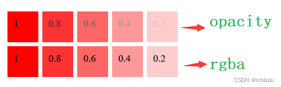
4.2.1 rgba 和 opacity 的区别
rgba() 和 opacity 都能实现透明效果,但最大的不同是 opacity 作用于元素,以及元素内的所有内容的透明度,而rgba()只作用于元素的颜色或其背景色
<!DOCTYPE html>
<html lang="en">

<head>
    <meta charset="UTF-8">
    <meta http-equiv="X-UA-Compatible" content="IE=edge">
    <meta name="viewport" content="width=device-width, initial-scale=1.0">
    <title>CSS3的颜色模式</title>
    <link rel="stylesheet" href="./style10.css">
</head>

<body>
    <div class="content opacity">
        <ul>
            <li>1</li>
            <li>0.8</li>
            <li>0.6</li>
            <li>0.4</li>
            <li>0.2</li>
        </ul>
    </div>

    <div class="content rgba">
        <ul>
            <li>1</li>
            <li>0.8</li>
            <li>0.6</li>
            <li>0.4</li>
            <li>0.2</li>
        </ul>
    </div>
</body>

</html>
.content {
    margin: 0 auto;
    clear: both;
}

.content li {
    list-style: none;
    width: 30px;
    height: 30px;
    float: left;
    padding: 10px;
    background-color: red;
    margin: 3px;
}

.opacity li:nth-child(1){opacity: 1;}
.opacity li:nth-child(2){opacity: 0.8;}
.opacity li:nth-child(3){opacity: 0.6;}
.opacity li:nth-child(4){opacity: 0.4;}
.opacity li:nth-child(5){opacity: 0.2;}

.rgba li:nth-child(1) {background-color: rgba(255, 0, 0, 1);}
.rgba li:nth-child(2) {background-color: rgba(255, 0, 0, 0.8);}
.rgba li:nth-child(3) {background-color: rgba(255, 0, 0, 0.6);}
.rgba li:nth-child(4) {background-color: rgba(255, 0, 0, 0.4);}
.rgba li:nth-child(5) {background-color: rgba(255, 0, 0, 0.2);}
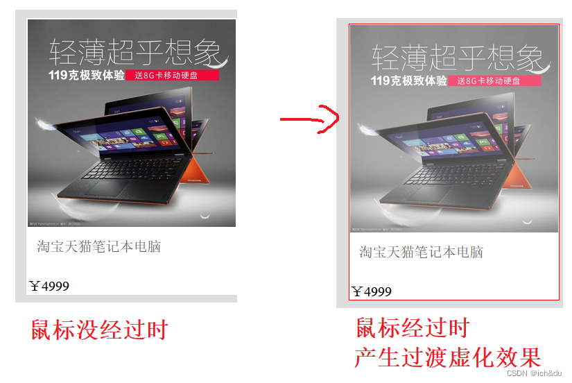
4.2.2 仿天猫商品展示效果
<!DOCTYPE html>
<html lang="en">
<head>
    <meta charset="UTF-8">
    <meta http-equiv="X-UA-Compatible" content="IE=edge">
    <meta name="viewport" content="width=device-width, initial-scale=1.0">
    <title>仿天猫商品展示效果</title>
    <link rel="stylesheet" href="./style11.css">
</head>
<body>
    <div id="main">
        <ul>
            <li>
                <div class="img">
                    <img src="../img/笔记本.jpg" alt="#">
                </div>
                <div class="goods_title">
                    淘宝天猫笔记本电脑
                </div>
                <div class="price">¥4999</div>
            </li>
            <li>
                <div class="img">
                    <img src="../img/蓝牙耳机.png" alt="#">
                </div>
                <div class="goods_title">
                    多彩蓝牙耳机头戴式游戏无线耳麦发光立体声低音
                </div>
                <div class="price">¥499</div>
            </li>
        </ul>
    </div>
</body>
</html>
让鼠标经过图片和离开图片时产生过渡虚化效果
body {
    background-color: #ddd;
}

#main {
    margin: 100px auto;
    width: 800px;
    clear: both;
}

#main li {
    background-color: #fff;
    list-style: none;
    width: 240px;
    padding: 1px;
    border: 1px solid rgba(255, 0, 0, 0);
    cursor: pointer;
    float: left;
    margin: 3px;
}

#main li:hover {
    border: 1px solid rgba(255, 0, 0, 1);
}

#main li:hover .img img {
    /* 虚化 */
    opacity: 0.7;
}

.img img {
    /* 过渡效果,虚化过渡 */
    transition: all 1s;
    width: 240px;
}

.goods_title {
    margin: 10px;
    color: #666;
    height: 35px;
    overflow: hidden;
}
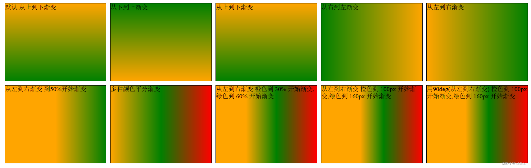
4.3 线性渐变 linear-gradient
像线一样渐变
- < angle > 用角度值指定渐变的方向(或角度)
- to left:设置渐变为从右到左 相当于:270 deg
- to right:设置渐变从左到右 相当于:90 deg
- to top:设置渐变从下到上 相当于:0 deg
- to bottom:设置渐变从上到下 相当于:180 deg
- < color-stop > 用于指定渐变的起止颜色
- < color >:指定颜色
- < length >:用长度值指定起止色位置 不允许负值
- < percentage >:用百分比指定起止色位置
<!DOCTYPE html>
<html lang="en">
<head>
    <meta charset="UTF-8">
    <meta http-equiv="X-UA-Compatible" content="IE=edge">
    <meta name="viewport" content="width=device-width, initial-scale=1.0">
    <title>线性渐变</title>
    <link rel="stylesheet" href="./style12.css">
</head>
<body>
    <div class="ceng1">默认 从上到下渐变</div>
    <div class="ceng2">从下到上渐变 </div>
    <div class="ceng3">从上到下渐变</div>
    <div class="ceng4">从右到左渐变</div>
    <div class="ceng5">从左到右渐变</div>
    <div class="ceng6">从左到右渐变 到50%开始渐变</div>
    <div class="ceng7">多种颜色平分渐变</div>
    <div class="ceng8">从左到右渐变 橙色到 30% 开始渐变,绿色到 60% 开始渐变</div>
    <div class="ceng9">从左到右渐变 橙色到 100px 开始渐变,绿色到 160px 开始渐变</div>
    <div class="ceng10">用90deg(从左到右渐变) 橙色到 100px 开始渐变,绿色到 160px 开始渐变</div>
</body>
</html>
div {
    width: 260px;
    height: 200px;
    margin: 5px;
    border: 1px solid black;
    float: left;
}

/* 默认 从上到下渐变 */
.ceng1 {
    background-image: linear-gradient(orange, green);
}

/* 从下到上渐变 */
.ceng2 {
    background-image: linear-gradient(to top, orange, green);
}

/* 从上到下渐变 */
.ceng3 {
    background-image: linear-gradient(to bottom, orange, green);
}

/* 从右到左渐变 */
.ceng4 {
    background-image: linear-gradient(to left, orange, green);
}

/* 从左到右渐变 */
.ceng5 {
    background-image: linear-gradient(to right, orange, green);
}

/* 从左到右渐变 橙色到50%开始渐变 */
.ceng6 {
    background-image: linear-gradient(to right, orange 50%, green 100%);
}

/* 多种颜色平分渐变 */
.ceng7 {
    background-image: linear-gradient(to right, orange, green, red);
}

/* 从左到右渐变 橙色到 30% 开始渐变,绿色到 60% 开始渐变 */
.ceng8 {
    background-image: linear-gradient(to right, orange 30%, green 60%, red 100%);
}

/* 从左到右渐变 橙色到 100px 开始渐变,绿色到 160px 开始渐变 */
.ceng9 {
    background-image: linear-gradient(to right, orange 100px, green 160px, red 260px);
}

/* 用90deg(从左到右渐变) 橙色到 100px 开始渐变,绿色到 160px 开始渐变 */
.ceng10 {
    background-image: linear-gradient(90deg, orange 100px, green 160px, red 260px);
}
4.4 径向渐变
按照一个圆或者椭圆来过渡渐变
<!DOCTYPE html>
<html lang="en">
<head>
    <meta charset="UTF-8">
    <meta http-equiv="X-UA-Compatible" content="IE=edge">
    <meta name="viewport" content="width=device-width, initial-scale=1.0">
    <title>径向渐变</title>
    <link rel="stylesheet" href="./style13.css">
</head>
<body>
    <div class="ceng circle1">中间</div>
    <div class="ceng ellipse1">中间</div>
    <div class="ceng circle2">右</div>
    <div class="ceng ellipse2">右</div>
    <div class="ceng circle3">上</div>
    <div class="ceng ellipse3">上</div>
    <div class="ceng circle4">下</div>
    <div class="ceng ellipse4">下</div>
    <div class="ceng circle5">左</div>
    <div class="ceng ellipse5">左</div>
    <div class="ceng circle6">左下角</div>
    <div class="ceng ellipse6">左下角</div>
    <div class="ceng circle7">半径</div>
    <div class="ceng ellipse7">x轴 y轴</div>
    <div class="ceng circle8">多颜色渐变</div>
    <div class="ceng ellipse8">多颜色渐变</div>
</body>
</html>
语法:background-image: repeating-radial-gradient(shape size at position, start-color, …, last-color);
| 值 | 描述 |
|---|---|
| shape | 确定圆的类型 ellipse(默认 椭圆) circle(圆) |
| size | 定义渐变的大小 farthest-corner (默认) : 指定径向渐变的半径长度为从圆心到离圆心最远的角 closest-side :指定径向渐变的半径长度为从圆心到离圆心最近的边 closest-corner : 指定径向渐变的半径长度为从圆心到离圆心最近的角 farthest-side :指定径向渐变的半径长度为从圆心到离圆心最远的边 |
| position | 定义渐变的位置 center(默认):设置中间为径向渐变圆心的纵坐标值 top:设置顶部为径向渐变圆心的纵坐标值 bottom:设置底部为径向渐变圆心的纵坐标值 |
| start-color, …, last-color | 用于指定渐变的起止颜色 |
.ceng {
    width: 100px;
    height: 100px;
    border: 1px solid black;
    border-radius: 50%;
    margin: 10px;
    float: left;
}

.circle1 {
    background-image: radial-gradient(orange, green);
    /* 相同的 */
    /* background-image: radial-gradient(circle at center, orange, green); */
}

.ellipse1 {
    background-image: radial-gradient(ellipse at center, orange, green);
}

/* 右 */
.circle2 {
    background-image: radial-gradient(circle at right, orange, green);
}

.ellipse2 {
    background-image: radial-gradient(ellipse at right, orange, green);
}

/* 上 */
.circle3 {
    background-image: radial-gradient(circle at top, orange, green);
}

.ellipse3 {
    background-image: radial-gradient(ellipse at top, orange, green);
}

/* 下 */
.circle4 {
    background-image: radial-gradient(circle at bottom, orange, green);
}

.ellipse4 {
    background-image: radial-gradient(ellipse at bottom, orange, green);
}

/* 左 */
.circle5 {
    background-image: radial-gradient(circle at left, orange, green);
}

.ellipse5 {
    background-image: radial-gradient(ellipse at left, orange, green);
}

/* 左下角 */
.circle6 {
    background-image: radial-gradient(circle at left bottom, orange, green);
}

.ellipse6 {
    background-image: radial-gradient(ellipse at left bottom, orange, green);
}

/* 设置按照规定半径渐变 */
.circle7 {
    background-image: radial-gradient(20px circle at center, orange, green);
}

/* 20px: X轴 30px:Y轴  */
.ellipse7 {
    background-image: radial-gradient(20px 30px ellipse at center, orange, green);
}

/* 多颜色渐变 */
.circle8 {
    background-image: radial-gradient(20px circle at center, orange, green, red);
}

.ellipse8 {
    background-image: radial-gradient(20px 30px ellipse at center, orange, green, red);
}
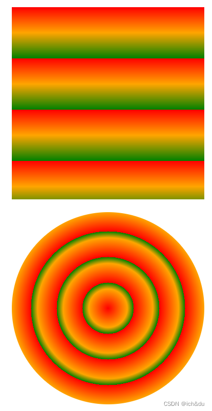
4.5 重复性渐变
repeating-radial-gradient() 函数用于创建重复的径向渐变 “图像”
<!DOCTYPE html>
<html lang="en">
<head>
    <meta charset="UTF-8">
    <meta http-equiv="X-UA-Compatible" content="IE=edge">
    <meta name="viewport" content="width=device-width, initial-scale=1.0">
    <title>重复性渐变</title>
    <link rel="stylesheet" href="./style14.css">
</head>
<body>
    <div class="linear"></div>
    <div class="circle"></div>
</body>
</html>
语法:background-image: repeating-radial-gradient(shape size at position, start-color, …, last-color);
| 值 | 描述 |
|---|---|
| shape | 确定圆的类型 ellipse(默认 椭圆) circle(圆) |
| size | 定义渐变的大小 farthest-corner (默认) : 指定径向渐变的半径长度为从圆心到离圆心最远的角 closest-side :指定径向渐变的半径长度为从圆心到离圆心最近的边 closest-corner : 指定径向渐变的半径长度为从圆心到离圆心最近的角 farthest-side :指定径向渐变的半径长度为从圆心到离圆心最远的边 |
| position | 圆心位置,类似 on与 background-position 或者 transform-origin。默认为 “center” |
| start-color, …, last-color | 用于指定渐变的起止颜色,可以使用 长度值或百分比来指定起止色位置,但不允许负值 |
.linear {
    width: 300px;
    height: 300px;
    margin: 20px auto;
    background-image: repeating-linear-gradient(red 0px, orange 40px, green 80px);
}

.circle {
    width: 300px;
    height: 300px;
    margin: 20px auto;
    border-radius: 50%;
    background-image: repeating-radial-gradient(red 0px, orange 30px, green 40px);
}
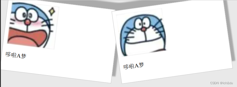
4.6 盒子阴影效果 box-shadow
<!DOCTYPE html>
<html lang="en">
<head>
    <meta charset="UTF-8">
    <meta http-equiv="X-UA-Compatible" content="IE=edge">
    <meta name="viewport" content="width=device-width, initial-scale=1.0">
    <title>盒子阴影效果</title>
    <link rel="stylesheet" href="./style15.css">
</head>
<body>
    <div class="ceng rotate_left">
        <img src="../img/1.png" alt="#">
        <p>哆啦A梦</p>
    </div>

    <div class="ceng rotate_right">
        <img src="../img/2.png" alt="#">
        <p>哆啦A梦</p>
    </div>
</body>
</html>
box-shadow属性可以设置一个或多个下拉阴影的框
语法:box-shadow: h-shadow v-shadow blur spread color inset;
| 值 | 说明 |
|---|---|
| h-shadow | 必需的。水平阴影的位置。允许负值 |
| v-shadow | 必需的。垂直阴影的位置。允许负值 |
| blur | 可选 模糊距离 |
| spread | 可选 阴影的大小 |
| color | 可选 阴影的颜色 |
| inset | 可选 从外层的阴影(开始时)改变阴影内侧阴影 |
body {
    background-color: #e9e9e9;
}

.ceng {
    width: 294px;
    padding: 10px 10px 20px 10px;
    border: 1px solid #bfbfbf;
    background-color: white;
    box-shadow: 10px -20px 3px #aaa;
}

.rotate_left {
    float: left;
    -webkit-transform: rotate(7deg);
    -ms-transform: rotate(7deg);
    -o-transform: rotate(7deg);
    transform: rotate(7deg);
}

.rotate_right {
    float: left;
    -webkit-transform: rotate(-8deg);
    -ms-transform: rotate(-8deg);
    -o-transform: rotate(-8deg);
    transform: rotate(-8deg);
}


 被折叠的 条评论
为什么被折叠?
被折叠的 条评论
为什么被折叠?
 到【灌水乐园】发言


