


布局格式定方圆
教程来源:https://datawhalechina.github.io/fantastic-matplotlib
参考资料:
1、python画分布、密度等图形
2、python - 如何注释海底联合网格/联合图中的边际图/分布图
3、python可视化48|最常用11个分布(Distribution)关系图
import numpy as np
import pandas as pd
import seaborn as sns
import matplotlib.pyplot as plt
plt.rcParams['font.sans-serif'] = ['SimHei']   #用来正常显示中文标签
plt.rcParams['axes.unicode_minus'] = False   #用来正常显示负号
1、子图
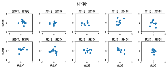
1.1、使用 plt.subplots() 绘制均匀状态下的子图
返回元素分别是画布和子图构成的列表,第一个数字为行,第二个为列,不传入时默认值都为1
figsize 参数可以指定整个画布的大小
sharex 和 sharey 分别表示是否共享横轴和纵轴刻度
tight_layout 函数可以调整子图的相对大小使字符不会重叠
fig, axs = plt.subplots(2, 5, figsize=(10, 4), sharex=False, sharey=False)
fig.suptitle('样例1', size=20)

for i in range(2):
    for j in range(5):
        axs[i][j].scatter(np.random.randn(10), np.random.randn(10))
        axs[i][j].set_title('第%d行,第%d列'%(i+1,j+1))
        axs[i][j].set_xlim(-5,5)
        axs[i][j].set_ylim(-5,5)
        if i==1:
            axs[i][j].set_xlabel('横坐标')
        if j==0:
            axs[i][j].set_ylabel('纵坐标')
fig.tight_layout()
subplots是基于OO模式的写法,显式创建一个或多个axes对象,然后在对应的子图对象上进行绘图操作。
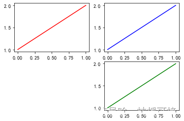
还有种方式是使用subplot这样基于pyplot模式的写法,每次在指定位置新建一个子图,并且之后的绘图操作都会指向当前子图,本质上subplot也是Figure.add_subplot的一种封装。
# 在调用subplot时一般需要传入三位数字,分别代表总行数,总列数,当前子图的index

plt.figure()
# 子图1
plt.subplot(2,2,1)
plt.plot([1,2], 'r')
# 子图2
plt.subplot(2,2,2)
plt.plot([1,2], 'b')
#子图3
plt.subplot(224)  # 当三位数都小于10时,可以省略中间的逗号,这行命令等价于plt.subplot(2,2,4)
plt.plot([1,2], 'g');
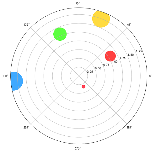
# 除了常规的直角坐标系,也可以通过projection方法创建极坐标系下的图表:

N = 5
r = 2 * np.random.rand(N)  # 散点半径
theta = 2 * np.pi * np.random.rand(N)  # 散点极角
area = 1000 * r**2  # 散点极径
colors = theta

plt.subplots(figsize=(8,8))
plt.subplot(projection='polar')
plt.scatter(theta, r, c=colors, s=area, cmap='hsv', alpha=0.75);

plt.savefig('test1.png',dpi=400,bbox_inches='tight',transparent=True)
Python Matplotlib.axes.Axes.bar()用法及代码示例:
https://vimsky.com/examples/usage/matplotlib-axes-axes-bar-in-python.html
Matplotlib.axes.Axes.bar()函数
matplotlib库的axiss模块中的Axes.bar()函数用于制作条形图。
用法: Axes.bar(self, x, height, width=0.8, bottom=None, *, align=’center’, data=None, **kwargs)
参数:此方法接受以下描述的参数:
x:此参数是水平坐标的顺序。
height:此参数是的高度。
width:此参数是可选参数。它是条的宽度,默认值为0.8。
bottom:此参数也是可选参数。它是条形底的y坐标,默认值为0。
alighn:此参数也是可选参数。它用于将条形图与x坐标对齐。
Python Matplotlib.axes.Axes.text()用法及代码示例:
https://vimsky.com/examples/usage/matplotlib-axes-axes-text-in-python.html
matplotlib库的axiss模块中的Axes.text()函数还用于将文本s添加到数据坐标中x,y位置的轴上。
用法:
Axes.text(self, x, y, s, fontdict=None, withdash=, **kwargs)
参数:此方法接受以下描述的参数:
s:此参数是要添加的文本。
xy:此参数是放置文本的点(x,y)。
fontdict:此参数是一个可选参数,并且是一个覆盖默认文本属性的字典。
withdash:此参数也是可选参数,它创建TextWithDash实例而不是Text实例。
返回值:此方法返回作为创建的文本实例的文本。
y=20
x=np.pi/2
w=np.pi/2

color=(206/255,32/255,69/255)
edgecolor=(206/255,32/255,69/255)

fig=plt.figure(figsize=(13.44,7.5))#建立一个画布
ax=fig.add_subplot(111,projection='polar')#建立一个坐标系,projection='polar'表示极坐标

ax.bar(x=np.pi/2,height=y,width=w,bottom=10,color=color,edgecolor=color)

fig.savefig('test2.png',dpi=400,bbox_inches='tight',transparent=True)

# 可以很清楚的发现
# 在笛卡尔坐标系中,一个柱状图由left,bottom,height,width四个参数决定位置和大小left决定了左边界,
# bottom决定了下边界,height决定了长度,width决定了宽度.
# 对应到笛卡尔坐标系中,
#left决定了扇形的中线位置,然后height决定扇形的长度,bottom决定了下边界,width决定了扇形的宽度。
# 能在目标位置画上一个扇形,基本上我们就能开始画玫瑰图辣!回到我们的例子中来
![[外链图片转存失败,源站可能有防盗链机制,建议将图片保存下来直接上传(img-ELE7knLj-1663591476496)(output_11_0.png)]](https://img-blog.csdnimg.cn/228d6a828ca643d8b00a97e17b097f1c.png#pic_center)
fig = plt.figure(figsize=(10,6))

#极坐标轴域
ax  = plt.subplot(111,projection='polar')
#顺时针
ax.set_theta_direction(-1)
#正上方为0度
ax.set_theta_zero_location('N')


#测试数据
r = np.arange(100,800,20)
theta = np.linspace(0, np.pi * 2, len(r), endpoint=False)

#绘制柱状图,
ax.bar( theta,r,    #角度对应位置,半径对应高度
        width=0.18, #宽度
        color=np.random.random((len(r),3)),#颜色
        align='edge',#从指定角度的径向开始绘制
        bottom=100)#远离圆心,设置偏离距离

#在圆心位置显示文本
ax.text(np.pi*3/2-0.2,90,'Origin',fontsize=14)

#每个柱的顶部显示文本表示大小
for angle,height in zip(theta,r):
    ax.text(angle+0.03,height+105,str(height),
    fontsize=height/80)

# 不显示坐标轴和网格线
plt.axis('off')
#紧凑布局,缩小外边距
plt.tight_layout()

plt.savefig('polarBar.png',dpi=480)

# 绘制南丁格尔玫瑰图

import numpy as np
import matplotlib.pyplot as plt

fig = plt.figure(figsize=(15,15))
ax = plt.subplot(projection='polar')
ax.set_theta_direction(-1)         # 调整顺逆时针
ax.set_theta_zero_location('N')    # 调整初始角度

r = np.arange(100, 800, 20)
theta = np.linspace(0, np.pi * 2, len(r), endpoint=False)

ax.bar(theta, r, width=0.18, color=np.random.random((len(r), 3)),
       align='edge', bottom=100)

ax.text(np.pi*3/2-0.2, 80, 'Origin', fontsize=30)

# 每个柱顶部显示文本大小
for angle, height in zip(theta, r):
    ax.text(angle + 0.03, height + 120, str(height), fontsize=height / 20)

plt.axis('off')  # 不显示坐标轴和网格线
plt.tight_layout()  # 紧凑布局,缩小外边距
plt.show()
fig.savefig('test3.png',dpi=400,bbox_inches='tight',transparent=True)

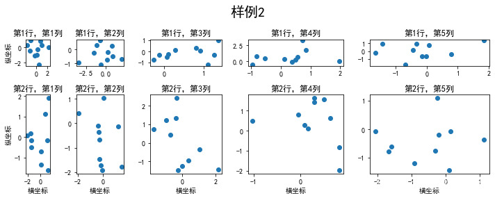
1.2、使用 GridSpec 绘制非均匀子图
所谓非均匀包含两层含义,第一是指图的比例大小不同但没有跨行或跨列,第二是指图为跨列或跨行状态
利用 add_gridspec 可以指定相对宽度比例 width_ratios 和相对高度比例参数 height_ratios
# 1、图的比例大小不同但没有跨行或跨列
fig = plt.figure(figsize=(10, 4))
spec = fig.add_gridspec(nrows=2, ncols=5, width_ratios=[1,2,3,4,5], height_ratios=[1,3])
fig.suptitle('样例2', size=20)

for i in range(2):
    for j in range(5):
        ax = fig.add_subplot(spec[i, j])
        ax.scatter(np.random.randn(10), np.random.randn(10))
        ax.set_title('第%d行,第%d列'%(i+1,j+1))
        if i==1:
            ax.set_xlabel('横坐标')
        if j==0:
            ax.set_ylabel('纵坐标')

fig.tight_layout()
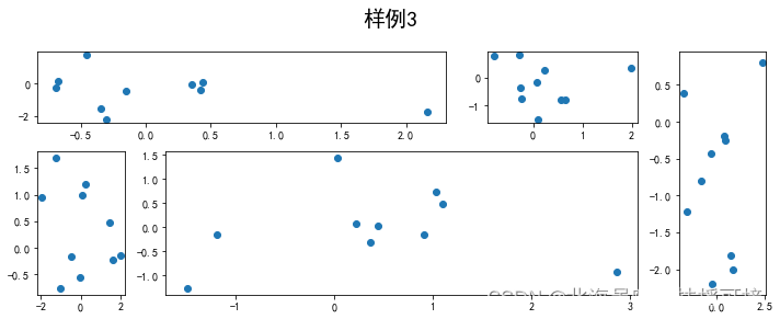
# 2、在上面的例子中出现了 spec[i, j] 的用法,事实上通过切片就可以实现子图的合并而达到跨图的共能
fig = plt.figure(figsize=(10, 4))
spec = fig.add_gridspec(nrows=2, ncols=6, width_ratios=[2,2.5,3,1,1.5,2], height_ratios=[1,2])
fig.suptitle('样例3', size=20,x=0.5,y=1)

# sub1
ax = fig.add_subplot(spec[0, :3])
ax.scatter(np.random.randn(10), np.random.randn(10))
# sub2
ax = fig.add_subplot(spec[0, 3:5])
ax.scatter(np.random.randn(10), np.random.randn(10))
# sub3
ax = fig.add_subplot(spec[:, 5])
ax.scatter(np.random.randn(10), np.random.randn(10))
# sub4
ax = fig.add_subplot(spec[1, 0])
ax.scatter(np.random.randn(10), np.random.randn(10))
# sub5
ax = fig.add_subplot(spec[1, 1:5])
ax.scatter(np.random.randn(10), np.random.randn(10))
fig.tight_layout()
2、子图上的方法
补充介绍一些子图上的方法
常用直线的画法为: axhline, axvline, axline (水平、垂直、任意方向)
matplotlib库的pyplot模块中的axhline()函数用于在轴上添加一条水平线。
用法: matplotlib.pyplot.axhline(y=0, xmin=0, xmax=1, **kwargs)
参数:此方法接受以下描述的参数:
y:该参数是可选的,它是在水平线的数据坐标中的位置。
xmin:此参数是标量,是可选的。其默认值为0。
xmax:此参数是标量,是可选的。默认值为1。
返回值:这将返回以下内容:
line:这将返回此函数创建的行。
axline函数的签名为:
matplotlib.pyplot.axline(xy1, xy2=None, *, slope=None, **kwargs)
其中:
xy1:直线贯穿的点的坐标。浮点数二元组(float, float)。
xy2:直线贯穿的点的坐标。浮点数二元组(float, float)。默认值为None。xy2和slope同时只能有一个值有效。两者既不能同时为None,也不能同时为非空值。
slope:直线的斜率。浮点数,默认值为None。
**kwargs:除’transform’之外的Line2D属性。
axline函数有两种应用模式:
axline(xy1, xy2)
axline(xy1, slope)
axline函数的返回值为Line2D对象。
fig, ax = plt.subplots(figsize=(4,3))
ax.axhline(0.5,0.2,0.8)
ax.axvline(0.5,0.2,0.8)
ax.axline([0.3,0.3],[0.7,0.7])
<matplotlib.lines.Line2D at 0x1b6f930f7c0>

# 使用 grid 可以加灰色网格

fig, ax = plt.subplots(figsize=(4,3))
ax.grid(True)

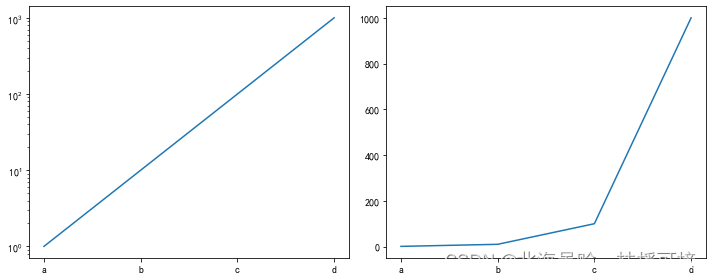
# 使用 set_xscale 可以设置坐标轴的规度(指对数坐标等)

fig, axs = plt.subplots(1, 2, figsize=(10, 4))

for j in range(2):
    axs[j].plot(list('abcd'), [10**i for i in range(4)])
    if j==0:
        axs[j].set_yscale('log')
    else:
        pass

fig.tight_layout()
3、思考题
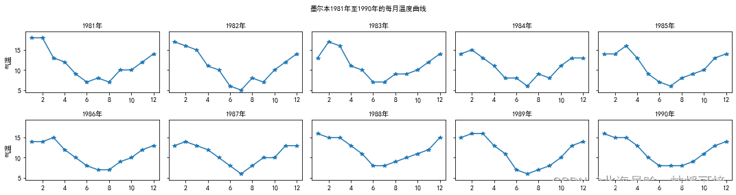
3.1、墨尔本1981年至1990年的每月温度情况
import csv
from matplotlib.pyplot import MultipleLocator
#从pyplot导入MultipleLocator类,这个类用于设置刻度间隔

tem = []
with open('fantastic-matplotlib-main\data\layout_ex1.csv', 'r') as f:
    reader = csv.reader(f)
    for i in reader:
        tem.append(i[1])
del tem[0]
temperature = [round(float(i)) for i in tem]

fig, axs = plt.subplots(2, 5, figsize=(15, 4), sharex=False, sharey=True)
fig.suptitle('墨尔本1981年至1990年的每月温度曲线', size=10)

k = 0
year = list(range(1981,1991))
x = list(range(1,13))


for i in range(2):
    for j in range(5):
        y = temperature[k*12:(k+1)*12]

        axs[i][j].plot(x,y,marker='*')
        axs[i][j].set_title('%d年' %(year[k]),size=10)
        k += 1

#         x_major_locator=MultipleLocator(1)
#         #把x轴的刻度间隔设置为1,并存在变量里
#         y_major_locator=MultipleLocator(5)
#         #把y轴的刻度间隔设置为10,并存在变量里
#         ax=plt.gca()
#         #ax为两条坐标轴的实例
#         ax.xaxis.set_major_locator(x_major_locator)
#         #把x轴的主刻度设置为1的倍数
#         ax.yaxis.set_major_locator(y_major_locator)
#         #把y轴的主刻度设置为10的倍数

        axs[i][j].set_xlim(0.5,12.5)
        axs[i][j].set_ylim(4.5,19.5)

        if j==0:
            axs[i][j].set_ylabel('气温')

fig.tight_layout()
fig.savefig('test4.png',dpi=400,bbox_inches='tight',transparent=True)
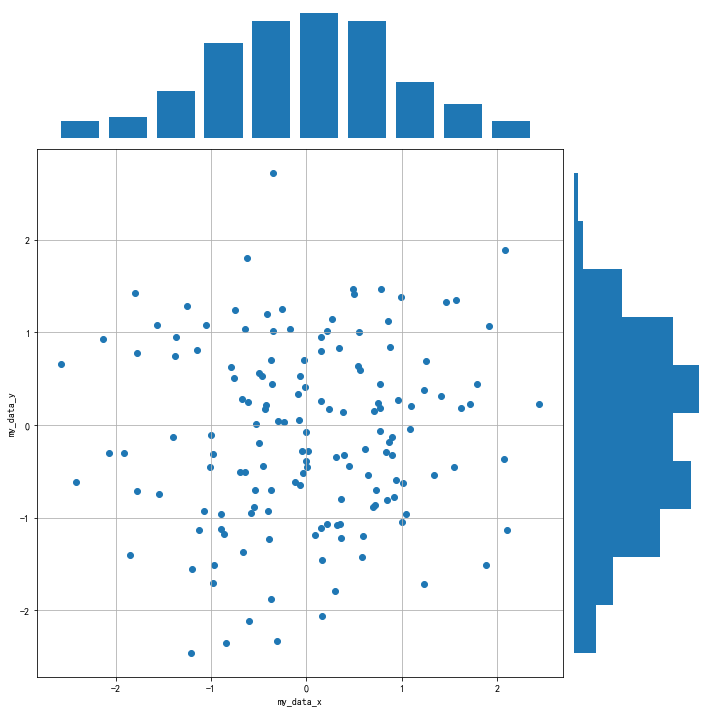
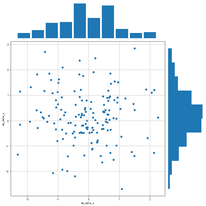
3.2、画出数据的散点图和边际分布
用 np.random.randn(2, 150) 生成一组二维数据,使用两种非均匀子图的分割方法,做出该数据对应的散点图和边际分布图
# 1、图的比例大小不同但没有跨行或跨列
fig = plt.figure(figsize=(10, 10))
spec = fig.add_gridspec(nrows=2, ncols=2, width_ratios=[4,1], height_ratios=[1,4])
# fig.suptitle('--', size=10)

x = np.random.randn(2, 150)


ax1 = fig.add_subplot(spec[0, 0])
ax1.hist(x[0],width=0.4)
ax1.patch.set_edgecolor('g')
plt.axis('off')  # 去除子图边框

ax2 = fig.add_subplot(spec[1, 0])
ax2.scatter(x[0],x[1])
ax2.grid(True)
ax2.set_xlabel('my_data_x')
ax2.set_ylabel('my_data_y')

ax3 = fig.add_subplot(spec[1, 1])
ax3.hist(x[1],orientation='horizontal')
plt.axis('off')

# with sns.color_palette("Set2"):
#         sns.kdeplot(x[1], vertical=True, shade=True)

fig.tight_layout()
fig.savefig('test5.png',dpi=400,bbox_inches='tight',transparent=True)
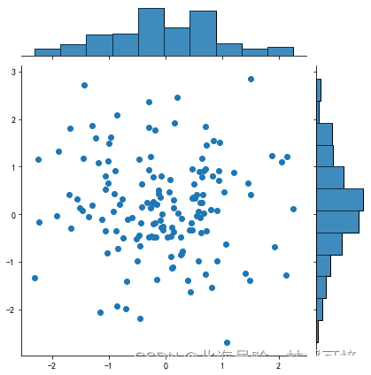
# 2、在上面的例子中出现了 spec[i, j] 的用法,事实上通过切片就可以实现子图的合并而达到跨图的共能
fig = plt.figure(figsize=(10, 10))
spec = fig.add_gridspec(nrows=5, ncols=5, width_ratios=[1,1,1,1,1], height_ratios=[1,1,1,1,1])
# fig.suptitle('样例3', size=20)
x = np.random.randn(2, 150)

# sub1
ax1 = fig.add_subplot(spec[0, :4])
ax1.hist(x[0],width=0.4)
ax1.patch.set_edgecolor('g')
plt.axis('off')

# sub2
ax2 = fig.add_subplot(spec[1: , :4])
ax2.scatter(x[0],x[1])
ax2.grid(True)
ax2.set_xlabel('my_data_x')
ax2.set_ylabel('my_data_y')

# sub3
ax3 = fig.add_subplot(spec[1:, -1])
ax3.hist(x[1],alpha=1,orientation='horizontal')
plt.axis('off')

fig.tight_layout()
# 3、jointplot方法
fig=sns.jointplot(x[0], x[1])
fig=fig.plot_joint(plt.scatter)
fig=fig.plot_marginals(sns.distplot,kde=False)
total = float(len(x[0]))

fig=sns.jointplot(x[0], x[1])

for p in fig.ax_marg_x.patches:
    height = p.get_height()
    fig.ax_marg_x.text(p.get_x()+p.get_width()/2.,height,
            '{:1.0f}'.format((height/total)*100), ha="center")

for p in fig.ax_marg_y.patches:
    width = p.get_width()
    fig.ax_marg_y.text(p.get_x()+p.get_width(),p.get_y()+p.get_height()/2.,
            '{:1.0f}'.format((width/total)*100), va="center")
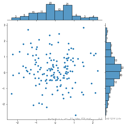
# 上面的多总体hist 还是独立作图, 并没有将二者结合,
# 使用jointplot就能作出联合分布图形, 即, x总体和y总体的笛卡尔积分布
# 不过jointplot要限于两个等量总体.
# jointplot还是非常实用的, 对于两个连续型变量的分布情况, 集中趋势能非常简单的给出.
# 比如下面这个例子
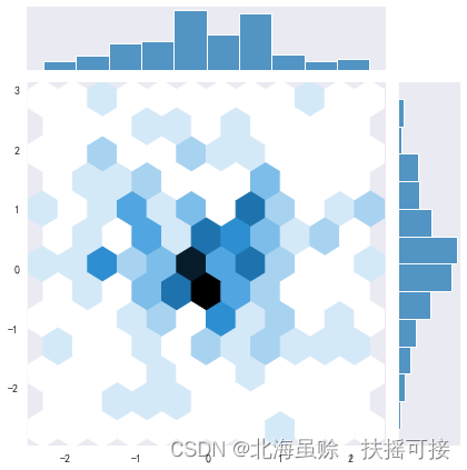
import seaborn as sns
with sns.axes_style("dark"):
sns.jointplot(x[0], x[1], kind="hex")
fig.savefig('test6.png',dpi=400,bbox_inches='tight',transparent=True)


 3069
3069


 被折叠的 条评论
为什么被折叠?
被折叠的 条评论
为什么被折叠?
 到【灌水乐园】发言


