


一、使用工具和开发前提
- vscode
- win10
- pc适配和移动端是两套代码且适配均使用了rem布局
- vue开发
二、步骤
-
开启新项目,配置好rem布局需要的条件。
-
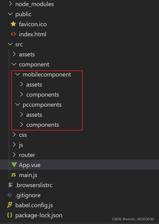
在项目中的
src->component目录中新建pccomponent 和 mobilecomponent目录,并将两套代码的component、assets(图片)文件分别放入相应的目录下,两个页面的字体可以公用,所以字体的配置可以直接在项目根目录下进行配置,然后在入口文件main.js文件中引入就可以了。
-
找到项目根目录下的
src->App.vue(项目最原始的根组件),向里面放入pc端和移动端要展示的页面组件并分别起一个类名,如:class=“pc”
<template>
  <div id="app">
    <div class="pc">
      <PcHeader></PcHeader>
      <PcMain></PcMain>
      <PcFooter></PcFooter>
    </div>
    <div class="mobile">
      <MobileHeader></MobileHeader>
      <MobileMain></MobileMain>
      <MobileFooter></MobileFooter>
    </div>
  </div>
</template>

<script>
import PcHeader from "./component/pccomponents/components/Header.vue";
import PcMain from "./component/pccomponents/components/Main.vue";
import PcFooter from "./component/pccomponents/components/Footer.vue";

import MobileHeader from "./component/mobilecomponent/components/Header.vue";
import MobileMain from "./component/mobilecomponent/components/Main.vue";
import MobileFooter from "./component/mobilecomponent/components/Footer.vue";

export default {
  name: "App",
  components: {
    PcHeader,
    PcMain,
    PcFooter,
    MobileHeader,
    MobileMain,
    MobileFooter,
  },
};
</script>

<style lang="less">
#app {
  height: 26.1042rem;
  font-family: Avenir, Helvetica, Arial, sans-serif;
  -webkit-font-smoothing: antialiased;
  -moz-osx-font-smoothing: grayscale;
  padding-top: 50px;
  color: #2c3e50;
  background-color: rgb(32, 33, 54);
}
</style>
- 使用媒体查询+display属性展示和隐藏页面内容:项目根目录
src下新建css目录,并在css目录内新建一个media.css文件,设置屏幕尺寸大小设置需要展示的页面,当浏览器宽度大于1023px时展示pc端页面,将mobile页面隐藏;小于1024px时,展示移动端页面:
@media only screen and (max-width:1024px) {
	.pc {
		display:none!important;
	}
	.mobile{
		display:block!important;
	}
}
@media only screen and (min-width:1023px) {
	.pc {
		display:block!important;
	}
	.mobile{
		display:none!important;
	}
}
这个时候,就可以实现移动端和pc端页面自适应屏幕大小自动切换的效果了。
三、总结
由于开发的时候移动端和pc端采用的rem基数不一样,所以会导致页面布局紊乱的情况,这个时候需要去media文件下根据页面的情况做调整。再就是这个方法比较粗暴,后期修改会比较繁琐,适用应急式解决适配问题;
解决办法:
- 从一开始就从pc页面和mobile页面里选rem基数做基本适配,另一个页面的rem基数则需要在总rem基数的基础上进行计算再开发,后期整合的时候也是按照一开始选的基数作为整合项目的rem基数来对两个页面进行整合。
- 如果使用的是postcss-pxtorem插件基数,就参考这篇文章去排除影响。
参考文章:
媒体查询讲解:https://blog.csdn.net/Azhongpu/article/details/112486337
页面整合讲解:https://blog.csdn.net/elephant230/article/details/96135602


 1448
1448


 被折叠的 条评论
为什么被折叠?
被折叠的 条评论
为什么被折叠?
 到【灌水乐园】发言


