


第一种水平均匀分布的效果
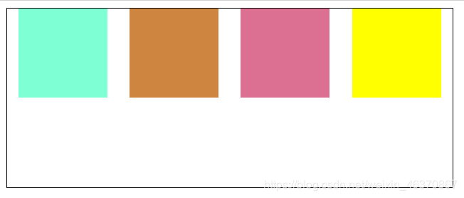
实现方式
给父级元素设置样式:
display: flex;
justify-content: space-around;
实现代码:
<!DOCTYPE html>
<html lang="en">
  <head>
    <meta charset="UTF-8" />
    <meta http-equiv="X-UA-Compatible" content="IE=edge" />
    <meta name="viewport" content="width=device-width, initial-scale=1.0" />
    <title>flex实现水平方向均匀分布</title>
    <style>
      #main {
        width: 500px;
        height: 200px;
        border: 1px solid #000;
         /* 使子级元素在水平方向均匀分布(最左边、最右边留空白) */
        display: flex;
        justify-content: space-around;
      }
      .one {
        width: 100px;
        height: 100px;
        background-color: aquamarine;
      }
      .two {
        width: 100px;
        height: 100px;
        background-color: peru;
      }
      .three {
        width: 100px;
        height: 100px;
        background-color: palevioletred;
      }
      .four {
        width: 100px;
        height: 100px;
        background-color: yellow;
      }
    </style>
  </head>
  <body>
    <div id="main">
      <div class="one"></div>
      <div class="two"></div>
      <div class="three"></div>
      <div class="four"></div>
    </div>
  </body>
</html>
第二种水平排列方式效果
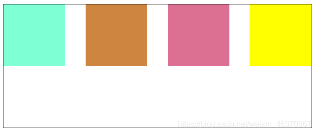
实现方式
display: flex;
justify-content: space-between;
实现代码
<!DOCTYPE html>
<html lang="en">
  <head>
    <meta charset="UTF-8" />
    <meta http-equiv="X-UA-Compatible" content="IE=edge" />
    <meta name="viewport" content="width=device-width, initial-scale=1.0" />
    <title>flex实现水平方向均匀分布</title>
    <style>
      #main {
        width: 500px;
        height: 200px;
        border: 1px solid #000;
        /* 使子级元素在水平方向均匀分布(最左边、最右边不留空白) */
        display: flex;
        justify-content: space-between;
      }
      .one {
        width: 100px;
        height: 100px;
        background-color: aquamarine;
      }
      .two {
        width: 100px;
        height: 100px;
        background-color: peru;
      }
      .three {
        width: 100px;
        height: 100px;
        background-color: palevioletred;
      }
      .four {
        width: 100px;
        height: 100px;
        background-color: yellow;
      }
    </style>
  </head>
  <body>
    <div id="main">
      <div class="one"></div>
      <div class="two"></div>
      <div class="three"></div>
      <div class="four"></div>
    </div>
  </body>
</html>


 扫一扫
扫一扫


 3315
3315

 被折叠的 条评论
为什么被折叠?
被折叠的 条评论
为什么被折叠?
 到【灌水乐园】发言


