


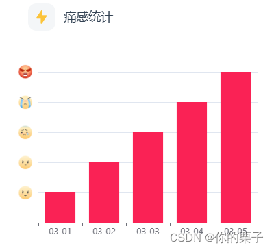
最终效果图如下:
Echarts官网:Apache ECharts
查看文档后,了解到在 Echarts 中,yAxis 的 axisLabel 配置中的 rich 属性用于更复杂的富文本标签样式设置。通过 rich 属性,你可以定义多个不同样式的标签样式,并在刻度标签的文本中应用这些样式,以实现更灵活的刻度标签显示效果。
废话不多说,我们直接看看实现代码吧!
<div ref="flow"></div>import { onMounted, reactive, ref } from 'vue';
import * as echarts from 'echarts';
import flowfirst from '@/assets/flow01.png'
import flowsecond from '@/assets/flow02.png'
import flowthird from '@/assets/flow03.png'
import flowfourth from '@/assets/flow04.png'
import flowfifth from '@/assets/flow05.png'
const flow = ref()
const dataParams=reactive(){
trafficStatistics: {
date: ['03-01', '03-02', '03-03', '03-04', '03-05',] as any,
degree: [1, 2, 3, 4, 5] as any
},
}
const curveInit = () => {
// 基于准备好的dom,初始化echarts实例
var flowChart = echarts.init(flow.value, 'null', { width: 400, height: 350 });
// 指定图表的配置项和数据
var flowoption = {
tooltip: {
trigger: 'axis',
axisPointer: {
type: 'shadow'
},
xAxis: {
data: dataParams.trafficStatistics.date
},
yAxis: {
min: 0,
max: 5,
type: 'value',
axisLabel: {
show: true,
formatter: function (value: any) {
return '{' + value + '| }'
},
rich: {
1: {
height: 22,
align: 'center',
backgroundColor: {
image: painfirst
}
},
2: {
height: 22,
align: 'center',
backgroundColor: {
image: painsecond
}
},
3: {
height: 22,
align: 'center',
backgroundColor: {
image: painthird
}
},
4: {
height: 22,
align: 'center',
backgroundColor: {
image: painfourth
}
},
5: {
height: 22,
align: 'center',
backgroundColor: {
image: painfifth
}
}
}
},
},
series: [
{
type: 'bar',
data: dataParams.trafficStatistics.degree,
itemStyle: {
color: '#FF1954'
}
}
]
};
// 使用刚指定的配置项和数据显示图表。
flowChart.setOption(flowoption);
}图片我这边采用的是import导入的方式
家人们,亲测有效,快试试吧!!


 1万+
1万+


 被折叠的 条评论
为什么被折叠?
被折叠的 条评论
为什么被折叠?
 到【灌水乐园】发言


