


微信小程序自定义弹框组件文件包括使用
组件实现的功能
1、可以自定义高度
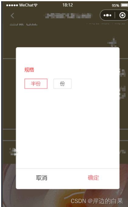
2、弹框方向(顶部弹出、底部弹出、左边弹出、右边弹出)
3、自定义modalName弹框标题、modalContent内容插槽
创建组件
miniprogram/components下添加modal文件夹以及对应的js、html、wxml、wxss文件

modal.js
```javascript
Component({
  /**
   * 组件的属性列表(共有数据)
   */
  properties: {
    //modal出现动画类型
    fadeStyle: {
      type: String,
      value: '',
      observer(newVal, oldVal, changedPath) {
        // 属性被改变时执行的函数(可选),通常 newVal 就是新设置的数据, oldVal 是旧数
        if (newVal == "slideUp") { //从下向上滑出
          this.setData({
            bottom: '-' + this.properties.height,
          })
        } else if (newVal == "slideDown") { //从上向下滑出
          this.setData({
            top: '-' + this.properties.height,
          })
        } else if (newVal == "slideRight") { //从左向右滑出
          this.setData({
            left: '-' + this.properties.width
          })
        } else if (newVal == "slideLeft") { //从右向左滑出
          this.setData({
            right: '-' + this.properties.width
          })
        } else if (newVal == "center") { //中间
          this.setData({
            right: '10%',
            left: '10%',
            top: '20%',
          })
        }
      }
    },
    width: {
      type: String,
      value: '100%',
    },
    height: {
      type: String,
      value: '',
    },
    top: {
      type: String,
      value: ''
    },
    bottom: {
      type: String,
      value: ''
    },
    left: {
      type: String,
      value: ''
    },
    right: {
      type: String,
      value: ''
    },
    opacity: {
      type: String,
      value: '0'
    },
  },
  /**
   * 组件的初始数据(私有数据)
   */
  data: {
    //控制模态框打开关闭参数
    showModalStatus: false
  },
  options: {
    addGlobalClass: true, //使其可以使用全局样式
    multipleSlots: true //使其可以使用多个slot,用name区分
  },
  /**
   * 组件的方法列表
   */
  methods: {
    //打开模态框
    showModal: function (event) {
      this.setData({
        showModalStatus: true
      })
      //需要等模态框出现再执行动画,否则无动画效果
      setTimeout(function () {
        if (this.properties.fadeStyle == "slideUp") {
          this.setData({
            bottom: 0,
            opacity: 1
          })
        } else if (this.properties.fadeStyle == "slideDown") {
          this.setData({
            top: 0,
            opacity: 1
          })
        } else if (this.properties.fadeStyle == "slideRight") {
          this.setData({
            left: 0,
            opacity: 1
          })
        } else if (this.properties.fadeStyle == "slideLeft") {
          this.setData({
            right: 0,
            opacity: 1
          })
        } else if (this.properties.fadeStyle == "center") {
          this.setData({
            right: '10%',
            left: '10%',
            top: '20%',
            opacity: 1
          })
        }
      }.bind(this), 100)
    },
    //关闭模态框
    closeModal: function () {
      //判断动画样式
      if (this.properties.fadeStyle == "slideUp") {
        this.setData({
          bottom: '-' + this.properties.height,
          opacity: 0
        })
      } else if (this.properties.fadeStyle == "slideDown") {
        this.setData({
          top: '-' + this.properties.height,
          opacity: 0
        })
      } else if (this.properties.fadeStyle == "slideRight") {
        this.setData({
          left: '-' + this.properties.width,
          opacity: 0
        })
      } else if (this.properties.fadeStyle == "slideLeft") {
        this.setData({
          right: '-' + this.properties.width,
          opacity: 0
        })
      } else if (this.properties.fadeStyle == "center") {
        this.setData({
          right: '10%',
          left: '10%',
          top: '20%',
          opacity: 0
        })
      }
      //等关闭动画完毕后再移除模态框和遮罩
      setTimeout(function () {
        this.setData({
          showModalStatus: false
        })
      }.bind(this), 400)
    }
  }
})
modal.json
{
  "component": true,
  "usingComponents": {}
}
modal.wxml
<!--components/modal.wxml-->
<!--遮罩层-->
<view class='mask' wx:if="{{showModalStatus}}" style="opacity:{{opacity}}"></view>
<!--弹出模态框-->
<view class='mymodal' wx:if="{{showModalStatus}}" style='width:{{width}};height:{{height}};top:{{top}};bottom:{{bottom}};left:{{left}};right:{{right}}'>
  <!-- 模态框title -->
  <view class='mymodal-title'>
    <slot name="modalName"></slot>
    <text class='fa fa-close fa-lg' style='color:#aaa;font-style:normal' bindtap='closeModal'></text>
  </view>
  <!-- 模态框内容 -->
  <view class='mymodal-content'>
    <slot name="modalContent"></slot>
  </view>
</view>
modal.wxss
/* components/modal.wxss */
/*遮罩层*/
.mask {
	position: fixed;
	width: 100%;
	height: 100%;
	background: rgba(0, 0, 0, 0.5);
	top: 0;
	left: 0;
	z-index: 10;
	transition: all 300ms ease-out;
}

/*弹出模态框*/
.mymodal {
	width: 100%;
	position: fixed;
	z-index: 20;
	background: white;
	height: 460px;
	border-radius: 10rpx;
	transition: all 300ms ease-out;
}

.mymodal .mymodal-title {
	font-size: 30rpx;
	line-height: 50px;
	color: #666;
	padding: 0 20px;
	display: flex;
	justify-content: space-between;
	align-items: center
}

.mymodal .mymodal-content {
	padding: 15px;
	height: 320px;
	overflow: scroll;
}
在页面里使用
wxml
<my-modal id="payModal" fadeStyle="slideUp" height="380px">
	<view slot="modalName" class="titleModal">标题</view>
	<view slot="modalContent">
		内容
	</view>
</my-modal>
json
{
  "backgroundTextStyle": "light",
  "navigationBarBackgroundColor": "#fff",
  "navigationBarTextStyle": "black",
  "usingComponents": {
    "my-modal": "/components/modal/modal"
  }
}
js
data: {

},
modal: '',
onLoad() {
  this.modal = this.selectComponent("#payModal"); //通过给组件所起的id调用组件
},
showModal() {
    this.modal.showModal() //调用组件中打开模态框方法
},
closeModal() {
    this.modal.closeModal() //调用组件中关闭模态框方法
},
json
{
  "backgroundTextStyle": "light",
  "navigationBarBackgroundColor": "#fff",
  "navigationBarTextStyle": "black",
  "usingComponents": {
    "my-modal": "/components/modal/modal"
  }
}


 5744
5744


 被折叠的 条评论
为什么被折叠?
被折叠的 条评论
为什么被折叠?
 到【灌水乐园】发言


