


R语言画图/绘图/作图2
动画气泡图
可以使用该gganimate包实现动画气泡图。它与气泡图相同,但是,您必须显示值如何在第五维(通常是时间)上变化。
要做的关键是将 设置为aes(frame)要在其上设置动画的所需列。其余与地块建设相关的程序是相同的。情节构建完成后,您可以gganimate()通过设置selected 来为其设置动画interval。
# Source: https://github.com/dgrtwo/gganimate
# install.packages("cowplot")  # a gganimate dependency
# devtools::install_github("dgrtwo/gganimate")
library(ggplot2)
library(gganimate)
library(gapminder)
theme_set(theme_bw())  # pre-set the bw theme.

g <- ggplot(gapminder, aes(gdpPercap, lifeExp, size = pop, frame = year)) +
  geom_point() +
  geom_smooth(aes(group = year),
              method = "lm",
              show.legend = FALSE) +
  facet_wrap(~continent, scales = "free") +
  scale_x_log10()  # convert to log scale

gganimate(g, interval=0.2)

边际直方图/箱线图
如果要在同一图表中显示关系以及分布,请使用边际直方图。它在散点图的边缘有一个 X 和 Y 变量的直方图。
这可以使用’ ’ 包中的ggMarginal()函数来实现。ggExtra除了 a 之外,您还可以通过设置相应的选项histogram来选择绘制边缘boxplot或绘图。densitytype
# load package and data
library(ggplot2)
library(ggExtra)
data(mpg, package="ggplot2")
# mpg <- read.csv("http://goo.gl/uEeRGu")

# Scatterplot
theme_set(theme_bw())  # pre-set the bw theme.
mpg_select <- mpg[mpg$hwy >= 35 & mpg$cty > 27, ]
g <- ggplot(mpg, aes(cty, hwy)) +
  geom_count() +
  geom_smooth(method="lm", se=F)

ggMarginal(g, type = "histogram", fill="transparent")
ggMarginal(g, type = "boxplot", fill="transparent")
# ggMarginal(g, type = "density", fill="transparent")

相关图
相关图让您检查存在于同一数据框中的多个连续变量的关联。这可以使用ggcorrplot包方便地实现。
# devtools::install_github("kassambara/ggcorrplot")
library(ggplot2)
library(ggcorrplot)

# Correlation matrix
data(mtcars)
corr <- round(cor(mtcars), 1)

# Plot
ggcorrplot(corr, hc.order = TRUE,
           type = "lower",
           lab = TRUE,
           lab_size = 3,
           method="circle",
           colors = c("tomato2", "white", "springgreen3"),
           title="Correlogram of mtcars",
           ggtheme=theme_bw)

2. 偏差
相对于固定参考比较少量项目(或类别)之间的值变化。
发散条
Diverging Bars 是一个可以处理负值和正值的条形图。这可以通过使用geom_bar(). 但是 的用法geom_bar()可能会很混乱。那是因为,它可以用来制作条形图和直方图。让我解释。
默认情况下,geom_bar()设置stat为count. 这意味着,当您只提供一个连续的 X 变量(并且没有 Y 变量)时,它会尝试从数据中制作直方图。
为了使条形图创建条形而不是直方图,您需要做两件事。
放stat=identity
提供两者x和y内部aes()where, xis characteror factorand yis numeric。
为了确保您获得发散条而不是条,请确保您的分类变量有 2 个类别,它们会在连续变量的某个阈值处更改值。在下面的示例中,mpg来自 mtcars 的数据集通过计算 z 分数进行了归一化。mpg高于零的车辆标记为绿色,低于零的车辆标记为红色。
library(ggplot2)
theme_set(theme_bw())

# Data Prep
data("mtcars")  # load data
mtcars$`car name` <- rownames(mtcars)  # create new column for car names
mtcars$mpg_z <- round((mtcars$mpg - mean(mtcars$mpg))/sd(mtcars$mpg), 2)  # compute normalized mpg
mtcars$mpg_type <- ifelse(mtcars$mpg_z < 0, "below", "above")  # above / below avg flag
mtcars <- mtcars[order(mtcars$mpg_z), ]  # sort
mtcars$`car name` <- factor(mtcars$`car name`, levels = mtcars$`car name`)  # convert to factor to retain sorted order in plot.

# Diverging Barcharts
ggplot(mtcars, aes(x=`car name`, y=mpg_z, label=mpg_z)) +
  geom_bar(stat='identity', aes(fill=mpg_type), width=.5)  +
  scale_fill_manual(name="Mileage",
                    labels = c("Above Average", "Below Average"),
                    values = c("above"="#00ba38", "below"="#f8766d")) +
  labs(subtitle="Normalised mileage from 'mtcars'",
       title= "Diverging Bars") +
  coord_flip()

发散的棒棒糖图表
棒棒糖图表传达与条形图和发散条相同的信息。除了它看起来更现代。而不是 geom_bar,我使用geom_pointandgeom_segment来获得棒棒糖。让我们使用我在前面的发散条示例中准备的相同数据绘制一个棒棒糖。
library(ggplot2)
theme_set(theme_bw())

ggplot(mtcars, aes(x=`car name`, y=mpg_z, label=mpg_z)) +
  geom_point(stat='identity', fill="black", size=6)  +
  geom_segment(aes(y = 0,
                   x = `car name`,
                   yend = mpg_z,
                   xend = `car name`),
               color = "black") +
  geom_text(color="white", size=2) +
  labs(title="Diverging Lollipop Chart",
       subtitle="Normalized mileage from 'mtcars': Lollipop") +
  ylim(-2.5, 2.5) +
  coord_flip()

发散点图
点图传达了类似的信息。原理与我们在发散条中看到的相同,只是只使用了点。下面的示例使用在发散条示例中准备的相同数据。
library(ggplot2)
theme_set(theme_bw())

# Plot
ggplot(mtcars, aes(x=`car name`, y=mpg_z, label=mpg_z)) +
  geom_point(stat='identity', aes(col=mpg_type), size=6)  +
  scale_color_manual(name="Mileage",
                     labels = c("Above Average", "Below Average"),
                     values = c("above"="#00ba38", "below"="#f8766d")) +
  geom_text(color="white", size=2) +
  labs(title="Diverging Dot Plot",
       subtitle="Normalized mileage from 'mtcars': Dotplot") +
  ylim(-2.5, 2.5) +
  coord_flip()

面积图
面积图通常用于可视化特定指标(例如股票回报率)与某个基线相比的表现。其他类型的 %returns 或 %change 数据也是常用的。geom_area()实现了这一点。
library(ggplot2)
library(quantmod)
data("economics", package = "ggplot2")

# Compute % Returns
economics$returns_perc <- c(0, diff(economics$psavert)/economics$psavert[-length(economics$psavert)])

# Create break points and labels for axis ticks
brks <- economics$date[seq(1, length(economics$date), 12)]
lbls <- lubridate::year(economics$date[seq(1, length(economics$date), 12)])

# Plot
ggplot(economics[1:100, ], aes(date, returns_perc)) +
  geom_area() +
  scale_x_date(breaks=brks, labels=lbls) +
  theme(axis.text.x = element_text(angle=90)) +
  labs(title="Area Chart",
       subtitle = "Perc Returns for Personal Savings",
       y="% Returns for Personal savings",
       caption="Source: economics")

3.排名
用于比较多个项目相对于彼此的位置或性能。实际值比排名更重要。
有序条形图
有序条形图是按 Y 轴变量排序的条形图。仅按感兴趣的变量对数据框进行排序不足以对条形图进行排序。为了使条形图保留行的顺序,X 轴变量(即类别)必须转换为因子。
让我们从数据集中绘制每个制造商的平均城市里程mpg。首先,在绘制绘图之前汇总数据并对其进行排序。最后,X 变量被转换为一个因子。
让我们看看这是怎么做到的。
# Prepare data: group mean city mileage by manufacturer.
cty_mpg <- aggregate(mpg$cty, by=list(mpg$manufacturer), FUN=mean)  # aggregate
colnames(cty_mpg) <- c("make", "mileage")  # change column names
cty_mpg <- cty_mpg[order(cty_mpg$mileage), ]  # sort
cty_mpg$make <- factor(cty_mpg$make, levels = cty_mpg$make)  # to retain the order in plot.
head(cty_mpg, 4)
#>          make  mileage
#> 9     lincoln 11.33333
#> 8  land rover 11.50000
#> 3       dodge 13.13514
#> 10    mercury 13.25000
X 变量现在是 a factor,让我们绘制。

library(ggplot2)
theme_set(theme_bw())

# Draw plot
ggplot(cty_mpg, aes(x=make, y=mileage)) +
  geom_bar(stat="identity", width=.5, fill="tomato3") +
  labs(title="Ordered Bar Chart",
       subtitle="Make Vs Avg. Mileage",
       caption="source: mpg") +
  theme(axis.text.x = element_text(angle=65, vjust=0.6))

棒棒糖图
棒棒糖图表传达的信息与条形图相同。通过将粗条减少为细线,它减少了混乱并更加强调了价值。它看起来既漂亮又现代。
library(ggplot2)
theme_set(theme_bw())

# Plot
ggplot(cty_mpg, aes(x=make, y=mileage)) +
  geom_point(size=3) +
  geom_segment(aes(x=make,
                   xend=make,
                   y=0,
                   yend=mileage)) +
  labs(title="Lollipop Chart",
       subtitle="Make Vs Avg. Mileage",
       caption="source: mpg") +
  theme(axis.text.x = element_text(angle=65, vjust=0.6))

点图
点图与棒棒糖非常相似,但没有线并且被翻转到水平位置。它更多地强调项目相对于实际值的等级排序以及实体之间的距离。
library(ggplot2)
library(scales)
theme_set(theme_classic())

# Plot
ggplot(cty_mpg, aes(x=make, y=mileage)) +
  geom_point(col="tomato2", size=3) +   # Draw points
  geom_segment(aes(x=make,
                   xend=make,
                   y=min(mileage),
                   yend=max(mileage)),
               linetype="dashed",
               size=0.1) +   # Draw dashed lines
  labs(title="Dot Plot",
       subtitle="Make Vs Avg. Mileage",
       caption="source: mpg") +
  coord_flip()

斜率图
斜率图是比较 2 个时间点之间的位置放置的绝佳方式。目前,没有内置函数来构造它。以下代码可作为有关如何处理此问题的指针。
library(ggplot2)
library(scales)
theme_set(theme_classic())

# prep data
df <- read.csv("https://raw.githubusercontent.com/selva86/datasets/master/gdppercap.csv")
colnames(df) <- c("continent", "1952", "1957")
left_label <- paste(df$continent, round(df$`1952`),sep=", ")
right_label <- paste(df$continent, round(df$`1957`),sep=", ")
df$class <- ifelse((df$`1957` - df$`1952`) < 0, "red", "green")

# Plot
p <- ggplot(df) + geom_segment(aes(x=1, xend=2, y=`1952`, yend=`1957`, col=class), size=.75, show.legend=F) +
                  geom_vline(xintercept=1, linetype="dashed", size=.1) +
                  geom_vline(xintercept=2, linetype="dashed", size=.1) +
                  scale_color_manual(labels = c("Up", "Down"),
                                     values = c("green"="#00ba38", "red"="#f8766d")) +  # color of lines
                  labs(x="", y="Mean GdpPerCap") +  # Axis labels
                  xlim(.5, 2.5) + ylim(0,(1.1*(max(df$`1952`, df$`1957`))))  # X and Y axis limits

# Add texts
p <- p + geom_text(label=left_label, y=df$`1952`, x=rep(1, NROW(df)), hjust=1.1, size=3.5)
p <- p + geom_text(label=right_label, y=df$`1957`, x=rep(2, NROW(df)), hjust=-0.1, size=3.5)
p <- p + geom_text(label="Time 1", x=1, y=1.1*(max(df$`1952`, df$`1957`)), hjust=1.2, size=5)  # title
p <- p + geom_text(label="Time 2", x=2, y=1.1*(max(df$`1952`, df$`1957`)), hjust=-0.1, size=5)  # title

# Minify theme
p + theme(panel.background = element_blank(),
           panel.grid = element_blank(),
           axis.ticks = element_blank(),
           axis.text.x = element_blank(),
           panel.border = element_blank(),
           plot.margin = unit(c(1,2,1,2), "cm"))

哑铃情节
如果您希望,哑铃图是一个很好的工具: 1. 可视化两个时间点之间的相对位置(如增长和下降)。2.比较两个类别之间的距离。
为了获得正确的哑铃顺序,Y 变量应该是一个因子,并且因子变量的水平应该与它在图中出现的顺序相同。
# devtools::install_github("hrbrmstr/ggalt")
library(ggplot2)
library(ggalt)
theme_set(theme_classic())

health <- read.csv("https://raw.githubusercontent.com/selva86/datasets/master/health.csv")
health$Area <- factor(health$Area, levels=as.character(health$Area))  # for right ordering of the dumbells

# health$Area <- factor(health$Area)
gg <- ggplot(health, aes(x=pct_2013, xend=pct_2014, y=Area, group=Area)) +
        geom_dumbbell(color="#a3c4dc",
                      size=0.75,
                      point.colour.l="#0e668b") +
        scale_x_continuous(label=percent) +
        labs(x=NULL,
             y=NULL,
             title="Dumbbell Chart",
             subtitle="Pct Change: 2013 vs 2014",
             caption="Source: https://github.com/hrbrmstr/ggalt") +
        theme(plot.title = element_text(hjust=0.5, face="bold"),
              plot.background=element_rect(fill="#f7f7f7"),
              panel.background=element_rect(fill="#f7f7f7"),
              panel.grid.minor=element_blank(),
              panel.grid.major.y=element_blank(),
              panel.grid.major.x=element_line(),
              axis.ticks=element_blank(),
              legend.position="top",
              panel.border=element_blank())
plot(gg)

4.分布
当您有大量的数据点并且想要研究数据点的分布位置和方式时。
直方图
默认情况下,如果只提供一个变量,则geom_bar()尝试计算计数。为了使其表现得像条形图,stat=identity必须设置选项并x提供y值。
连续变量的直方图
可以使用geom_bar()或来完成连续变量的直方图geom_histogram()。使用 时geom_histogram(),您可以使用该bins选项控制条数。否则,您可以使用 设置每个 bin 覆盖的范围binwidth。的值与binwidth构建直方图的连续变量具有相同的比例。由于geom_histogram提供了控制 和 的数量的bins便利binwidth,因此它是在连续变量上创建直方图的首选选项。
library(ggplot2)
theme_set(theme_classic())

# Histogram on a Continuous (Numeric) Variable
g <- ggplot(mpg, aes(displ)) + scale_fill_brewer(palette = "Spectral")

g + geom_histogram(aes(fill=class),
                   binwidth = .1,
                   col="black",
                   size=.1) +  # change binwidth
  labs(title="Histogram with Auto Binning",
       subtitle="Engine Displacement across Vehicle Classes")

g + geom_histogram(aes(fill=class),
                   bins=5,
                   col="black",
                   size=.1) +   # change number of bins
  labs(title="Histogram with Fixed Bins",
       subtitle="Engine Displacement across Vehicle Classes")


分类变量的直方图
分类变量的直方图将生成显示每个类别条形的频率图。通过调整width,您可以调整条的粗细。
library(ggplot2)
theme_set(theme_classic())

# Histogram on a Categorical variable
g <- ggplot(mpg, aes(manufacturer))
g + geom_bar(aes(fill=class), width = 0.5) +
  theme(axis.text.x = element_text(angle=65, vjust=0.6)) +
  labs(title="Histogram on Categorical Variable",
       subtitle="Manufacturer across Vehicle Classes")

密度图
library(ggplot2)
theme_set(theme_classic())

# Plot
g <- ggplot(mpg, aes(cty))
g + geom_density(aes(fill=factor(cyl)), alpha=0.8) +
    labs(title="Density plot",
         subtitle="City Mileage Grouped by Number of cylinders",
         caption="Source: mpg",
         x="City Mileage",
         fill="# Cylinders")

箱形图
箱线图是研究分布的绝佳工具。它还可以显示多个组内的分布,以及中位数、范围和异常值(如果有)。
方框内的黑线代表中位数。箱顶为 75%ile,箱底为 25%ile。线的端点(又名胡须)的距离为 1.5*IQR,其中 IQR 或四分位间距是第 25 和第 75 个百分位数之间的距离。晶须外的点被标记为点,通常被认为是极值点。
设置varwidth=T将框的宽度调整为与其包含的观察数成正比。
library(ggplot2)
theme_set(theme_classic())

# Plot
g <- ggplot(mpg, aes(class, cty))
g + geom_boxplot(varwidth=T, fill="plum") +
    labs(title="Box plot",
         subtitle="City Mileage grouped by Class of vehicle",
         caption="Source: mpg",
         x="Class of Vehicle",
         y="City Mileage")

library(ggthemes)
g <- ggplot(mpg, aes(class, cty))
g + geom_boxplot(aes(fill=factor(cyl))) +
  theme(axis.text.x = element_text(angle=65, vjust=0.6)) +
  labs(title="Box plot",
       subtitle="City Mileage grouped by Class of vehicle",
       caption="Source: mpg",
       x="Class of Vehicle",
       y="City Mileage")

点+箱线图
在箱线图提供的信息之上,点图可以以各组汇总统计的形式提供更清晰的信息。这些点交错排列,每个点代表一个观察结果。因此,在下图中,给定制造商的点数将与源数据中该制造商的行数相匹配。
library(ggplot2)
theme_set(theme_bw())

# plot
g <- ggplot(mpg, aes(manufacturer, cty))
g + geom_boxplot() +
  geom_dotplot(binaxis='y',
               stackdir='center',
               dotsize = .5,
               fill="red") +
  theme(axis.text.x = element_text(angle=65, vjust=0.6)) +
  labs(title="Box plot + Dot plot",
       subtitle="City Mileage vs Class: Each dot represents 1 row in source data",
       caption="Source: mpg",
       x="Class of Vehicle",
       y="City Mileage")

塔夫特箱线图
包装提供的 Tufte 箱形图ggthemes灵感来自 Edward Tufte 的作品。Tufte 的箱线图只是一个箱线图,它的设计极简且具有视觉吸引力
library(ggthemes)
library(ggplot2)
theme_set(theme_tufte())  # from ggthemes

# plot
g <- ggplot(mpg, aes(manufacturer, cty))
g + geom_tufteboxplot() +
      theme(axis.text.x = element_text(angle=65, vjust=0.6)) +
      labs(title="Tufte Styled Boxplot",
           subtitle="City Mileage grouped by Class of vehicle",
           caption="Source: mpg",
           x="Class of Vehicle",
           y="City Mileage")

小提琴剧情
小提琴图类似于箱线图,但显示了组内的密度。箱线图中提供的信息不多。可以使用geom_violin()
library(ggplot2)
theme_set(theme_bw())

# plot
g <- ggplot(mpg, aes(class, cty))
g + geom_violin() +
  labs(title="Violin plot",
       subtitle="City Mileage vs Class of vehicle",
       caption="Source: mpg",
       x="Class of Vehicle",
       y="City Mileage")

人口金字塔
人口金字塔提供了一种独特的方式来可视化有多少人口或多少百分比的人口属于某个类别。下面的金字塔是一个很好的例子,说明在电子邮件营销活动漏斗的每个阶段保留了多少用户。
library(ggplot2)
library(ggthemes)
options(scipen = 999)  # turns of scientific notations like 1e+40

# Read data
email_campaign_funnel <- read.csv("https://raw.githubusercontent.com/selva86/datasets/master/email_campaign_funnel.csv")

# X Axis Breaks and Labels
brks <- seq(-15000000, 15000000, 5000000)
lbls = paste0(as.character(c(seq(15, 0, -5), seq(5, 15, 5))), "m")

# Plot
ggplot(email_campaign_funnel, aes(x = Stage, y = Users, fill = Gender)) +   # Fill column
                              geom_bar(stat = "identity", width = .6) +   # draw the bars
                              scale_y_continuous(breaks = brks,   # Breaks
                                                 labels = lbls) + # Labels
                              coord_flip() +  # Flip axes
                              labs(title="Email Campaign Funnel") +
                              theme_tufte() +  # Tufte theme from ggfortify
                              theme(plot.title = element_text(hjust = .5),
                                    axis.ticks = element_blank()) +   # Centre plot title
                              scale_fill_brewer(palette = "Dark2")  # Color palette

5. 作文 华夫饼图
华夫饼图是显示总人口分类构成的好方法。虽然没有直接的函数,但可以通过使用geom_tile()函数巧妙地操纵 ggplot2 来表达它。下面的模板应该可以帮助您创建自己的华夫饼。
var <- mpg$class  # the categorical data

## Prep data (nothing to change here)
nrows <- 10
df <- expand.grid(y = 1:nrows, x = 1:nrows)
categ_table <- round(table(var) * ((nrows*nrows)/(length(var))))
categ_table
#>   2seater    compact    midsize    minivan     pickup subcompact        suv
#>         2         20         18          5         14         15         26

df$category <- factor(rep(names(categ_table), categ_table))
# NOTE: if sum(categ_table) is not 100 (i.e. nrows^2), it will need adjustment to make the sum to 100.

## Plot
ggplot(df, aes(x = x, y = y, fill = category)) +
        geom_tile(color = "black", size = 0.5) +
        scale_x_continuous(expand = c(0, 0)) +
        scale_y_continuous(expand = c(0, 0), trans = 'reverse') +
        scale_fill_brewer(palette = "Set3") +
        labs(title="Waffle Chart", subtitle="'Class' of vehicles",
             caption="Source: mpg") +
        theme(panel.border = element_rect(size = 2),
              plot.title = element_text(size = rel(1.2)),
              axis.text = element_blank(),
              axis.title = element_blank(),
              axis.ticks = element_blank(),
              legend.title = element_blank(),
              legend.position = "right")

饼形图
饼图是一种显示作品的经典方式,就所传达的信息而言,它与华夫饼图相当。但是在 ggplot2 中使用coord_polar().
library(ggplot2)
theme_set(theme_classic())

# Source: Frequency table
df <- as.data.frame(table(mpg$class))
colnames(df) <- c("class", "freq")
pie <- ggplot(df, aes(x = "", y=freq, fill = factor(class))) +
  geom_bar(width = 1, stat = "identity") +
  theme(axis.line = element_blank(),
        plot.title = element_text(hjust=0.5)) +
  labs(fill="class",
       x=NULL,
       y=NULL,
       title="Pie Chart of class",
       caption="Source: mpg")

pie + coord_polar(theta = "y", start=0)

# Source: Categorical variable.
# mpg$class
pie <- ggplot(mpg, aes(x = "", fill = factor(class))) +
  geom_bar(width = 1) +
  theme(axis.line = element_blank(),
        plot.title = element_text(hjust=0.5)) +
  labs(fill="class",
       x=NULL,
       y=NULL,
       title="Pie Chart of class",
       caption="Source: mpg")

pie + coord_polar(theta = "y", start=0)

树状图
Treemap 是一种使用嵌套矩形显示分层数据的好方法。该treemapify软件包提供了必要的功能来将数据转换为所需的格式 ( treemapify) 以及绘制实际绘图 ( ggplotify)。
为了创建树形图,必须使用 将数据转换为所需的格式treemapify()。重要的要求是,您的数据必须有一个变量,每个变量描述area图块,fill颜色变量,具有图块的变量,label最后是父变量group。
数据格式化完成后,只需调用ggplotify()treemapified 数据。
library(ggplot2)
library(treemapify)
proglangs <- read.csv("https://raw.githubusercontent.com/selva86/datasets/master/proglanguages.csv")

# plot
treeMapCoordinates <- treemapify(proglangs,
                                 area = "value",
                                 fill = "parent",
                                 label = "id",
                                 group = "parent")

treeMapPlot <- ggplotify(treeMapCoordinates) +
                  scale_x_continuous(expand = c(0, 0)) +
                  scale_y_continuous(expand = c(0, 0)) +
                  scale_fill_brewer(palette = "Dark2")

print(treeMapPlot)

条形图
默认情况下,geom_bar()设置stat为count. 这意味着,当您只提供一个连续的 X 变量(并且没有 Y 变量)时,它会尝试从数据中制作直方图。
为了使条形图创建条形而不是直方图,您需要做两件事。
放stat=identity
提供两者x和y内部aes()where, xis characteror factorand yis numeric。
可以从分类列变量或单独的频率表中绘制条形图。通过调整width,您可以调整条的粗细。如果你的数据源是频率表,也就是说,如果你不想让 ggplot 计算计数,你需要stat=identity在geom_bar().
# prep frequency table
freqtable <- table(mpg$manufacturer)
df <- as.data.frame.table(freqtable)
head(df)
#>          Var1 Freq
#> 1        audi   18
#> 2   chevrolet   19
#> 3       dodge   37
#> 4        ford   25
#> 5       honda    9
#> 6     hyundai   14
# plot
library(ggplot2)
theme_set(theme_classic())

# Plot
g <- ggplot(df, aes(Var1, Freq))
g + geom_bar(stat="identity", width = 0.5, fill="tomato2") +
      labs(title="Bar Chart",
           subtitle="Manufacturer of vehicles",
           caption="Source: Frequency of Manufacturers from 'mpg' dataset") +
      theme(axis.text.x = element_text(angle=65, vjust=0.6))

它也可以直接从列变量中计算出来。在这种情况下,仅提供 X 并且stat=identity未设置。
# From on a categorical column variable
g <- ggplot(mpg, aes(manufacturer))
g + geom_bar(aes(fill=class), width = 0.5) +
  theme(axis.text.x = element_text(angle=65, vjust=0.6)) +
  labs(title="Categorywise Bar Chart",
       subtitle="Manufacturer of vehicles",
       caption="Source: Manufacturers from 'mpg' dataset")

6.改变
时间序列对象的时间序列图 ( ts)
该ggfortify包允许 autoplot 直接从时间序列对象 ( ts) 中自动绘制。
## From Timeseries object (ts)
library(ggplot2)
library(ggfortify)
theme_set(theme_classic())

# Plot
autoplot(AirPassengers) +
  labs(title="AirPassengers") +
  theme(plot.title = element_text(hjust=0.5))

来自数据框的时间序列图
使用geom_line(),也可以从 a 中绘制时间序列(或折线图)data.frame。默认情况下会生成 X 轴中断。在下面的示例中,中断每 10 年形成一次。
默认 X 轴标签
library(ggplot2)
theme_set(theme_classic())

# Allow Default X Axis Labels
ggplot(economics, aes(x=date)) +
  geom_line(aes(y=returns_perc)) +
  labs(title="Time Series Chart",
       subtitle="Returns Percentage from 'Economics' Dataset",
       caption="Source: Economics",
       y="Returns %")

每月时间序列的时间序列图
如果要在 X 轴上设置自己的时间间隔(中断),则需要使用 设置中断和标签scale_x_date()。
library(ggplot2)
library(lubridate)
theme_set(theme_bw())

economics_m <- economics[1:24, ]

# labels and breaks for X axis text
lbls <- paste0(month.abb[month(economics_m$date)], " ", lubridate::year(economics_m$date))
brks <- economics_m$date

# plot
ggplot(economics_m, aes(x=date)) +
  geom_line(aes(y=returns_perc)) +
  labs(title="Monthly Time Series",
       subtitle="Returns Percentage from Economics Dataset",
       caption="Source: Economics",
       y="Returns %") +  # title and caption
  scale_x_date(labels = lbls,
               breaks = brks) +  # change to monthly ticks and labels
  theme(axis.text.x = element_text(angle = 90, vjust=0.5),  # rotate x axis text
        panel.grid.minor = element_blank())  # turn off minor grid

年度时间序列的时间序列图
library(ggplot2)
library(lubridate)
theme_set(theme_bw())

economics_y <- economics[1:90, ]

# labels and breaks for X axis text
brks <- economics_y$date[seq(1, length(economics_y$date), 12)]
lbls <- lubridate::year(brks)

# plot
ggplot(economics_y, aes(x=date)) +
  geom_line(aes(y=returns_perc)) +
  labs(title="Yearly Time Series",
       subtitle="Returns Percentage from Economics Dataset",
       caption="Source: Economics",
       y="Returns %") +  # title and caption
  scale_x_date(labels = lbls,
               breaks = brks) +  # change to monthly ticks and labels
  theme(axis.text.x = element_text(angle = 90, vjust=0.5),  # rotate x axis text
        panel.grid.minor = element_blank())  # turn off minor grid

长数据格式的时间序列图:同一数据框列中的多个时间序列
在此示例中,我从长数据格式构建 ggplot。这意味着,所有列的列名和各自的值仅堆叠在 2 个变量中(variable和value分别)。如果您将此数据转换为宽格式,它看起来就像economics数据集。
在下面的示例中,geom_line为value列绘制 并且aes(col)设置为variable。这样,只需一次调用 ,就geom_line可以绘制多条彩色线,每条线对应列中的每个唯一值variable。scale_x_date()更改 X 轴中断和标签,并更改线条的scale_color_manual颜色。
data(economics_long, package = "ggplot2")
head(economics_long)
#>         date variable value      value01
#>       <date>   <fctr> <dbl>        <dbl>
#> 1 1967-07-01      pce 507.4 0.0000000000


#> 2 1967-08-01      pce 510.5 0.0002660008


#> 3 1967-09-01      pce 516.3 0.0007636797
#> 4 1967-10-01      pce 512.9 0.0004719369
#> 5 1967-11-01      pce 518.1 0.0009181318


        y


#> 6 1967-12-01      pce 525.8 0.0015788435
library(ggplot2)
library(lubridate)
theme_set(theme_bw())

df <- economics_long[economics_long$variable %in% c("psavert", "uempmed"), ]
df <- df[lubridate::year(df$date) %in% c(1967:1981), ]

# labels and breaks for X axis text
brks <- df$date[seq(1, length(df$date), 12)]
lbls <- lubridate::year(brks)

# plot
ggplot(df, aes(x=date)) +
  geom_line(aes(y=value, col=variable)) +
  labs(title="Time Series of Returns Percentage",
       subtitle="Drawn from Long Data format",
       caption="Source: Economics",
       y="Returns %",
       color=NULL) +  # title and caption
  scale_x_date(labels = lbls, breaks = brks) +  # change to monthly ticks and labels
  scale_color_manual(labels = c("psavert", "uempmed"),
                     values = c("psavert"="#00ba38", "uempmed"="#f8766d")) +  # line color
  theme(axis.text.x = element_text(angle = 90, vjust=0.5, size = 8),  # rotate x axis text
        panel.grid.minor = element_blank())  # turn off minor grid

宽数据格式的时间序列图:数据帧多列中的数据
如本教程第 2 部分所述,每当绘图的几何图形(如点、线、条等)更改fill、size、或基于另一列时,都会自动绘制图例col。shapestroke
但是,如果您要从宽数据格式创建时间序列(甚至其他类型的图),则必须通过为每条线调用geom_line()一次来手动绘制每条线。因此,默认情况下不会绘制图例。
不过,有传奇还是不错的。这可以使用scale_aesthetic_manual()函数的格式来完成(例如,scale_color_manual()如果只有线条的颜色发生变化)。使用此函数,您可以使用参数给出图例标题,使用name参数告诉图例应该采用什么颜色,values并设置图例标签。
尽管下图看起来与上图一模一样,但构造它的方法却有所不同。
您可能想知道为什么我在前面的示例中也使用此函数来处理长数据格式。请注意,在前面的示例中,它仅用于更改线条的颜色。如果没有scale_color_manual(),您仍然会有一个图例,但线条将具有不同的(默认)颜色。但是在当前示例中,如果没有scale_color_manual(),您甚至不会有图例。试试看!
library(ggplot2)
library(lubridate)
theme_set(theme_bw())
df <- economics[, c("date", "psavert", "uempmed")]
df <- df[lubridate::year(df$date) %in% c(1967:1981), ]
# labels and breaks for X axis text
brks <- df$date[seq(1, length(df$date), 12)]
lbls <- lubridate::year(brks)
# plot
ggplot(df, aes(x=date)) +
geom_line(aes(y=psavert, col="psavert")) +
geom_line(aes(y=uempmed, col="uempmed")) +
labs(title="Time Series of Returns Percentage",
subtitle="Drawn From Wide Data format",
caption="Source: Economics", y="Returns %") + # title and caption
scale_x_date(labels = lbls, breaks = brks) + # change to monthly ticks and labels
scale_color_manual(name="",
values = c(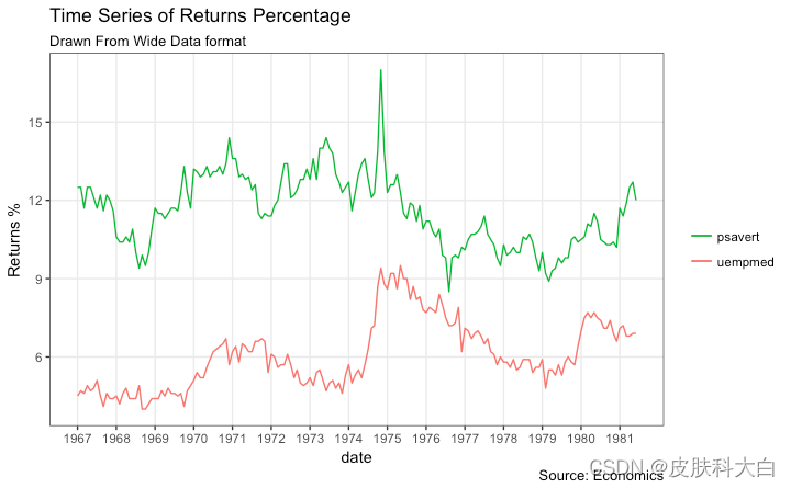
"psavert"="#00ba38", "uempmed"="#f8766d")) + # line color
theme(panel.grid.minor = element_blank()) # turn off minor grid
堆积面积图
堆积面积图就像折线图,只是图下方的区域都是彩色的。这通常在以下情况下使用:
您想描述数量或数量(而不是价格之类的东西)如何随时间变化
你有很多数据点。对于很少的数据点,请考虑绘制条形图。
您想显示各个组件的贡献。
这可以使用geom_areawhich works 非常像geom_line. 但是有一点需要注意。默认情况下,每个geom_area()从 Y 轴的底部(通常为 0)开始,但是,如果要显示单个组件的贡献,您希望geom_area将 堆叠在前一个组件的顶部,而不是情节本身。y所以,你必须在设置的时候添加所有底层geom_area。
在下面的示例中,我将其设置y=psavert+uempmed为 topmost geom_area()。
无论情节看起来多么美好,但需要注意的是,如果组件太多,它很容易变得复杂和难以理解。
library(ggplot2)
library(lubridate)
theme_set(theme_bw())

df <- economics[, c("date", "psavert", "uempmed")]
df <- df[lubridate::year(df$date) %in% c(1967:1981), ]

# labels and breaks for X axis text
brks <- df$date[seq(1, length(df$date), 12)]
lbls <- lubridate::year(brks)

# plot
ggplot(df, aes(x=date)) +
  geom_area(aes(y=psavert+uempmed, fill="psavert")) +
  geom_area(aes(y=uempmed, fill="uempmed")) +
  labs(title="Area Chart of Returns Percentage",
       subtitle="From Wide Data format",
       caption="Source: Economics",
       y="Returns %") +  # title and caption
  scale_x_date(labels = lbls, breaks = brks) +  # change to monthly ticks and labels
  scale_fill_manual(name="",
                    values = c("psavert"="#00ba38", "uempmed"="#f8766d")) +  # line color
  theme(panel.grid.minor = element_blank())  # turn off minor grid

日历热图
当您想在实际日历上查看股票价格等指标的变化,尤其是高点和低点时,日历热图是一个很好的工具。它强调随时间变化的视觉变化,而不是实际值本身。
这可以使用geom_tile. 但是以正确的格式获得它更多地与数据准备有关,而不是绘图本身。
# http://margintale.blogspot.in/2012/04/ggplot2-time-series-heatmaps.html
library(ggplot2)
library(plyr)
library(scales)
library(zoo)

df <- read.csv("https://raw.githubusercontent.com/selva86/datasets/master/yahoo.csv")
df$date <- as.Date(df$date)  # format date
df <- df[df$year >= 2012, ]  # filter reqd years

# Create Month Week
df$yearmonth <- as.yearmon(df$date)
df$yearmonthf <- factor(df$yearmonth)
df <- ddply(df,.(yearmonthf), transform, monthweek=1+week-min(week))  # compute week number of month
df <- df[, c("year", "yearmonthf", "monthf", "week", "monthweek", "weekdayf", "VIX.Close")]
head(df)
#>   year yearmonthf monthf week monthweek weekdayf VIX.Close
#> 1 2012   Jan 2012    Jan    1         1      Tue     22.97
#> 2 2012   Jan 2012    Jan    1         1      Wed     22.22
#> 3 2012   Jan 2012    Jan    1         1      Thu     21.48
#> 4 2012   Jan 2012    Jan    1         1      Fri     20.63
#> 5 2012   Jan 2012    Jan    2         2      Mon     21.07
#> 6 2012   Jan 2012    Jan    2         2      Tue     20.69


# Plot
ggplot(df, aes(monthweek, weekdayf, fill = VIX.Close)) +
  geom_tile(colour = "white") +
  facet_grid(year~monthf) +
  scale_fill_gradient(low="red", high="green") +
  labs(x="Week of Month",
       y="",
       title = "Time-Series Calendar Heatmap",
       subtitle="Yahoo Closing Price",
       fill="Close")

library(dplyr)
theme_set(theme_classic())
source_df <- read.csv("https://raw.githubusercontent.com/jkeirstead/r-slopegraph/master/cancer_survival_rates.csv")

# Define functions. Source: https://github.com/jkeirstead/r-slopegraph
tufte_sort <- function(df, x="year", y="value", group="group", method="tufte", min.space=0.05) {
    ## First rename the columns for consistency
    ids <- match(c(x, y, group), names(df))
    df <- df[,ids]
    names(df) <- c("x", "y", "group")

    ## Expand grid to ensure every combination has a defined value
    tmp <- expand.grid(x=unique(df$x), group=unique(df$group))
    tmp <- merge(df, tmp, all.y=TRUE)
    df <- mutate(tmp, y=ifelse(is.na(y), 0, y))

    ## Cast into a matrix shape and arrange by first column
    require(reshape2)
    tmp <- dcast(df, group ~ x, value.var="y")
    ord <- order(tmp[,2])
    tmp <- tmp[ord,]

    min.space <- min.space*diff(range(tmp[,-1]))
    yshift <- numeric(nrow(tmp))
    ## Start at "bottom" row
    ## Repeat for rest of the rows until you hit the top
    for (i in 2:nrow(tmp)) {
        ## Shift subsequent row up by equal space so gap between
        ## two entries is >= minimum
        mat <- as.matrix(tmp[(i-1):i, -1])
        d.min <- min(diff(mat))
        yshift[i] <- ifelse(d.min < min.space, min.space - d.min, 0)
    }


    tmp <- cbind(tmp, yshift=cumsum(yshift))

    scale <- 1
    tmp <- melt(tmp, id=c("group", "yshift"), variable.name="x", value.name="y")
    ## Store these gaps in a separate variable so that they can be scaled ypos = a*yshift + y

    tmp <- transform(tmp, ypos=y + scale*yshift)
    return(tmp)

}

plot_slopegraph <- function(df) {
    ylabs <- subset(df, x==head(x,1))$group
    yvals <- subset(df, x==head(x,1))$ypos
    fontSize <- 3
    gg <- ggplot(df,aes(x=x,y=ypos)) +
        geom_line(aes(group=group),colour="grey80") +
        geom_point(colour="white",size=8) +
        geom_text(aes(label=y), size=fontSize, family="American Typewriter") +
        scale_y_continuous(name="", breaks=yvals, labels=ylabs)
    return(gg)
}

## Prepare data
df <- tufte_sort(source_df,
                 x="year",
                 y="value",
                 group="group",
                 method="tufte",
                 min.space=0.05)

df <- transform(df,
                x=factor(x, levels=c(5,10,15,20),
                            labels=c("5 years","10 years","15 years","20 years")),
                y=round(y))

## Plot
plot_slopegraph(df) + labs(title="Estimates of % survival rates") +
                      theme(axis.title=element_blank(),
                            axis.ticks = element_blank(),
                            plot.title = element_text(hjust=0.5,
                                                      family = "American Typewriter",
                                                      face="bold"),
                            axis.text = element_text(family = "American Typewriter",
                                                     face="bold"))

季节性图
如果您正在使用ts或类的时间序列对象xts,您可以通过使用 绘制的季节性图查看季节性波动forecast::ggseasonplot。下面是一个使用本机AirPassengers和nottem时间序列的示例。
您可以看到多年来航空旅客的交通量增加以及交通量的重复季节性模式。而诺丁汉多年来并没有显示出整体温度的升高,但它们肯定遵循季节性模式。
library(ggplot2)
library(forecast)
theme_set(theme_classic())

# Subset data
nottem_small <- window(nottem, start=c(1920, 1), end=c(1925, 12))  # subset a smaller timewindow

# Plot
ggseasonplot(AirPassengers) + labs(title="Seasonal plot: International Airline Passengers")
ggseasonplot(nottem_small) + labs(title="Seasonal plot: Air temperatures at Nottingham Castle")


7. 团体
层次树状图
# install.packages("ggdendro")
library(ggplot2)
library(ggdendro)
theme_set(theme_bw())

hc <- hclust(dist(USArrests), "ave")  # hierarchical clustering

# plot
ggdendrogram(hc, rotate = TRUE, size = 2)

集群
可以使用 来显示不同的集群或组geom_encircle()。如果数据集有多个弱特征,您可以计算主成分并使用 PC1 和 PC2 作为 X 和 Y 轴绘制散点图。
可geom_encircle()用于包围所需的组。唯一需要注意的data是geom_circle(). 您需要提供一个子集数据框,其中仅包含属于该组的观察(行)作为data参数。
# devtools::install_github("hrbrmstr/ggalt")
library(ggplot2)
library(ggalt)
library(ggfortify)
theme_set(theme_classic())
# Compute data with principal components ------------------
df <- iris[c(1, 2, 3, 4)]
pca_mod <- prcomp(df) # compute principal components
# Data frame of principal components ----------------------
df_pc <- data.frame(pca_mod$x, Species=iris$Species) # dataframe of principal components
df_pc_vir <- df_pc[df_pc$Species == "virginica", ] # df for 'virginica'
df_pc_set <- df_pc[df_pc$Species == "setosa", ] # df for 'setosa'
df_pc_ver <- df_pc[df_pc$Species == "versicolor", ] # df for 'versicolor'
# Plot ----------------------------------------------------
ggplot(df_pc, aes(PC1, PC2, col=Species)) +
geom_point(aes(shape=Species), size=2) + # draw points
labs(title="Iris Clustering",
subtitle="With principal components PC1 and PC2 as X and Y axis",
caption="Source: Iris") +
coord_cartesian(xlim = 1.2 * c(min(df_pc$PC1), max(df_pc$PC1)),
ylim = 1.2 * c(min(df_pc$PC2), max(df_pc$PC2))) + # change axis limits
geom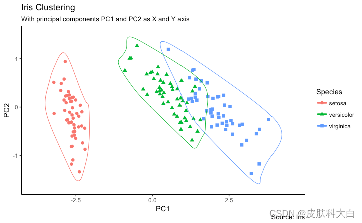
_encircle(data = df_pc_vir, aes(x=PC1, y=PC2)) + # draw circles
geom_encircle(data = df_pc_set, aes(x=PC1, y=PC2)) +
geom_encircle(data = df_pc_ver, aes(x=PC1, y=PC2))

8. 空间
该ggmap软件包提供了与 google maps api 交互并获取您要绘制的地点的坐标(纬度和经度)的设施。下面的示例显示了钦奈市的卫星、道路和混合地图,包围了一些地方。我使用该geocode()函数来获取这些地方的坐标并qmap()获取地图。要获取的地图类型由您设置为maptype.
zoom您还可以通过设置参数来放大地图。默认为 10(适合大城市)。如果要缩小,请减少此数字(最多 3 个)。它可以放大到 21,适用于建筑物。
# Better install the dev versions ----------
# devtools::install_github("dkahle/ggmap")
# devtools::install_github("hrbrmstr/ggalt")

# load packages
library(ggplot2)
library(ggmap)
library(ggalt)

# Get Chennai's Coordinates --------------------------------
chennai <-  geocode("Chennai")  # get longitude and latitude

# Get the Map ----------------------------------------------
# Google Satellite Map
chennai_ggl_sat_map <- qmap("chennai", zoom=12, source = "google", maptype="satellite")

# Google Road Map
chennai_ggl_road_map <- qmap("chennai", zoom=12, source = "google", maptype="roadmap")

# Google Hybrid Map
chennai_ggl_hybrid_map <- qmap("chennai", zoom=12, source = "google", maptype="hybrid")

# Open Street Map
chennai_osm_map <- qmap("chennai", zoom=12, source = "osm")

# Get Coordinates for Chennai's Places ---------------------
chennai_places <- c("Kolathur",
                    "Washermanpet",
                    "Royapettah",
                    "Adyar",
                    "Guindy")

places_loc <- geocode(chennai_places)  # get longitudes and latitudes


# Plot Open Street Map -------------------------------------
chennai_osm_map + geom_point(aes(x=lon, y=lat),
                             data = places_loc,
                             alpha = 0.7,
                             size = 7,
                             color = "tomato") +
                  geom_encircle(aes(x=lon, y=lat),
                                data = places_loc, size = 2, color = "blue")

# Plot Google Road Map -------------------------------------
chennai_ggl_road_map + geom_point(aes(x=lon, y=lat),
                                  data = places_loc,
                                  alpha = 0.7,
                                  size = 7,
                                  color = "tomato") +
                       geom_encircle(aes(x=lon, y=lat),
                                     data = places_loc, size = 2, color = "blue")

# Google Hybrid Map ----------------------------------------
chennai_ggl_hybrid_map + geom_point(aes(x=lon, y=lat),
                                     data = places_loc,
                                     alpha = 0.7,
                                     size = 7,
                                     color = "tomato") +
                          geom_encircle(aes(x=lon, y=lat),
                                        data = places_loc, size = 2, color = "blue")


http://r-statistics.co/Top50-Ggplot2-Visualizations-MasterList-R-Code.html


 被折叠的 条评论
为什么被折叠?
被折叠的 条评论
为什么被折叠?
 到【灌水乐园】发言


