


单侧投影
单侧投影
只有下侧有投影
box-shadow: 0px 4px 4px -4px red;
只有左侧有投影
box-shadow: -4px 0px 4px -4px red;
只有右侧有投影
box-shadow: 4px 0px 4px -4px red;
只有上侧有投影
box-shadow: 0px -4px 4px -4px red;
邻边投影
box-shadow: 6px 6px 4px red;
双侧投影
box-shadow: -4px 0px 4px -4px red, 4px 0px 4px -4px red;
其实就是把单侧投影叠加
不规则投影
filter CSS属性将模糊或颜色偏移等图形效果应用于元素。滤镜通常用于调整图像,背景和边框的渲染。
box-shadow: 2px 2px 10px rgba(0,0,0,0.5)可以写成这样filter: drop-shadow(2px 2px 10px rgba(0,0,0,0.5))
可以适配不规则的形状
<!DOCTYPE html>
<html lang="en">

<head>
    <meta charset="UTF-8">
    <meta http-equiv="X-UA-Compatible" content="IE=edge">
    <meta name="viewport" content="width=device-width, initial-scale=1.0">
    <title>Document</title>
</head>
<style>
    div {
        position: relative;
        left: 0;
        right: 0;
        background: pink;
        width: 200px;
        height: 200px;
        filter: drop-shadow(2px 2px 10px rgba(0, 0, 0, 0.5));
    }

    div::before {
        width: 100px;
        height: 100px;
        content: "";
        position: absolute;
        left: 0;
        top: 0;
        margin-left: 100%;
        margin-top: 50px;
        clip-path: polygon(0% 0, 30% 30%, 0% 50%);
        background: pink;
    }
</style>

<body>
    <div></div>
</body>

</html>

染色效果
为一-幅灰度图片(或是被转换为灰度模式的彩色图片)增加染色效果
(color tint),是一种流行且优雅的方式,可以给- -系列风格迥异的照片带来
视觉上的一致性。我们通常会在静止状态下应用这个效果,当发生:hover
或其他交互时再去除。
HSL即色相、饱和度、亮度(英语:Hue, Saturation, Lightness)。HSV即色相、饱和度、明度(英语:Hue, Saturation, Value),又称HSB,其中B即英语:Brightness。
滤镜方案
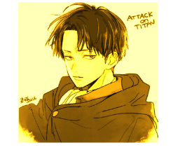
原图:
在这里插入图片描述
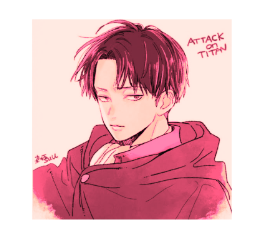
sepia(1):

filter: sepia(1) saturate(4);:
filter: sepia(1) saturate(4) hue-rotate(295deg):
动画效果
<!DOCTYPE html>
<html lang="en">

<head>
    <meta charset="UTF-8">
    <meta http-equiv="X-UA-Compatible" content="IE=edge">
    <meta name="viewport" content="width=device-width, initial-scale=1.0">
    <title>Document</title>
</head>
<style>
    img {
        filter: sepia(1) saturate(4) hue-rotate(295deg);
        transform: 0.5s filter;
    }

    img:hover,
    img:focus {
        filter: none;
    }
</style>

<body>
    <div>
        <img src="https://lh3.googleusercontent.com/proxy/ysQGj5GlHT8K2EAfT5q5QuZJMBWy_PyqttnD_Rs5I_uERLa_J2Z-F-cx-LDXEkhEQ4Ud0G-uzN8Zoy-pI9XPwnotKbJuVBGETi5aSnSk6kEkVqBM-w"
            alt="">
    </div>
</body>

</html>
混合模式的方案
混合模式会保留上层的hsl亮度信息,并从它下层吸取饱和度信息
- 把图片包在一个容器中,并且把容器的背景色设置成我们想要的主色调
- 不用图片,用div,把第一层背景设置成要染色的图片,第二层背景设置成我们想要的主色调
第一种:
<!DOCTYPE html>
<html lang="en">

<head>
    <meta charset="UTF-8">
    <meta http-equiv="X-UA-Compatible" content="IE=edge">
    <meta name="viewport" content="width=device-width, initial-scale=1.0">
    <title>Document</title>
</head>
<style>
    div {
        width: 200px;
        height: 200px;
        background: hsl(355, 100%, 50%);
    }

    img {
        width: 200px;
        height: 200px;
        mix-blend-mode: luminosity;
    }
</style>

<body>
    <div>
        <img src="https://lh3.googleusercontent.com/proxy/ysQGj5GlHT8K2EAfT5q5QuZJMBWy_PyqttnD_Rs5I_uERLa_J2Z-F-cx-LDXEkhEQ4Ud0G-uzN8Zoy-pI9XPwnotKbJuVBGETi5aSnSk6kEkVqBM-w"
            alt="">
    </div>
</body>

</html>
毛玻璃效果
<!DOCTYPE html>
<html lang="en">

<head>
    <meta charset="UTF-8">
    <meta http-equiv="X-UA-Compatible" content="IE=edge">
    <meta name="viewport" content="width=device-width, initial-scale=1.0">
    <title>Document</title>
</head>
<style>
    .bg {
        width: 800px;
        height: 400px;
        background-image: url(https://i.pinimg.com/originals/cc/79/a9/cc79a9f13eb8069a5366a2ebbcd48d7e.jpg);
        overflow: hidden;
    }

    .filter {
        width: 700px;
        height: 350px;
        background: hsla(0, 0%, 100%, 0.3);
        overflow: hidden;
        margin: 25px auto;
        text-align: center;
        color: white;
        font-size: 19px;
        font-family: Verdana, Geneva, Tahoma, sans-serif;
        backdrop-filter: blur(5px);/*主要是这一句*/
    }
</style>

<body>
    <div class="bg">
        <div class="filter">
            Sonnet 116 <br> Let me not to the marriage of true mindsAdmit impediments. <br> Love is not loveWhich alters
            when it
            alteration finds, <br> Or bends with the remover to remove:O no! <br> it is an ever-fixed markThat looks on
            tempests
            and is never shaken; <br> It is the star to every wandering bark, <br> Whose worth's unknown, <br> although
            his highth be
            takenLove's not Time's fool, <br> though rosy lips and cheeksWithin his bending sickle's compass come: <br>
            Love alters
            not with his brief hours and weeks, <br> But bears it out even to the edge of doom. <br> If this be error
            and upon me
            proved, <br> I never writ, <br> nor no man ever loved.
        </div>
    </div>
</body>

</html>
![[外链图片转存失败,源站可能有防盗链机制,建议将图片保存下来直接上传(img-9r7dqefk-1618134849078)(D:\code\web_learning_record\CSS\books\imgs\1618133621356.png)]](https://img-blog.csdnimg.cn/20210411175742433.png?x-oss-process=image/watermark,type_ZmFuZ3poZW5naGVpdGk,shadow_10,text_aHR0cHM6Ly9ibG9nLmNzZG4ubmV0L3dlaXhpbl80NzAyOTg5Ng==,size_16,color_FFFFFF,t_70)
切角效果
<!DOCTYPE html>
<html lang="en">

<head>
    <meta charset="UTF-8">
    <meta http-equiv="X-UA-Compatible" content="IE=edge">
    <meta name="viewport" content="width=device-width, initial-scale=1.0">
    <title>Document</title>
</head>
<style>
    div {
        width: 200px;
        height: 200px;
        background: linear-gradient(to left bottom, transparent 50%, rgba(0, 0, 0, 0.4) 0) no-repeat 100% 0 / 2em 2em,
            linear-gradient(-135deg, transparent 1.4em, #58a 0);
    }
</style>

<body>
    <div>

    </div>
</body>

</html>


 651
651


 被折叠的 条评论
为什么被折叠?
被折叠的 条评论
为什么被折叠?
 到【灌水乐园】发言


