


效果图

代码
<body>
    <section class="content">
        <div class="item">元素</div>
        <div class="item">元素</div>
        <div class="item">元素</div>
        <div class="item">元素</div>
        <div class="item">元素</div>
        <div class="item">元素</div>
        <div class="item">元素</div>
    </section>
</body>
<style>
    .content {
        width: 100%;
        display: flex;
        flex-wrap: wrap;
        background-color: skyblue;
    }
    .item {
        flex: 0 0 calc((100% - 10px)/3);
        height: 120px;
        background-color: pink;
        /* 间隙为5px */
        margin: 0 5px 5px 0;
    }
    .item:nth-child(3n) {
        /* 去除第3n个的margin-right */
        margin-right: 0;
    }
</style>
方法二
.item {
    /* flex: 0 0 calc((100% - 10px)/3); */
    width: calc((100% - 10px) / 3);
    height: 120px;
    background-color: pink;
    /* 间隙为5px */
    margin: 0 5px 5px 0;
}
注意calc写法
1、错误的格式:width:calc(100%-10px);
2、正确格式:width:calc(100% - 10px);
减号左右要留有空格,咱们只管用,也不敢问这是为什么
Grid实现
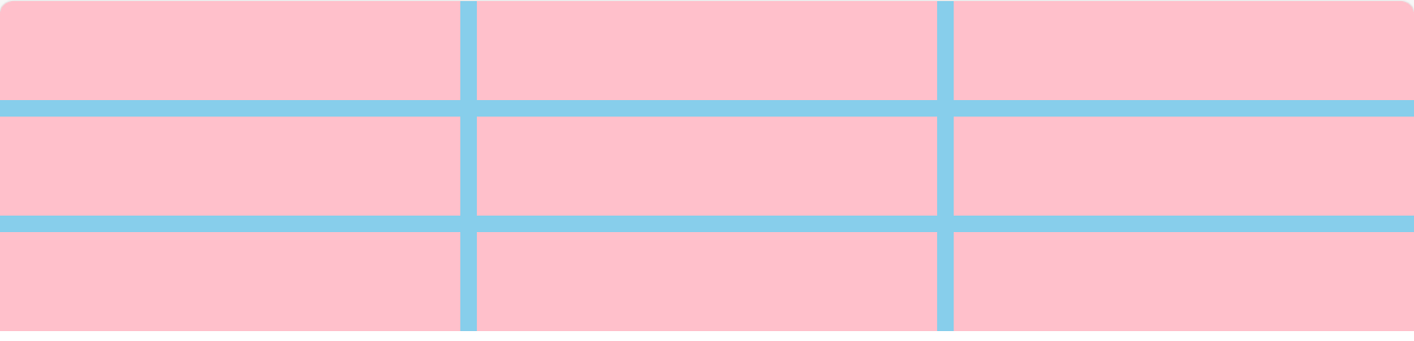
代码
    <div class="grid">
        <div class="pink"></div>
        <div class="pink"></div>
        <div class="pink"></div>
        <div class="pink"></div>
        <div class="pink"></div>
        <div class="pink"></div>
        <div class="pink"></div>
        <div class="pink"></div>
        <div class="pink"></div>
    </div>
<style>
        .grid {
            display: grid;
            grid-template-columns: repeat(3, 1fr);
            grid-template-rows: repeat(3, 1fr);
            gap: 10px;
            width: 100vw;
            height: 200px;
            background-color: skyblue;
        }

        .pink {
            background-color: pink;
        }
    </style>


 扫一扫
扫一扫


 1万+
1万+

 被折叠的 条评论
为什么被折叠?
被折叠的 条评论
为什么被折叠?
 到【灌水乐园】发言


