


示例1-1 使用Scikit-Learn训练一个线性模型
# Python ≥3.5 is required
import sys
assert sys.version_info >= (3, 5)	# Python ≥3.5 is required,否则抛出错误
# Scikit-Learn ≥0.20 is required
import sklearn
assert sklearn.__version__ >= "0.20"	# Scikit-Learn ≥0.20 is required,否则抛错。
# 备注:Scikit-learn是一个支持有监督和无监督学习的开源机器学习库。它还为模型拟合、数据预处理、模型选择和评估以及许多其他实用程序提供了各种工具。
# 经合组织统计生活满意度,国家平均GDP,处理后得到所需的数据(两表融合为一表)
# 涉及数据分析和处理的知识...
def prepare_country_stats(oecd_bli, gdp_per_capita):
    oecd_bli = oecd_bli[oecd_bli["INEQUALITY"]=="TOT"]
    oecd_bli = oecd_bli.pivot(index="Country", columns="Indicator", values="Value")
    gdp_per_capita.rename(columns={"2015": "GDP per capita"}, inplace=True)
    gdp_per_capita.set_index("Country", inplace=True)
    full_country_stats = pd.merge(left=oecd_bli, right=gdp_per_capita,
                                  left_index=True, right_index=True)
    full_country_stats.sort_values(by="GDP per capita", inplace=True)
    remove_indices = [0, 1, 6, 8, 33, 34, 35]
    keep_indices = list(set(range(36)) - set(remove_indices))
    return full_country_stats[["GDP per capita", 'Life satisfaction']].iloc[keep_indices]
# 设置数据表格的存放路径,存于本地
import os
datapath = os.path.join("datasets", "lifesat", "")
# To plot pretty figures directly within Jupyter 直接在jupyter绘制漂亮的图形
%matplotlib inline	# 将matplotlib的图表直接嵌入到Notebook之中
import matplotlib as mpl	# matplotlib 数据可视化工具
mpl.rc('axes', labelsize=14)	# 一次性设置多个参数,axes画布,xytick为XY轴,并指定大小。如mpl.rc('lines', linewidth=2, color='r')
mpl.rc('xtick', labelsize=12)
mpl.rc('ytick', labelsize=12)
# Download the data	下载数据,爬取数据
import urllib.request
DOWNLOAD_ROOT = "https://raw.githubusercontent.com/ageron/handson-ml2/master/"
os.makedirs(datapath, exist_ok=True)	# 当前目录下创建文件夹datapath
for filename in ("oecd_bli_2015.csv", "gdp_per_capita.csv"):
    print("Downloading", filename)
    url = DOWNLOAD_ROOT + "datasets/lifesat/" + filename
    urllib.request.urlretrieve(url, datapath + filename)	# 将查到的url放在datapath路径下,并命名为filename
# Code example
import matplotlib.pyplot as plt # matplotlib画图工具,数据可视化
import numpy as np # 数据处理,处理矩阵、数组
import pandas as pd # 数据处理,处理表格
import sklearn.linear_model # 从sklearn机器学习库里调用线性模型
# Load the data # 加载原始数据。此时数据已在本地datapath
oecd_bli = pd.read_csv(datapath + "oecd_bli_2015.csv", thousands=',')
gdp_per_capita = pd.read_csv(datapath + "gdp_per_capita.csv",thousands=',',delimiter='\t',
encoding='latin1', na_values="n/a")
# Prepare the data # 调用prepare_country_stats准备所需的数据。np.c_是列合并,要求列数一致,np.r_是行合并,要求行数一致。
country_stats = prepare_country_stats(oecd_bli, gdp_per_capita)
X = np.c_[country_stats["GDP per capita"]]
y = np.c_[country_stats["Life satisfaction"]]
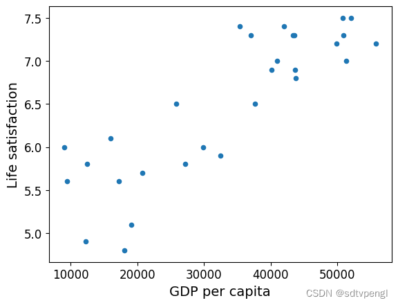
# Visualize the data # 数据可视化
country_stats.plot(kind='scatter', x="GDP per capita", y='Life satisfaction')
plt.show()
# Select a linear model # 选择sklearn库里的一个线性回归模型
model = sklearn.linear_model.LinearRegression()
# Train the model # 训练模型
model.fit(X, y)
# Make a prediction for Cyprus # 根据模型为塞浦路斯做预测,根据Xgdp预测幸福指数
X_new = [[22587]] # Cyprus' GDP per capita
print(model.predict(X_new)) # outputs [[ 5.96242338]]
# 用k近邻回归模型替换原来的线性模型再预测一次
# Select a 3-Nearest Neighbors regression model
import sklearn.neighbors
model1 = sklearn.neighbors.KNeighborsRegressor(n_neighbors=3)

# Train the model
model1.fit(X,y)

# Make a prediction for Cyprus
print(model1.predict(X_new)) # outputs [[5.76666667]]
# Where to save the figures	# 写一个函数保存图片
PROJECT_ROOT_DIR = "."
CHAPTER_ID = "fundamentals"	# 章节ID:基本原理
IMAGES_PATH = os.path.join(PROJECT_ROOT_DIR, "images", CHAPTER_ID)	# 图片路径
os.makedirs(IMAGES_PATH, exist_ok=True)
# save_fig参数(图片id即图片名,tight_layout固定间距,扩展名,像素dpi),结合plt.savefig进行图片保存
def save_fig(fig_id, tight_layout=True, fig_extension="png", resolution=300):
	# 图片保存路径
    path = os.path.join(IMAGES_PATH, fig_id + "." + fig_extension)
    print("Saving figure", fig_id)
    if tight_layout:
        plt.tight_layout()
    plt.savefig(path, format=fig_extension, dpi=resolution)
# 你也可以从经合组织官网(http://stats.oecd.org/index.aspx?DataSetCode=BLI)上下载最新的数据保存到本地datasets/lifesat/
# 读取数据前两行
oecd_bli = pd.read_csv(datapath + "oecd_bli_2015.csv", thousands=',')
oecd_bli = oecd_bli[oecd_bli["INEQUALITY"]=="TOT"]
oecd_bli = oecd_bli.pivot(index="Country", columns="Indicator", values="Value")
oecd_bli.head(2)
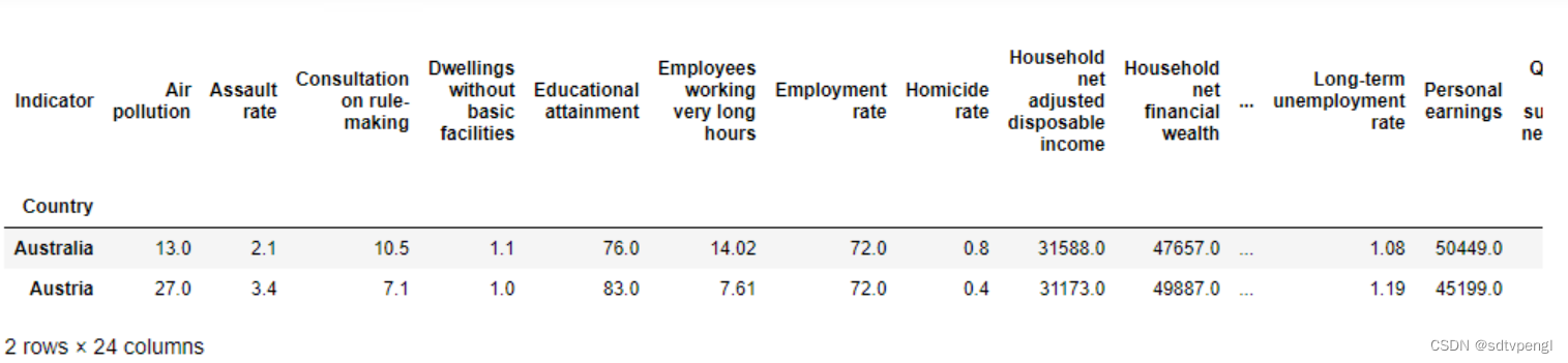
# .head()默认前五行(Pandas库)
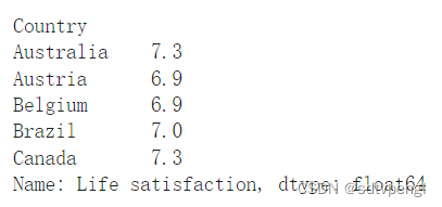
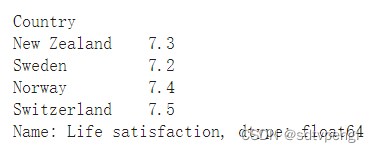
oecd_bli["Life satisfaction"].head()
# 你也可以从(http://goo.gl/j1MSKe (=> imf.org))上下载最新的数据保存到本地datasets/lifesat/
gdp_per_capita = pd.read_csv(datapath+"gdp_per_capita.csv", thousands=',', delimiter='\t',
encoding='latin1', na_values="n/a")
# 列名'2015'改为'GDP per capita'
gdp_per_capita.rename(columns={"2015": "GDP per capita"}, inplace=True)
# 将'Country'列为索引
gdp_per_capita.set_index("Country", inplace=True)
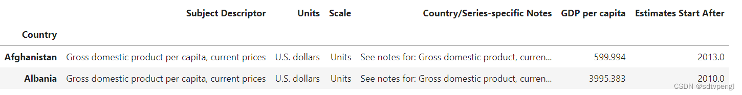
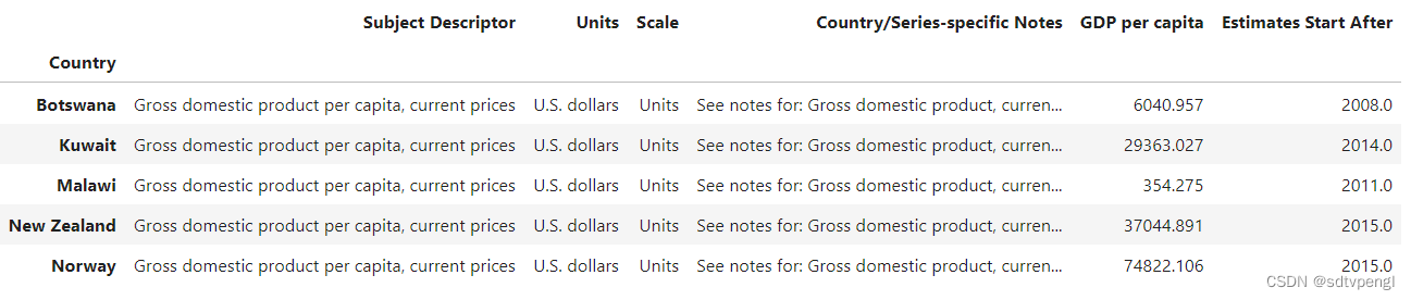
gdp_per_capita.head(2)
# pd.merge合并数据'https://blog.csdn.net/m0_70166478/article/details/127562787'
full_country_stats = pd.merge(left=oecd_bli, right=gdp_per_capita, left_index=True, right_index=True)
# 排序by
full_country_stats.sort_values(by="GDP per capita", inplace=True)
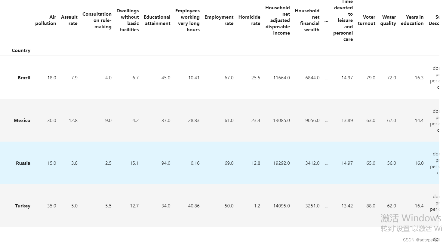
full_country_stats
# data.loc配合set_index使用,data.set_index("Country", inplace=True)设置'Country'为下标,就可以根据"Country"选择不同的数据了,使用 data.loc[<label>],参考'https://blog.csdn.net/weixin_44285715/article/details/100116192'
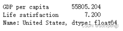
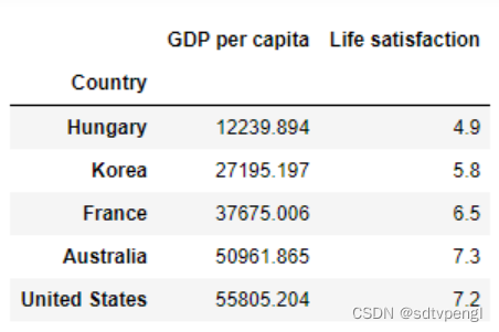
full_country_stats[["GDP per capita", 'Life satisfaction']].loc["United States"]
# 对比data.loc[0]是选取的是行标签为0的数据,data.iloc[0]选取的是第0行数据
remove_indices = [0, 1, 6, 8, 33, 34, 35]
keep_indices = list(set(range(36)) - set(remove_indices))

sample_data = full_country_stats[["GDP per capita", 'Life satisfaction']].iloc[keep_indices]
missing_data = full_country_stats[["GDP per capita", 'Life satisfaction']].iloc[remove_indices]
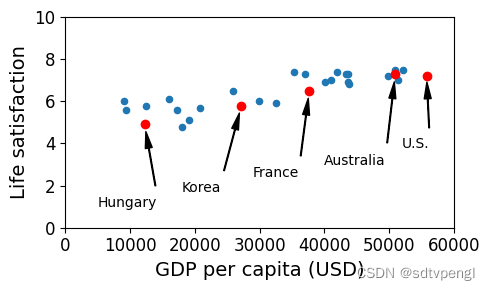
# figsize=(5,3)设置图形的大小,宽*高
sample_data.plot(kind='scatter', x="GDP per capita", y='Life satisfaction', figsize=(5,3))
# 坐标控制,横轴0-60000,纵轴0-10
plt.axis([0, 60000, 0, 10])
position_text = {
    "Hungary": (5000, 1),
    "Korea": (18000, 1.7),
    "France": (29000, 2.4),
    "Australia": (40000, 3.0),
    "United States": (52000, 3.8),
}
# plt.annotate参考https://blog.csdn.net/TeFuirnever/article/details/88946088
for country, pos_text in position_text.items():
    pos_data_x, pos_data_y = sample_data.loc[country]
    country = "U.S." if country == "United States" else country
    plt.annotate(country, xy=(pos_data_x, pos_data_y), xytext=pos_text,
            arrowprops=dict(facecolor='black', width=0.5, shrink=0.1, headwidth=5))
    plt.plot(pos_data_x, pos_data_y, "ro")	# 红色小圆圈
plt.xlabel("GDP per capita (USD)")
save_fig('money_happy_scatterplot')
plt.show()
# 样本数据保存lifesat.csv
sample_data.to_csv(os.path.join("datasets", "lifesat", "lifesat.csv"))
# 列出特定样本数据
sample_data.loc[list(position_text.keys())]
import numpy as np
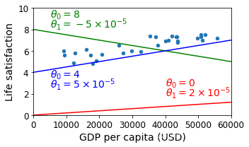
sample_data.plot(kind='scatter', x="GDP per capita", y='Life satisfaction', figsize=(5,3))
plt.xlabel("GDP per capita (USD)")
plt.axis([0, 60000, 0, 10])
# 创建等差数列
X=np.linspace(0, 60000, 1000)
# 线性函数1,画图
plt.plot(X, 2*X/100000, "r")
# plt.text()函数用于设置文字说明,参考'https://blog.csdn.net/TeFuirnever/article/details/88947248'
plt.text(40000, 2.7, r"$\theta_0 = 0$", fontsize=14, color="r")
plt.text(40000, 1.8, r"$\theta_1 = 2 \times 10^{-5}$", fontsize=14, color="r")
# 线性函数2,画图
plt.plot(X, 8 - 5*X/100000, "g")
plt.text(5000, 9.1, r"$\theta_0 = 8$", fontsize=14, color="g")
plt.text(5000, 8.2, r"$\theta_1 = -5 \times 10^{-5}$", fontsize=14, color="g")
# 线性函数3,画图
plt.plot(X, 4 + 5*X/100000, "b")
plt.text(5000, 3.5, r"$\theta_0 = 4$", fontsize=14, color="b")
plt.text(5000, 2.6, r"$\theta_1 = 5 \times 10^{-5}$", fontsize=14, color="b")
save_fig('tweaking_model_params_plot')
plt.show()
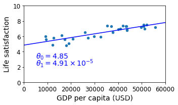
from sklearn import linear_model
lin1 = linear_model.LinearRegression()
Xsample = np.c_[sample_data["GDP per capita"]]
ysample = np.c_[sample_data["Life satisfaction"]]
lin1.fit(Xsample, ysample)
# 斜率w存在coef_中,偏移b存在intercept_中
t0, t1 = lin1.intercept_[0], lin1.coef_[0][0]
t0, t1
(4.853052800266436, 4.911544589158484e-05)
# 绘制训练出来的模型图像并保存
sample_data.plot(kind='scatter', x="GDP per capita", y='Life satisfaction', figsize=(5,3))
plt.xlabel("GDP per capita (USD)")
plt.axis([0, 60000, 0, 10])
X=np.linspace(0, 60000, 1000)
plt.plot(X, t0 + t1*X, "b")
plt.text(5000, 3.1, r"$\theta_0 = 4.85$", fontsize=14, color="b")
plt.text(5000, 2.2, r"$\theta_1 = 4.91 \times 10^{-5}$", fontsize=14, color="b")
save_fig('best_fit_model_plot')
plt.show()
# 根据最新获得的预测模型,由塞浦路斯人均GDP来预测生活满意度数值
cyprus_gdp_per_capita = gdp_per_capita.loc["Cyprus"]["GDP per capita"]
print(cyprus_gdp_per_capita)
cyprus_predicted_life_satisfaction = lin1.predict([[cyprus_gdp_per_capita]])[0][0]
cyprus_predicted_life_satisfaction
22587.49
5.96244744318815
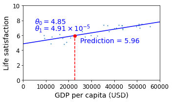
sample_data.plot(kind='scatter', x="GDP per capita", y='Life satisfaction', figsize=(5,3), s=1)
plt.xlabel("GDP per capita (USD)")
X=np.linspace(0, 60000, 1000)
plt.plot(X, t0 + t1*X, "b")
plt.axis([0, 60000, 0, 10])
plt.text(5000, 7.5, r"$\theta_0 = 4.85$", fontsize=14, color="b")
plt.text(5000, 6.6, r"$\theta_1 = 4.91 \times 10^{-5}$", fontsize=14, color="b")
# 用红色'--'线绘制一条竖线,x从[x0,x0],y从[0,y0]
plt.plot([cyprus_gdp_per_capita, cyprus_gdp_per_capita], [0, cyprus_predicted_life_satisfaction], "r--")
plt.text(25000, 5.0, r"Prediction = 5.96", fontsize=14, color="b")
# 用红色'o'线绘制一圆点,标记塞浦路斯生活满意度预测值
plt.plot(cyprus_gdp_per_capita, cyprus_predicted_life_satisfaction, "ro")
save_fig('cyprus_prediction_plot')
plt.show()
# 取样本数据7-10行
sample_data[7:10]
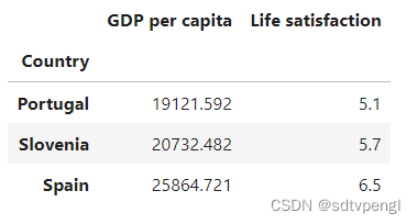
# 塞浦路斯人均GDP为22587,均值法抽取22587附近三条样本y值取平均
(5.1+5.7+6.5)/3
5.766666666666667
# 再重复一次获取数据。修改表格数据之前先做备份
backup = oecd_bli, gdp_per_capita

def prepare_country_stats(oecd_bli, gdp_per_capita):
    oecd_bli = oecd_bli[oecd_bli["INEQUALITY"]=="TOT"]
    oecd_bli = oecd_bli.pivot(index="Country", columns="Indicator", values="Value")
    gdp_per_capita.rename(columns={"2015": "GDP per capita"}, inplace=True)
    gdp_per_capita.set_index("Country", inplace=True)
    full_country_stats = pd.merge(left=oecd_bli, right=gdp_per_capita,
                                  left_index=True, right_index=True)
    full_country_stats.sort_values(by="GDP per capita", inplace=True)
    remove_indices = [0, 1, 6, 8, 33, 34, 35]
    keep_indices = list(set(range(36)) - set(remove_indices))
    return full_country_stats[["GDP per capita", 'Life satisfaction']].iloc[keep_indices]
# Code example
import matplotlib.pyplot as plt
import numpy as np
import pandas as pd
import sklearn.linear_model

# Load the data
oecd_bli = pd.read_csv(datapath + "oecd_bli_2015.csv", thousands=',')
gdp_per_capita = pd.read_csv(datapath + "gdp_per_capita.csv",thousands=',',delimiter='\t',
                             encoding='latin1', na_values="n/a")

# Prepare the data
country_stats = prepare_country_stats(oecd_bli, gdp_per_capita)
X = np.c_[country_stats["GDP per capita"]]
y = np.c_[country_stats["Life satisfaction"]]

# Visualize the data
country_stats.plot(kind='scatter', x="GDP per capita", y='Life satisfaction')
plt.show()

# Select a linear model
model = sklearn.linear_model.LinearRegression()

# Train the model
model.fit(X, y)

# Make a prediction for Cyprus
X_new = [[22587]]  # Cyprus' GDP per capita
print(model.predict(X_new)) # outputs [[ 5.96242338]]
oecd_bli, gdp_per_capita = backup
missing_data
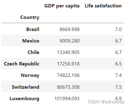
# 列出country,以及注释文字的位置,方便plt.annotate绘制这些missingdata
position_text2 = {
    "Brazil": (1000, 9.0),
    "Mexico": (11000, 9.0),
    "Chile": (25000, 9.0),
    "Czech Republic": (35000, 9.0),
    "Norway": (60000, 3),
    "Switzerland": (72000, 3.0),
    "Luxembourg": (90000, 3.0),
}
# 样本数据模型图线,蓝色
sample_data.plot(kind='scatter', x="GDP per capita", y='Life satisfaction', figsize=(8,3))
plt.axis([0, 110000, 0, 10])
# 根据position_text2绘制plt.annotate出missingdata数据,红点
for country, pos_text in position_text2.items():
    pos_data_x, pos_data_y = missing_data.loc[country]
    plt.annotate(country, xy=(pos_data_x, pos_data_y), xytext=pos_text,
            arrowprops=dict(facecolor='black', width=0.5, shrink=0.1, headwidth=5))
    plt.plot(pos_data_x, pos_data_y, "rs")

X=np.linspace(0, 110000, 1000)
plt.plot(X, t0 + t1*X, "b:")
# 全量数据训练模型并绘制图线,边缘黑色
lin_reg_full = linear_model.LinearRegression()
Xfull = np.c_[full_country_stats["GDP per capita"]]
yfull = np.c_[full_country_stats["Life satisfaction"]]
lin_reg_full.fit(Xfull, yfull)

t0full, t1full = lin_reg_full.intercept_[0], lin_reg_full.coef_[0][0]
X = np.linspace(0, 110000, 1000)
plt.plot(X, t0full + t1full * X, "k")
plt.xlabel("GDP per capita (USD)")

save_fig('representative_training_data_scatterplot')
plt.show()
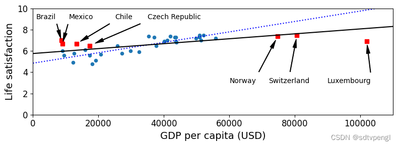
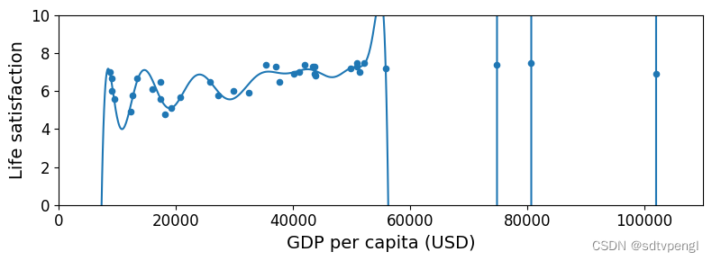
可见噪点数据对预测图线影响较大
full_country_stats.plot(kind='scatter', x="GDP per capita", y='Life satisfaction', figsize=(8,3))
plt.axis([0, 110000, 0, 10])

from sklearn import preprocessing
from sklearn import pipeline
# preprocessing.PolynomialFeatures通过增加一些输入数据的非线性特征来增加模型的复杂度
poly = preprocessing.PolynomialFeatures(degree=30, include_bias=False)
# 将特征数据的分布调整成标准正太分布,也叫高斯分布,也就是使得数据的均值维0,方差为1
scaler = preprocessing.StandardScaler()
lin_reg2 = linear_model.LinearRegression()
# Pipeline()的参数为一个有“步骤”(steps)组称的列表。每个步骤(step)则为一个元组,包括该步骤的名称(可自行命名),比如“'poly'”或“'scal'”,以及此步骤所有估计量的实例(an instance of an estimator),比如“poly()”或“scaler()”。此命令生成Pipeline类的一个实例pipeline_reg。
pipeline_reg = pipeline.Pipeline([('poly', poly), ('scal', scaler), ('lin', lin_reg2)])
pipeline_reg.fit(Xfull, yfull)
# 给X增加维度
curve = pipeline_reg.predict(X[:, np.newaxis])
plt.plot(X, curve)
plt.xlabel("GDP per capita (USD)")
save_fig('overfitting_model_plot')
plt.show()
# index 'Country'中含"W"的的"Life satisfaction"数据
full_country_stats.loc[[c for c in full_country_stats.index if "W" in c.upper()]]["Life satisfaction"]
# gdp_per_capita index 'Country'中含"W"的的数据,选取前五条
gdp_per_capita.loc[[c for c in gdp_per_capita.index if "W" in c.upper()]].head()
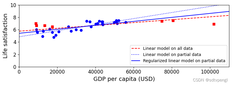
plt.figure(figsize=(8,3))

plt.xlabel("GDP per capita")
plt.ylabel('Life satisfaction')
# 画样本数据和丢失数据离散点
plt.plot(list(sample_data["GDP per capita"]), list(sample_data["Life satisfaction"]), "bo")
plt.plot(list(missing_data["GDP per capita"]), list(missing_data["Life satisfaction"]), "rs")
# 画全数据和样本数据预测模型线
X = np.linspace(0, 110000, 1000)
plt.plot(X, t0full + t1full * X, "r--", label="Linear model on all data")
plt.plot(X, t0 + t1*X, "b:", label="Linear model on partial data")
# 具有l2正则化的线性最小二乘法,alpha:正则化系数,float类型,默认为1.0。正则化改善了问题的条件并减少了估计的方差。较大的值指定较强的正则化
ridge = linear_model.Ridge(alpha=10**9.5)
Xsample = np.c_[sample_data["GDP per capita"]]
ysample = np.c_[sample_data["Life satisfaction"]]
ridge.fit(Xsample, ysample)
t0ridge, t1ridge = ridge.intercept_[0], ridge.coef_[0][0]
plt.plot(X, t0ridge + t1ridge * X, "b", label="Regularized linear model on partial data")
# 图例显示的位置,右下角
plt.legend(loc="lower right")
plt.axis([0, 110000, 0, 10])
plt.xlabel("GDP per capita (USD)")
save_fig('ridge_model_plot')
plt.show()


 6530
6530


 被折叠的 条评论
为什么被折叠?
被折叠的 条评论
为什么被折叠?
 到【灌水乐园】发言


