


目录
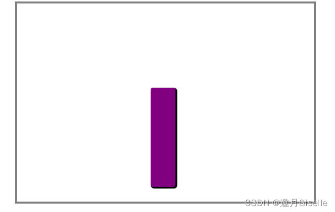
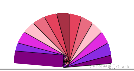
度数,速度,颜色之类的可以自己再调整
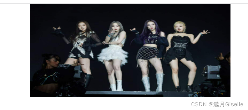
效果图如下
<!DOCTYPE html>
<html lang="en">
<head>
<meta charset="UTF-8">
<meta http-equiv="X-UA-Compatible" content="IE=edge">
<meta name="viewport" content="width=device-width, initial-scale=1.0">
<title>Document</title>
<style>
*{margin: 0;padding: 0;}
ul{list-style-type:none;}
ul{
margin: 10px auto;
width: 600px;
height: 400px;
border: 4px solid gray;
position: relative;
}
li{
width: 50px;
height: 200px;
position: absolute;
left: 50%;
margin-left: -30px;
bottom: 30px;
text-align: center;
transform-origin: bottom center;
transition: all 3s linear;
border-radius: 5px;
box-shadow: 2px 2px 2px black;
}
ul li:nth-child(1),ul li:nth-child(13){
background-color: purple;
}
ul li:nth-child(2),ul li:nth-child(12){
background-color:blueviolet;
}
ul li:nth-child(3),ul li:nth-child(11){
background-color:rgb(226, 43, 226);
}
ul li:nth-child(4),ul li:nth-child(10){
background-color:pink;
}
ul li:nth-child(5),ul li:nth-child(9){
background-color:rgb(233, 108, 129);
}
ul li:nth-child(6),ul li:nth-child(8){
background-color:rgb(228, 66, 93);
}
ul li:nth-child(7){
background-color:rgb(167, 49, 69);
}
ul:hover li:nth-child(13){
transform: rotate(-85deg);
}
ul:hover li:nth-child(12){
transform: rotate(-75deg);
}
ul:hover li:nth-child(11){
transform: rotate(-60deg);
}
ul:hover li:nth-child(10){
transform: rotate(-45deg);
}
ul:hover li:nth-child(9){
transform: rotate(-30deg);
}
ul:hover li:nth-child(8){
transform: rotate(-15deg);
}
ul:hover li:nth-child(6){
transform: rotate(15deg);
}
ul:hover li:nth-child(5){
transform: rotate(30deg);
}
ul:hover li:nth-child(4){
transform: rotate(45deg);
}
ul:hover li:nth-child(3){
transform: rotate(60deg);
}
ul:hover li:nth-child(2){
transform: rotate(75deg);
}
ul:hover li:nth-child(1){
transform: rotate(85deg);
}
</style>
</head>
<body>
<ul>
<li></li>
<li></li>
<li></li>
<li></li>
<li></li>
<li></li>
<li></li>
<li></li>
<li></li>
<li></li>
<li></li>
<li></li>
<li></li>
</ul>
</body>
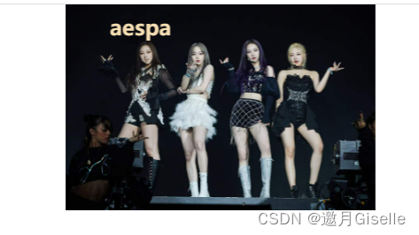
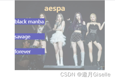
</html>②资料卡
<!DOCTYPE html>
<html lang="en">
<head>
<meta charset="UTF-8">
<meta http-equiv="X-UA-Compatible" content="IE=edge">
<meta name="viewport" content="width=device-width, initial-scale=1.0">
<title>Document</title>
<style>
*{
margin: 0;
padding: 0;
}
img{
display: block;
}
.box{
width: 350px;
overflow: hidden;
margin: 0 auto;
position: relative;
}
.box img{
width: 100%;
transition: all 1s
}
.box:hover img{
transform: translateX(50px);
opacity: 0.5;
}
.box h2{
position:absolute;
left: 50px;
top: 10px;
color: wheat;
transition: all 1s 0.3s;
}
.box:hover h2{
transform: translateX(100px);
}
.box p{
position: absolute;
left:50px;
width: 100px;
color: white;
background: rgb(108, 108, 190);
}
.box .p1{
top: 60px;
transform: translateY(300px);
transition: all 1s;
}
.box:hover .p1{
transform: translateY(0px);
}
.box .p2{
top: 110px;
transform: translateY(400px);
transition: all 1s;
}
.box:hover .p2{
transform: translateY(0px);
}
.box .p3{
top:160px;
transform: translateY(400px);
transition: all 1s;
}
.box:hover .p3{
transform: translateY(0px);
}
</style>
</head>
<body>
<div class="box">
<img src="../tu/7.jpg" alt="">
<h2>aespa</h2>
<p class="p1">black manba</p>
<p class="p2">savage</p>
<p class="p3">forever</p>
</div>
</body>
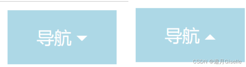
</html>③定格轮播(鼠标移上去会暂停)

<!DOCTYPE html>
<html lang="en">

<head>
    <meta charset="UTF-8">
    <meta http-equiv="X-UA-Compatible" content="IE=edge">
    <meta name="viewport" content="width=device-width, initial-scale=1.0">
    <title>Document</title>
    <!-- 原理    一个大容器里面一个很长的盒子,盒子里装了浮动的图片,不断改变长盒子的位置实现轮播,图片可以再根据需要增删-->
    <style>
        * {
            margin: 0;
            padding: 0;
        }

        .container {
            /* 固定高宽 */
            width: 640px;
            height: 300px;
            margin: 0 auto;
            overflow: hidden;
        }

        .swiper img {
            width: 640px;
            height: 300px;
        }

        .slider {
            float: left;
        }

        .swiper {
            width: 5000px;
            /* 只要大于图片加起来的宽度就行 */
            animation: swipers 8s linear infinite;
        }

        @keyframes swipers {

            /* 10,43,76实现图片定格*/
            0% {
                transform: translateX(0);
            }
            10% {
                transform: translateX(-640px);
            }
            33% {
                transform: translateX(-640px);
            }
            43% {
                transform: translateX(-1280px);
            }
            66% {
                transform: translateX(-1280px);
            }
            76% {
                transform: translateX(-1920px);
            }
            100% {
                transform: translateX(-1920px);
            }
        }
        .swiper:hover{
            animation-play-state: paused;
        }
    </style>
</head>
<body>
    <div class="container">
        <div class="swiper">
            <div class="slider">
                <img src="../tu/5.jpg" alt="">
            </div>
            <div class="slider">
                <img src="../tu/6.jpg" alt="">
            </div>
            <div class="slider">
                <img src="../tu/7.jpg" alt="">
            </div>
            <!-- 实现无缝轮播,第一张和最后一张图片一样 -->
            <div class="slider">
                <img src="../tu/5.jpg" alt="">
            </div>
        </div>
    </div>
</body>

</html>
④三角形菜单栏
实现原理:先定义一个盒子,设置宽高,将border设置成不同的宽度和颜色

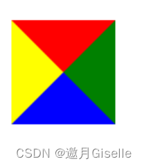
会出现以上效果 ,可以想象,当每个色彩栏中间的宽度不断缩小,就变成了三角形,当div的高宽变成0时,就变成了如图所示,将其他颜色改变为背景色是不可取的,如果背景色改变一眼就能看出,将其他改为transparent即可
效果图
<head>
    <meta charset="UTF-8">
    <meta http-equiv="X-UA-Compatible" content="IE=edge">
    <meta name="viewport" content="width=device-width, initial-scale=1.0">
    <title>Document</title>
    <style>
        .box {
            width: 100px;
            height: 50px;
            line-height: 50px;
            text-align: center;
            background: lightblue;
            color: white;
        }

        span {
            width: 0;
            height: 0;
            display: inline-block;
            border: 5px solid transparent;  /*  变三角形 */
            border-top: 5px solid white;
            position: relative;   /*给三角形一个固定位置变化*/
            top: 2.5px;
            transition: 0.3s; /* 0.3s变化*/
        }

        .box:hover span {
            border: 5px solid transparent;/*  变三角形 */
            border-bottom: 5px solid white;
            position: relative;/*给三角形一个固定位置变化*/
            top: -2px;
        }
    </style>
</head>

<body>
    <div class="box"> 导航
        <span></span>
    </div>
</body>

</html>


 3090
3090


 被折叠的 条评论
为什么被折叠?
被折叠的 条评论
为什么被折叠?
 到【灌水乐园】发言


