


class MainActivity : ComponentActivity() {
override fun onCreate(savedInstanceState: Bundle?) {
super.onCreate(savedInstanceState)
setContent {
Column(Modifier.fillMaxSize()) {
outLinedEditText()
}
}
}
}
@Composable
fun outLinedEditText() {
var text by remember { mutableStateOf("") }
OutlinedTextField(value = text, onValueChange = { text = it }, label = { Text("用户名") },
leadingIcon = {
Icon(imageVector = Icons.Filled.AccountBox, contentDescription = "")
},
colors = TextFieldDefaults.outlinedTextFieldColors(
focusedBorderColor = Color.DarkGray, // 边框颜色
focusedLabelColor = Color.Blue // Label颜色
),
modifier = Modifier.padding(50.dp)
)
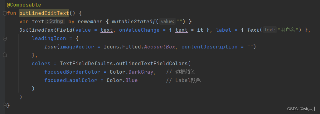
}运行效果图:
点击前:
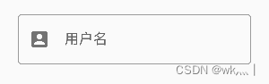
点击后:
还是自带动画的


 9688
9688


 被折叠的 条评论
为什么被折叠?
被折叠的 条评论
为什么被折叠?
 到【灌水乐园】发言


