


1、基本使用
1.1 随便用用
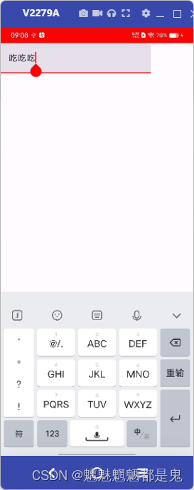
TextField(value = "吃吃吃", onValueChange = {})
结果
- 点击输入框可以弹出软键盘
- 光标显示正常 到文字最后位置
- 文字 “吃吃吃” 无法删除
- 输入文本无法变更
1.2 使用
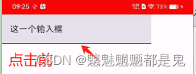
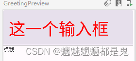
 val text = remember {mutableStateOf("这一个输入框") }
TextField(
       value = text.value,
       onValueChange = {text.value = it},
   )
结果:
可正常输入删除 value参数 需要一个动态的值来表示显示
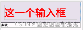
1.3 enabled 默认true 是否可用
enabled = false 不可用
结果
- 输入框不可操作 约等于 文本显示效果
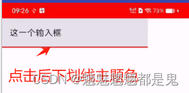
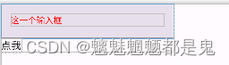
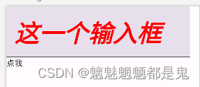
1.4 readOnly 默认false 是否只读
readOnly = true
TextField(
           value = text.value,
           onValueChange = {text.value = it},
           modifier = Modifier.clickable {
              Log.i("text_compose","点击>>")
           },
           readOnly = true,
       )
结果
- 点击不弹出输入框
- 点击有选中效果 但点击事件未触发
- 文字可通过设置 text.value变更
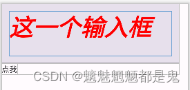
1.5 textStyle 基本上与Text的style 一样
Text 的 style: TextStyle = LocalTextStyle.current
TextField 的 textStyle: TextStyle = LocalTextStyle.current,
 constructor(
        color: Color = Color.Unspecified,    // 与Text的color效果一致 设置文字颜色   优先级低于 Text的color
        fontSize: TextUnit = TextUnit.Unspecified,  //设置字体大小   优先级低于 Text的
        fontWeight: FontWeight? = null,   //设置字体权重   优先级低于 Text的
        fontStyle: FontStyle? = null,   //设置字体斜体   优先级低于 Text的
        fontSynthesis: FontSynthesis? = null,     大概可能就是使用的fontFamily 没有粗体或者斜体的时候,系统给造一个
        fontFamily: FontFamily? = null,   //设置字体  草书什么的
        fontFeatureSettings: String? = null,   //字体的高级设置  与 CCS一致
        letterSpacing: TextUnit = TextUnit.Unspecified,     //文字间隔
        baselineShift: BaselineShift? = null,    //文字基线
        textGeometricTransform: TextGeometricTransform? = null,   //缩放与倾斜
        localeList: LocaleList? = null,
        background: Color = Color.Unspecified,   //背景
        textDecoration: TextDecoration? = null,     //下划线删除线
        shadow: Shadow? = null,   //阴影
        textAlign: TextAlign? = null,       //对齐方式
        textDirection: TextDirection? = null,  //文字方向
        lineHeight: TextUnit = TextUnit.Unspecified, //行高
        textIndent: TextIndent? = null  //缩进
    )
1.5.1 TextStyle - color
textStyle = TextStyle(
               color = Color(0xFFFF0000)
           ),
效果
1.5.2 TextStyle - fontSize
textStyle = TextStyle(
               color = Color(0xFFFF0000),
               fontSize = 50.sp
           ),
1.5.3 TextStyle - fontWeight
 textStyle = TextStyle(
               color = Color(0xFFFF0000),
               fontSize = 50.sp,
               fontWeight = FontWeight.Bold
           ),
效果
1.5.4 TextStyle - fontStyle
 textStyle = TextStyle(
               color = Color(0xFFFF0000),
               fontSize = 50.sp,
               fontWeight = FontWeight.Bold,
               fontStyle = FontStyle.Italic,
           ),
结果
1.5.5 TextStyle - baselineShift
 textStyle = TextStyle(
               color = Color(0xFFFF0000),
               fontSize = 50.sp,
               fontWeight = FontWeight.Bold,
               fontStyle = FontStyle.Italic,
               baselineShift = BaselineShift(0.6f)
           ),
结果
1.5.6 TextStyle - textGeometricTransform
 textStyle = TextStyle(
               color = Color(0xFFFF0000),
               fontSize = 50.sp,
               fontWeight = FontWeight.Bold,
               fontStyle = FontStyle.Italic,
               baselineShift = BaselineShift(0.6f),
               textGeometricTransform = TextGeometricTransform(0.5f,0.5f)
           ),
结果
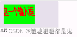
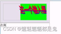
1.5.7 TextStyle - background
 textStyle = TextStyle(
               color = Color(0xFFFF0000),
               fontSize = 50.sp,
               fontWeight = FontWeight.Bold,
               fontStyle = FontStyle.Italic,
               baselineShift = BaselineShift(0.6f),
               textGeometricTransform = TextGeometricTransform(0.5f,0.5f),
               background = Color(0xFF00FF00)
           ),
效果
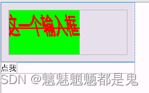
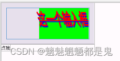
1.5.8 TextStyle - textDecoration
 textStyle = TextStyle(
               color = Color(0xFFFF0000),
               fontSize = 50.sp,
               fontWeight = FontWeight.Bold,
               fontStyle = FontStyle.Italic,
               baselineShift = BaselineShift(0.6f),
               textGeometricTransform = TextGeometricTransform(0.5f,0.5f),
               background = Color(0xFF00FF00),
               textDecoration = TextDecoration.LineThrough
           ),
效果
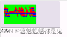
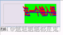
1.5.9 TextStyle - shadow
textStyle = TextStyle(
               color = Color(0xFFFF0000),
               fontSize = 50.sp,
               fontWeight = FontWeight.Bold,
               fontStyle = FontStyle.Italic,
               baselineShift = BaselineShift(0.6f),
               textGeometricTransform = TextGeometricTransform(0.5f,0.5f),
               background = Color(0xFF00FF00),
               textDecoration = TextDecoration.LineThrough,
               shadow = Shadow(color= Color(0xFF0000FF), Offset(5f,10f),3f)
           ),
效果
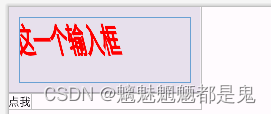
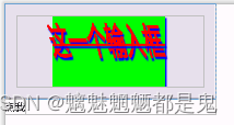
1.5.10 TextStyle - textAlign
 textStyle = TextStyle(
               color = Color(0xFFFF0000),
               fontSize = 50.sp,
               fontWeight = FontWeight.Bold,
               fontStyle = FontStyle.Italic,
               baselineShift = BaselineShift(0.6f),
               textGeometricTransform = TextGeometricTransform(0.5f,0.5f),
               background = Color(0xFF00FF00),
               textDecoration = TextDecoration.LineThrough,
               shadow = Shadow(color= Color(0xFF0000FF), Offset(5f,10f),3f),
               textAlign = TextAlign.Right
           ),
效果
1.5.11 TextStyle - textDirection 文字方向 从右往左或从左往右
- Rtl right to left
- Ltr left to right
textStyle = TextStyle(
               color = Color(0xFFFF0000),
               fontSize = 50.sp,
               fontWeight = FontWeight.Bold,
               fontStyle = FontStyle.Italic,
               baselineShift = BaselineShift(0.6f),
               textGeometricTransform = TextGeometricTransform(0.5f,0.5f),
               background = Color(0xFF00FF00),
               textDecoration = TextDecoration.LineThrough,
               shadow = Shadow(color= Color(0xFF0000FF), Offset(5f,10f),3f),
               textAlign = TextAlign.Right,
               textDirection = TextDirection.Rtl
           ),
效果: 测试手机无效果
1.5.12 TextStyle - lineHeight
 textStyle = TextStyle(
               color = Color(0xFFFF0000),
               fontSize = 50.sp,
               fontWeight = FontWeight.Bold,
               fontStyle = FontStyle.Italic,
               baselineShift = BaselineShift(0.6f),
               textGeometricTransform = TextGeometricTransform(0.5f,0.5f),
               background = Color(0xFF00FF00),
               textDecoration = TextDecoration.LineThrough,
               shadow = Shadow(color= Color(0xFF0000FF), Offset(5f,10f),3f),
               textAlign = TextAlign.Right,
               textDirection = TextDirection.Rtl,
               lineHeight = 200.sp
           ),
结果 无效果
1.5.13 TextStyle - textIndent
textStyle = TextStyle(
               color = Color(0xFFFF0000),
               fontSize = 50.sp,
               fontWeight = FontWeight.Bold,
               fontStyle = FontStyle.Italic,
               baselineShift = BaselineShift(0.6f),
               textGeometricTransform = TextGeometricTransform(0.5f,0.5f),
               background = Color(0xFF00FF00),
               textDecoration = TextDecoration.LineThrough,
               shadow = Shadow(color= Color(0xFF0000FF), Offset(5f,10f),3f),
               textAlign = TextAlign.Right,
               textDirection = TextDirection.Rtl,
               lineHeight = 200.sp,
               textIndent = TextIndent(50.sp,100.sp)
           ),
效果
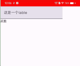
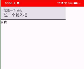
1.5 label 输入框的标签
val text = remember {
        mutableStateOf("")
    }
TextField(
           value = text.value,
           onValueChange = {text.value = it},
           modifier = Modifier.clickable {
              Log.i("text_compose","点击>>")
           },
           label = {Text(text = "这是一个lable")},

       )
效果
如果text有默认值
val text = remember {
        mutableStateOf("这一个输入框")
    }
效果
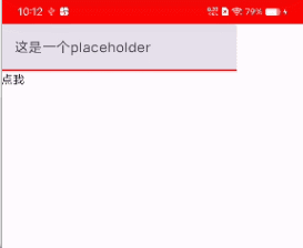
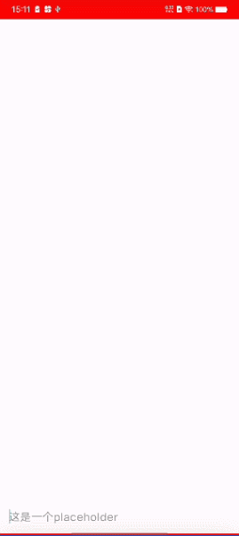
1.6 placeholder 占位内容 当文本框为空时显示
- val text = remember { mutableStateOf(“”) } //不设置默认值
- 删除lable
val text = remember {
          mutableStateOf("")
      }

      TextField(
          value = text.value,
          onValueChange = {text.value = it},
          modifier = Modifier.clickable {
             Log.i("text_compose","点击>>")
          },

          placeholder = {Text(text = "这是一个placeholder")},
      )
效果如下
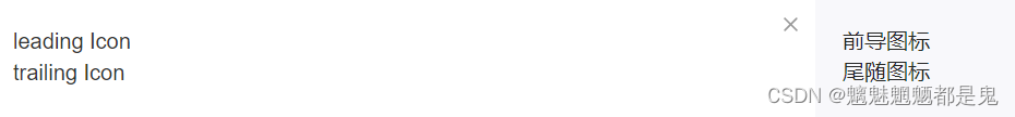
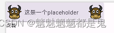
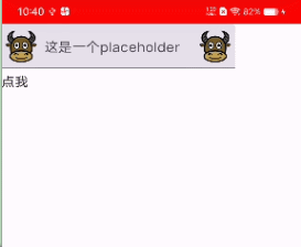
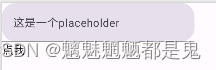
1.7 leadingIcon trailingIcon
 TextField(
           value = text.value,
           onValueChange = {text.value = it},
           modifier = Modifier.clickable {
              Log.i("text_compose","点击>>")
           },

           placeholder = {Text(text = "这是一个placeholder")},
           leadingIcon = {
               Image(painter = painterResource(id = R.drawable.ic_cattle), contentDescription = "")
           },
           trailingIcon = {
               Image(painter = painterResource(id = R.drawable.ic_cattle), contentDescription = "")
           },
       )
效果
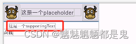
1.8 supportingText

 TextField(
           value = text.value,
           onValueChange = {text.value = it},
           modifier = Modifier.clickable {
              Log.i("text_compose","点击>>")
           },

           placeholder = {Text(text = "这是一个placeholder")},
           leadingIcon = {
               Image(painter = painterResource(id = R.drawable.ic_cattle), contentDescription = "")
           },
           trailingIcon = {
               Image(painter = painterResource(id = R.drawable.ic_cattle), contentDescription = "")
           },
           supportingText = {Text(text = "这是一个supportingText")},
       )
效果
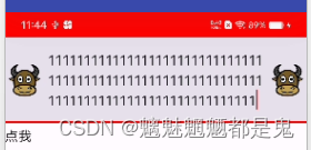
isError = true,
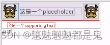
实现有错误时,文本框底部提醒功能
- 场景,列入 登录时的 账号不存在,或者密码错误
 val text = remember {
           mutableStateOf("")
       }

       val isError = remember {
           mutableStateOf(false)
       }

       TextField(
           value = text.value,
           onValueChange = {text.value = it},
           modifier = Modifier.clickable {
              Log.i("text_compose","点击>>")
           },

           placeholder = {Text(text = "这是一个placeholder")},
           leadingIcon = {
               Image(painter = painterResource(id = R.drawable.ic_cattle), contentDescription = "")
           },
           trailingIcon = {
               Image(painter = painterResource(id = R.drawable.ic_cattle), contentDescription = "")
           },
           supportingText = {
               AnimatedVisibility(visible = isError.value){
                   Text(text = "这是一个supportingText")
               }
            },
           isError = isError.value,
       )

       Text(text = "点我", modifier = Modifier.clickable {
           isError.value = !isError.value }, )
效果
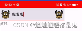
1.9 visualTransformation 把输入的文字转换成指定的字符

密码加密
visualTransformation = PasswordVisualTransformation()
效果
也可以指定字符
visualTransformation = PasswordVisualTransformation(mask = '啦')
效果就是输入的字符全变成啦
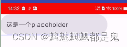
1.10 keyboardOptions 设置键盘类型 和 发送/确认/go按钮的文字

弹出密码键盘
keyboardOptions = KeyboardOptions(
               keyboardType = KeyboardType.Password
           )
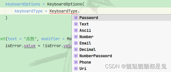
keyboardType = KeyboardType.Number
imeAction
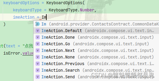
imeAction = ImeAction.Next
imeAction = ImeAction.Search 键盘按钮变成搜索
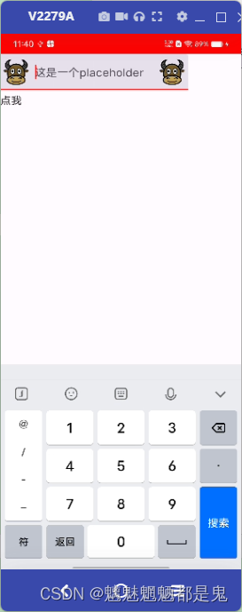
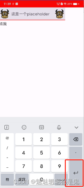
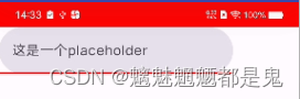
1.11 keyboardActions 触发键盘的按钮发送事件
TextField(
value = text.value,
modifier = Modifier.fillMaxWidth(),
onValueChange = {text.value = it},
placeholder = {Text(text = "这是一个placeholder")},
singleLine = true,
keyboardOptions = KeyboardOptions(imeAction = ImeAction.Next),
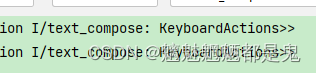
keyboardActions = KeyboardActions(
onAny = {
Log.i("text_compose","KeyboardActions>>")
}
),
colors = TextFieldDefaults.textFieldColors(
focusedIndicatorColor = Color.Red,
unfocusedIndicatorColor = Color.Blue,
containerColor = Color.Transparent,
textColor = TEXT_COLOR_333,
placeholderColor = TEXT_COLOR_999,
cursorColor = Color.Cyan
)
)
效果,日志
1.12 singleLine 是否一行
1.13 maxLines 最大行数 与singleLine 互斥
maxLines = 3, 最大三行
1.14 interactionSource 用于设置交互源,以便对输入框进行手势交互

1.15 shape输入框的形状
设置圆角矩形
shape = RoundedCornerShape(20.dp)
效果
1.16 colors 所有的颜色都通过此设置
例如 无焦点相关 获取到焦点相关 光标颜色 内容 文字 背景 等颜色

 TextField(
           value = text.value,
           onValueChange = {text.value = it},
           placeholder = {Text(text = "这是一个placeholder")},
           shape = CircleShape,
           colors = TextFieldDefaults.textFieldColors(
               focusedIndicatorColor = Color(0xFFFF0000),
               disabledIndicatorColor = Color(0xFF00FF00),
               unfocusedIndicatorColor = Color(0xFF0000FF),
           )
       )
未获取焦点时 底部横线颜色
获取焦点时底部横线颜色
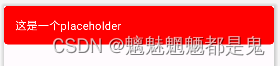
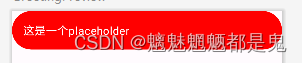
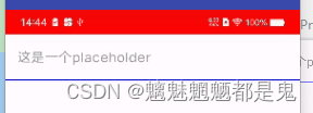
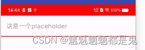
自定义输入框背景样式
1 圆角矩形
- 去除底部横线
 colors = TextFieldDefaults.textFieldColors(
               focusedIndicatorColor = Color.Transparent,
               disabledIndicatorColor = Color.Transparent,
               unfocusedIndicatorColor = Color.Transparent,
           )
TextField(
           value = text.value,
           modifier = Modifier.fillMaxWidth(),
           onValueChange = {text.value = it},
           placeholder = {Text(text = "这是一个placeholder")},
           shape = RoundedCornerShape(10),
           colors = TextFieldDefaults.textFieldColors(
               focusedIndicatorColor = Color.Transparent,
               disabledIndicatorColor = Color.Transparent,
               unfocusedIndicatorColor = Color.Transparent,
               containerColor = Color.Red,
               textColor = Color.White,
               placeholderColor = Color.White
           )
       )
效果:
2 椭圆
修改shape
shape = CircleShape,
3 下滑线
TextField(
           value = text.value,
           modifier = Modifier.fillMaxWidth(),
           onValueChange = {text.value = it},
           placeholder = {Text(text = "这是一个placeholder")},
           colors = TextFieldDefaults.textFieldColors(
               focusedIndicatorColor = Color.Red,
               unfocusedIndicatorColor = Color.Blue,
               containerColor = Color.Transparent,
               textColor = TEXT_COLOR_333,
               placeholderColor = TEXT_COLOR_999
           )
       )
效果
获取焦点后
4设置光标颜色 cursorColor = Color.Cyan
 colors = TextFieldDefaults.textFieldColors(
               focusedIndicatorColor = Color.Red,
               unfocusedIndicatorColor = Color.Blue,
               containerColor = Color.Transparent,
               textColor = TEXT_COLOR_333,
               placeholderColor = TEXT_COLOR_999,
               cursorColor = Color.Cyan
           )
输入变化监听
就使用
onValueChange = {text.value = it},
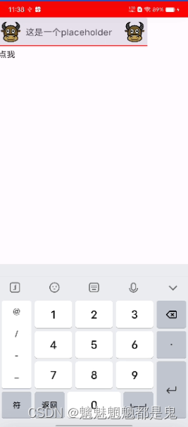
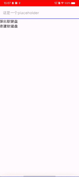
键盘弹出与隐藏
 val keyboardController = LocalSoftwareKeyboardController.current

 TextField(
           value = text.value,
           modifier = Modifier.fillMaxWidth(),
           onValueChange = {text.value = it},
           placeholder = {Text(text = "这是一个placeholder")},
           singleLine = true,
           keyboardOptions = KeyboardOptions(imeAction = ImeAction.Next),
           keyboardActions = KeyboardActions(
               onAny = {
                   Log.i("text_compose","KeyboardActions>>")
               }
           ),
           colors = TextFieldDefaults.textFieldColors(
               focusedIndicatorColor = Color.Red,
               unfocusedIndicatorColor = Color.Blue,
               containerColor = Color.Transparent,
               textColor = TEXT_COLOR_333,
               placeholderColor = TEXT_COLOR_999,
               cursorColor = Color.Cyan
           )
       )


       Text(
           text = "弹出软键盘",
           modifier = Modifier.clickable { keyboardController?.show() }
       )
       Text(
           text = "隐藏软键盘",
           modifier = Modifier.clickable { keyboardController?.hide() }
       )
弹出软键盘 需要在软键盘弹出一次,的情况下才有效果(也就是TextField获取到焦点之后),否则不会弹出
键盘弹出与隐藏监听 用到再瞅
聊天布局效果
 Column(modifier = Modifier) {


       Box(
           modifier = Modifier.weight(1f)
       ) {

       }

       val text = remember {
           mutableStateOf("")
       }
       TextField(
           value = text.value,
           modifier = Modifier.fillMaxWidth(),
           onValueChange = {text.value = it},
           placeholder = {Text(text = "这是一个placeholder")},
           singleLine = true,
           keyboardOptions = KeyboardOptions(imeAction = ImeAction.Next),
           keyboardActions = KeyboardActions(
               onAny = {
                   Log.i("text_compose","KeyboardActions>>")
               }
           ),
           colors = TextFieldDefaults.textFieldColors(
               focusedIndicatorColor = Color.Red,
               unfocusedIndicatorColor = Color.Blue,
               containerColor = Color.Transparent,
               textColor = TEXT_COLOR_333,
               placeholderColor = TEXT_COLOR_999,
               cursorColor = Color.Cyan
           )
       )
   }


 1414
1414


 被折叠的 条评论
为什么被折叠?
被折叠的 条评论
为什么被折叠?
 到【灌水乐园】发言


