


大屏自适应 自适应 echarts
能够跟着屏幕的视口变化而自适应变化
<div id="app" style="width: 1920px;height: 1080px;"></div>
// 防抖
function debounce(fn, delay) {
     let timer
     return function() {
         clearTimeout(timer)
         timer = setTimeout(() => {
             fn.apply(this, arguments)
         }, delay)
     }
 }

 const options = {
     width: 1920,
     height: 1080
 }

 const el = document.querySelector('#app')
 const {width, height} = options
 el.style.transformOrigin = 'top left'
 el.style.transition = 'transform 0.5s'
 function init() {
     const scaleX = innerWidth / width
     const scaleY = innerHeight / height
     const scale = Math.min(scaleX,scaleY)
     const left = (innerWidth - width * scale) / 2
     const top = (innerHeight - height * scale) / 2
     el.style.transform = `translate(${left}px, ${top}px) scale(${scale})`
 }
 init()
 addEventListener('resize', debounce(init, 200))
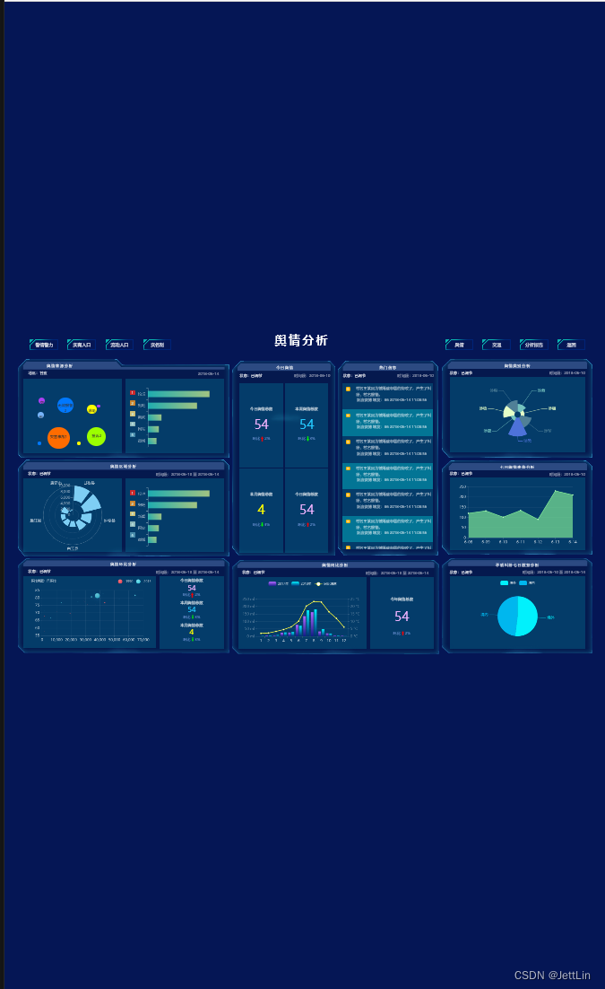
使用前效果

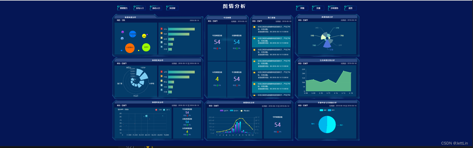
使用后果


 784
784

 被折叠的 条评论
为什么被折叠?
被折叠的 条评论
为什么被折叠?
 到【灌水乐园】发言


