


在我们遇到公祭日等日子的时候,某些网页可能会有变灰的需求。
主流网页如何变灰?
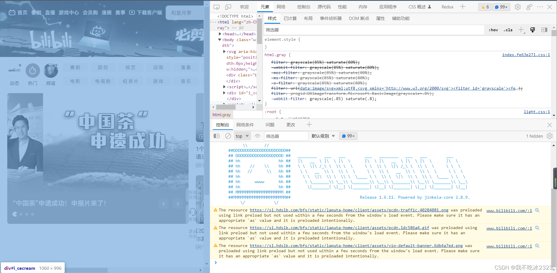
b站
淘宝
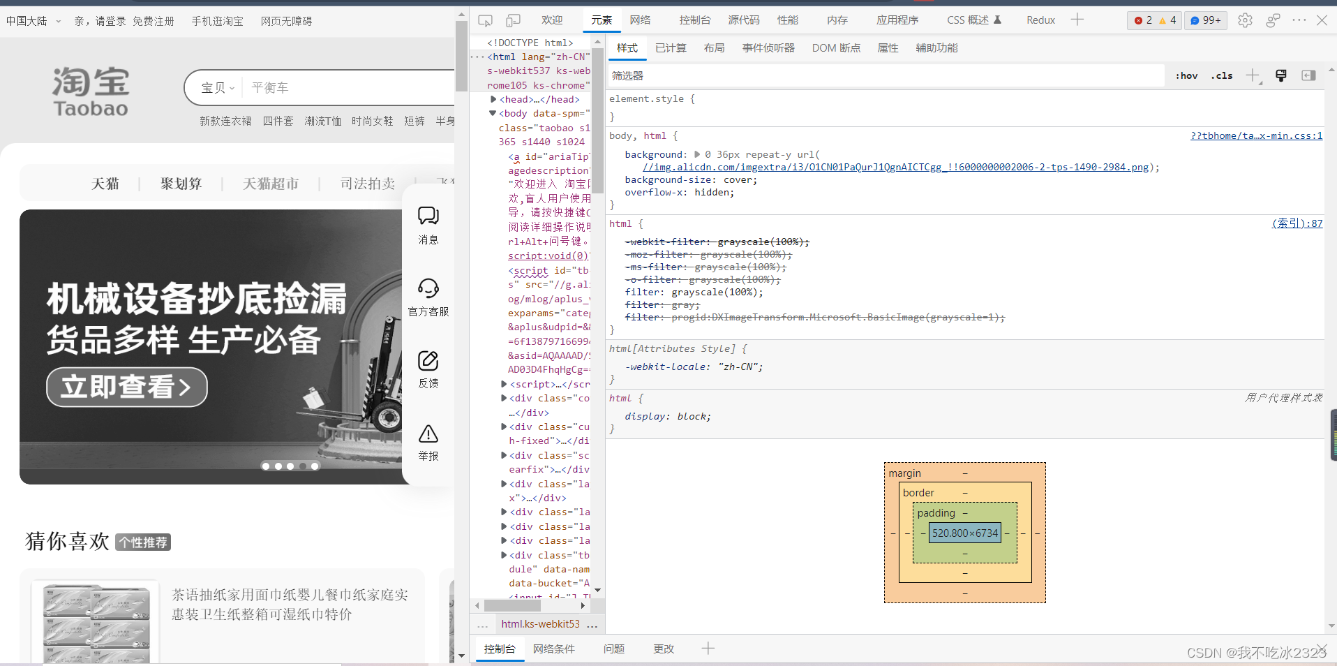
以上是哔哩哔哩与淘宝的变灰方式,它们都使用了CSS中的filter属性。以下是W3C对它的解释:
filter 属性定义元素(通常是 <img>)的视觉效果(如模糊和饱和度)。
比如:需求是把所有图片都改为黑白色:
<!DOCTYPE html>
<html>
<head>
<style>
	img {
  		filter: grayscale(100%);
	}
</style>
</head>
<body>

<h1>filter属性</h1>

<p>将图像转换为灰阶:</p>

<img src="picture.jpg" alt="Picture" width="300" height="300">

<p><b>注释:</b>Edge 12 或 Internet Explorer 不支持 filter 属性。</p>

</body>
</html>
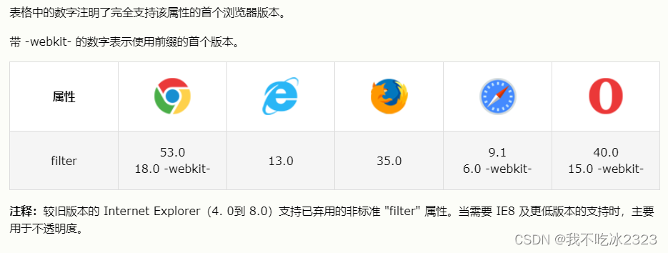
filter的默认值是none,不支持继承。浏览器支持如下:
当然,filter属性不止有变灰的作用,属性值改变还有其他作用:
- none:默认值。规定无效果。
- blur(px) :对图像应用模糊效果。较大的值将产生更多的模糊。如果为指定值,则使用 0。
- brightness(%):调整图像的亮度。0% 将使图像完全变黑。默认值是 100%,代表原始图像。值超过 100% 将提供更明亮的结果。
- contrast(%):调整图像的对比度。0% 将使图像完全变黑。默认值是 100%,代表原始图像。超过 100% 的值将提供更具对比度的结果。
- grayscale(%):将图像转换为灰阶。0% (0) 是默认值,代表原始图像。100% 将使图像完全变灰(用于黑白图像)。注释:不允许负值。
- opacity(%):设置图像的不透明度级别。opacity-level 描述了透明度级别,其中:0% 为完全透明。100% (1) 是默认值,代表原始图像(不透明)。注释:不允许负值。提示:这个滤镜类似 opacity 属性。
其他的请参考官网:CSS filter属性
最后对所有滤镜函数进行演示:
<!DOCTYPE html>
<html>
<head>
<style>
img {
  width: 33%;
  height: auto;
  float: left;
}
.blur {filter: blur(4px);}
.brightness {filter: brightness(0.30);}
.contrast {filter: contrast(180%);}
.grayscale {filter: grayscale(100%);}
.huerotate {filter: hue-rotate(180deg);}
.invert {filter: invert(100%);}
.opacity {filter: opacity(50%);}
.saturate {filter: saturate(7);}
.sepia {filter: sepia(100%);}
.shadow {filter: drop-shadow(8px 8px 10px green);}
</style>
</head>
<body>

<h1>filter 属性</h1>

<img src="/i/photo/tulip.jpg" alt="Tulip" width="300" height="300">
<img class="blur" src="/i/photo/tulip.jpg" alt="Tulip" width="300" height="300">
<img class="brightness" src="/i/photo/tulip.jpg" alt="Tulip" width="300" height="300">
<img class="contrast" src="/i/photo/tulip.jpg" alt="Tulip" width="300" height="300">
<img class="grayscale" src="/i/photo/tulip.jpg" alt="Tulip" width="300" height="300">
<img class="huerotate" src="/i/photo/tulip.jpg" alt="Tulip" width="300" height="300">
<img class="invert" src="/i/photo/tulip.jpg" alt="Tulip" width="300" height="300">
<img class="opacity" src="/i/photo/tulip.jpg" alt="Tulip" width="300" height="300">
<img class="saturate" src="/i/photo/tulip.jpg" alt="Tulip" width="300" height="300">
<img class="sepia" src="/i/photo/tulip.jpg" alt="Tulip" width="300" height="300">
<img class="shadow" src="/i/photo/tulip.jpg" alt="Tulip" width="300" height="300">

<p><b>注释:</b>Edge 12 或 Internet Explorer 不支持 filter 属性。</p>

</body>
</html>
感谢阅读!


 388
388


 被折叠的 条评论
为什么被折叠?
被折叠的 条评论
为什么被折叠?
 到【灌水乐园】发言


