


一、简介
顾名思义,本篇文章介绍使用Vue对描述性质的折线进行封装,用于更加鲜明的展示、描述某一元素、属性等。类似于echarts饼图中往外延申的描述折线。
本文章实现方式为:将描述折线封装成vue组件,在使用的地方引入使用。
二、效果预览
效果如下图所示(其中引用了四次该组件):

三、实现思路
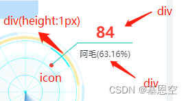
思路描述:如下图,该组件中包括一个icon(样式实现的)、一个高度为1px的div、一个无边框无背景的div(上)、一个有上边框的div(下)。通过旋转 + 定位来实现所需效果。
(1)其中,icon放置于容器正中心。
(2)高度为1px的div以icon位置为旋转原点,根据角度进行旋转(角度为该div与横向形成的夹角,如下图中角度为270°-360°之间)
(3)无边框无背景的div(上)则是根据高度为1px的div于x轴的夹角,使用直角三角形计算公式计算其定位的偏移量(定位的原点为icon),及计算出夹角的对边与临边的长度。
(4)一个有上边框的div(下)同样是根据高度为1px的div于x轴的夹角,使用直角三角形计算公式计算其定位的偏移量(定位的原点为icon),及计算出夹角的对边与临边的长度。此外,通过显示该div的上边框来实现描述线效果。
(5)需要注意的是,往不同方向偏移时,需要额外加上或减去无边框无背景的div(上)、有上边框的div(下) 的宽高。(往右边定位时,需要注意加减高度;往左边定位时,需要注意加减宽度)
四、具体实现
实现代码如下:
<template>
    <div class="fold-line" :style="itemStyle.foldLineStyle">
        <div class="fold-line-content">
            <div class="center-icon" :style="itemStyle.iconStyle"></div>
            <div class="line1" :style="itemStyle.line1Style"></div>
            <div class="text1" :style="itemStyle.text1Style">{{ data.num }}</div>
            <div class="text2" :style="itemStyle.text2Style">{{ data.level}}{{'(' + data.rate + ')'}}</div>
        </div>
    </div>
</template>

<script>
    export default {
        props:{
            // 配置项
            config:{
                type:Object,
                default:()=>{
                    return {
                        // 圆点颜色
                        iconColor:'#FFBA00',
                        // 圆点的大小
                        iconSize:6,
                        // 线1与x轴的角度
                        deg:30,
                        // 线1的长度 px
                        line1Width:50,
                        // 线2的长度
                        line2Width:50,
                         // 线1的颜色
                        line1Color:'#03C4C4',
                        // 线2的颜色
                        line2Color:'#03C4C4',
                        // 文字1的颜色
                        text1Color:"#353C46",
                        // 文字2的颜色
                        text2Color:'#FFBA00'
                    }
                }
            },
            // 数据项: 数量、项目名、占比
            data:{
                type:Object,
                default:()=>{
                	//默认数据
                    return {
                        num:84,
                        level:'阿毛',
                        rate:"63.16%",
                    }
                }
            }
        },
        data() {
            return {
                // 样式对象
                itemStyle:{
                    foldLineStyle:{
                        width:"150px",
                        height:"150px"
                    },
                    iconStyle:{},
                    line1Style:{},
                    text1Style:{},
                    text2Style:{},
                },
                // 沿横轴偏移量
                x:43,
                // 沿竖轴偏移量
                y:25
            }
        },
        created(){
            this.initConfig();
            this.getPositionByRotate(this.config);
            this.initStyle(this.config);
        },
        methods:{
            // 根据角度计算  线2的偏移量x、y
            getPositionByRotate(config){
                let deg = config?.deg || 0;
                let length = config?.length || 50;
                let x = 0;
                let y = 0;
                // 判断角度正负
                if (deg > 0) {
                    // 当角度在0至90度时,及右下角
                    if (Math.ceil(deg/90) % 4 == 1 && ((deg / 90) % 4 != 1)) {
                        let rea_deg = deg - (Math.floor(Math.ceil(deg/90)/4) - 1)*360;
                        x = this.getLength(rea_deg,length,'临边');
                        y = this.getLength(rea_deg,length,'对边');
                    }
                    // 当角度在90至180度时,及左下角
                    else if (Math.ceil(deg/90) % 4 == 2 && ((deg / 90) % 4 != 2)) {
                        let rea_deg = 90 - (deg - (Math.floor(Math.ceil(deg/90)/4) - 1)*360 - 90);
                        x = 0 - this.getLength(rea_deg,length,'临边')- config.line2Width;
                        y = this.getLength(rea_deg,length,'对边');
                    }
                    // 当角度在180至270度时,及左上角
                    else if (Math.ceil(deg/90) % 4 == 3 && ((deg / 90) % 4 != 3)) {
                        let rea_deg = deg - (Math.floor(Math.ceil(deg/90)/4) - 1)*360 - 180 ;
                        x = 0 - this.getLength(rea_deg,length,'临边') - config.line2Width;
                        y = 0 - this.getLength(rea_deg,length,'对边');
                    }
                    // 当角度在180至270度时,及右上角
                    else if (Math.ceil(deg/90) % 4 == 0 && ((deg / 90) % 4 != 0)) {
                        let rea_deg = 90 - (deg - (Math.floor(Math.ceil(deg/90)/4) - 1)*360 - 270 );
                        x = this.getLength(rea_deg,length,'临边');
                        y = 0 - this.getLength(rea_deg,length,'对边');
                    }
                }else{
                    x = 0;
                    y = 0;
                }
                this.x = x.toFixed(2);
                this.y = y.toFixed(2);
            },
            //已知直角三角形的斜角度数和斜边长度,求邻边和对边的长度
            getLength(rotate,length,flag) {
                //获得弧度
                var radian = ((2 * Math.PI) / 360) * rotate;
                if (flag == '对边') {
                    return Math.sin(radian) * length;
                }else{
                    return Math.cos(radian) * length;
                }
            },
            // 初始化基本配置项(若组件有传参,则取值,否则设置默认值)
            initConfig(){
                this.$set(this.config,'iconColor',this.config?.iconColor ? this.config.iconColor : '#2c2b2b');
                this.$set(this.config,'iconSize',this.config?.iconColor ? this.config.iconColor : 6);
                this.$set(this.config,'deg',this.config?.deg ? this.config.deg : 0);
                this.$set(this.config,'line1Width',(this.config?.line1Width && !isNaN(Number(this.config.line1Width))) ? this.config.line1Width : 50);
                this.$set(this.config,'line2Width',(this.config?.line2Width && !isNaN(Number(this.config.line2Width))) ? this.config.line2Width : 50);
            },
            // 根据配置项对样式进行计算,初始化
            initStyle(config){
                this.$set(this.itemStyle,'foldLineStyle',{
                    // width:(config.line1Width + config.line2Width)*2 + 'px',
                    // height:(config.line1Width + config.line2Width)*2 + 'px'
                    width:"150px",
                    height:"150px"
                });
                this.$set(this.itemStyle,'iconStyle',{
                    backgroundColor:config.iconColor,
                    width:config.iconSize + "px",
                    height:config.iconSize + "px",
                    marginLeft:"-" + config.iconSize/2 + "px",
                    marginTop:"-" + config.iconSize/2 + "px"
                });
                this.$set(this.itemStyle,'line1Style',{
                    width:config.line1Width + "px",
                    transform:"rotate("+ config.deg +"deg)",
                    backgroundColor:config?.line1Color || '#BDDFFF'
                });
                this.$set(this.itemStyle,'text1Style',{
                    width:config.line2Width + "px",
                    marginLeft:this.x + "px",
                    marginTop:this.y - 30 + "px",
                    color:config?.text1Color || '#353C46'
                });
                this.$set(this.itemStyle,'text2Style',{
                    width:config.line2Width + "px",
                    marginLeft:this.x + "px",
                    marginTop:this.y + "px",
                    color:config.text2Color || '#FF3B30',
                    borderTop:"1px solid " + config?.line2Color || '#BDDFFF'
                });
            }
        }
    }
</script>

<style scoped lang="scss">
    .fold-line{
        width: 100%;
        height: 100%;
        .fold-line-content{
            width: 100%;
            height: 100%;
            position: relative;
            .center-icon{
                width: 6px;
                height: 6px;
                position: absolute;
                border-radius: 50%;
                background-color: #2c2b2b;
                top: 50%;
                left: 50%;
                margin-top: -3px;
                margin-left: -3px;
            }
            .line1{
                width: 50px;
                height: 1px;
                background-color: rgb(3, 196, 196);
                position: absolute;
                left: 50%;
                top: 50%;
                margin-top: -0.5px;
                transform: rotate(30deg);
                transform-origin: left center;
            }
            .text1{
                width: 50px;
                height: 30px;
                line-height: 30px;
                text-align: center;
                position: absolute;
                font-size: 22px;
                color: #353C46;
                font-weight: 600;
                left: 50%;
                top: 50%;
                margin-left: 43px;
                margin-top: 25px;
            }
            .text2{
                width: 50px;
                height: 30px;
                line-height: 30px;
                font-size: 12px;
                text-align: center;
                position: absolute;
                border-top:1px solid blue;
                left: 50%;
                top: 50%;
                margin-left: 43px;
                margin-top: 25px;
            }
        }
    }
</style>
五、使用说明
下面以第二大点效果图中的阿毛项为例(及右上角),展示如何使用。
第一步:在使用的地方引入组件,并使用。(路径根据自己存放路径)
import FoldLine from "@/components/foldLine.vue";
components:{
  FoldLine
}
<FoldLine class="critical" :config="rightTop" :data="criticalData"></FoldLine>
第二步:给组件传参,其中有配置项config和数据项:data两个参数。
rightTop:{
  // 圆点颜色
  iconColor:'#FF3B30',
  // 圆点的大小
  iconSize:6,
  // 线1与x轴的角度
  deg:320,
  // 线1的长度 px
  line1Width:50,
  // 线2的长度
  line2Width:80,
  // 线1的颜色
  line1Color:'#03C4C4',
  // 线2的颜色
  line2Color:'#03C4C4',
  // 文字1的颜色
  text1Color:"#FF3B30",
  // 文字2的颜色
  text2Color:'#353C46'
}
criticalData:{
  num:84,
  level:'阿毛',
  rate:'63.16%'
}
第三步:将该组件的父级元素设置成position:relative,且本身设置position:absolute以及定位位置。(根据自己存放的父级元素对应)
.content{
  position: relative;
 }
.critical{
  position: absolute;
  top: 30px;
  left: 170px;
 }
六、结束语
本文章所述组件的封装还是较为简陋,并不灵活,主要用于参考实现思路。其中还是存在比较多的瑕疵,使用起来并不方便,若需要更好地实现功能还需自行加以改善。


 2386
2386


 被折叠的 条评论
为什么被折叠?
被折叠的 条评论
为什么被折叠?
 到【灌水乐园】发言


