


1、平面转换-平移

取值
- 像素单位数值
- 百分比(参照盒子自身尺寸计算结果)
- 正负均可
技巧
- translate()只写一个值,表示沿着X轴移动
- 单独设置X或Y轴移动距离:translateX()或translateY()

<!DOCTYPE html>
<html lang="en">
<head>
    <meta charset="UTF-8">
    <meta name="viewport" content="width=device-width, initial-scale=1.0">
    <title>Document</title>
    <style>
        .father {
            width: 500px;
            height: 300px;
            margin: 100px auto;
            border: 1px solid #000;
        }

        .son {
            width: 200px;
            height: 100px;
            background-color: pink;
            transition: all 0.5s;
        }

        /* 鼠标移入到父盒子,son改变位置 */
        .father:hover .son {
            transform: translate(200px, 100px);

            /* 取值是百分比:参照盒子自身尺寸计算结果 */
            transform: translate(50%, 100%);
            transform: translate(-50%, 100%);

            /* 只写一个数表示水平方向 */
            transform: translate(100%);

            transform: translateY(100%);
            transform: translateX(100%);
        }
    </style>
</head>
<body>
    <div class="father">
        <div class="son"></div>
    </div>
</body>
</html>
2、平移实现居中效果
方法一:
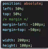
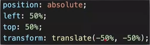
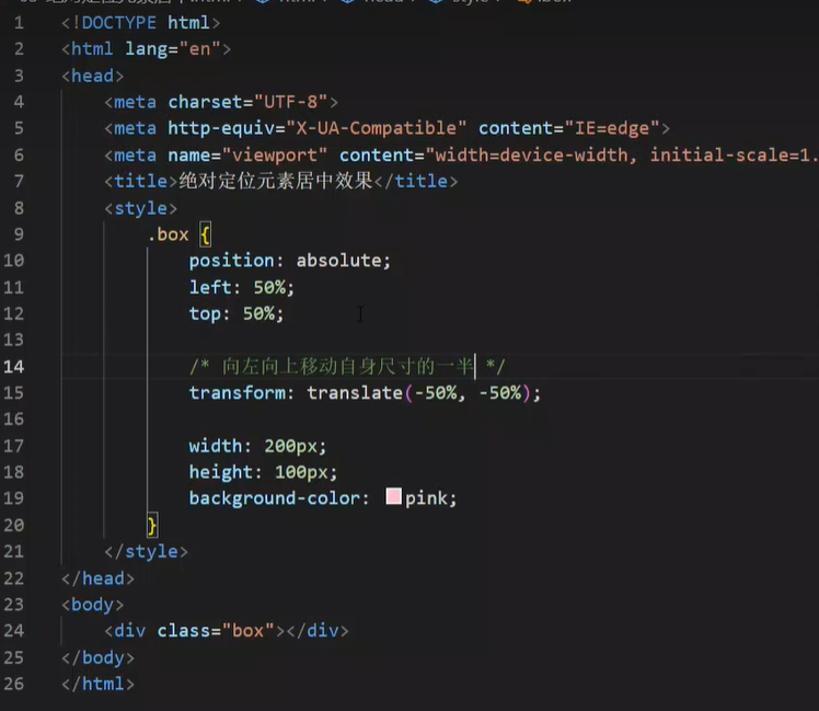
方法二:百分比参照盒子自身尺寸计算结果
3、案例 双开门效果
<!DOCTYPE html>
<html lang="en">
<head>
    <meta charset="UTF-8">
    <meta name="viewport" content="width=device-width, initial-scale=1.0">
    <title>Document</title>
    <style>
        * {
            margin: 0;
            padding: 0;
        }

        /* 1. 布局:父子结构,父级是大图,子级是左右小图*/
        .father {
            display: flex;
            margin: 0 auto;
            width: 1300px;
            height: 600px;
            background-image: url(../photo/1.jpg);

            overflow: hidden;
        }

        .father .left,
        .father .right {
            width: 50%;
            height: 600px;
            background-image: url(../photo/2.jpg);

            transition: all .5s;
        }

        .father .right {
            /* right 表示的取到精灵图右面的图片 */
            background-position: right 0;
        }
       /* 2. 鼠标悬停的效果:左右移动 */
       .father:hover .left {
            transform: translate(-100%);
       }

       .father:hover .right {
        transform: translate(100%);
       }
    </style>
</head>
<body>
    <div class="father">
        <div class="left"></div>
        <div class="right"></div>
    </div>
</body>
</html>


 512
512


 被折叠的 条评论
为什么被折叠?
被折叠的 条评论
为什么被折叠?
 到【灌水乐园】发言


