


空间转换
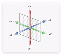
空间:是从坐标轴角度定义的X、Y和Z三条坐标轴构成了一个立体空间,Z轴位置与视线方向相同。
空间转换也叫3D转换
属性:transform
1、空间转换-平移
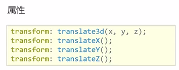
取值(正负均可)
- 像素单位数值
- 百分比(参照盒子自身尺寸计算结果)
<!DOCTYPE html>
<html lang="en">
<head>
<meta charset="UTF-8">
<title>空间平移</title>
<style>
.box {
width: 200px;
height: 200px;
margin: 100px auto;
background-color: pink;
transition: all 0.5s;
}
.box:hover {
/* 电脑是平面,默认无法观察 Z 轴平移效果 */
/* transform: translate3d(100px, 200px, 300px); */
/* 3d 小括号里面必须逗号隔开三个数 */
/* transform: translate3d(100px, 200px); */
transform: translateX(100px);
transform: translateY(-100%);
transform: translateZ(300px);
}
</style>
</head>
<body>
<div class="box"></div>
</body>
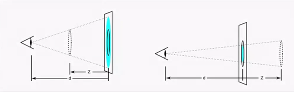
</html>2、空间转换-视距 perspective
作用:指定了观察者与Z=0平面的距离,为元素添加透视效果
透视效果:近大远小、近实远虚
<!DOCTYPE html>
<html lang="en">

<head>
  <meta charset="UTF-8">
  <title>透视效果</title>
  <style>
    /* 视距属性必须添加给 直接父级 */
    .father {
      perspective: 1000px;
      /* perspective: 10000px;
      perspective: 100px; */
    }

    .son {
      width: 200px;
      height: 200px;
      margin: 100px auto;
      background-color: pink;
      transition: all 0.5s;
    }

    .son:hover{
      transform: translateZ(-300px);
      transform: translateZ(300px);
    }
  </style>
</head>

<body>
  <div class="father">
    <div class="son"></div>
  </div>
</body>

</html>
3、空间-旋转
3.1 transform:rotateZ(值)
<!DOCTYPE html>
<html lang="en">
  <head>
    <meta charset="UTF-8" />
    <meta http-equiv="X-UA-Compatible" content="IE=edge" />
    <meta name="viewport" content="width=device-width, initial-scale=1.0" />
    <title>空间旋转-Z轴</title>
    <style>
      .box {
        width: 300px;
        margin: 100px auto;
      }

      img {
        width: 300px;
        transition: all 2s;
      }

      .box img:hover {
        transform: rotateZ(360deg);
      }
    </style>
  </head>
  <body>
    <div class="box">
      <img src="./images/hero.jpeg" alt="" />
    </div>
  </body>
</html>
3.2 transform rotateX(值)
<!DOCTYPE html>
<html lang="en">
  <head>
    <meta charset="UTF-8" />
    <meta http-equiv="X-UA-Compatible" content="IE=edge" />
    <meta name="viewport" content="width=device-width, initial-scale=1.0" />
    <title>空间旋转-X轴</title>
    <style>
      .box {
        width: 300px;
        margin: 100px auto;
      }

      img {
        width: 300px;
        transition: all 2s;
      }

      .box {
        /* 透视效果:近大远小,近实远虚 */
        perspective: 1000px;
      }

      .box img:hover {
        transform: rotateX(60deg);
        transform: rotateX(-60deg);
      }
    </style>
  </head>
  <body>
    <div class="box">
      <img src="./images/hero.jpeg" alt="" />
    </div>
  </body>
</html>
3.3 transform:rotateY(值)
<!DOCTYPE html>
<html lang="en">
  <head>
    <meta charset="UTF-8" />
    <meta http-equiv="X-UA-Compatible" content="IE=edge" />
    <meta name="viewport" content="width=device-width, initial-scale=1.0" />
    <title>空间旋转-Y轴</title>
    <style>
      .box {
        width: 300px;
        margin: 100px auto;
      }

      img {
        width: 300px;
        transition: all 2s;
      }

      .box {
        /* 透视效果:近大远小,近实远虚 */
        perspective: 1000px;
      }

      .box img:hover {
        transform: rotateY(60deg);
        transform: rotateY(-60deg);
      }
    </style>
  </head>
  <body>
    <div class="box">
      <img src="./images/hero.jpeg" alt="" />
    </div>
  </body>
</html>
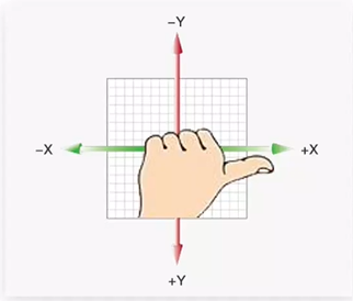
4、空间-旋转
左手法则-根据旋转方向确定取值正负
左手握住旋转轴,拇指指向正值方向,其他四个手指弯曲方向为旋转正值方向
拓展
- rotate3d(x,y,z,角度度数):用来设置自定义旋转轴的位置及旋转的角度
- x,y,z取值为0-1之间的数字
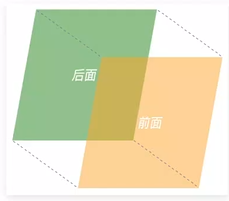
5、立体呈现-transform-style
作用:设置元素的子元素是位于3D空间中还是平面中
属性名:transform-style
呈现立体图形步骤:
- 父元素添加transform-style:preserve-3d;
- 子级定位
- 调整子盒子的位置(位移或旋转)
<!DOCTYPE html>
<html lang="en">
  <head>
    <meta charset="UTF-8" />
    <meta http-equiv="X-UA-Compatible" content="IE=edge" />
    <meta name="viewport" content="width=device-width, initial-scale=1.0" />
    <title>立体呈现</title>
    <style>
      .cube {
        position: relative;
        width: 200px;
        height: 200px;
        margin: 100px auto;
        /* background-color: pink; */
        transition: all 2s;

        transform-style: preserve-3d;

        /* 旋转与案例效果无关,用来看前后移动的效果 */
        /* transform: rotateY(89deg); */
      }

      .cube div {
        position: absolute;
        left: 0;
        top: 0;
        width: 200px;
        height: 200px;
      }

      .front {
        background-color: orange;
        transform: translateZ(100px);
      }

      .back {
        background-color: green;
        transform: translateZ(-100px);
      }

      .cube:hover {
        transform: rotateY(90deg);
      }
    </style>
  </head>
  <body>
    <div class="cube">
      <div class="front">前面</div>
      <div class="back">后面</div>
    </div>
  </body>
</html>
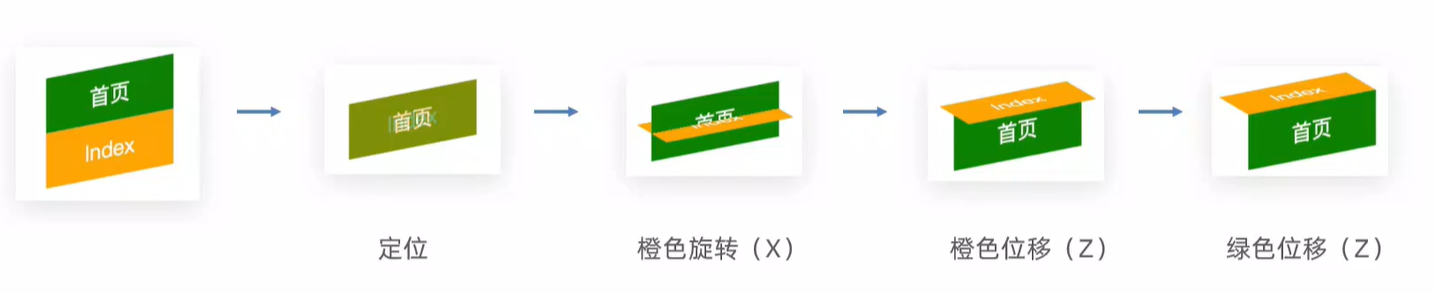
6、案例-3D导航
1.搭建立方体
- 绿色是立方体的前面
- 橙色是立方体的上面

2.添加鼠标悬停的旋转效果
<!DOCTYPE html>
<html lang="en">
  <head>
    <meta charset="UTF-8" />
    <meta name="viewport" content="width=device-width, initial-scale=1.0" />
    <title>3D导航</title>
    <style>
      ul {
        margin: 0;
        padding: 0;
        list-style: none;
      }

      .nav {
        width: 300px;
        height: 40px;
        margin: 50px auto;
      }

      .nav ul {
        display: flex;
      }

      .nav li {
        position: relative;
        width: 100px;
        height: 40px;
        line-height: 40px;
        transition: all 0.5s;

        transform-style: preserve-3d;

        /* 为了看到橙色和绿色的移动过程,给立方体添加旋转 */
        /* transform: rotateX(-20deg) rotateY(30deg); */
      }

      .nav li a {
        position: absolute;
        left: 0;
        top: 0;
        display: block;
        width: 100%;
        height: 100%;
        text-align: center;
        text-decoration: none;
        color: #fff;
      }

      /* 立方体每个面都有独立的坐标轴,互不影响 */
      .nav li a:first-child {
        background-color: green;
        transform: translateZ(20px);
      }

      .nav li a:last-child {
        background-color: orange;
        transform: rotateX(90deg) translateZ(20px);
      }

      .nav li:hover {
        transform: rotateX(-90deg);
      }
    </style>
  </head>

  <body>
    <div class="nav">
      <ul>
        <li>
          <a href="#">首页</a>
          <a href="#">Index</a>
        </li>
        <li>
          <a href="#">登录</a>
          <a href="#">Login</a>
        </li>
        <li>
          <a href="#">注册</a>
          <a href="#">Register</a>
        </li>
      </ul>
    </div>
  </body>
</html>
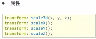
7、空间转换-缩放
<!DOCTYPE html>
<html lang="en">
  <head>
    <meta charset="UTF-8" />
    <meta name="viewport" content="width=device-width, initial-scale=1.0" />
    <title>空间缩放</title>
    <style>
      ul {
        margin: 0;
        padding: 0;
        list-style: none;
      }

      .nav {
        width: 300px;
        height: 40px;
        margin: 50px auto;
      }

      .nav li {
        position: relative;
        float: left;
        width: 100px;
        height: 40px;
        line-height: 40px;
        transition: all 0.5s;
        transform-style: preserve-3d;

        transform: scaleX(0.5);
        transform: scaleY(2);
        transform: scaleZ(3);

        transform: scale3d(0.5, 2, 3);
      }

      .nav li a {
        position: absolute;
        left: 0;
        top: 0;
        width: 100%;
        height: 100%;
        text-align: center;
        text-decoration: none;
        color: #fff;
      }

      .nav li a:first-child {
        background-color: green;
        transform: translateZ(20px);
      }

      .nav li a:last-child {
        background-color: orange;
        transform: rotateX(90deg) translateZ(20px);
      }

      .nav li:hover {
        transform: rotateX(-90deg);
      }
    </style>
  </head>

  <body>
    <div class="nav">
      <ul>
        <li>
          <a href="#">首页</a>
          <a href="#">Index</a>
        </li>
        <li>
          <a href="#">登录</a>
          <a href="#">Login</a>
        </li>
        <li>
          <a href="#">注册</a>
          <a href="#">Register</a>
        </li>
      </ul>
    </div>
  </body>
</html>


 3332
3332


 被折叠的 条评论
为什么被折叠?
被折叠的 条评论
为什么被折叠?
 到【灌水乐园】发言


