


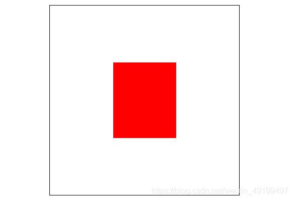
效果如下
body部分如下:
<body>
    <div id="parent">
        <div id="son"></div>
    </div>
</body>
1.定位+偏移(需要知道子盒子的宽高)
#parent{
            width: 300px; height: 300px; background: white;
            border: 1px black solid;
            position: relative; margin: auto;
        }
        #son{
            width: 100px; height: 120px; background: red;
            position: absolute; top: 50%; left: 50%;
            margin-top: -60px; margin-left: -50px;
        }
2.定位+transform(不需要知道子盒子的宽高)
 #parent{
            width: 300px; height: 300px; background : white;
            border: 1px black solid;
            position: relative; margin: auto;
        }
        #son{
            width: 100px; height: 120px; background: red;
            position: absolute; top: 50%; left: 50%;
            transform: translate(-50%,-50%);
        }
3.绝对定位+margin:auto
#parent{
            width: 300px; height: 300px; background : white;
            border: 1px black solid; margin: auto;
            display:flex;
        }
        #son{
            width: 100px; height: 120px; background: red;
            top:0; bottom:0; left:0; right:0;
            margin: auto;
        }
4.设置父盒子为flex容器
#parent{
            width: 300px; height: 300px; background : white;
            border: 1px black solid; margin: auto;
            display:flex;
            align-items:center;
        }
        #son{
            width: 100px; height: 120px; background: red;
            margin: auto;
        }


 1425
1425


 被折叠的 条评论
为什么被折叠?
被折叠的 条评论
为什么被折叠?
 到【灌水乐园】发言


