


目录
动画(animation)是css3中具有颠覆性的特征之一,可通过设置多个节点来精确控制一个或一组动画,常用来实现复杂的动画效果。
相比较过渡,动画可以实现更多变化,更多控制,连续自动播放等效果。
1.1动画的基本使用
1.先定义动画
2.再使用(调用)动画
1.用keyframes定义动画(类似定义类选择器)
        @keyframes move {
            0% {
                transform: translateX(0px);
            }
            100% {
                transform: translateX(1000px);
            }
        }
2.调用动画
 <style>
        /* 我们想页面一打开,一个盒子就从左边走到右边 */
        /* 1.定义动画 */
        @keyframes move {
            0% {
                transform: translateX(0px);
            }
            100% {
                transform: translateX(1000px);
            }
        }
        div {
            width: 200px;
            height: 200px;
            background-color: yellow;
            /* 2.调用动画 */
            animation-name: move;
            /* 3.持续时间 */
            animation-duration: 2s;
        }
    </style>
<body>
<div></div>
</body>动画序列
-
0%是动画的开始,100%是动画的完成,这样的规则就是动画序列。
-
在@keyframes中规定某项CSS样式,就能创建由当前样式逐渐改为新样式的动画效果。
-
动画是使元素从一种样式逐渐变化为另一种样式的效果,您可以改变任意多的样式任意多的次数。
-
请用百分比来规定变化发生的时间,或用关键词“from”和“to”,等同于0%和100%。
<style>
        /* from和to等价于0%到100% */
        /* @keyframes move {
            from {
                transform: translate(0,0);
            }
            to {
                transform: translate(1000px,0);
            }
        } */
        /* 1.可以做多个状态变化 keyframes 关键帧 */
        /* 2.里面的百分比得是整数 */
        /* 3.里面的百分比就是总的时间的划分 此案例为12s */
        @keyframes move {
            0% {
                transform: translate(0,0);
            }
            25% {
                transform: translate(1000px,0);
            }
            50% {
                transform: translate(1000px,500px);
            }
            75% {
                transform: translate(0,500px);
            }
            100% {
                transform: translate(0,0);
            }
        }
        div {
            width: 100px;
            height: 100px;
            background-color: yellow;
            /* animation-name: move;
            animation-duration: 3s; */
            animation-name: move;
            animation-duration: 12s;
        }
    </style>
<body>
<div></div>
</body>实现效果:
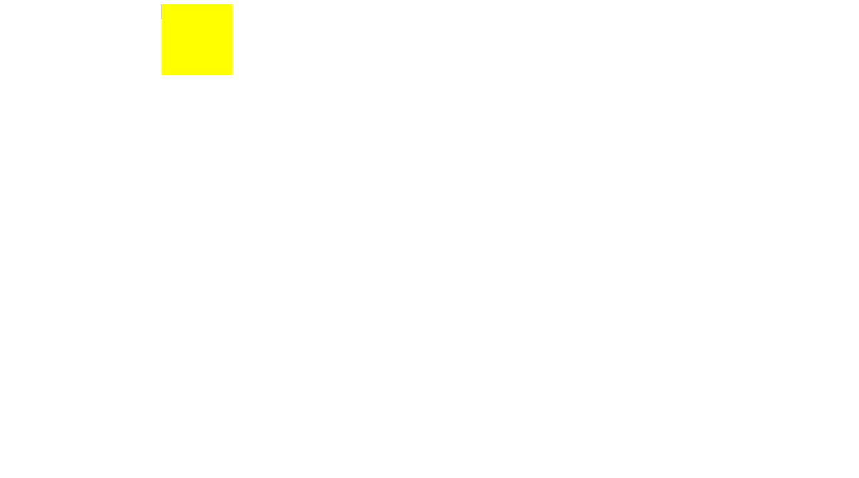
2.1动画常见属性

 <style>
      /* @keyframes规定动画 */
      @keyframes move {
        0% {
          transform: translate(0, 0);
        }
        100% {
          transform: translate(1000px, 0);
        }
      }
      div {
        width: 100px;
        height: 100px;
        background-color: yellowgreen;
        /* 动画名称 必须的 */
        animation-name: move;
        /* 完成一个周期所花费的时间 持续时间  必须的 默认为0*/
        animation-duration: 10s;
        /* 规定动画运动曲线 默认ease */
        animation-timing-function: ease;
        /* 何时开始 默认0 */
        animation-delay: 1s;
        /* 规定动画被播放次数 默认1 iteration 重复 还有infinite 无限的 */
        /* animation-iteration-count: infinite; */
        /* 是否反方向播放 alternate 轮流的 默认的是normal*/
        /* animation-direction:  alternate; */
        /* 动画结束后的状态 默认是 backwards 回到起始状态 */
        /* 我们可以让它停留在结束状态 forwards */
        animation-fill-mode: forwards;
      }
      div:hover {
        /* 鼠标经过 让div 停止动画  鼠标离开就继续动画  默认是running  paused 暂停*/
        animation-play-state: paused;
      }
    </style>
<body>
<div></div>
</body>2.2动画简写属性
animation:动画·名称 持续时间 运动曲线 何时开始 播放次数 是否反方向 动画起始或者结束的状态;
animation: name duration timing-function delay iteration-count direction fill-mode;name和duration是一定要写的,其余属性有默认值,不需要的情况下可以不写
-
简写属性里面不包含 animation-play-state
-
暂停动画:animation-play-state:paused;经常和鼠标经过等其他配合使用
-
想要动画走回来,而不是直接跳回来:animation-dircetion:alternate
-
盒子动画结束后,停留在结束位置:animation-fill-mode:forwards
<style>
      @keyframes move {
        0% {
          transform: translate(0, 0);
        }
        100% {
          transform: translate(1000px, 0);
        }
      }
      div {
        height: 100px;
        width: 100px;
        background-color: yellow;
        /* animation: name duration timing-function delay iteration-count direction fill-mode; */
        animation: move 2s ease 1s infinite alternate forwards;
      }
      div:hover {
        /* 简写属性里面不包含 animation-play-state
        暂停动画:animation-play-state:paused;经常和鼠标经过等其他配合使用
        想要动画走回来,而不是直接跳回来:animation-dircetion:alternate
        盒子动画结束后,停留在结束位置:animation-fill-mode:forwards */
        animation-play-state: paused;
      }
    </style>
<body>
<div></div>
</body>3.1大数据热点图案例
 <style>
      body {
        background-color: #000;
      }
      .map {
        position: relative;
        width: 747px;
        height: 616px;
        background: url(../images/map.png) no-repeat;
        margin: 0 auto;
      }
      .city {
        position: absolute;
        top: 227px;
        right: 193px;
        color: white;
      }
      .city2 {
        position: absolute;
        top: 499px;
        right: 83px;
        color: white;
      }
      .city3 {
        position: absolute;
        /* 有top有bottom会优先执行top值 */
        top: 543px;
        right: 193px;
        color: white;
      }
      .dotted {
        width: 8px;
        height: 8px;
        border-radius: 50%;
        background-color: #09f;
      }
      div[class^="pluse"] {
        /* 保证我们小波纹在父盒子里面水平垂直居中 放大之后就会中心向四周发散 */
        position: absolute;
        /* 使用left:0;top:0;的写法在3个同心圆相等的情况下效果是一致的,但是加上动画效果后圆的大小变化,中心点也会随之变化 */
        /* 左上边框是固定的,所以动画变大时,图像只能向右下方变化,圆心也是如此 */
        top: 50%;
        left: 50%;
        transform: translate(-50%, -50%);
        width: 8px;
        height: 8px;
        box-shadow: 0 0 12px #009dfd;
        border-radius: 50%;
        animation: pluse 1.5s linear infinite;
      }
      .map div.pluse2 {
        animation-delay: 0.4s;
      }
      .pluse3 {
        animation-delay: 0.8s !important;
      }
      @keyframes pluse {
        0% {
        }
        70% {
          /* transform: scale(5);  不要使用scale,他除了放大本身大小外还会放大阴影 */
          width: 40px;
          height: 40px;
          opacity: 1;
        }
        100% {
          width: 70px;
          height: 70px;
          opacity: 0;
        }
      }
    </style>
<body>
<div class="map">
<div class="city">
<div class="dotted"></div>
<div class="pluse1"></div>
<div class="pluse2"></div>
<div class="pluse3"></div>
</div>
<div class="city2">
<div class="dotted"></div>
<div class="pluse1"></div>
<div class="pluse2"></div>
<div class="pluse3"></div>
</div>
<div class="city3">
<div class="dotted"></div>
<div class="pluse1"></div>
<div class="pluse2"></div>
<div class="pluse3"></div>
</div>
</div>
</body>实现效果:
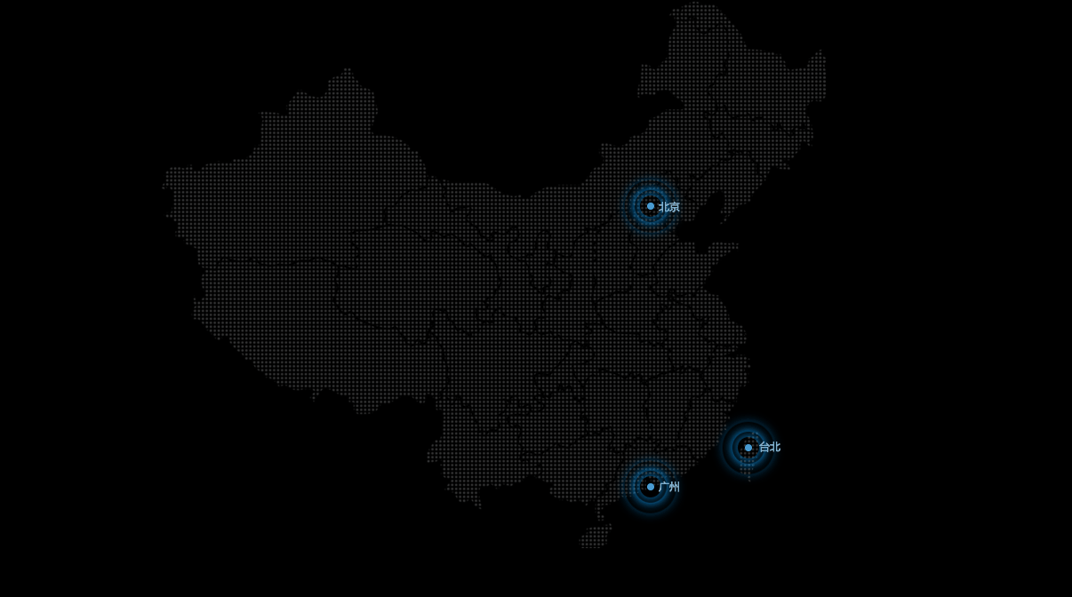
制作思路: 先插入背景图片,接着将大盒子city绝对定位到北京的旁边,再给里面的4个盒子添加样式,dotted添加点样式,添加完后盒子大小变化,位置有所偏移,通过浏览器的调试功能调到合适位置。之后给后面的三个pluse添加定位,通过定位50%,translate(-50%,-50%)的方法,在dotted中做到水平垂直居中,因为是百分比缩放自身,后续动画改变大小是仍可做到水平垂直居中。随后再给pluse添加阴影以及动画动画,再给后两个盒子分别设置延迟注意权重(animation-delay改变延时时间也可以改变实现效果)就可以实现该效果了(定义动画时可以改变动画的段数,以及所占百分比,所实现的效果会不同,可以自行尝试)。
4.1速度曲线-steps步长

<style>
      @keyframes s {
        0% {
          width: 0;
        }
        100% {
          width: 180px;
        }
      }
      div {
        width: 0;
        height: 30px;
        margin: 0 auto;
        font-size: 20px;
        background-color: yellow;
        border-radius: 10px;
        /* steps 就是分几步来完成我们的动画 有了steps就不要再写ease和linear了 */
        animation: s 2s steps(9) forwards;
        white-space: nowrap;
        overflow: hidden;
      }
    </style>
<body>
<div>键盘敲烂,月入过万</div>
</body>实现效果:
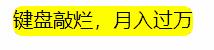
white-space:nowrap 强制文字一行显示,不会影响后面的布局。不使用该函数,文字会因为盒子宽度为0,全部纵向排列,影响后面布局。
overflow:hidden 强制一行显示后隐藏盒子外的字,这样随着动画宽度的改变以及steps一段一段的播放方式,字体会一个个进入盒子显示。
总结: steps 就是分几步来完成我们的动画 有了steps就不要再写ease和linear了,steps的播放方式是一段一段的,可以用来制作类似连环画的效果。
5.1奔跑的小熊案例
    <style>
      body {
        margin: 0;
        padding: 0;
      }
      div {
        position: absolute;
        top: 430px;
        width: 200px;
        height: 100px;
        background: url(../images/bear.png) no-repeat;
        overflow: hidden;
        z-index: 3;
        /* 元素可以添加多个动画,用逗号分隔 */
        animation: bear 1s steps(8) infinite, move 5s linear forwards;
      }
      section {
        position: relative;
        width: 100%;
        height: 569px;
      }
      .one {
        position: absolute;
        top: 0;
        left: 0;
        height: 569px;
        width: 100%;
        z-index: 2;
        background: url(../images/bg1.png) no-repeat bottom left;
        animation: san 30s linear infinite;
      }
      .two {
        position: absolute;
        top: 0;
        left: 0;
        height: 569px;
        width: 100%;
        background: url(../images/bg2.png) left;
        animation: san 60s linear infinite;
      }
      @keyframes san {
        0% {
          background-position: bottom left;
        }
        100% {
          background-position: bottom right;
        }
      }
      @keyframes bear {
        0% {
          background-position: 0 0;
        }
        100% {
          background-position: -1600px 0;
        }
      }
      @keyframes move {
        0% {
          left: 0;
        }
        100% {
          left: 50%;
          transform: translate(-50%);
        }
      }
    </style>
<body>
<section>
<span class="one"></span>
<p class="two"></p>
</section>
<div></div>
</body>实现效果:
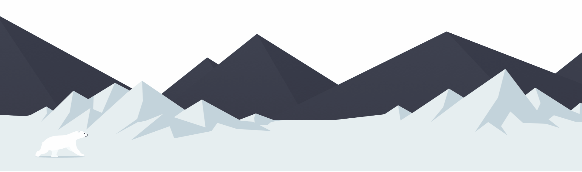
由于图片5MB的限制,只能发这样的图片了
通过steps来实现小熊自身的动画,然后通过动画translat实现小熊从左侧到屏幕正中的效果。
两个背景插入到一个盒子里,通过定位,以及背景图片的position做到背景层叠(要将.one的z-index调高),然后分别给两个背景插入动画,做到一慢一快
最后给小熊加定位,放到合适位置。
问题:span盒子和section盒子一样大小,但p盒子会多出上下16px的margin值。
解决:span为行内元素没有上下外边距,而p盒子为块元素会出现上下margin值,全改为span可以解决该情况,或者自定p上下margin为0。
但p盒子为什么会出现margin值仍不清楚,希望能有大佬来为我解答一下。


 332
332


 被折叠的 条评论
为什么被折叠?
被折叠的 条评论
为什么被折叠?
 到【灌水乐园】发言


