


1.npm下载Echarts并引入项目(Echarts官网Apache ECharts)
2.项目中新建myechart.js
import React, { Component } from 'react';
import * as echarts from 'echarts';
import { renderBarCharts } from '../utils';


class MyEcharts extends Component {

    componentDidMount() {
        // 基于准备好的dom,初始化echarts实例
        const MyEcharts = echarts.init(document.getElementById("charts"));
        // console.log(MyEcharts);

        // 绘制图表
        MyEcharts.setOption(renderBarCharts('小马的echarts柱状图'))

    }

    render() {
        return (
            <div>
                <div id='charts' style={{ height: 700 }}>

                </div>
            </div>
        )
    }

}

export default MyEcharts;
3.表格数据
export function renderBarCharts(title) {
return {
// 图表背景颜色
// backgroundColor: '#ccc',
title: {
text: title,
left: "center",
textStyle: {
color: 'pink',
fontSize: 24,
}
},
tooltip: {
trigger: 'axis'
},
legend: {
data: ['Rainfall', 'Evaporation'],
textStyle: {
color: 'black',
},
orient: 'vertical',
left: 'center',
bottom:'bottom',
},
toolbox: {
show: true,
feature: {
dataView: { show: true, readOnly: false },
magicType: { show: true, type: ['line', 'bar'] },
restore: { show: true },
saveAsImage: { show: true }
}
},
calculable: true,
xAxis: [
{
name: '月份',
nameTextStyle: {
padding: [20, 0, 0, 0], // 四个数字分别为上右下左与原位置距离
color:'green',
fontSize: 18,
},
type: 'category',
// prettier-ignore
data: ['1月', '2月', '3月', '4月', '5月', '6月', '7月', '8月', '9月', '10月', '11月', '12月'],
axisLabel: {
margin: 20,
interval: 0,
rotate: 20,
textStyle: {
//改变x轴上文字的颜色
color: "green",
fontSize: 18,
}
}
}
],
yAxis: [
{
name:'降雨量',
nameTextStyle: {
padding: [20, 0, 0, 0], // 四个数字分别为上右下左与原位置距离
color:'red',
fontSize: 18,
},
type: 'value',
axisLabel: {
textStyle: {
//改变y轴上文字的颜色
color: "red",
fontSize: 18,
}
},
axisLine: {
show: true,//是否显示轴线
lineStyle: {
color: 'black',//刻度线的颜色
}
}
}
],
series: [
{
name: 'Rainfall',
type: 'bar',
data: [
2.0, 4.9, 7.0, 23.2, 25.6, 76.7, 135.6, 162.2, 32.6, 20.0, 6.4, 3.3
],
itemStyle: {
normal: {
color: 'pink'
},
},
markPoint: {
data: [
{ type: 'max', name: 'Max' },
{ type: 'min', name: 'Min' }
]
},
markLine: {
data: [{ type: 'average', name: 'Avg' }]
}
},
{
name: 'Evaporation',
type: 'bar',
data: [
2.6, 5.9, 9.0, 26.4, 28.7, 70.7, 175.6, 182.2, 48.7, 18.8, 6.0, 2.3
],
markPoint: {
data: [
{ name: 'Max', value: 182.2, xAxis: 7, yAxis: 183 },
{ name: 'Min', value: 2.3, xAxis: 11, yAxis: 3 }
],
label: {
offset: [0, 0],
textStyle: {
color: "red",
fontSize: 12,
},
},
},
markLine: {
data: [{ type: 'average', name: 'Avg' }],
label: {
offset: [0, 0],
textStyle: {
color: "red",
fontSize: 12,
},
},
}
}
]
}
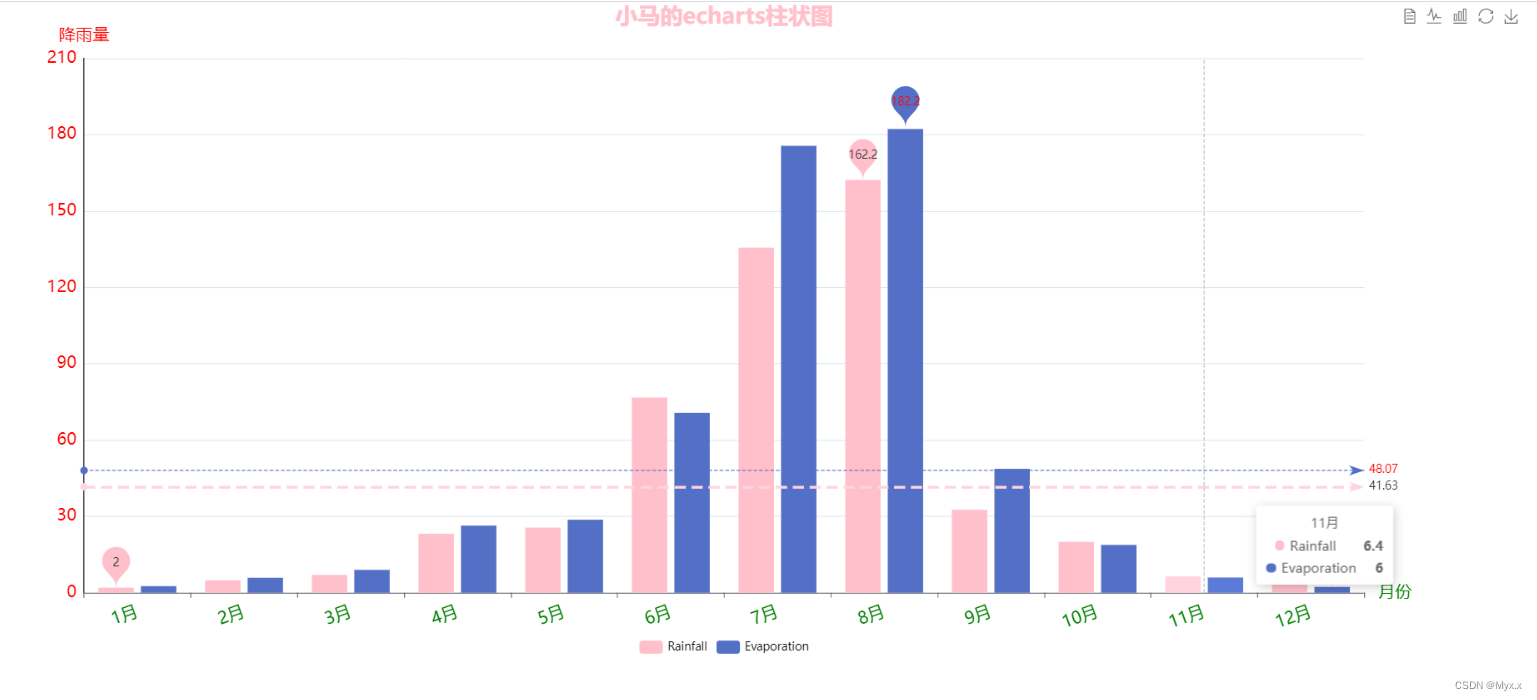
}运行图:


 5169
5169


 被折叠的 条评论
为什么被折叠?
被折叠的 条评论
为什么被折叠?
 到【灌水乐园】发言


