


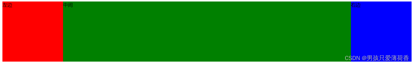
圣杯布局和双飞翼的特点:
1,两边定宽,中间100%
2,中间部分优先渲染,提升用户体验
3,圣杯布局缺点:当中间区域宽度小于两边时,布局会破碎
双飞翼布局不会破碎
圣杯布局:
wrapper(div中 div左 div右)
1、wrapper >div,float:left
2、wrapper设置左右padding
3、div左, margin-left:-100%;relative
4、div右, margin-left:-200px;relative
<!DOCTYPE html>
<html>
	<head>
		<meta charset="utf-8">
		<title></title>
		<style>
			.f1,
			.fr {
				width: 200px;
				height: 200px;
			}

			/*2,负外边距+相对定位 移动到空白区域*/
			.f1 {
				background-color: red;
				/*负外边距*/
				margin-left: -100%;
				/*相对定位*/
				position: relative;
				left: -200px;
			}

			.fr {
				background-color: blue;
				margin-left: -200px;
				position: relative;
				left: 200px;
			}

			.center {
				width: 100%;
				height: 200px;
				background-color: green;
			}

			.wrapper div {
				float: left;
			}

			/*1,设置padding给左右预留空间*/
			.wrapper {
				padding-left: 200px;
				padding-right: 200px;
			}

			body {
				/*防止布局破碎*/
				min-width: 600px;
			}
		</style>
	</head>
	<body>
		<div class="wrapper">
			<div class="center">中间</div>
			<div class="f1">左边</div>
			<div class="fr">右边</div>
		</div>
	</body>
</html>
 双飞翼:
双飞翼:
wrapper(div中(div.contain) div左 div右)
1、wrapper >div,float:left
2、div.contain设置左右margin
3、div左, margin-left:-100%
4、div右, margin-left:-200px
<!DOCTYPE html>
<html>
	<head>
		<meta charset="utf-8">
		<title></title>
		<style>
			.f1,.fr{
				width: 200px;
				height: 200px;
			}
			/*2,通过负外边距移动位置*/
			.f1{
				background-color: red;
				margin-left: -100%;
			}
			.fr{
				background-color: blue;
				margin-left: -200px;
			}
			.center{
				width: 100%;
				height: 200px;
				background-color: green;
			}
			/*1,通过contain左右margin预留空间*/
			.conter .contain{
				height: 200px;
				margin-left: 200px;
				margin-right: 200px;
			}
			.wrapper>div{
				float: left;
			}
		</style>
	</head>
	<body>
		<div class="wrapper">
			<div class="center">
				<div class="contain"></div>
			</div>
			<div class="f1"></div>
			<div class="fr"></div>
		</div>
	</body>
</html>


 1960
1960


 被折叠的 条评论
为什么被折叠?
被折叠的 条评论
为什么被折叠?
 到【灌水乐园】发言


