


Tips:这个只是作者的学习笔记,仅作参考
目录
前面的章节都是以pc端为基准进行学习,那么移动手机端与pc端的区别又在哪里?我们对pc端进行编写又该注意些什么?
我们先在谷歌浏览器中打开一个手机页面(以京东为例)

首先我们先注意到第一个圈起来的地方:m.jd.com 与pc端不同的是,移动端的网页往往会做出区分,比pc端多出一个m.,意味着mobile(移动的).
第二个圈起来的地方则是右方蓝色的两个长方形叠起来,意思是开发者模式转变成手机模式.
一.DPR
第三个圈起来的就是DPR.
DPR=2意味着什么?设备像素比
目的是为了知道设计图与真实浏览器解析之间的换算比例,方便数据书写
是默认缩放为100%的情况下,设备像素和css像素的比值.
DPR=设备像素(物理像素)/CSS像素(某一方向上)
1.设备像素:设备屏幕的物理像素,任何设备的物理像素的数量都是固定的
2.CSS像素:又称为逻辑像素,视为web开发者创造的,在CSS和javascript中使用的一个抽象的层.
Tips:我们通过CSS和javascript代码设置的像素都是逻辑像素
很复杂,简单说就是dpr=2就相当于两个像素当一个像素用,如果在dpr=2的设计稿中测量的长度为90px,答案实际书写时应该写45px.也就是说 实际数据=测量数据/dpr
反之,如果设备的像素为750px,css像素为375px时,dpr则为2.
常见设备分辨率
| 手机型号 | 物理分辨率 | 逻辑分辨率 | 比例关系 |
| iphone6/7/8 | 750*1334 | 375*667 | 2:1 |
二.视口
使用目的:使用meta标签设置视口宽度,制作适配不同设备宽度的网页
视口设置是为了让写成的页面效果,根据不同的设备变化时都按照1:1还原显示
布局视口(layout viewport)
移动端CSS布局的依据视口,即CSS布局会根据布局视口来计算
在移动端,视口和浏览器窗口将不在关联,实际上,布局视口要比浏览器窗口大得多.
视觉视口(visual viewport)
视觉视口是用户当前看到的区域,用户可以通过缩放操作视觉视口,同时不会影响布局视口.
理想视口 (ideal viewport)
移动设备默认的viewport是布局视口(layout viewport),但在进行移动设备网站的开发时,我们需要的是理想视口(ideal viewport).那么怎么才能得到ideal viewport呢?
<meta charset="UTF-8">
    <!-- 视觉视口 缺点-用户可以任意缩放 -->
    <!-- width=device-width - 苹果设备不兼容 -->
    <!-- initial-scale=1.0 - IE不兼容 -->
    <meta name="viewport" content="width=device-width,initial-scale=1.0 ">

    <!-- 理想视口 - 优点:既有视觉视口的优点还不可以缩放 -->
    <!-- 平时练习不常用,写项目时用 -->
    <!-- maximum - 最大缩放比例 -->
    <!-- minimum - 最小缩放比例 -->
    <!-- user-scalable=no - 禁止用户缩放 -->
    <meta name="viewport" content="width=device-width,initial-scale=1.0,
    minimum-scale=1,maximum-scale=1,user-scalable=no ">
三.meta设置解析
maximum-scale=1.0 定义最大放大比例
minimum-scale=1.0 定义最小缩小比例
user-scalable=no 定义是否允许用户手动缩放页面,默认为yes
Tips:viewport标签值对移动端浏览器有效,对PC端浏览器是无效的
单独设置initial-scale或width都会有兼容性问题(横竖屏不分),所以设置布局视口为理想视口的最佳方法是同时设置这两个属性.
及时设置了user-scalable = no,在Android Chrome浏览器中也可以强制启用手动缩放.
四.百分比布局
百分比布局:流式布局
效果:宽度自适应,高度固定
例如下:
<!DOCTYPE html>
<html lang="en">
<head>
    <meta charset="UTF-8">
    <meta name="viewport" content="width=device-width, initial-scale=1.0">
    <title>Document</title>
    <style>
        *{padding: 0;
        margin: 0;}
        ul{
            list-style: none;
            background-color: pink;
            height: 55px;
            position: absolute;
            /* 定位后会脱离标准流失去独占一行特性,所以要设置宽度 */
            width: 100%;
            bottom: 0;
            left: 0;
        }
        li{
            width: 20%;
            float: left;
            height: 100%;
            text-align: center;
        }
        a{
            height: 100%;
            float: left;
            width: 100%;
        }
        img{
            height: 100%;
        }

    </style>
</head>
<body>
    <!--
        px布局 - %百分比布局(高度固定,宽度自适应) - 浮动布局 - 定位布局 - flex布局

     -->
     <ul>
        <li><a href="#"><img src="./images/car.png" alt=""></a></li>
        <li><a href="#"><img src="./images/classify.png" alt=""></a></li>
        <li><a href="#"><img src="./images/index.png" alt=""></a></li>
        <li><a href="#"><img src="./images/jd.png" alt=""></a></li>
        <li><a href="#"><img src="./images/login.png" alt=""></a></li>
     </ul>
</body>
</html>
效果如下:

五.长度单位
网页效果:根据屏幕宽度不同,网页元素尺寸不同(等比缩放)
与px单位的区别在哪?
px单位是绝对单位,百分比布局特点式宽度自适应高度固定
适配方案:
rem
vw/vh
vmin/vmax
(一).rem
特点:1. 相对单位
2. 是相对于HTML标签的字号计算结果
3. 1rem = 1HTML字号大小
这玩意要怎么设置使用呢?
三个方法
1.媒体查询
媒体查询能检测视口宽度,然后编写差异化的CSS样式,
当某个条件成立,执行相应的样式
移动适配:将字体大小设为视口宽度的10%,这样可以更好地实现等比缩放效果
例如下:
 /* 1.不同的窗口,html标签字号不同,字号是视口宽度的1/10  */
        /* ipone 5/se 屏幕大小 */
        @media(width:320px){
            html{
                font-size: 32px;
            }
        }

        /* ipone 6/7/8 屏幕大小 */
        @media(width:375px){
            html{
                font-size: 37.5;
            }
        }

        /* ipone 12pro 屏幕尺寸 */

        @media (width:390px){
            html{
                font-size: 39px;
            }
        }
        /* ipone xr 屏幕尺寸 */
        @media (width:414px){
            html{
                font-size: 41.4px;
            }
        }

        /* 2.设定盒子大小 */
        .box{
            width: 2rem;
            height: 2rem;
            background-color: aquamarine
            ;
        }
    </style>
2.JS文件导入(flexible.js)
使用flexible js配合rem在不同宽度的设备中实现等比缩放效果.
Tips:因为视口有很多的,所以媒体查询局限性太大.
flexible.js是手淘开发出来的一个专门用来适配移动端的js框架,核心原理就是根据不同视口宽度给网页中html根节点设置不同font-size.
所以只需要直接导入插件即可.直接写rem单位即可.
<head>
    <meta charset="UTF-8">
    <meta name="viewport" content="width=device-width, initial-scale=1.0">
    <title>Document</title>
    <style>
        /*
            量取的宽度/DPR/当前视口的宽度的10%
        */
        /* 例如:ipone 6/7/8 */
        /* ps量取宽度为680px,则rem=680/2/37.5=680/75 */

        *{
            padding: 0;
            margin: 0;
        }

        div{

            width: 1rem;
            height: 1rem;
            background-color: pink;
        }
    </style>
</head>
<body>
    <div></div>
</body>
<script src="../../js/flexible.js"></script>
</html>
3.使用插件px to rem
我们得先理清楚,正常一个rem的计算步骤
假设我们量取了一个宽68px,那么它等于?rem (dpr=2)
1rem=375px/10(视口宽度的10%)=37.5px
68px=68px/37.5px/2(DPR=2)=68px/75px=0.90666...rem
这样计算就很麻烦
我们在插件商城搜索px to rem即可找到

点击设置键-拓展设置

点开后看到Root Font Size,里面填的数也就是量取的值要除以的数,所以这里我们就填75(DPR*视口宽度的10%)
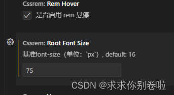
我们再回到代码,此时我们只要输入任意px都会出现计算后的rem供我们使用(回车即可)

(二).vw/vh
vw/vh有什么特殊?
他们能根据相对视口计算结果
vw:viewport width (根据视口宽度)
1vw = 1/100视口宽度
vh:viewport height (根据视口高度)
1vh = 1/100视口高度
vw适配原理(vh同理,只不过宽改高)
作用:实现在不同宽度的设备中,网页元素尺寸等比缩放效果
vw单位尺寸
1.确定设计稿对应的vw尺寸(1/100视口宽度)
> 查看设计稿宽度 ->确定参考设备宽度(视口宽度)->确定vw尺寸(1/100视口宽度)
2.vw单位的尺寸 = px单位数值/(1/100视口宽度)
Tips:vw和vh不会混用,全面屏视口高度尺寸大,如果混用可能导致盒子变形
但是这玩意怎么用?
假设我量取了一个长方形,长50px,宽30px.视口宽度375px,dpr=2
所以1vw=3.75px 量取的值均除以2(DPR)
那么它的长 25px=6.66666666667vw (量取的值/1vw的长度)
它的宽则为 15px= 4vw (与长同理)
同样的,它也有相对应的插件可以使用
插件px to vw
长这样

同样拓展设置:
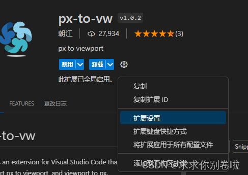
具体看设计稿,设计稿宽度375就写375,设计稿750那就750
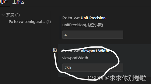
设置好后输入量好的值就会自动弹出供选择

案例练习-购物车
变下代码以实现以下效果:(商品图片随便截一个就行)

HTML代码部分
<!DOCTYPE html>
<html lang="en">
<head>
    <meta charset="UTF-8">
    <meta name="viewport" content="width=device-width, initial-scale=1.0">
    <link rel="stylesheet" href="./font/iconfont.css">
    <link rel="stylesheet" href="./购物车.css">
    <title>天猫购物车</title>
</head>
<body>
    <!--
        设计稿 ipone6/7/8
        量取宽度750px css宽度375 dpr=2 鸡舍1rem = 120px 1rem=120px 1vw=3.75px
        1rem = 32vw
        在设计稿上量取的宽度为100px
        用的单位为rem
        1rem=120px 100px=?rem
        量取的值100px/dpr(2)/120px = 100px/240px
        修改插件font-size240
     -->

     <header class="iconfont icon-fangxiang-xiangzuo">
        购物车
    </header>

     <section>
        <div>
            <h1>
                <span>
                    <input type="checkbox">
                <b class="iconfont icon-tianmao icon-fangxiang-xiangyou">木之林旗舰店</b>
                </span>
                <u>
                    <a href="#">领券</a>
                    <a href="#">编辑</a>
                </u>
            </h1>
            <ul>
                <li>
                    <input type="checkbox">
                    <img src="./购物车图片/images/tm.png" alt="">
                    <div>
                        <p>
                            充电式暖手宝女暖宝宝电暖宝两用可爱男防爆小冬季成人随身电热宝
                        </p>
                        <span class="iconfont icon-iconfonttianmaowuyougou"></span>
                        <em>
                            小恶魔【5600大容量长时续航两年质保只换不修】
                        </em>
                        <strong>
                            <ins>139</ins>
                            <s>
                                <button class="iconfont icon-jian"></button>
                                <del>1</del>
                                <button class="iconfont icon-jia"></button>
                            </s>
                        </strong>
                    </div>

                </li>
            </ul>
        </div>
        <div>
            <h1>
                <span>
                    <input type="checkbox">
                <b class="iconfont icon-tianmao icon-fangxiang-xiangyou">木之林旗舰店</b>
                </span>
                <u>
                    <a href="#">领券</a>
                    <a href="#">编辑</a>
                </u>
            </h1>
            <ul>
                <li>
                    <input type="checkbox">
                    <img src="./购物车图片/images/tm.png" alt="">
                    <div>
                        <p>
                            充电式暖手宝女暖宝宝电暖宝两用可爱男防爆小冬季成人随身电热宝
                        </p>
                        <span class="iconfont icon-iconfonttianmaowuyougou"></span>
                        <em>
                            小恶魔【5600大容量长时续航两年质保只换不修】
                        </em>
                        <strong>
                            <ins>139</ins>
                            <s>
                                <button class="iconfont icon-jian"></button>
                                <del>1</del>
                                <button class="iconfont icon-jia"></button>
                            </s>
                        </strong>
                    </div>

                </li>
            </ul>
        </div>
        <div>
            <h1>
                <span>
                    <input type="checkbox">
                <b class="iconfont icon-tianmao icon-fangxiang-xiangyou">木之林旗舰店</b>
                </span>
                <u>
                    <a href="#">领券</a>
                    <a href="#">编辑</a>
                </u>
            </h1>
            <ul>
                <li>
                    <input type="checkbox">
                    <img src="./购物车图片/images/tm.png" alt="">
                    <div>
                        <p>
                            充电式暖手宝女暖宝宝电暖宝两用可爱男防爆小冬季成人随身电热宝
                        </p>
                        <span class="iconfont icon-iconfonttianmaowuyougou"></span>
                        <em>
                            小恶魔【5600大容量长时续航两年质保只换不修】
                        </em>
                        <strong>
                            <ins>139</ins>
                            <s>
                                <button class="iconfont icon-jian"></button>
                                <del>1</del>
                                <button class="iconfont icon-jia"></button>
                            </s>
                        </strong>
                    </div>

                </li>
            </ul>
        </div>


    </section>

     <footer>
        <label>
            <input type="checkbox">
            全选
        </label>
        <span>
            合计:
            <b>¥0.<i>00</i></b>
            <button>结算(0)</button>
        </span>
    </footer>

</body>

</html>
CSS部分代码:
html{
    font-size: 32vw;
}
*{
    padding: 0;
    margin: 0;
}
html,body{
    width: 100%;
    height: 100%;
}
a,u,ins,i,s,del{
    text-decoration: none;
}
/* 设置初始字号大小 */
body{
    font-size: 0.1rem;
    display: flex;
    flex-direction: column;
    background-color: #eeeeee;
}
header{
    height: .358333rem;
    background-color: white;
    text-align: center;
    line-height: .358333rem;
    font-size: .125rem;
    color: #666666;
    position: relative;
}
header::before{
    position: absolute;
    left: .0958rem;
    top: 0;
}
section{
    /* background-color: aquamarine; */
    flex: 1;
}
section>div{
    margin-top: .125rem;
}
section>div>h1{
    font-weight: normal;
    height: .3083rem;
    /* background-color: white; */
    display: flex;
    justify-content: space-between;
    align-items: center;


}
section>div>h1 b{
    font-size: .125rem;
    font-weight: normal;

}
section>div>h1>span{
    display: flex;
    align-items: center;
}

input[type="checkbox"]{
    margin:0 .1rem ;
    width: .1667rem;
    height: .1667rem;
    appearance: none;
    border: .0042rem solid grey;
    border-radius: 50%;
    position: relative;
    background-color: white;
}

input[type="checkbox"]:checked::before{
    content: '';
    width: .125rem;
    height: .125rem;
    background-color: tomato;
    position: absolute;
    border-radius: 50%;
    left: 50%;
    top: 50%;
    transform: translate(-50%,-50%);
}
section>div>h1 b::before{
    margin-right: .091667rem;

}
section>div>h1 b::after{
    margin-right: .091667rem;
}
section>div>h1 u{
    display: flex;
}
section>div>h1 a{
    font-size: .091667rem;
    padding: 0 .108333rem;
    color: #051b28;
}
section>div>h1 a:nth-of-type(1){
    border-right: .004167rem solid #f3f3f3;
}

section>div{
    margin-top: .125rem;
    background-color: white;
}
section>div>ul>li{
    /* height: .9208rem; */
    display: flex;
    background-color: #fff;
    padding-bottom: .1667rem;
}
section li>img{
    width: .8042rem;
    height: .8042rem;
    margin-right: .1rem;
}
section li>div{
    width: 1.775rem;
    display: flex;
    flex-direction: column;
}
section li>input{
    align-self: center;
}
section li>div>p{
    font-size: .1rem;
    line-height: .15rem;
}
section li>div .icon-iconfonttianmaowuyougou{
    font-size: .1458rem;
    color: #ff0036;
    margin: .0417rem 0;
}
section li>div>em{
    background-color: #f5f5f5;
    font-style: normal;
    font-size: .0833rem;
    color: #999999;
    line-height: .1458rem;
    margin-bottom: .1167rem;
}
section li>div>strong{
    font-weight: normal;
    display: flex;
    justify-content: space-between;
    align-items: center;
}
section li>div>strong>ins{
    color: #ff6600;
    font-size: .108333rem;
    /* font-style: normal; */
}
section li>div>strong>ins::before{
    content: '¥';
    font-size: .083333rem;
}
section li>div>strong button{
    width: .0917rem;
    height: .0917rem;
    text-align: center;
    font-size: .075rem;
    line-height: .091667rem;
    border: 0;
    background-color: transparent;
}
section li>div>strong>s{
    font-size: .0917rem;
    display: flex;
    align-items: center;
}
section li>div>strong del{
    margin: 0 .1125rem;
}
footer{
    background-color: white;
    height: .458333rem;
    display: flex;
    justify-content: space-between;
    align-items: center;
}
/* footer input{
    margin:0 .1rem;
    width: .1667rem;
    height: .1667rem;
    appearance: none;
    border: .0042rem solid grey;
    border-radius: 50%;
    position: relative;
} */
/* footer input:checked::before{
    content: '';
    width: .125rem;
    height: .125rem;
    background-color: tomato;
    position: absolute;
    border-radius: 50%;
    left: 50%;
    top: 50%;
    transform: translate(-50%,-50%);
} */
footer>label{
    display: flex;
    align-items: center;
    font-size: .125rem;
}
footer>span{
    font-size: .1125rem;
    display: flex;
    align-items: center;
}
footer b{
    /* font-weight: normal; */
    color: #ff5500;
    font-size: .1rem;
    margin-left: .0917rem;
}
footer i{
    font-size: .075rem;
    font-style: normal;
}
footer button{
    height: .4583rem;
    width: .8667rem;
    border: 0;
    color: #fff;
    background-color: #ff5500;
    font-size: .1083rem;
    margin-left: .1083rem;
}
footer button:hover{
    background-color: #fcb693 ;
}


 457
457


 被折叠的 条评论
为什么被折叠?
被折叠的 条评论
为什么被折叠?
 到【灌水乐园】发言


