


Material Design实战
统一android平台的界面风格。
Toolbar
actionbar就是标题栏,但由于设计原因,被限定在activity的顶部,从而不能实现Material Design效果。
toolbar继承了actionbar的所有功能,且灵活性极高,可配合其他控件完成一些Material Design的效果
每个activity都会自带一个actionbar,这定义在androidmanifest中
<application
 android:allowBackup="true"
 android:icon="@mipmap/ic_launcher"
 android:label="@string/app_name"
 android:roundIcon="@mipmap/ic_launcher_round"
 android:supportsRtl="true"
 //使用了主题AppTheme
 android:theme="@style/AppTheme">
 ...
</application>

//style里面有以下定义
<resources>
 <!-- Base application theme. -->
 //出现actionbar就是因为指定了这个主题,而我们准备使用Toolbar来替代AcitonBar,
 //需指定一个不带ActionBar的主题,常有有Theme.AppCompat.NoActionBar 和  Theme.AppCompat.Light.NoActionBar可选,
 //前者为深色主题,主体为深色,陪衬色为浅色,后者则相反。
 <style name="AppTheme" parent="Theme.AppCompat.Light.DarkActionBar">
 <!-- Customize your theme here. -->
 <item name="colorPrimary">@color/colorPrimary</item>
 <item name="colorPrimaryDark">@color/colorPrimaryDark</item>
 <item name="colorAccent">@color/colorAccent</item>
 </style>
</resources>
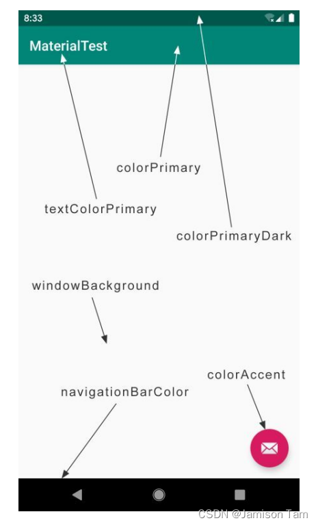
类似默认定义好的colorPrimary等,我们也可以定义上图其他元素,而coloAccent用于表达强调。
<FrameLayout xmlns:android="http://schemas.android.com/apk/res/android"
 xmlns:app="http://schemas.android.com/apk/res-auto"
 android:layout_width="match_parent"
 android:layout_height="match_parent">
 //此处定义了一个toolbar控件,由appcompat库提供
 //由于前面已经设计主题使用浅色主题,因此toolbar也为浅色主题,toolbar上的各种元素就会变为深色系
 //但这样就会导致字体变成黑色,很难看
 //为使toolbar单独使用深色主题,这里指定了主题为深色 android:theme
 //但这样就导致了toolbar弹出的菜单项也变成深色主题,又会十分难看
 //因此将弹出菜单指定为浅色主题 app:popupTheme
 <androidx.appcompat.widget.Toolbar
  android:id="@+id/toolbar"
  android:layout_width="match_parent"
  android:layout_height="?attr/actionBarSize"
  android:background="@color/colorPrimary"
  android:theme="@style/ThemeOverlay.AppCompat.Dark.ActionBar"
  app:popupTheme="@style/ThemeOverlay.AppCompat.Light" />
</FrameLayout>
此处使用了xmlns:app指定了一个新的命名空间,许多marerial属性是在新系统中新增的,老系统不存在。
//传入toolbar实例,使得既使用了toolbar,又使其外观和功能都和actionbar一致
class MainActivity : AppCompatActivity() {
 override fun onCreate(savedInstanceState: Bundle?) {
 super.onCreate(savedInstanceState)
 setContentView(R.layout.activity_main)
 setSupportActionBar(toolbar)
 }
}
优化ToolBar
<application
 android:allowBackup="true"
 android:icon="@mipmap/ic_launcher"
 //设置标题栏的文字,默认为app名字
 android:label="@string/app_name"
 android:roundIcon="@mipmap/ic_launcher_round"
 android:supportsRtl="true"
 android:theme="@style/AppTheme">
 <activity
 android:name=".MainActivity"
 android:label="Fruits">
 ...
 </activity>
</application>
为toolbar添加按钮
使用app:showAsAction来指定按钮的显示位置,这里之所以再次使用了app命名空间,同样是为了能够兼容低版本的系统。
<menu xmlns:android="http://schemas.android.com/apk/res/android"
 xmlns:app="http://schemas.android.com/apk/res-auto">
  <item
   android:id="@+id/backup"
   android:icon="@drawable/ic_backup"
   android:title="Backup"
   app:showAsAction="always" />
  <item
   android:id="@+id/delete"
   android:icon="@drawable/ic_delete"
   android:title="Delete"
   app:showAsAction="ifRoom" />
  <item
   android:id="@+id/settings"
   android:icon="@drawable/ic_settings"
   android:title="Settings"
   app:showAsAction="never" />
</menu>
showAsAction主要有以下几种值可选:
- always表示永远显示在Toolbar中,如果屏幕空间不够则不显示;
- ifRoom表示屏幕空间足够的情况下显示在Toolbar中,不够的话就显示在菜单当中;
- never则表示永远显示在菜单当中。
注意,Toolbar中的action按钮只会显示图标,菜单中的action按钮只会显示文字。
<menu
 xmlns:android="http://schemas.android.com/apk/res/android"
 xmlns:app="http://schemas.android.com/apk/res-auto">
  <item
   android:id="@+id/backup"
   android:icon="@drawable/ic_backup"
   android:title="Backup"
   app:showAsAction="always" />
 <item
   android:id="@+id/delete"
   android:icon="@drawable/ic_delete"
   android:title="Delete"
   app:showAsAction="ifRoom" />
 <item
   android:id="@+id/settings"
   android:icon="@drawable/ic_settings"
   android:title="Settings"
   app:showAsAction="never" />
</menu>

class MainActivity : AppCompatActivity() {
 ...
  override fun onCreateOptionsMenu(menu: Menu?): Boolean {
     menuInflater.inflate(R.menu.toolbar, menu)
     return true
 }
  override fun onOptionsItemSelected(item: MenuItem): Boolean {
    when (item.itemId) {
        R.id.backup -> Toast.makeText(this, "You clicked Backup",Toast.LENGTH_SHORT).show()
        R.id.delete -> Toast.makeText(this, "You clicked Delete",Toast.LENGTH_SHORT).show()
        R.id.settings -> Toast.makeText(this, "You clicked Settings",Toast.LENGTH_SHORT).show()
       }
       return true
    }
}
最终结果如下
此处就会出现了三种显示情况,
- 返回设置的是always,总是显示在toolbar中,屏幕空间不足时才不显示,此处空间足够,因此正常显示;
- delete设置的是ifRoom表示空间足够才显示在toolbar中,不够则显示在菜单当中;
- setting设置的是never,无论如何都不会显示在toolbar,只会在菜单当中
ps: toolbar中的只显示图标,菜单则只显示文字
滑动菜单
DrawerLayout
隐藏一些菜单选项,并不放置在主屏幕上,而是通过滑动将菜单显示出来,通过DrawerLayout控件实现。
DL本身是一个布局,在布局中允许放入两个直接子控件:第一个子控件为主屏幕中显示的内容,第二个子控件为滑动菜单中显示的内容。
<androidx.drawerlayout.widget.DrawerLayout
   xmlns:android="http://schemas.android.com/apk/res/android"
   xmlns:app="http://schemas.android.com/apk/res-auto"
   android:id="@+id/drawerLayout"
   android:layout_width="match_parent"
   android:layout_height="match_parent">
   //第一个子控件,主页面内容
 <FrameLayout
   android:layout_width="match_parent"
   android:layout_height="match_parent">
 <androidx.appcompat.widget.Toolbar
   android:id="@+id/toolbar"
   android:layout_width="match_parent"
   android:layout_height="?attr/actionBarSize"
   android:background="@color/colorPrimary"
   android:theme="@style/ThemeOverlay.AppCompat.Dark.ActionBar"
   app:popupTheme="@style/ThemeOverlay.AppCompat.Light" />
 </FrameLayout>
   //第二个子控件,即拉出来的内容
 <TextView
   android:layout_width="match_parent"
   android:layout_height="match_parent"
   //必须要定义,用于指定滑动页所在方向
   android:layout_gravity="start"
  android:background="#FFF"
  android:text="This is menu"
  android:textSize="30sp" />
</androidx.drawerlayout.widget.DrawerLayout>
滑动效果出现了,但可能用户不知道可以滑动,我们可以添加个导航键,使得点击导航键展开滑动页面。
class MainActivity : AppCompatActivity() {
  override fun onCreate(savedInstanceState: Bundle?) {
    super.onCreate(savedInstanceState)
    setContentView(R.layout.activity_main)
    //获取action的实例
    setSupportActionBar(toolbar)
    supportActionBar?.let {
       it.setDisplayHomeAsUpEnabled(true)//显示导航按钮
       it.setHomeAsUpIndicator(R.drawable.ic_menu)//设置导航按钮图标
     }
 }
 ...
  override fun onOptionsItemSelected(item: MenuItem): Boolean {
    when (item.itemId) {
    //home按钮的id永远都是android.R.id.home,通过openDrawer展示菜单
       android.R.id.home -> drawerLayout.openDrawer(GravityCompat.START)
       ...
   }
   return true
  }
}
NavigationView
使用NavigationView优化滑动菜单,在滑动菜单里面可以使用NavigationView定制任意布局。
添加依赖库,第一个为material库,第二为一个开源项目CircleImageView,用于实现图片圆形化。
implementation ‘com.google.android.material:material:1.1.0’
implementation ‘de.hdodenhof:circleimageview:3.0.1’
除此之外还需要将主题改为无标题栏,避免崩溃。
使用NavigationView之前,还需要两个东西:menu和headerLayout。
menu是用来在NavigationView中显示具体的菜单项,
headerLayout是用来在NavigationView中显示头部布局的。
Menu
<menu xmlns:android="http://schemas.android.com/apk/res/android">
 <group android:checkableBehavior="single">//表明为只能单选
  <item
    android:id="@+id/navCall"
    android:icon="@drawable/nav_call"
    android:title="Call" />
  <item
    android:id="@+id/navFriends"
    android:icon="@drawable/nav_friends"
    android:title="Friends" />
  <item
    android:id="@+id/navLocation"
    android:icon="@drawable/nav_location"
    android:title="Location" />
  <item
    android:id="@+id/navMail"
    android:icon="@drawable/nav_mail"
    android:title="Mail" />
  <item
    android:id="@+id/navTask"
    android:icon="@drawable/nav_task"
    android:title="Tasks" />
 </group>
</menu>
Header
<RelativeLayout xmlns:android="http://schemas.android.com/apk/res/android"
   android:layout_width="match_parent"
   android:layout_height="180dp"
   android:padding="10dp"
   android:background="@color/colorPrimary">
   //CircleImageView是一个用于将图片圆形化的控件
 <de.hdodenhof.circleimageview.CircleImageView
   android:id="@+id/iconImage"
   android:layout_width="70dp"
   android:layout_height="70dp"
   android:src="@drawable/nav_icon"
   android:layout_centerInParent="true" />
 <TextView
   android:id="@+id/mailText"
   android:layout_width="wrap_content"
   android:layout_height="wrap_content"
   android:layout_alignParentBottom="true"
   android:text="tonygreendev@gmail.com"
   android:textColor="#FFF"
   android:textSize="14sp" />
 <TextView
   android:id="@+id/userText"
   android:layout_width="wrap_content"
   android:layout_height="wrap_content"
   android:layout_above="@id/mailText"
   android:text="Tony Green"
   android:textColor="#FFF"
   android:textSize="14sp" />
</RelativeLayout>
<androidx.drawerlayout.widget.DrawerLayout
   xmlns:android="http://schemas.android.com/apk/res/android"
   xmlns:app="http://schemas.android.com/apk/res-auto"
   android:id="@+id/drawerLayout"
   android:layout_width="match_parent"
   android:layout_height="match_parent">
 <FrameLayout
   android:layout_width="match_parent"
   android:layout_height="match_parent">
 <androidx.appcompat.widget.Toolbar
   android:id="@+id/toolbar"
   android:layout_width="match_parent"
   android:layout_height="?attr/actionBarSize"
   android:background="@color/colorPrimary"
   android:theme="@style/ThemeOverlay.AppCompat.Dark.ActionBar"
   app:popupTheme="@style/ThemeOverlay.AppCompat.Light" />
 </FrameLayout>
 <com.google.android.material.navigation.NavigationView
   android:id="@+id/navView"
   android:layout_width="match_parent"
   android:layout_height="match_parent"
   android:layout_gravity="start"
   //通过app:menu和app:headerLayout属性将我们刚才准备好的menu和headerLayout设置了进去
   app:menu="@menu/nav_menu"
   app:headerLayout="@layout/nav_header"/>
</androidx.drawerlayout.widget.DrawerLayout>
activity中设计点击时间
navView.setCheckedItem(R.id.navCall)
//先调用了NavigationView的setCheckedItem()方法
//将Call菜单项设置为默认选中。接着调用了setNavigationItemSelectedListener()方法
//来设置一个菜单项选中事件的监听器,当用户点击了任意菜单项时,就会回调到传入的
//Lambda表达式当中,我们可以在这里编写具体的逻辑处理。这里调用了DrawerLayout的
//closeDrawers()方法将滑动菜单关闭,并返回true表示此事件已被处理
 navView.setNavigationItemSelectedListener {
 drawerLayout.closeDrawers()
 true
 }
悬浮按钮和可交互提示
立面设计是Material Design中非常重要的设计思想,即应用程序的界面不仅仅是一个平面,而应该是有立体效果。
FloatingActionButton
FloatingActionButton是material库中提供的一个控件,默认使用colorAccent作为按钮颜色。
<androidx.drawerlayout.widget.DrawerLayout
  xmlns:android="http://schemas.android.com/apk/res/android"
  xmlns:app="http://schemas.android.com/apk/res-auto"
  android:id="@+id/drawerLayout"
  android:layout_width="match_parent"
  android:layout_height="match_parent">
 <FrameLayout
  android:layout_width="match_parent"
  android:layout_height="match_parent">
 <androidx.appcompat.widget.Toolbar
  android:id="@+id/toolbar"
  android:layout_width="match_parent"
  android:layout_height="?attr/actionBarSize"
  android:background="@color/colorPrimary"
  android:theme="@style/ThemeOverlay.AppCompat.Dark.ActionBar"
  app:popupTheme="@style/ThemeOverlay.AppCompat.Light" />
 <com.google.android.material.floatingactionbutton.FloatingActionButton
  android:id="@+id/fab"
  android:layout_width="wrap_content"
  android:layout_height="wrap_content"
  android:layout_gravity="bottom|end"
  android:layout_margin="16dp"
  android:src="@drawable/ic_done" />
 </FrameLayout>
 ...
</androidx.drawerlayout.widget.DrawerLayout>
悬浮按钮还有阴影效果,即前面提到的立体效果,值越大,越高,阴影越淡,反之越浓。
app:elevation=“8dp”
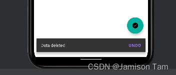
Snackbar
material库提供比Toast更先进的提示工具–Snackbar
两者差异在于:Toast是告诉用户现在发生了什么事情,但用户只能被动接收这个事情。而Snackbar进行了拓展,允许在提示中加入一个可交互按钮,当用户点击按钮时,可执行一些额外的逻辑操作。
如当执行删除操作时,通过Snackbar增加一个undo按钮,提供了弥补措施。
fab.setOnClickListener {
//view为当前界面的任意一个view,snackbar会使用view自动查找最外层布局,
//用于展示提示信息,参数2为内容,参数3为显示时长,与Toast类似。
  view ->Snackbar.make(view, "Data deleted", Snackbar.LENGTH_SHORT)
     .setAction("Undo") {
          Toast.makeText(this, "Data restored", Toast.LENGTH_SHORT).show()
   }
   .show()
 }

此处的snackbar挡住了悬浮按钮。
CoordinatorLayout
CoordinatorLayout是一个加强版的FrameLayout,由AndroidX库提供,普通情况下作用与FrameLayout基本一致,但它拥有一些额外的material能力。
CoordinatorLayout可以监听其所有子控件的各种事件,并自动帮助我们做出最合理的响应。如上面例子,刚才弹出snackbar提示遮挡住了悬浮按钮,当使用CoordinatorLayout监听到snackbar的弹出事件,它会自动将悬浮按钮向上偏移,使其不被遮挡。
修改framelayout为CoordinatorLayout即可
前面提到了CoordinatorLayout可以监听其所有子控件的各种事件,但snackbar并不是CoordinatorLayout的子控件,之所以能被监听到,是因为我们在snackbar的make方法中传入的第一个参数是view,即悬浮按钮本身,这个参数指定了snackbar基于悬浮按钮触发,使得CoordinatorLayout可以监听到snackbar的弹出和隐藏事件。
如果将view改为DrawerLayout,就会出现遮挡问题。
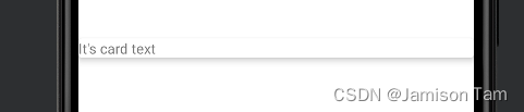
卡片式布局
此时主页面仍比较空,我们可以添加图片在其中,而为了让水果图片也能material化,使得页面中的元素看起来就像在卡片中医药,拥有圆角和投影。
MaterialCardView
MaterialCardView用于实现卡片式布局效果的重要控件,由material库提供,实际上MaterialCardView也是一个FrameLayout,只是额外提供了圆角和阴影等效果。
卡片效果如下:
引入导航
implementation ‘androidx.recyclerview:recyclerview:1.0.0’
implementation ‘com.github.bumptech.glide:glide:4.9.0’
布局中加入
<androidx.recyclerview.widget.RecyclerView
android:id=“@+id/recyclerView”
android:layout_width=“match_parent”
android:layout_height=“match_parent” />
创建实体类
class Fruit(val name: String, val imageId: Int)
创建recyclerview item,此处使用MaterialCardView作为子项的最外层布局,从而使得RecyclerView中的每个元素都是在卡片当中。由于MCV是一个FrameLayout,因此它没有什么方便的定位方式,因此在这里再嵌套LinearLayout
<com.google.android.material.card.MaterialCardView
    xmlns:android="http://schemas.android.com/apk/res/android"
    xmlns:app="http://schemas.android.com/apk/res-auto"
    android:layout_width="match_parent"
    android:layout_height="wrap_content"
    android:layout_margin="5dp"
    app:cardCornerRadius="4dp">
  <LinearLayout
   android:orientation="vertical"
   android:layout_width="match_parent"
   android:layout_height="wrap_content">
  <ImageView
   android:id="@+id/fruitImage"
   android:layout_width="match_parent"
   android:layout_height="100dp"
   //指定缩放模式,centerCrop使得图片以原比例填满ImageView,超出部分裁掉
   android:scaleType="centerCrop" />
  <TextView
   android:id="@+id/fruitName"
   android:layout_width="wrap_content"
   android:layout_height="wrap_content"
   android:layout_gravity="center_horizontal"
   android:layout_margin="5dp"
   android:textSize="16sp" />
  </LinearLayout>
</com.google.android.material.card.MaterialCardView>
接下来为RecycleView准备适配器,
class FruitAdapter(val context: Context, val fruitList: List<fruit>) :
    RecyclerView.Adapter<FruitAdapter.ViewHolder>() {
    inner class ViewHolder(view: View) : RecyclerView.ViewHolder(view) {
        val fruitImage: ImageView = view.findViewById(R.id.fruitImage)
        val fruitName: TextView = view.findViewById(R.id.fruitName)
    }
    override fun onCreateViewHolder(parent: ViewGroup, viewType: Int): ViewHolder {
        val view = LayoutInflater.from(context).inflate(R.layout.fruit_item, parent, false)
        return ViewHolder(view)
    }
    override fun onBindViewHolder(holder: ViewHolder, position: Int) {
        val fruit = fruitList[position]
        holder.fruitName.text = fruit.name
        Glide.with(context).load(fruit.imageId).into(holder.fruitImage)
    }
    override fun getItemCount() = fruitList.size
}
首先调用Glide.with()方法并传入一个Context、Activity或Fragment参数,然后调用load()方法加载图片,可以是一个URL地址,也可以是一个本地路径,或者是一个资源id,最后调用into()方法将图片设置到具体某一个ImageView中就可以了。
那么我们为什么要使用Glide而不是传统的设置图片方式呢?因为这次水果图片像素非常高,如果不进行压缩就直接展示的话,很容易引起内存溢出。而使用Glide就完全不需要担心这回事,Glide在内部做了许多非常复杂的逻辑操作,其中就包括了图片压缩,我们只需要安心按照Glide的标准用法去加载图片就可以了。
class MainActivity : AppCompatActivity() {
  val fruits = mutableListOf(Fruit("Apple", R.drawable.apple), Fruit("Banana",
   R.drawable.banana), Fruit("Orange", R.drawable.orange), Fruit("Watermelon",
  R.drawable.watermelon), Fruit("Pear", R.drawable.pear), Fruit("Grape",
  R.drawable.grape), Fruit("Pineapple", R.drawable.pineapple), Fruit("Strawberry",
  R.drawable.strawberry), Fruit("Cherry", R.drawable.cherry), Fruit("Mango",
  R.drawable.mango))
 val fruitList = ArrayList<Fruit>()
  override fun onCreate(savedInstanceState: Bundle?) {
    super.onCreate(savedInstanceState)
    setContentView(R.layout.activity_main)
 ...
   initFruits()
   val layoutManager = GridLayoutManager(this, 2)
   recyclerView.layoutManager = layoutManager
   val adapter = FruitAdapter(this, fruitList)
   recyclerView.adapter = adapter
  }
  private fun initFruits() {
    fruitList.clear()
   repeat(50) {
     val index = (0 until fruits.size).random()
     fruitList.add(fruits[index])
   }
 }
 ...
}
这样设置还有一个问题是,遮挡了toolbar,因为CoordinatorLayout本身是一个特别的framelayout,在不进行定位时,都会默认放置在左上角。
解决方法除了传统的偏移,还有更合适的方法。
使用AppBarLayout,这其实是一个垂直方向上的LinearLayout,内部做了很多滚动事件的封装,并应用了一些Material design的思想。
解决方法:
通过appbarlayout包含toolbar,
在recycleviewlayout中补充app:layout_behavior=“@string/appbar_scrolling_view_behavior”
<androidx.drawerlayout.widget.DrawerLayout
  xmlns:android="http://schemas.android.com/apk/res/android"
  xmlns:app="http://schemas.android.com/apk/res-auto"
  android:id="@+id/drawerLayout"
  android:layout_width="match_parent"
  android:layout_height="match_parent">
 <androidx.coordinatorlayout.widget.CoordinatorLayout
  android:layout_width="match_parent"
  android:layout_height="match_parent">
 <com.google.android.material.appbar.AppBarLayout
  android:layout_width="match_parent"
  android:layout_height="wrap_content">
  <androidx.appcompat.widget.Toolbar
   android:id="@+id/toolbar"
   android:layout_width="match_parent"
   android:layout_height="?attr/actionBarSize"
   android:background="@color/colorPrimary"
   android:theme="@style/ThemeOverlay.AppCompat.Dark.ActionBar"
   app:popupTheme="@style/ThemeOverlay.AppCompat.Light" />
  </com.google.android.material.appbar.AppBarLayout>
 <androidx.recyclerview.widget.RecyclerView
  android:id="@+id/recyclerView"
  android:layout_width="match_parent"
  android:layout_height="match_parent"
  app:layout_behavior="@string/appbar_scrolling_view_behavior" />
 ...
 </androidx.coordinatorlayout.widget.CoordinatorLayout>
 ...
</androidx.drawerlayout.widget.DrawerLayout>
前面提到了appbarlayout有material design的思想,上面的没有太多体现。
当recyclerview滚动时将滚动事件通知给appbarlayout,只是我们没有进行处理。
当appbarlayout接收到滚动事件的时候,它内部的子控件其实是可以去指定如何响应事件
当下滑时,一般都会隐藏toolbar,可将此句添加在appbarlayout的子控件中
app:layout_scrollFlags=“scroll|enterAlways|snap”
scroll鄙视当RV向上滚动,toolbar跟着向上滚动并隐藏。
enterAlways表示当RV向下滚动时,toolbar会跟着一起向下滚动并重新显示。
snap表示当toolbar还没完全隐藏或显示时,会根据当前滚动的距离,自动选择是隐藏还是显示。
下拉刷新
google让android的下拉刷新有统一风格,在material design中制定了一个官方的设计规范,提供了现成的控件。
SwipeRefreshLayout就是实现下拉刷新功能的核心类,把要想实现下拉刷新功能的控件放置在SwipeRefreshlayout中,可让这个控件支持下拉刷新。
添加依赖
implementation?“androidx.swiperefreshlayout:swiperefreshlayout:1.0.0”
将recyclerlayout嵌入SwipeRefreshlayout中
<?xml version="1.0" encoding="utf-8"?>
<androidx.drawerlayout.widget.DrawerLayout
    xmlns:android="http://schemas.android.com/apk/res/android"
    xmlns:app="http://schemas.android.com/apk/res-auto"
    android:id="@+id/drawer_layout"
    android:layout_width="match_parent"
    android:layout_height="match_parent">
    <androidx.coordinatorlayout.widget.CoordinatorLayout
        android:layout_width="match_parent"
        android:layout_height="match_parent">
        <com.google.android.material.appbar.AppBarLayout
            android:layout_width="match_parent"
            android:layout_height="wrap_content">
         <androidx.appcompat.widget.Toolbar
            android:id="@+id/toolbar"
            android:layout_width="match_parent"
            android:layout_height="?attr/actionBarSize"
            android:background="@color/design_default_color_primary"
            android:theme="@style/ThemeOverlay.AppCompat.Dark.ActionBar"
            app:popupTheme = "@style/ThemeOverlay.AppCompat.Light"
            app:layout_scrollFlags="scroll|enterAlways|snap">
         </androidx.appcompat.widget.Toolbar>
        </com.google.android.material.appbar.AppBarLayout>
          //添加嵌套
        <androidx.swiperefreshlayout.widget.SwipeRefreshLayout
            android:id="@+id/swipeRefresh"
            android:layout_width = "match_parent"
            android:layout_height = "match_parent"
            //此时变更了子控件,需要及时修改
            app:layout_behavior = "@string/appbar_scrolling_view_behavior">
            <androidx.recyclerview.widget.RecyclerView
                android:id="@+id/recyclerView"
                android:layout_width="match_parent"
                android:layout_height="match_parent"
                app:layout_behavior="@string/appbar_scrolling_view_behavior" />
        </androidx.swiperefreshlayout.widget.SwipeRefreshLayout>
        <com.google.android.material.floatingactionbutton.FloatingActionButton
            android:id="@+id/floating_action_button"
            android:layout_width="wrap_content"
            android:layout_height="wrap_content"
            android:layout_margin="16dp"
            android:layout_gravity="bottom|end"
            android:src="@mipmap/done"
            android:contentDescription="done">
        </com.google.android.material.floatingactionbutton.FloatingActionButton>
    </androidx.coordinatorlayout.widget.CoordinatorLayout>
    <com.google.android.material.navigation.NavigationView
        android:id="@+id/navView"
        android:layout_width="match_parent"
        android:layout_height="match_parent"
        android:layout_gravity="start"
        app:menu="@menu/nav_menu"
        app:headerLayout="@layout/nav_header">
    </com.google.android.material.navigation.NavigationView>
</androidx.drawerlayout.widget.DrawerLayout>
设置刷新逻辑
class MainActivity : AppCompatActivity() {
 ...
 override fun onCreate(savedInstanceState: Bundle?) {
   super.onCreate(savedInstanceState)
   setContentView(R.layout.activity_main)
 ...
   swipeRefresh.setColorSchemeResources(R.color.colorPrimary)
   swipeRefresh.setOnRefreshListener {
       refreshFruits(adapter)
  }
 }
   private fun refreshFruits(adapter: FruitAdapter) {
     thread {
         Thread.sleep(2000)
         runOnUiThread {
             initFruits()
             adapter.notifyDataSetChanged()
             swipeRefresh.isRefreshing = false
          }
       }
    }
 ...
}
可折叠式标题栏
Collapsing ToolbarLayout
Collapsing ToolbarLayout是一个作用域toolbar基础上的布局,由material库提供,Collapsing ToolbarLayout使得toolbar效果更丰富,不仅仅是展示一个标题栏,且能实现非常华丽的效果。
但Collapsing ToolbarLayout不能独立存在,仅能作为AppBarLayout的直接子布局来使用,而AppBarLayout又必须是CoordinatorLayout的子布局,因此使三层布局。
<?xml version="1.0" encoding="utf-8"?>
<androidx.coordinatorlayout.widget.CoordinatorLayout
    xmlns:android="http://schemas.android.com/apk/res/android"
    xmlns:app="http://schemas.android.com/apk/res-auto"
    android:layout_width="match_parent"
    android:layout_height="match_parent">
    <com.google.android.material.appbar.AppBarLayout
        android:id="@+id/appBar"
        android:layout_width="match_parent"
        android:layout_height="250dp">
        <com.google.android.material.appbar.CollapsingToolbarLayout
            android:id="@+id/collapsingToolbar"
            android:layout_width="match_parent"
            android:layout_height="match_parent"
            **//要实现更高级的toolbar效果,需要将这个主题的指定提到上一层来。
            //app:contentScrim用于指定CoollapsingToolbarLayout在趋于折叠状态以及折叠后的背景色
            //其实CoollapsingToolbarLayout在折叠后就是一个普通的toolbar。
            //app:layout_scrollFlags属性也同样提到外面来,
            //其中scroll表示CTL会随着水果内容详情的滚动一起滚动,
            //exitUntilCollapsed表示当CTL随着滚动完成折叠后就保留在界面上,不再移出屏幕。**
            android:theme="@style/ThemeOverlay.AppCompat.Dark.ActionBar"
            app:contentScrim="@color/design_default_color_primary"
            app:layout_scrollFlags="scroll|exitUntilCollapsed">
            //在CTL里面定义了一个imageview和toolbar,
            //即表示这个高级的标题栏是由普通标题栏加上图片组合而成的。
            //app:layout_collapseMode指定当前控件在CTL折叠过程中的折叠模式,
            //其中toolbar指定为pin,表示在折叠的过程中位置始终保持不变,
            //imageview指定成parallax,表示在折叠过程中产生一定的错位偏移。
            <ImageView
                android:id="@+id/fruitImageView"
                android:layout_width="match_parent"
                android:layout_height="match_parent"
                android:scaleType="centerCrop"
                app:layout_collapseMode="parallax" />
            <androidx.appcompat.widget.Toolbar
                android:id="@+id/toolbar"
                android:layout_width="match_parent"
                android:layout_height="?attr/actionBarSize"
                app:layout_collapseMode="pin" />
        </com.google.android.material.appbar.CollapsingToolbarLayout>
    </com.google.android.material.appbar.AppBarLayout>
    //由于CoordinatorLayout本身可以响应滚动事件,
    //其内部就需要NestedScrollView或RecyclerView这样的布局,
    //另外还通过app:layout_behavior属性指定了一个布局行为,
    //这和之前在RecyclerView中的用法是一模一样的,
     //水果内容详情的最外层布局使用了一个NestedScrollView,
     //注意它和AppBarLayout是平级的,NestedScrollView比起ScrollView,
     //除了允许使用滚动的方式来查看屏幕以外的数据,还增加了嵌套响应滚动事件的功能。
    <androidx.core.widget.NestedScrollView
        android:layout_width="match_parent"
        android:layout_height="match_parent"
        app:layout_behavior="@string/appbar_scrolling_view_behavior">
        //不管是ScrollView还是NestedScrollView,
        //其内部只允许存在一个直接子布局,
        //因此当我们想向其中放入很多东西,通常先嵌套一个LinearLayout,
        //然后在LinearLayout中放入具体的内容即可。
        <LinearLayout
            android:orientation="vertical"
            android:layout_width="match_parent"
            android:layout_height="wrap_content">
            <com.google.android.material.card.MaterialCardView
                android:layout_width="match_parent"
                android:layout_height="wrap_content"
                android:layout_marginBottom="15dp"
                android:layout_marginLeft="15dp"
                android:layout_marginRight="15dp"
                android:layout_marginTop="35dp"
                app:cardCornerRadius="4dp">
                <TextView
                    android:id="@+id/fruitContentText"
                    android:layout_width="wrap_content"
                    android:layout_height="wrap_content"
                    android:layout_margin="10dp" />
            </com.google.android.material.card.MaterialCardView>
        </LinearLayout>
    </androidx.core.widget.NestedScrollView>
    //FloatingActionButton中使用app:layout_anchor属性指定了一个锚点,
    //我们将锚点设置为AppBarLayout,这样悬浮按钮就会出现在水果标题栏的区域内,
    //接着又使用app:layout_anchorGravity属性将悬浮按钮定位在标题栏区域的右下角。
    <com.google.android.material.floatingactionbutton.FloatingActionButton
        android:layout_width="wrap_content"
        android:layout_height="wrap_content"
        android:layout_margin="16dp"
        android:src="@mipmap/other"
        app:layout_anchor="@id/appBar"
        app:layout_anchorGravity="bottom|end" />
</androidx.coordinatorlayout.widget.CoordinatorLayout>
Adapter中也要进行对应修改,需要完成点击事件。
用户点击图片进入详情页,adapter需要为每个item设置监听器,当接收到点击事件后,跳转到详情页,并传入数据:水果名字和图片。
class FruitAdapter(val context: Context, val fruitList: List<fruit>) :
    RecyclerView.Adapter<FruitAdapter.ViewHolder>() {
    inner class ViewHolder(view: View) : RecyclerView.ViewHolder(view) {
        val fruitImage: ImageView = view.findViewById(R.id.fruitImage)
        val fruitName: TextView = view.findViewById(R.id.fruitName)
    }
    override fun onCreateViewHolder(parent: ViewGroup, viewType: Int): ViewHolder {
        val view = LayoutInflater.from(context).inflate(R.layout.fruit_item, parent, false)
        val holder =  ViewHolder(view)
        //设置监听器
        holder.itemView.setOnClickListener {
            val position = holder.adapterPosition
            val fruit = fruitList[position]
            val intent = Intent(context,FruitActivity::class.java).apply {
                putExtra(FruitActivity.FRUIT_NAME,fruit.name)
                putExtra(FruitActivity.FRUIT_IMAGE_ID,fruit.imageId)
            }
            context.startActivity(intent)
        }
        return holder

    }
    override fun onBindViewHolder(holder: ViewHolder, position: Int) {
        val fruit = fruitList[position]
        holder.fruitName.text = fruit.name
        Glide.with(context).load(fruit.imageId).into(holder.fruitImage)
    }
    override fun getItemCount() = fruitList.size
}
编写详情页的activity
class FruitActivity : AppCompatActivity() {
    companion object {
        const val FRUIT_NAME = "fruit_name"
        const val FRUIT_IMAGE_ID = "fruit_image_id"
    }
    override fun onCreate(savedInstanceState: Bundle?) {
        super.onCreate(savedInstanceState)
        setContentView(R.layout.activity_fruit)
        //接收传入的数据
        val fruitName = intent.getStringExtra(FRUIT_NAME) ?: ""
        val fruitImageId = intent.getIntExtra(FRUIT_IMAGE_ID, 0)
        //将toolbar实例化
        setSupportActionBar(toolbar)
        //当向上滑动时显示toolbar
        supportActionBar?.setDisplayHomeAsUpEnabled(true)
        collapsingToolbar.title = fruitName
        //进行UI更新
        Glide.with(this).load(fruitImageId).into(fruitImageView)
        fruitContentText.text = generateFruitContent(fruitName)
    }
    override fun onOptionsItemSelected(item: MenuItem): Boolean {
        when (item.itemId) {
            android.R.id.home -> {
                finish()
                return true
            }
        }
        return super.onOptionsItemSelected(item)
    }
    //此处仅为模拟数据传入
    private fun generateFruitContent(fruitName: String) = fruitName.repeat(500)
}
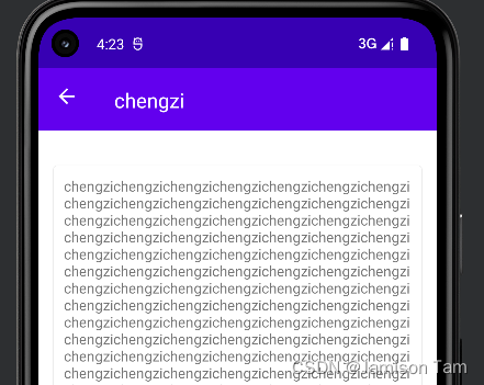
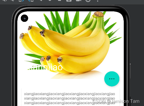
最终折叠化效果如下。
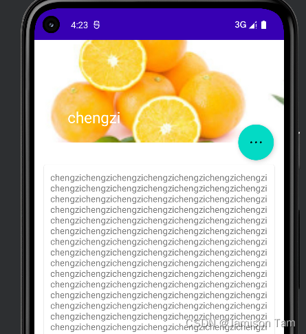
水果背景图和系统状态栏有点不搭,如果我们将背景图和状态栏融合在一起,能提升视觉体验。
在android5.0前,我们无法对状态栏的背景或颜色进行操作,5.0以及之后的系统就支持该功能。
想要让背景图能够和系统状态栏融合,需要借助android:fitsSystemWindows来实现,在CoordinatorLayout、AppBarLayout、CollapsingToolbarLayout这种嵌套结构的布局中,将控件的android:fitSystemWindows指定为true,表示该控件出现在系统状态栏。
对应到程序,那就是水果标题栏中的imageview以及对应的所有父布局应该设置这个属性
除此之外还需要在主题文件中设置状态栏颜色为透明色
@android:color/transparent
编写好用的工具方法
求最大值,使用kotlin内置的max函数,但这只支持两个参数,如果想比较三个得写成max(a,max(b,c)),实在是麻烦,因此可以这么写
//vararg表示接收任意个同类型参数
fun max(vararg nums: Int): Int {
 var maxNum = Int.MIN_VALUE
 for (num in nums) {
    maxNum = kotlin.math.max(maxNum, num)
 }
 return maxNum
}
但这样写还有个问题,只能接收int类型数据,当然可以通过重写各种参数类型版本的max,但这十分繁琐,因此可以这么写:
java中任何类型的数字都可比较,因此需要实现comparable接口,这个规则在kotlin中也同样成立,我们可通过泛型将max修改成接收任意多个实现comparable的参数。
//指定泛型上界为Comparable<T>,表明T为Comparable<T>的子类型,即参数类型为实现了Comparable的子类型
fun <T : Comparable<T>> max(vararg nums: T): T {
 if (nums.isEmpty()) throw RuntimeException("Params can not be empty.")
     var maxNum = nums[0]
     for (num in nums) {
       if (num > maxNum) {
           maxNum = num
       }
    }
 return maxNum
}
Toast的简化写法
//重写两个int和string版本的,并将时长设置为默认参数,作为拓展函数写就很简便
fun String.showToast(context: Context, duration: Int = Toast.LENGTH_SHORT) {
 Toast.makeText(context, this, duration).show()
}
fun Int.showToast(context: Context, duration: Int = Toast.LENGTH_SHORT) {
 Toast.makeText(context, this, duration).show()
}
"a".showToast(this)
Snackbar
//因为snackbar原本传入参数里面有view,会自动找寻最外层布局,用于显示snackbar,因此写成view的拓展函数
//通过高阶函数补充action的用法
fun View.showSnackbar(text: String, actionText: String? = null,
   duration: Int = Snackbar.LENGTH_SHORT, block: (() -> Unit)? = null) {
   val snackbar = Snackbar.make(this, text, duration)
   if (actionText != null && block != null) {
      snackbar.setAction(actionText) {
          block()
     }
   }
  snackbar.show()
}

fun View.showSnackbar(resId: Int, actionResId: Int? = null,
   duration: Int = Snackbar.LENGTH_SHORT, block: (() -> Unit)? = null) {
   val snackbar = Snackbar.make(this, resId, duration)
   if (actionResId != null && block != null) {
       snackbar.setAction(actionResId) {
           block()
       }
   }
 snackbar.show()
}


 398
398


 被折叠的 条评论
为什么被折叠?
被折叠的 条评论
为什么被折叠?
 到【灌水乐园】发言


