


背景
我正在开发一款购物类的App,它包含购物车,订单,地址管理等模块.但是我在开发的时候发现很多包含列表的页面会需要用到一个功能,就是需要一个入口来对列表的某一个item做一些操作.例如,购物车页面需要对单个商品收藏或删除.地址列表页面需要对单个地址做删除或修改. 调研其他App的时候发现一般的做法是通过划动item来展示操作选项,用户选择操作后重新将item复位.
然后我就开始尝试寻找一个原生的Compose组件来支持这个能力.但是很遗憾没有找到. 于是我便尝试着自己实现了这个组件,它能支持左右双向划动,并且支持展示多个操作选项.目前已经在Github上开源:https://github.com/KevinnZou/compose-swipeBox
简介
这个库提供了一个Composable组件: SwipeBox,它可以向左或向右滑动以显示操作按钮并支持自定义设计操作按钮。它还提供了封装好的文字和按钮组件: SwipeIcon 和 SwipeText,用于通用操作按钮。
API
首先让我们来看一下它的基础API
@Composable
fun SwipeBox(
    modifier: Modifier = Modifier,
    state: SwipeableState<Int> = rememberSwipeableState(initialValue = 0),
    swipeDirection: SwipeDirection = SwipeDirection.EndToStart,
    startContentWidth: Dp = 0.dp,
    startContent: @Composable (RowScope.(swipeableState: SwipeableState<Int>, startSwipeProgress: Float) -> Unit)? = null,
    endContentWidth: Dp = 0.dp,
    endContent: @Composable (RowScope.(swipeableState: SwipeableState<Int>, endSwipeProgress: Float) -> Unit)? = null,
    thresholds: (from: Int, to: Int) -> ThresholdConfig = { _, _ -> FixedThreshold(12.dp) },
    content: @Composable BoxScope.(swipeableState: SwipeableState<Int>, startSwipeProgress: Float, endSwipeProgress: Float) -> Unit,
)
swipeDirection参数定义了滑动的方向,如果方向是SwipeDirection.EndToStart,则只会显示endContent。startContentWidth参数指定了左侧操作按钮的宽度;startContent参数指定了左侧操作按钮的内容,它接受两个参数:swipeableState用于更改滑动状态,startSwipeProgress表示起始内容的滑动进度(对于null的startContent,值为0f)。endContentWidth和endContent的参数使用方式相同。
请注意,content参数所提供的UI组件将在具有可变宽度的RowScope中布局。因此,对于其中的子内容,您必须使用weight修饰符来确定内容的宽度,而不是直接使用width修饰符。此外,由于容器的宽度会随着滑动进度而改变,因此子容器中的内容必须使用requiredWidth修饰符来避免异常重新组合到该宽度变化。
对于仅包含图标或文本的内容,建议使用SwipeIcon和SwipeText。它们为您设置了大小限制,您只需设置实际内容即可。
基础使用
介绍完API后,让我们来看下它的基础使用:
单向划动
@OptIn(ExperimentalMaterialApi::class)
@Composable
fun SwipeBoxAtEnd() {
val coroutineScope = rememberCoroutineScope()
SwipeBox(
modifier = Modifier.fillMaxWidth(),
swipeDirection = SwipeDirection.EndToStart,
endContentWidth = 60.dp,
endContent = { swipeableState, endSwipeProgress ->SwipeIcon(
imageVector = Icons.Outlined.Delete,
contentDescription = "Delete",
tint = Color.White,
background = Color(0xFFFA1E32),
weight = 1f,
iconSize = 20.dp
) {
coroutineScope.launch {
swipeableState.animateTo(0)
}
}
}
) { _, _, _ ->Box(
modifier = Modifier
.fillMaxWidth()
.height(90.dp)
.background(Color(148, 184, 216)),
contentAlignment = Alignment.Center
) {
Text(
text = "Swipe Left", color = Color.White, fontSize = 14.sp,
fontWeight = FontWeight.Bold
)
}
}
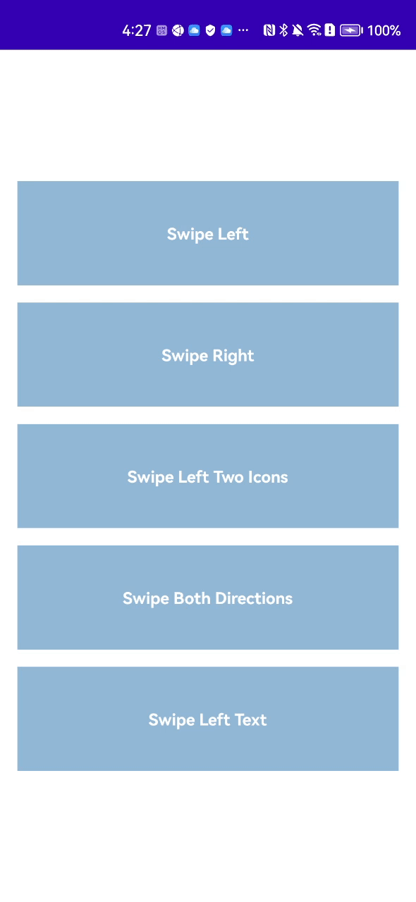
}API非常好理解,上述代码就实现了一个简单的单项划动并展示删除选项的组件。
双向划动
该组件同样支持双向划动:
@OptIn(ExperimentalMaterialApi::class)
@Composable
fun SwipeBoxAtBoth() {
    val coroutineScope = rememberCoroutineScope()
    SwipeBox(
        modifier = Modifier.fillMaxWidth(),
        swipeDirection = SwipeDirection.Both,
        startContentWidth = 60.dp,
        startContent = { swipeableState, endSwipeProgress ->SwipeIcon(
                imageVector = Icons.Outlined.Favorite,
                contentDescription = "Favorite",
                tint = Color.White,
                background = Color(0xFFFFB133),
                weight = 1f,
                iconSize = 20.dp
            ) {
                coroutineScope.launch {
                    swipeableState.animateTo(0)
                }
            }
        },
        endContentWidth = 60.dp,
        endContent = { swipeableState, endSwipeProgress ->SwipeIcon(
                imageVector = Icons.Outlined.Delete,
                contentDescription = "Delete",
                tint = Color.White,
                background = Color(0xFFFA1E32),
                weight = 1f,
                iconSize = 20.dp
            ) {
                coroutineScope.launch {
                    swipeableState.animateTo(0)
                }
            }
        }
    ) { _, _, _ ->Box(
            modifier = Modifier
                .fillMaxWidth()
                .height(90.dp)
                .background(Color(148, 184, 216)),
            contentAlignment = Alignment.Center
        ) {
            Text(
                text = "Swipe Both Directions", color = Color.White, fontSize = 14.sp,
                fontWeight = FontWeight.Bold
            )
        }
    }
}
下载
当前该库的最新版本是1.2.0,欢迎关注该库的GitHub来获取最新版本
allprojects {
  repositories {
    mavenCentral()
  }
}

dependencies {
    implementation("io.github.kevinnzou:compose-swipebox:1.2.0")
}
在列表中使用
该组件最常用的使用场景就是在列表中组合使用。但是这就要求某个已经划开的组件在列表发生滚动或其他item被划开时,需要自动恢复原样。否则的话会出现多个列表项都处于展开状态的情况,用户体验不好。而这个组件在设计的时候就考虑到了这种情况并提供了解决方案。我们将在下一篇单独的文章中介绍如何在列表中支持该能力。


 686
686


 被折叠的 条评论
为什么被折叠?
被折叠的 条评论
为什么被折叠?
 到【灌水乐园】发言


