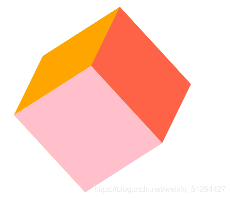
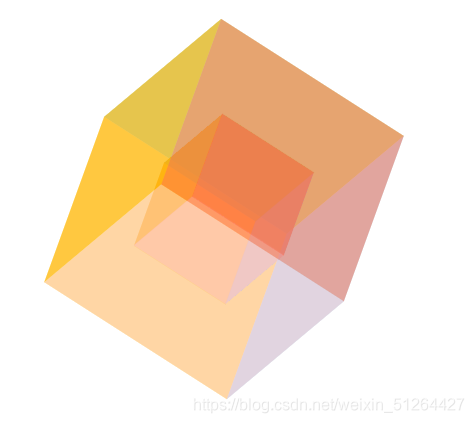
立方体旋转
效果图:
代码实现:
<!DOCTYPE html>
<html>
	<head>
		<meta charset="utf-8">
		<title>旋转的立方体</title>
		<style type="text/css">
			@keyframes roll{
				from{
					transform: rotateX(0) rotateY(0) rotateZ(0);
				}
				to{
					transform: rotateX(360deg) rotateY(720deg) rotateZ(360deg);
				}
			}
			*{
				margin: 0;
				padding: ;
				list-style: none;
			}
			body{
				padding: 100px;
			}
			ul{
				width: 200px;
				height: 200px;
				position: relative;
				/* 开启3d效果 */
				transform-style: preserve-3d;
				animation: roll 4s linear infinite;
			}
			/* 1、2上下,3、4左右,5、6前后 */
			/* 创建立方体 */
			li{
				width: 200px;
				height: 200px;
				position: absolute;
			}
			li:nth-of-type(1){
				background-color: gold;
				transform: rotateX(90deg) translateZ(100px);
			}
			li:nth-of-type(2){
				background-color: tomato;
				transform: rotateX(-90deg) translateZ(100px);
			}
			li:nth-of-type(3){
				background-color: pink;
				transform: rotateY(90deg) translateZ(100px);
			}
			li:nth-of-type(4){
				background-color: yellowgreen;
				transform: rotateY(-90deg) translateZ(100px);
			}
			li:nth-of-type(5){
				background-color: skyblue;
				transform: translateZ(100px);
			}
			li:nth-of-type(6){
				background-color: orange;
				transform: rotateY(180deg) translateZ(100px);
			}
		</style>
	</head>
	<body>
		<ul>
			<li></li>
			<li></li>
			<li></li>
			<li></li>
			<li></li>
			<li></li>
		</ul>
	</body>
</html>
<!DOCTYPE html>
<html>
	<head>
		<meta charset="utf-8">
		<title>旋转的立方体</title>
		<style type="text/css">
			@keyframes roll{
				from{
					transform: rotateX(0) rotateY(0) rotateZ(0);
				}
				to{
					transform: rotateX(360deg) rotateY(720deg) rotateZ(360deg);
				}
			}
			*{
				margin: 0;
				padding: ;
				list-style: none;
			}
			body{
				padding: 100px;
			}
			ul{
				width: 200px;
				height: 200px;
				position: relative;
				/* 开启3d效果 */
				transform-style: preserve-3d;
				animation: roll 4s linear infinite;
			}
			/* 1、2上下,3、4左右,5、6前后 */
			/* 创建立方体 */
			li{
				width: 200px;
				height: 200px;
				position: absolute;
				opacity: .5;
			}
			li:nth-of-type(1){
				background-color: gold;
				transform: rotateX(90deg) translateZ(100px);
			}
			li:nth-of-type(2){
				background-color: tomato;
				transform: rotateX(-90deg) translateZ(100px);
			}
			li:nth-of-type(3){
				background-color: pink;
				transform: rotateY(90deg) translateZ(100px);
			}
			li:nth-of-type(4){
				background-color: yellowgreen;
				transform: rotateY(-90deg) translateZ(100px);
			}
			li:nth-of-type(5){
				background-color: skyblue;
				transform: translateZ(100px);
			}
			li:nth-of-type(6){
				background-color: orange;
				transform: rotateY(180deg) translateZ(100px);
			}

			.small{
				width: 100px;
				height: 100px;
				margin: 50px;
			}
			li:nth-of-type(7){
				background-color: gold;
				transform: rotateX(90deg) translateZ(50px);
			}
			li:nth-of-type(8){
				background-color: tomato;
				transform: rotateX(-90deg) translateZ(50px);
			}
			li:nth-of-type(9){
				background-color: pink;
				transform: rotateY(90deg) translateZ(50px);
			}
			li:nth-of-type(10){
				background-color: yellowgreen;
				transform: rotateY(-90deg) translateZ(50px);
			}
			li:nth-of-type(11){
				background-color: skyblue;
				transform: translateZ(50px);
			}
			li:nth-of-type(12){
				background-color: orange;
				transform: rotateY(180deg) translateZ(50px);
			}
		</style>
	</head>
	<body>
		<ul>
			<li></li>
			<li></li>
			<li></li>
			<li></li>
			<li></li>
			<li></li>

			<li class="small"></li>
			<li class="small"></li>
			<li class="small"></li>
			<li class="small"></li>
			<li class="small"></li>
			<li class="small"></li>
		</ul>
	</body>
</html>
钟表旋转
效果图:

代码实现:
<!DOCTYPE html>
<html>
	<head>
		<meta charset="utf-8">
		<title></title>
		<style type="text/css">
			@keyframes clock{
				from{transform: rotate(0);}
				to{transform: rotate(360deg);}
			}
			*{
				margin: 0;
				padding: 0;
				list-style: none;
				box-sizing: border-box;
			}
			.item{
				width: 200px;
				height: 200px;
				background-color: #594889;
				margin: 10px;
				position: relative;
			}
			.clock{
				width: 160px;
				height: 160px;
				border: 5px solid white;
				border-radius: 50%;
				position: absolute;
				left: 20px;
				top: 20px;
			}
			.zhen1{
				width: 4px;
				height: 70px;
				background-color: white;
				position: absolute;
				left: 98px;
				top: 30px;
				transform-origin: center bottom;
				animation: clock 2s linear infinite;
			}
			.zhen2{
				width: 4px;
				height: 50px;
				background-color: white;
				position: absolute;
				left: 98px;
				top: 50px;
				transform-origin: center bottom;
				animation: clock 6s linear infinite;
			}
		</style>
	</head>
	<body>
		<div class="item">
			<div class="clock"></div>
			<div class="zhen1"></div>
			<div class="zhen2"></div>
		</div>
	</body>
</html>
灌水
效果图:

<!DOCTYPE html>
<html>
	<head>
		<meta charset="utf-8">
		<title></title>
		<style type="text/css">
			@keyframes rect1{
				from{margin-top: 92px;opacity: 0;}
				to{margin-top: 0;opacity: 1;}
			}
			@keyframes rect2{
				0%{left: 20px;top: 20px;}
				25%{left: 170px;top: 20px;}
				50%{left: 170px;top: 170px;}
				75%{left: 20px;top: 170px;}
				100%{left: 20px;top: 20px;}
			}
			*{
				margin: 0;
				padding: 0;
				list-style: none;
				box-sizing: border-box;
			}
			.item{
				width: 200px;
				height: 200px;
				background-color: #594889;
				margin: 10px;
				position: relative;
				overflow: hidden;
			}
			.rect{
				width: 100px;
				height: 100px;
				border: 4px solid white;
				margin: 50px;
				overflow: hidden;
			}
			.rect div{
				width: 100%;
				height: 100%;
				background-color: white;
				margin-top: 92px;
				opacity: 0;
				animation: rect1 4s linear infinite;
			}
			.item .slider{
				width: 10px;
				height: 10px;
				background-color: white;
				position: absolute;
				left: 20px;
				top: 20px;
				animation: rect2 4s linear infinite;
			}
		</style>
	</head>
	<body>
		<div class="item">
			<div class="rect">
				<div></div>
			</div>
			<div class="slider"></div>
		</div>
	</body>
</html>
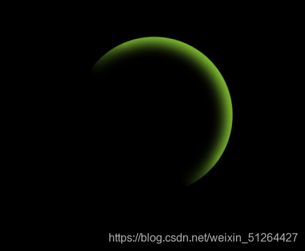
梦幻
效果图:
代码实现:
<!DOCTYPE html>
<html>
	<head>
		<meta charset="utf-8">
		<title></title>
		<style type="text/css">
			@keyframes roll{
				from{
					transform: rotate(0);
					filter: hue-rotate(0);
				}
				to{
					transform: rotate(360deg);
					filter: hue-rotate(360deg);
				}
			}
			*{
				margin: 0;
				padding: 0;
			}
			.wrap{
				width: 100vW;
				height: 100vh;
				background-color: #000;
				overflow: hidden;
			}
			.d1{
				width: 200px;
				height: 200px;
				margin: 100px auto;
				background-image: -webkit-linear-gradient(45deg,transparent 40%,yellowgreen 60%);
				background-image: linear-gradient(45deg,transparent 40%,yellowgreen 60%);
				border-radius: 50%;
				position: relative;
				overflow: hidden;
				animation: roll 2s linear infinite;
			}
			.mask{
				width: 192px;
				height: 192px;
				background-color: #000;
				position: absolute;
				left: 0;
				bottom: 0;
				border-radius: 50%;
				filter: blur(8px);
			}
		</style>
	</head>
	<body>
		<div class="wrap">
			<div class="d1">
				<div class="mask"></div>
			</div>
		</div>
	</body>
</html>


 扫一扫
扫一扫
 1680
1680

 被折叠的 条评论
为什么被折叠?
被折叠的 条评论
为什么被折叠?
 到【灌水乐园】发言


