


<!DOCTYPE html>
<html lang="en">
<head>
    <meta charset="UTF-8">
    <meta name="viewport" content="width=device-width, initial-scale=1.0">
    <title>Document</title>
    <style>
        *{
            margin: 0;
            border: 0;
            padding: 0;
        }

        body{
            background-color: #ff8585;
        }

        .box{
            width: 500px;
            height: 50px;
            background-color: #fff;
            margin: 100px;
            border-radius: 30px;
            /* display: flex; */
        }

        .box label{
            display: inline-block;
            text-align: center;
            line-height: 50px;
            border-radius: 30px;
            color: #fff;
            width: 100px;
            background-color: orange;
        }

        .box input{
            display: inline-block;
            height: 50px;
            outline: none;
            background-color: blueviolet;
        }


    </style>
</head>
<body>
    <div class="box">
        <label for="user">用户名</label>
        <input type="text">
    </div>
</body>
</html>
运行后是有空隙的:
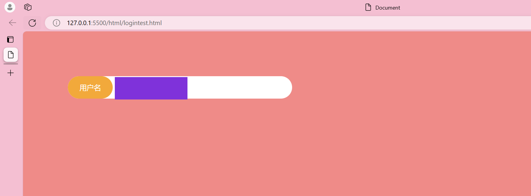
把.box中加入display:flex后,就可以消除缝隙

以此类推,如果有空隙,可以考虑一下弹性盒子能不能消除把,或者使用margin-top:-3px(听说有用)这样的试试


 727
727

 被折叠的 条评论
为什么被折叠?
被折叠的 条评论
为什么被折叠?
 到【灌水乐园】发言


