


antd组件库为Web应用提供了丰富的基础UI组件,antd全称为:ant-design。
antd官网:Ant Design - 一套企业级 UI 设计语言和 React 组件库
一、安装
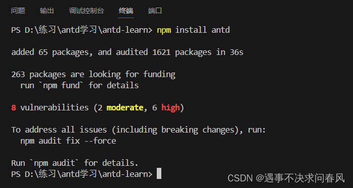
npm install antd或
yarn add antd1、antd的使用例子
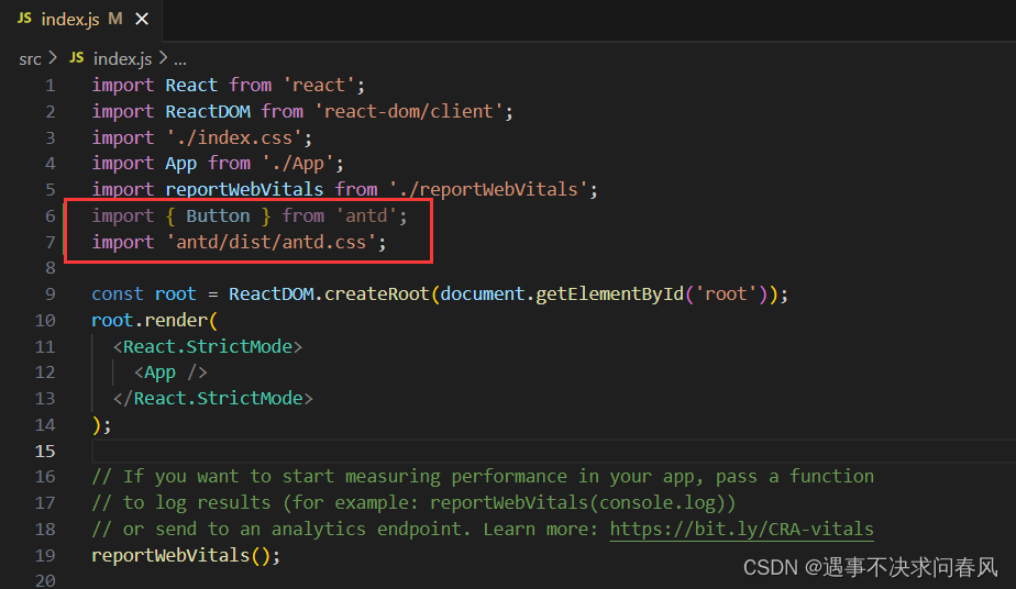
//在index.js文件中引入
import { 引入的组件 } from 'antd';
//在ReactDOM渲染即可
ReactDOM.render(<组件名 />,mountNode);
//记得引入css样式
import 'antd/dist/antd.css'; 或者 'antd/dist/antd.less'
css的引入是全局引入,引入一次即可
2、创建一个React项目,并导入antd组件库
1、创建React项目,并运行
create-react-app antd-learn
cd antd-learn
npm run start
2、使用VScode打开该文件夹,并下载antd组件库
code .
npm install antd
3、导入antd组件和css代码
二、antd的学习
1、Grid栅格系统(24)
24栅格系统,即一行24个单位
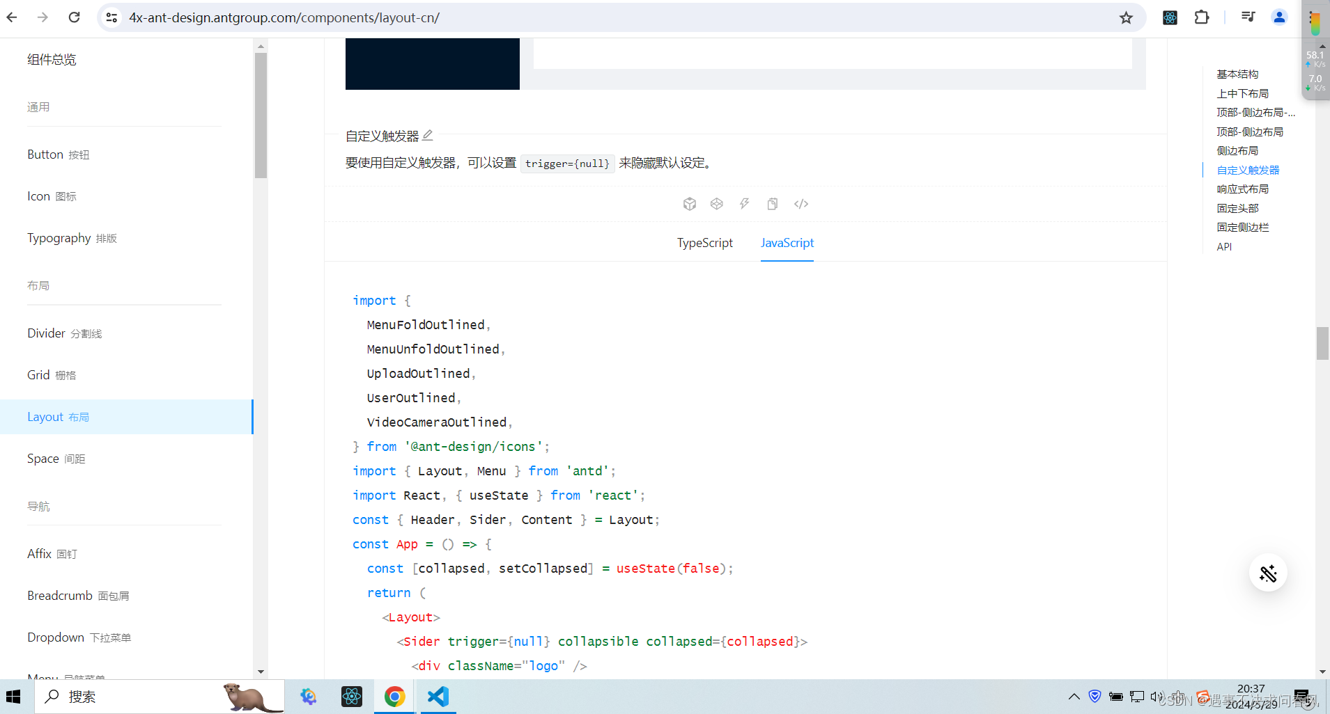
2、Layout布局
构建过程
1、在ant-Design上选中想要的组件样式,复制代码
注意:复制时,默认复制的是Typescript,而不是JavaScript。
选中喜欢的组件样式后,复制代码
2、新建文件,导入相应的css代码
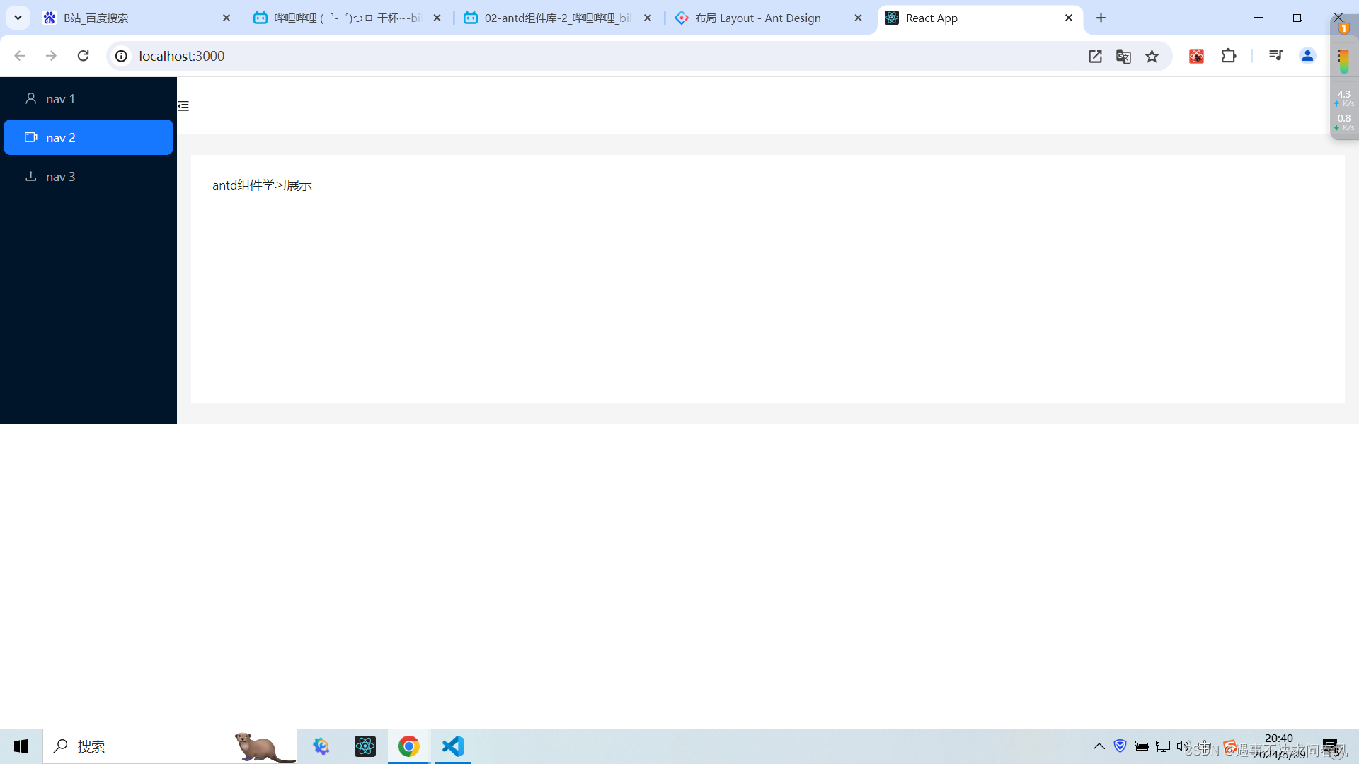
3、效果展示
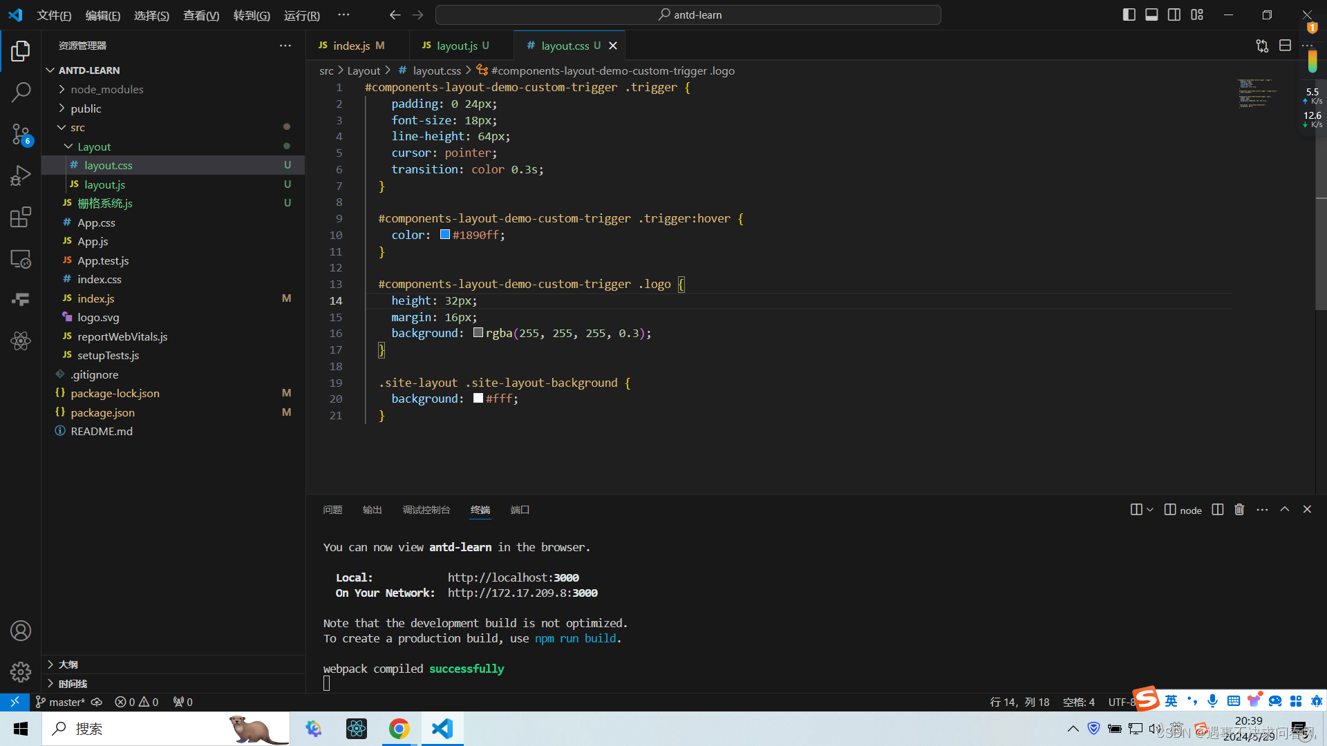
上述实例中,页面高度并不是视口高度,可通过css重写,将组件设置为视口高度。
改动如下:
找到css的选择器:
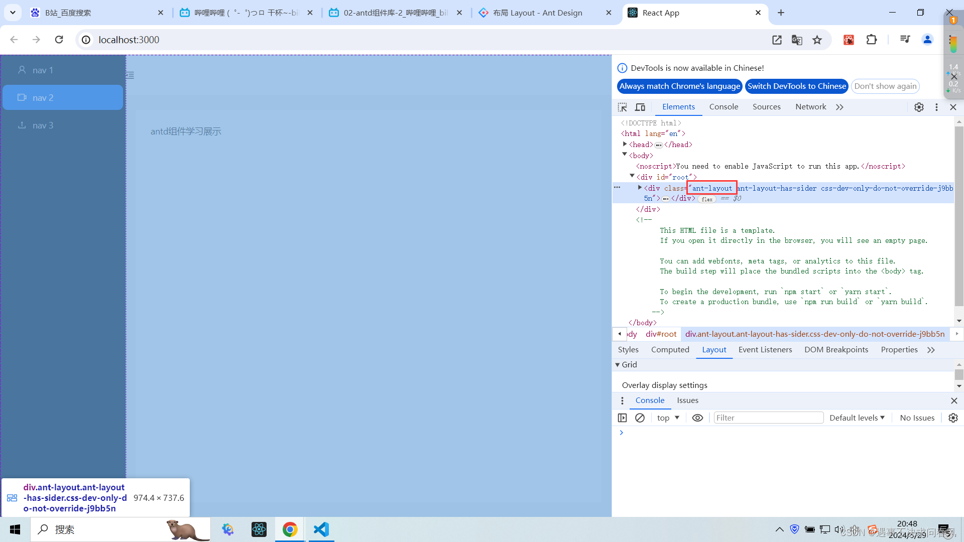
在css中进行重写:
/* 将页面布局设置为视口高度 */
.ant-layout {
height: 100vh;
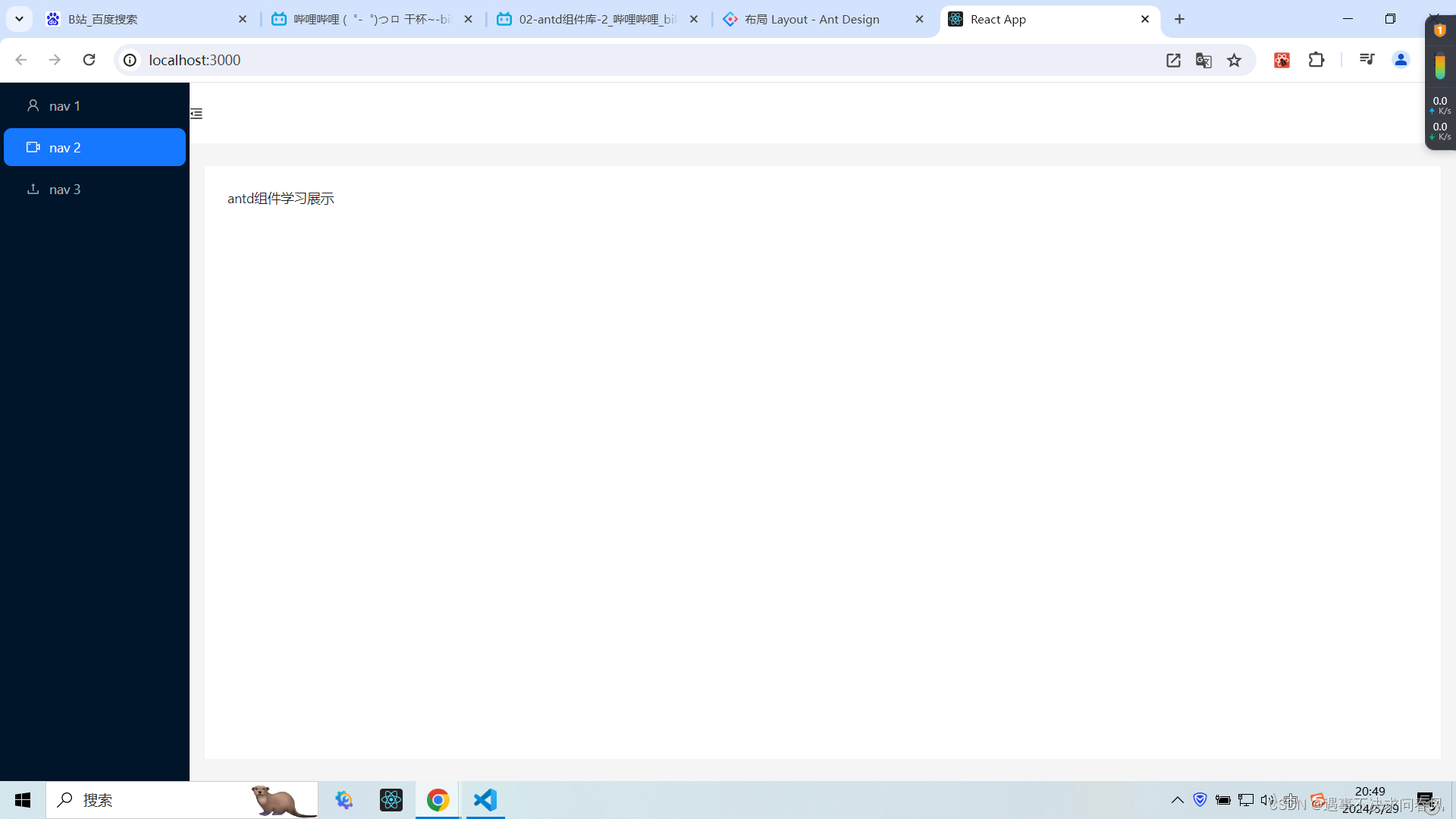
}效果如下:
3、下拉菜单
import { Button, Dropdown, Space } from 'antd';
import React from 'react';
const items = [
  {
    key: '1',
    label: (
      <a target="_blank" rel="noopener noreferrer" href="https://www.antgroup.com">
        1st menu item
      </a>
    ),
  },
  {
    key: '2',
    label: (
      <a target="_blank" rel="noopener noreferrer" href="https://www.aliyun.com">
        2nd menu item
      </a>
    ),
  },
  {
    key: '3',
    label: (
      <a target="_blank" rel="noopener noreferrer" href="https://www.luohanacademy.com">
        3rd menu item
      </a>
    ),
  },
];
const App = () => (
  <Space direction="vertical">
    <Space wrap>
      <Dropdown
        menu={{
          items,
        }}
        placement="bottomLeft"
      >
        <Button>bottomLeft</Button>
      </Dropdown>
      <Dropdown
        menu={{
          items,
        }}
        placement="bottom"
      >
        <Button>bottom</Button>
      </Dropdown>
      <Dropdown
        menu={{
          items,
        }}
        placement="bottomRight"
      >
        <Button>bottomRight</Button>
      </Dropdown>
    </Space>
    <Space wrap>
      <Dropdown
        menu={{
          items,
        }}
        placement="topLeft"
      >
        <Button>topLeft</Button>
      </Dropdown>
      <Dropdown
        menu={{
          items,
        }}
        placement="top"
      >
        <Button>top</Button>
      </Dropdown>
      <Dropdown
        menu={{
          items,
        }}
        placement="topRight"
      >
        <Button>topRight</Button>
      </Dropdown>
    </Space>
  </Space>
);
export default App;
效果如下:
4、步骤条
import { LoadingOutlined, SmileOutlined, SolutionOutlined, UserOutlined } from '@ant-design/icons';
import { Steps } from 'antd';
import React from 'react';
const App = () => (
  <Steps
    items={[
      {
        title: 'Login',
        status: 'finish',
        icon: <UserOutlined />,
      },
      {
        title: 'Verification',
        status: 'finish',
        icon: <SolutionOutlined />,
      },
      {
        title: 'Pay',
        status: 'process',
        icon: <LoadingOutlined />,
      },
      {
        title: 'Done',
        status: 'wait',
        icon: <SmileOutlined />,
      },
    ]}
  />
);
export default App;
效果如下:

5、轮播组件(走马灯)
import { Carousel } from 'antd';
import React from 'react';
const contentStyle = {
height: '160px',
color: '#fff',
lineHeight: '160px',
textAlign: 'center',
background: '#364d79',
};
const App = () => (
<Carousel autoplay>
<div>
<h3 style={contentStyle}>1</h3>
</div>
<div>
<h3 style={contentStyle}>2</h3>
</div>
<div>
<h3 style={contentStyle}>3</h3>
</div>
<div>
<h3 style={contentStyle}>4</h3>
</div>
</Carousel>
);
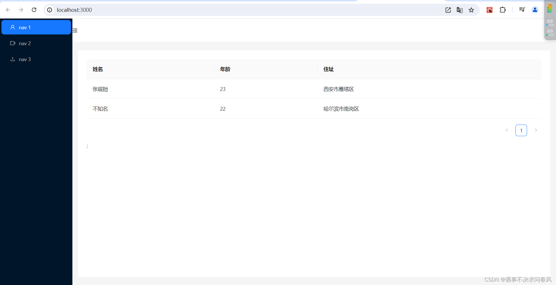
export default App;6、表格
1、在js中引入Table标签
import { Layout, Menu, Carousel, Table } from 'antd';

<Table dataSource={dataSource} columns={columns} />;
2、在js中写入静态数据
  const dataSource = [
    {
      key: '1',
      name: '张砚拙',
      age: 23,
      address: '西安市雁塔区',
    },
    {
      key: '2',
      name: '不知名',
      age: 22,
      address: '哈尔滨市南岗区',
    },
  ];

  const columns = [
    {
      title: '姓名',
      dataIndex: 'name',
      key: 'name',
    },
    {
      title: '年龄',
      dataIndex: 'age',
      key: 'age',
    },
    {
      title: '住址',
      dataIndex: 'address',
      key: 'address',
    },
  ];
3、运行效果
更多组件的使用,查阅文档即可。


 3738
3738

 被折叠的 条评论
为什么被折叠?
被折叠的 条评论
为什么被折叠?
 到【灌水乐园】发言


