


1:介绍
我们在学习HTML和CSS的时候,上手的时候总是不知道怎么写才好,接下来给大家来展示一下,小编做的《日月交替》效果。
2:CSS
接下来是css代码:
<style>
			body{
				/* 初始化 取消内外边距 */
				margin:0;
				padding:0;
			}
			#container{
				/* 100%窗口宽度 */
				height: 100vh;
			}
			.bg{
				/* 绝对定位 */
				position: absolute;
				top: 0;
				left: 0;
				width: 100%;
				height: 100%;
			}
			.sun{
				margin:0;
				padding:0;
				/* 绝对定位 水平垂直居中 */
				position:absolute;
				top:50%;
				left:50%;
				transform: translate(-50%,-50%);
				width: 600px;
				height: 600px;
				background-color:orange;
				border-radius: 50%;
			}
			.moon{
				margin:0;
				padding:0;
				/* 绝对定位 水平垂直居中 */
				position:absolute;
				top:50%;
				left:50%;
				/* 计算得出月亮的位置 */
				transform: translate(calc( -50% + -160px),calc( -50% + -180px));
				width: 600px;
				height: 600px;
				/* 通过阴影绘制月亮 */
				box-shadow: 160px 180px 0 cyan;
				border-radius: 50%;
			}
			.sea{
				position: absolute;
				bottom: 0;
				width: 100%;
				height: 35%;
				/* 背景模糊制造大海的感觉 */
				backdrop-filter: blur(100px);
				-webkit-backdrop-filter: blur(100px);
				z-index: 100;
			}
			.sun,
			.moon,
			.sun-box,
			.moon-box,
			.bg{
				/* 添加动画元素 */
				transition: all 1s ease-in-out;
			}
			.sun-box,
			.moon-box{
				/* 相对定位 */
				position: relative;
				/* 溢出隐藏 */
				overflow: hidden;
			}
			/* 白天 */
			.light .sun-box{
				height: 100%;
			}
			.light .moon-box{
				height: 0;
			}
			.light .bg{
				background-color: #ffeea2;
			}
			/* 夜晚 */
			.dark .sun-box{
				height: 0;
			}
			.dark .moon-box{
				height: 100%;
			}
			.dark .bg{
				background-color: #040720;
			}
			/* 切换按钮样式 */
			.btn-box{
				position: absolute;
				top: 5px;
				left: 5px;
				z-index: 101;
				display: flex;
				flex-direction: row;
			}
			.btn-box div{
				background: ragb(255,255,255,0.7);
				color: #000;
				width: 90px;
				height: 40px;
				line-height: 40px;
				text-align: center;
				margin: 5px;
				font-size: 14px;
				border-radius: 5px;
				cursor: pointer;
			}
			.btn-box div::hover{
				background: #fff;
			}

		</style>
3:HTML代码
<body>
		<div class="btn-box">
			<div onclick="change('light')">
				<!-- 注意添加标签的时候前面添加了 fa  -->
				<i class="fa fa-sun-o" aria-hidden="true"></i> 日
			</div>
			<div onclick="change('dark')">
				<i class="fa fa-moon-o" aria-hidden="true"></i> 月
			</div>
		</div>
		<div class="dark" id="container">
			<div class="bg"></div>
			<div class="moon-box">
				<div class="moon"></div>
			</div>
			<div class="sun-box">
				<div class="sun"></div>
			</div>
			<div class="sea"></div>
		</div>
	</body>
4:接下来是全部代码
<!DOCTYPE html>
<html>
	<head>
		<meta charset="utf-8">
		<title>日月交替</title>
		<!-- 这是网址 -->
		<link href="https://netdna.bootstrapcdn.com/font-awesome/4.7.0/css/font-awesome.min.css" rel="stylesheet">
		<style>
			body{
				/* 初始化 取消内外边距 */
				margin:0;
				padding:0;
			}
			#container{
				/* 100%窗口宽度 */
				height: 100vh;
			}
			.bg{
				/* 绝对定位 */
				position: absolute;
				top: 0;
				left: 0;
				width: 100%;
				height: 100%;
			}
			.sun{
				margin:0;
				padding:0;
				/* 绝对定位 水平垂直居中 */
				position:absolute;
				top:50%;
				left:50%;
				transform: translate(-50%,-50%);
				width: 600px;
				height: 600px;
				background-color:orange;
				border-radius: 50%;
			}
			.moon{
				margin:0;
				padding:0;
				/* 绝对定位 水平垂直居中 */
				position:absolute;
				top:50%;
				left:50%;
				/* 计算得出月亮的位置 */
				transform: translate(calc( -50% + -160px),calc( -50% + -180px));
				width: 600px;
				height: 600px;
				/* 通过阴影绘制月亮 */
				box-shadow: 160px 180px 0 cyan;
				border-radius: 50%;
			}
			.sea{
				position: absolute;
				bottom: 0;
				width: 100%;
				height: 35%;
				/* 背景模糊制造大海的感觉 */
				backdrop-filter: blur(100px);
				-webkit-backdrop-filter: blur(100px);
				z-index: 100;
			}
			.sun,
			.moon,
			.sun-box,
			.moon-box,
			.bg{
				/* 添加动画元素 */
				transition: all 1s ease-in-out;
			}
			.sun-box,
			.moon-box{
				/* 相对定位 */
				position: relative;
				/* 溢出隐藏 */
				overflow: hidden;
			}
			/* 白天 */
			.light .sun-box{
				height: 100%;
			}
			.light .moon-box{
				height: 0;
			}
			.light .bg{
				background-color: #ffeea2;
			}
			/* 夜晚 */
			.dark .sun-box{
				height: 0;
			}
			.dark .moon-box{
				height: 100%;
			}
			.dark .bg{
				background-color: #040720;
			}
			/* 切换按钮样式 */
			.btn-box{
				position: absolute;
				top: 5px;
				left: 5px;
				z-index: 101;
				display: flex;
				flex-direction: row;
			}
			.btn-box div{
				background: ragb(255,255,255,0.7);
				color: #000;
				width: 90px;
				height: 40px;
				line-height: 40px;
				text-align: center;
				margin: 5px;
				font-size: 14px;
				border-radius: 5px;
				cursor: pointer;
			}
			.btn-box div::hover{
				background: #fff;
			}

		</style>
	<body>
		<div class="btn-box">
			<div onclick="change('light')">
				<!-- 注意添加标签的时候前面添加了 fa  -->
				<i class="fa fa-sun-o" aria-hidden="true"></i> 日
			</div>
			<div onclick="change('dark')">
				<i class="fa fa-moon-o" aria-hidden="true"></i> 月
			</div>
		</div>
		<div class="dark" id="container">
			<div class="bg"></div>
			<div class="moon-box">
				<div class="moon"></div>
			</div>
			<div class="sun-box">
				<div class="sun"></div>
			</div>
			<div class="sea"></div>
		</div>
	</body>
	<script>
		function change(str){
			document.getElementById('container').setAttribute('class',str);
		}
	</script>
</html>
接下来是效果:
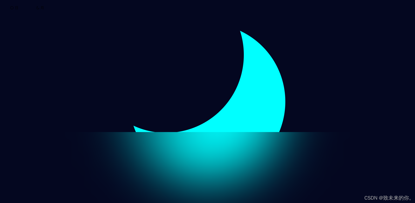
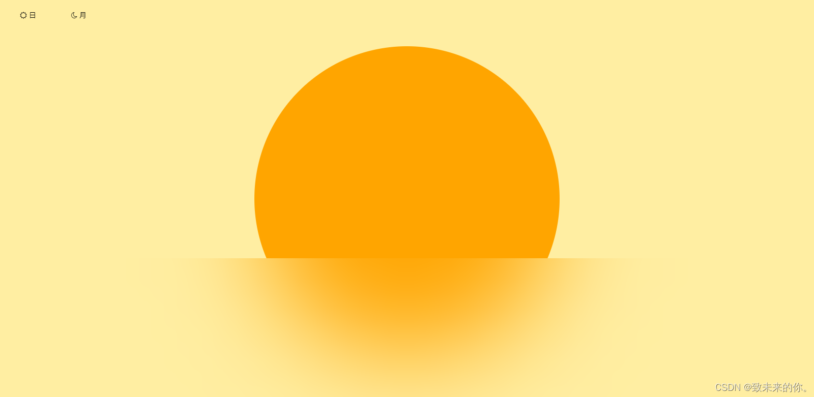
分享知识是一种美德,希望大家给一个免费的关注,博主接下来还会给大家更多好玩的,有趣的知识。


 1629
1629


 被折叠的 条评论
为什么被折叠?
被折叠的 条评论
为什么被折叠?
 到【灌水乐园】发言


