


最终最终的大屏可视化成果(这次还不行,这次是主要结构)

本次的主要目标是实现可视化前端的基本结构以及中上部分的表示设计。
主要结构的想法是这样的:

然后成果大概是这样的,后续再进行下一步
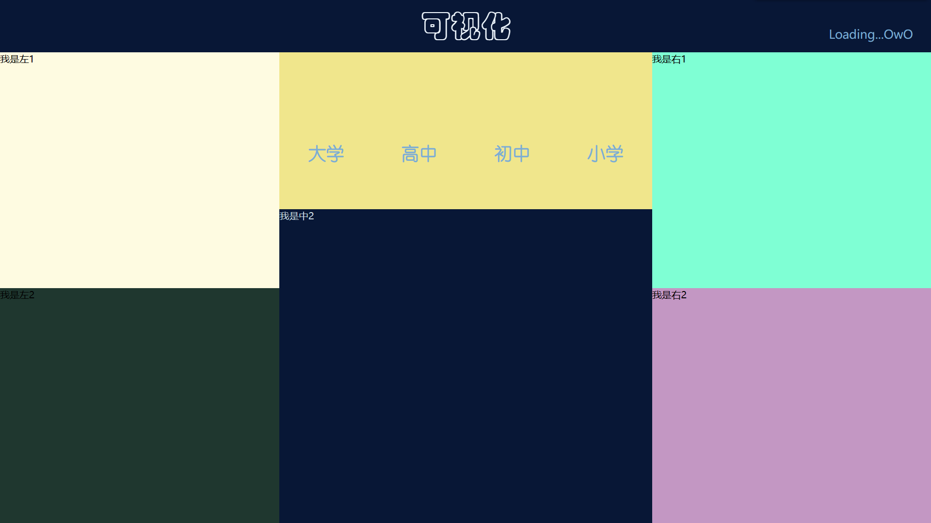
这样分为6个主要部分,然后这次只将中上的部分填上字。为了方便看出来各部分的分划,我将各部分都用不同的颜色表示了。
前端部分的文件主要有html+css+js文件,这一次只用到html和css,之后会通过js做图表和一些函数来添加到各部分,现在只是结构的话用不到js呢。
一、对各部分进行分块
html文件代码。
<title>标签为浏览器窗口上方显示的名字,我随便写的OwO,然后<link>标签引入css文件来设计html显示的一些格式。这是<head>部分完事。
<body>为主要页面部分,使用8个<div>标签将页面分为8部分,第一部分为标题部分就是上图中最上面的标题部分,我起的名字是可视化,将第一个div标签的id设置为title用于与css进行对接来控制标题块的格式。
id为tim的是时间块,现在还啥也没有,我让他啥也加载不出的时候就显示Loading...OwO
l1,l2,c1,c2,r1,r2分别为左上、左下、中上、中下、右上、右下块。
<!DOCTYPE html>
<html lang="en">
<head>
    <meta charset="UTF-8">
    <meta http-equiv="X-UA-Compatible" content="IE=edge">
    <meta name="viewport" content="width=device-width, initial-scale=1.0">
    <title>OwO</title>
    <link rel="stylesheet" href="m.css" rel="stylesheet">
</head>
<body>
    <div id="title">可视化</div>
    <div id="tim">Loading...OwO</div>
    <div id="l1">我是左1</div>
    <div id="l2">我是左2</div>
    <div id="c1"></div>
    <div id="c2">我是中2</div>
    <div id="r1">我是右1</div>
    <div id="r2">我是右2</div>
</body>
</html>
二、对页面各部分的格式进行控制
css代码。css文件的名字要和html中引用的名字相同,我使用的是m.css
整个页面的背景为body中的background。
#用于对应标签id。.用于对应类class。
width,height用于控制宽度和高度,这里用百分比的方式。top,left,right用于上左右的外边距。
font-family控制字体类型,font-size控制字体大小。使用弹性盒子布局控制居中显示。
body{
    margin:0;
    /* background: #011c5f; */
    background: #081736;
}

#title{
    /* 绝对定位 */
    position: absolute;
    width: 40%;
    height: 10%;
    top: 0;
    right: 30%;
    left: 30%;
    /* background-color: aquamarine; */
    color: aliceblue;
    font-family: "华文彩云";
    font-size: 50px;
    /* 弹性布局 */
    display: flex;
    /* 居中 */
    align-items: center;
    justify-content: center;
}
#tim{
    position: absolute;
    /* width: 30%; */
    height: 10%;
    top: 5%;
    right: 2%;
    color: #7aadd4;
    font-size: 20px;
    /* background-color: rgb(177, 228, 96); */
}
#c1{
    /* 绝对定位 */
    position: absolute;
    width: 40%;
    height: 30%;
    top: 10%;
    right: 30%;
    left: 30%;
    background-color: khaki;
    color: rgba(122,173,212,1);
    font-size: 15px;
}
.num{
    width: 25%;
    height: 50%;
    float: left;
    display: flex;
    justify-content: center;
    align-items: center;
    color: rgb(3, 232, 245);
    font-size: 10px;
    font-style: oblique;
}
.txt{
    width: 25%;
    float: left;
    font-family: "幼圆";
    display: flex;
    align-items: center;
    justify-content: center;
}


#c2{
    /* 绝对定位 */
    position: absolute;
    width: 40%;
    height: 60%;
    top: 40%;
    right: 30%;
    left: 30%;
    color: #ccdde4;

}
#l1{
    /* 绝对定位 */
    position: absolute;
    width: 30%;
    height: 45%;
    top: 10%;
    left: 0;
    background-color: #fefbe1;
}
#l2{
    /* 绝对定位 */
    position: absolute;
    width: 30%;
    height: 45%;
    top: 55%;
    left: 0;
    background-color: rgb(31, 55, 47);
}
#r1{
    /* 绝对定位 */
    position: absolute;
    width: 30%;
    height: 45%;
    top: 10%;
    right: 0;
    /* left: 30%; */
    background-color: aquamarine;
}
#r2{
    /* 绝对定位 */
    position: absolute;
    width: 30%;
    height: 45%;
    top: 55%;
    right: 0;
    /* left: 30%; */
    background-color: #c397c3;
}
三、中上部分的填充
中上部分用于放置大学、高中、初中、小学学历的总人数,下方是文字,上方是数量。
在原来html代码的记住上在id为c1的部分添加为这样:
num为数字有4个,标题有4个,他们用类class来进行定位。格式在上方的css文件都有。
<!DOCTYPE html>
<html lang="en">
<head>
    <meta charset="UTF-8">
    <meta http-equiv="X-UA-Compatible" content="IE=edge">
    <meta name="viewport" content="width=device-width, initial-scale=1.0">
    <title>OwO</title>
    <link rel="stylesheet" href="m.css" rel="stylesheet">
</head>
<body>
    <div id="title">可视化</div>
    <div id="tim">Loading...OwO</div>
    <div id="l1">我是左1</div>
    <div id="l2">我是左2</div>
    <div id="c1">
        <div class="num"><h1>12</h1></div>
        <div class="num"><h1>34</h1></div>
        <div class="num"><h1>56</h1></div>
        <div class="num"><h1>78</h1></div>
        <div class="txt"><h1>大学</h1></div>
        <div class="txt"><h1>高中</h1></div>
        <div class="txt"><h1>初中</h1></div>
        <div class="txt"><h1>小学</h1></div>
    </div>
    <div id="c2">我是中2</div>
    <div id="r1">我是右1</div>
    <div id="r2">我是右2</div>
</body>
</html>
四、最终效果及完整代码
最终效果

本次完整代码
html
<!DOCTYPE html>
<html lang="en">
<head>
    <meta charset="UTF-8">
    <meta http-equiv="X-UA-Compatible" content="IE=edge">
    <meta name="viewport" content="width=device-width, initial-scale=1.0">
    <title>OwO</title>
    <link rel="stylesheet" href="m.css" rel="stylesheet">
</head>
<body>
    <div id="title">可视化</div>
    <div id="tim">Loading...OwO</div>
    <div id="l1">我是左1</div>
    <div id="l2">我是左2</div>
    <div id="c1">
        <div class="num"><h1>12</h1></div>
        <div class="num"><h1>34</h1></div>
        <div class="num"><h1>56</h1></div>
        <div class="num"><h1>78</h1></div>
        <div class="txt"><h1>大学</h1></div>
        <div class="txt"><h1>高中</h1></div>
        <div class="txt"><h1>初中</h1></div>
        <div class="txt"><h1>小学</h1></div>
    </div>
    <div id="c2">我是中2</div>
    <div id="r1">我是右1</div>
    <div id="r2">我是右2</div>
</body>
</html>
css代码
body{
    margin:0;
    /* background: #011c5f; */
    background: #081736;
}

#title{
    /* 绝对定位 */
    position: absolute;
    width: 40%;
    height: 10%;
    top: 0;
    right: 30%;
    left: 30%;
    /* background-color: aquamarine; */
    color: aliceblue;
    font-family: "华文彩云";
    font-size: 50px;
    /* 弹性布局 */
    display: flex;
    /* 居中 */
    align-items: center;
    justify-content: center;
}
#tim{
    position: absolute;
    /* width: 30%; */
    height: 10%;
    top: 5%;
    right: 2%;
    color: #7aadd4;
    font-size: 20px;
    /* background-color: rgb(177, 228, 96); */
}
#c1{
    /* 绝对定位 */
    position: absolute;
    width: 40%;
    height: 30%;
    top: 10%;
    right: 30%;
    left: 30%;
    background-color: khaki;
    color: rgba(122,173,212,1);
    font-size: 15px;
}
.num{
    width: 25%;
    height: 50%;
    float: left;
    display: flex;
    justify-content: center;
    align-items: center;
    color: rgb(3, 232, 245);
    font-size: 10px;
    font-style: oblique;
}
.txt{
    width: 25%;
    float: left;
    font-family: "幼圆";
    display: flex;
    align-items: center;
    justify-content: center;
}


#c2{
    /* 绝对定位 */
    position: absolute;
    width: 40%;
    height: 60%;
    top: 40%;
    right: 30%;
    left: 30%;
    color: #ccdde4;

}
#l1{
    /* 绝对定位 */
    position: absolute;
    width: 30%;
    height: 45%;
    top: 10%;
    left: 0;
    background-color: #fefbe1;
}
#l2{
    /* 绝对定位 */
    position: absolute;
    width: 30%;
    height: 45%;
    top: 55%;
    left: 0;
    background-color: rgb(31, 55, 47);
}
#r1{
    /* 绝对定位 */
    position: absolute;
    width: 30%;
    height: 45%;
    top: 10%;
    right: 0;
    /* left: 30%; */
    background-color: aquamarine;
}
#r2{
    /* 绝对定位 */
    position: absolute;
    width: 30%;
    height: 45%;
    top: 55%;
    right: 0;
    /* left: 30%; */
    background-color: #c397c3;
}


 2万+
2万+


 被折叠的 条评论
为什么被折叠?
被折叠的 条评论
为什么被折叠?
 到【灌水乐园】发言


