


bem.scss
$namespcae: 'el' !default;
$block-symbol: '-' !default;
$element-symbol: '__' !default;
$modifier-symbol: '--' !default;

@mixin b($block) {
    #{$namespcae + $block-symbol + $block} {
        @content;
    }
}

@mixin e($element) {
    $selector: &;

    @at-root {
        #{$selector + $element-symbol + $element} {
            @content;
        }
    }
}

@mixin m($modifier) {
    $selector: &;

    @at-root {
        #{$selector + $modifier-symbol + $modifier} {
            @content;
        }
    }
}
$namespcae: class命名前缀
$block.: 块级,可以把组件认为是一个块,而组件的最外层div就是block
$element: 元素, 可以认为就是组建block包裹的元素
$modifier: 修饰符, 比如颜色/高度/宽度/大小的修饰
在vite中全局注册bem.scss
vite.config.ts
import { defineConfig } from 'vite'
import vue from '@vitejs/plugin-vue'

// https://vitejs.dev/config/
export default defineConfig({
  plugins: [vue()],
  css: {
    preprocessorOptions: {
      scss: {
        additionalData: `@import "./src/bem.scss"`
      }
    }
  }
})
例子1:
<script setup lang="ts">

</script>

<template>
  <div class="el-box">
    <div class="el-box__header el-box--blue">
      header
    </div>
    <div class="el-box__footer el-box--red">
      footer
    </div>
  </div>
</template>

<style lang='scss' scoped>
  @include b(box){
    width: 300px;
    height: 300px;
    border: 1px solid #ccc;
    @include e(header) {
      width: 100%;
      height: 50px;
      display: flex;
      align-items: center;
      justify-content: center;
    }
    @include e(footer) {
      width: 100%;
    }
    @include m(blue) {
      color: blue
    }
    @include m(red) {
      color: red
    }
  }
</style>
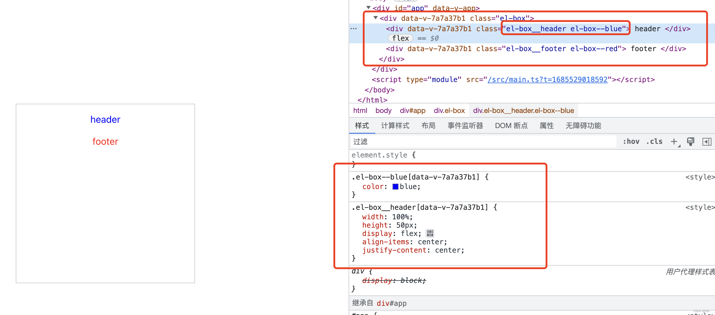
这个例子中可以看到 外层div的class是el-box 也就是block, 而内部的两个元素 header和footer 就是element 并且在这两个元素上的blue和red就是modifier
例子2(以一个简单的button组件为例):
<script setup lang="ts">
import XButton from './components/x-button.vue'
</script>

<template>
  <x-button></x-button>
</template>

<style lang="scss" scoped></style>
x-button.vue
<script setup lang="ts">
import { defineProps, withDefaults } from 'vue'
interface iProps {
type?: 'success' | 'primary'
}
const props = withDefaults(defineProps<iProps>(), {
type: 'success'
})
</script>
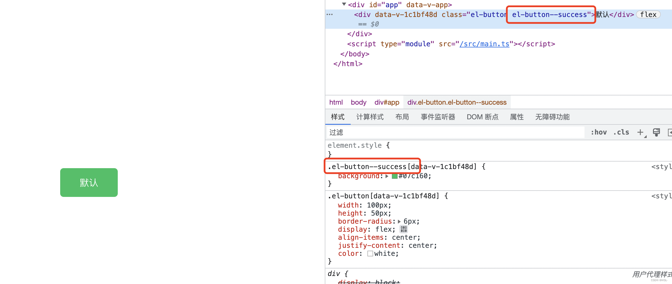
<template>
<div :class="['el-button', `el-button--${props.type}`]">默认</div>
</template>
<style lang="scss" scoped>
@include b(button) {
width: 100px;
height: 50px;
border-radius: 6px;
display: flex;
align-items: center;
justify-content: center;
color: white;
@include m(success) {
background: #07c160;
}
@include m(primary) {
background: #1989fa;
}
}
</style>
<script setup lang="ts">
import XButton from './components/x-button.vue'
</script>

<template>
  <x-button type="primary"></x-button>
</template>

<style lang="scss" scoped></style>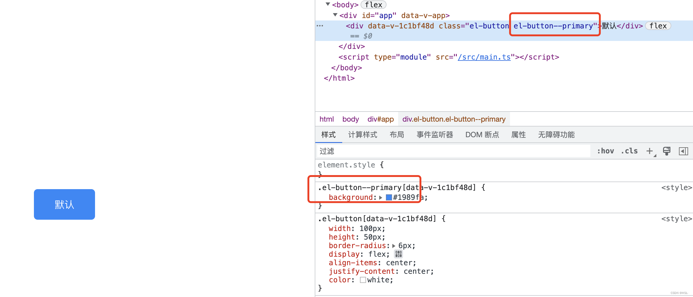
在element-ui中能经常看到这种修饰符


 381
381


 被折叠的 条评论
为什么被折叠?
被折叠的 条评论
为什么被折叠?
 到【灌水乐园】发言


