


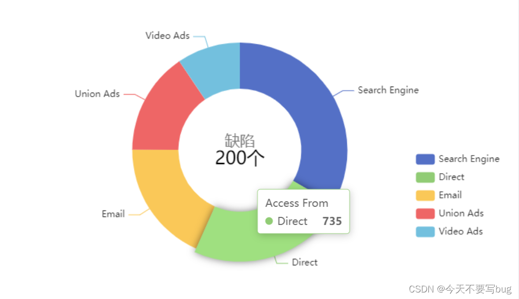
使用echarts,实现如上常用例图,代码如下:(ps:如何引入echarts等这里就略过啦~)
<div id="main"></div>
...
import * as echarts from 'echarts';

var chartDom = document.getElementById('main');
var myChart = echarts.init(chartDom);
var option;

option = {
// 提示
  tooltip: {
    trigger: 'item'
  },
  // 图例
  legend: {
    orient: 'vertical',
    right: 10,
    top: '50%'
  },
  // 图色块颜色
  color: ['#1890FF', '#13C2C2', '#2FC25B', '#FACC14'],
  //环形图中间添加文字
  graphic: [
    {
      type: 'text', //通过不同top值可以设置上下显示
      left: 'center',
      top: '50%',
      style: {
        text: '200个', //(自己设置显示内容),
        textAlign: 'center',
        fill: '#000', //文字的颜色
        width: 30,
        height: 30,
        fontSize: 24,
        fontWeight: 500,
        color: '#000',
        fontFamily: 'Microsoft YaHei'
      }
    },
    {
      type: 'text',
      left: 'center',
      top: '45%',
      style: {
        text: '缺陷',
        textAlign: 'center',
        fill: '#797979',
        width: 30,
        height: 30,
        fontSize: 20
      }
    }
  ],
  series: [
    {
      name: 'Access From',
      type: 'pie',
      radius: ['40%', '70%'],
      avoidLabelOverlap: false,
      data: [
        { value: 1048, name: 'Search Engine' },
        { value: 735, name: 'Direct' },
        { value: 580, name: 'Email' },
        { value: 484, name: 'Union Ads' },
        { value: 300, name: 'Video Ads' }
      ],
      emphasis: {
        itemStyle: {
          shadowBlur: 10,
          shadowOffsetX: 0,
          shadowColor: 'rgba(0, 0, 0, 0.5)'
        }
      }
    }
  ]
};

option && myChart.setOption(option);
此系列为开发中常用图,相似的可以直接来这里粘贴代码,省时间哦~


 2万+
2万+


 被折叠的 条评论
为什么被折叠?
被折叠的 条评论
为什么被折叠?
 到【灌水乐园】发言


