


定位有三种,分别是相对定位、绝对定位、固定定位。
1.1 相对定位position: relative;
认识相对定位
1.1.1 相对定位有2个作用:
(1)自己位置的微调。相对定位,就是微调元素位置的。让元素相对自己原来的位置,进行位置调整。
(2)子绝父相
(1)自己位置的微调
<!DOCTYPE html>
<html lang="en">
<head>
<meta charset="UTF-8">
<meta name="viewport" content="width=device-width, initial-scale=1.0">
<meta http-equiv="X-UA-Compatible" content="ie=edge">
<title>Document</title>
<style>
*{
margin: 0;
padding: 0;
}
.box{
width: 220px;
height: 220px;

}
.parent{
width: 800px;
height: 800px;
margin: 0 auto;
outline:1px dashed yellow;
}
.box1{
background-color: blue;

}
.box2{
background-color: red;
/* 相对定位 ----自己位置的微调 */
position:relative;
/* 右下 */
/* 距离左侧坐标原点 100px */
left:100px;
/* 距离顶部坐标原点 200px */
top:200px;

}
.box3{
background-color: green;
}
</style>
</head>
<body>
<div class="parent">

<div class="box box1"></div>
<div class="box box2"></div>
<div class="box box3"></div>
</div>
</body>
</html>
/* 左下 */
right:100px;
top:200px;预览:

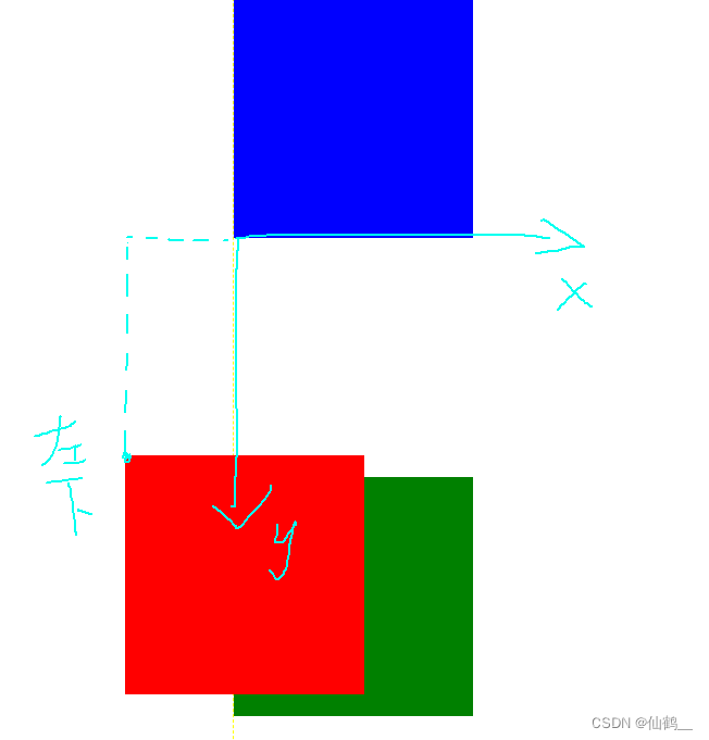
也就是说,如果一个盒子想进行位置调整,那么就要使用相对定位
position:relative; → 必须先声明,自己要相对定位了
left:100px; → 然后进行调整。
top:150px; → 然后进行调整。
1.1.2 不脱标,老家留坑,形影分离(相对定位最大的特点)
相对定位不脱标,真实位置是在老家,只不过影子出去了,可以到处飘。

1.1.3 相对定位的定位值
可以用left、right来描述盒子右、左的移动;
可以用top、bottom来描述盒子的下、上的移动。
↘:(右下)
position: relative;
top: 10px;
left: 40px;
↙:(左下)
position: relative;
right: 40px;
top: 10px;
↖:(左上)
position: relative;
right: 40px;
bottom: 10px;
↗:(右上)
position: relative;
right: -40px;
top: -40px;
等价于:
position: relative;
right: -40px;
bottom: 40px;
  <style>
        *{
            margin: 0;
            padding: 0;
        }
        .parent{
            width: 600px;
            height: 600px;
            margin: 0 auto;
            margin-top: 30px;
            border: 8px solid blue;
        }
        .son{
            width: 260px;
            height: 260px;
            background-color: orange;
            /* 相对定位 */
            /* position: relative;
            left: 40px;
            top: 10px; */


            /* position: relative;
            right: 40px;
            top: 10px; */

            /* position: relative;
            right: 40px;
            bottom: 10px; */

            /* position: relative;
            right: -40px;
            top: -40px; */

            position: relative;
            right: -40px;
            bottom: 40px;
        }

        .son2{
            width: 260px;
            height: 260px;
            background-color: pink;
        }
    </style>
</head>
<body>
    <div class="parent">
        <div class="son"></div>
        <div class="son2"></div>
    </div>
1.2 绝对定位position: absolute
绝对定位比相对定位更灵活。
1.2.1 绝对定位脱标
绝对定位的盒子,是脱离标准文档流的。所以,所有的标准文档流的性质,绝对定位之后都不遵守了。
绝对定位之后,标签就不区分所谓的行内元素、块级元素了,不需要display:block;就可以设置宽、高了
<!DOCTYPE html>
<html>
<head>
    <meta charset="UTF-8">
    <meta name="viewport" content="width=device-width, initial-scale=1.0">
    <meta http-equiv="X-UA-Compatible" content="ie=edge">
    <title>Document</title>
    <style>
    *{
        margin: 0;
        padding: 0;
    }
    .xm{
        /* 绝对定位 */
        position:absolute;
        left:200px;
        top:200px;
        background:blue;
        width: 300px;
        height: 300px;
        z-index: 1;
    }
    .xy{
        /* 绝对定位 */
        position:absolute;
        left:240px;
        top:240px;
        background:red;
        width: 300px;
        height: 300px;
        z-index: 0;
    }
    </style>

</head>
<body>
    <span class="xm"></span>
<a href="" class="xy"></a>
</body>
</html>
两个或多个绝对定位的元素,“标签”靠后写的标签,它的层的叠放顺序靠上。 (注意:和样式谁在上面写,谁在下面写,没有关系!)

1.2.2 绝对定位的参考点---以页面的左上角或页面的左下角为参考点
绝对定位的参考点,如果用top描述,那么定位参考点就是页面的左上角,而不是浏览器的左上角:
    <style>
        *{
            margin: 0;
            padding: 0;
        }
        html,body{
            width: 100%;
            height: 200%;
            background-color: #33CCFF;
        }
        .box{
            width: 100px;
            height: 100px;
            background-color: red;
            /* 绝对定位 */
            position: absolute;
            left: 100px;
            top: 20px;
        }
    </style>
</head>
<body>
    <div class="box"></div>
预览:

如果用bottom描述,那么就是浏览器首屏窗口尺寸,对应的页面的左下角:
    <style>
        *{
            margin: 0;
            padding: 0;
        }
        html,body{
            width: 100%;
            /*  height: 200%是2个屏。 */
            height: 200%;
            background-color: #33CCFF;
        }
        .box{
            width: 100px;
            height: 100px;
            background-color: red;
            /* 绝对定位 */
            position: absolute;
            left: 100px;
            bottom: 50px;
        }
    </style>
</head>
<body>
    <div class="box"></div>
</body>
预览:

1.2.3绝对定位的参考点---以盒子为参考点
一个绝对定位的元素,如果父辈元素中出现了定位了的元素,那么将以父辈这个元素,为参考点。
以盒子为参考点,必须要给盒子添加相对定位。(这个定位元素,是相对于这个盒子来说,出现在这个盒子里的 某个位置上!)
1.2.3.1 绝对定位出现在盒子中的常见场景
(1)要听最近的已经定位的祖先元素的,不一定是父亲,可能是爷爷
情况1:
<!DOCTYPE html>
<html>
<head>
    <meta charset="UTF-8">
    <meta name="viewport" content="width=device-width, initial-scale=1.0">
    <meta http-equiv="X-UA-Compatible" content="ie=edge">
    <title>Document</title>
    <style>
            *{
                margin: 0;
                padding: 0;
            }
            .box1{
                width: 360px;
                height: 360px;
                border: 5px solid blue;
                margin: 0 auto;
                margin-top: 50px;
                /* 相对定位 */
                position: relative;

            }
            .box2{
                width: 260px;
                height: 260px;
                border: 5px solid green;
                margin : 0 auto;
                position: relative;

            }
            .box1 .box2 p{
                width: 50px;
                height: 50px;
                background-color: orange;
                /* 绝对定位 */
                position: absolute;
                left: 20px;
                top: 26px;
            }
        </style>
    </head>
    <body>
        <div>
            <div>
                <p>小汤</p>
            </div>
        </div>
    </body>

</body>
</html>
预览:

(2)不一定是相对定位,任何定位,都可以作为参考点
<div>  → 绝对定位
			<p></p>  → 绝对定位,将以div作为参考点。因为父亲定位了。
		</div>
 <style>
        *{
            margin: 0;
            padding: 0;
        }
        .parent{
            width: 500px;
            height: 500px;
            border: 20px solid red;
            /* 绝对定位 */
            position: absolute;
        }
        .son{
            width: 100px;
            height: 100px;
            background-color: orange;
            /* 绝对定位 */
            position: absolute;
            left: 40px;
            top: 40px;
        }
    </style>
</head>
<body>
    <div class="parent">
        <div class="son"></div>
    </div>
预览:

扩展:
下面这3个属性,结合在一起使用,可以实现一个效果:让盒子在浏览器中水平方向居中显示!
left: 50%;
            margin-left: -250px;

            margin-top: 100px;
在实际项目开发中,需要注意:
子绝父绝、子绝父相、子绝父固,都是可以给儿子定位的。但是,工程上子绝、父绝,没有一个盒子在标准流里面了,所以页面就不稳固,没有任何实战用途。工程上,“子绝父相”有意义,父亲没有脱标,儿子脱标在父亲的范围里面移动。
在网页布局中,如果子元素需要设置绝对定位,我们推荐使用子绝父相。
	<div class=”box1”>  → 绝对定位
		<div class=”box2”>  → 相对定位
			<div class=”box3”>  → 没有定位
				<p></p>  → 绝对定位,以box2为参考定位。
			</div>
		</div>
	</div>
绝对定位的儿子,无视参考的那个盒子的padding。
下图中,绿色部分是div的padding,蓝色部分是div的内容区域。那么此时,div相对定位,p绝对定位。
p将无视父亲的padding,在border内侧为参考点,进行定位
<style>
        *{
            margin: 0;
            padding: 0;
        }
        .parent{
            width: 500px;
            height: 500px;
            border: 20px solid red;
            margin: 0 auto;
            margin-top: 20px;
            background-color: pink;
            padding: 50px;
            /* 相对定位 */
            position: relative;
        }
        .son{
            width: 100px;
            height: 100px;
            background-color: orange;
            /* 绝对定位 */
            position: absolute;
            left: 40px;
            top: 40px;
        }
    </style>
</head>
<body>
    <div class="parent">
        <div class="son"></div>
    </div>
1.2.4 绝对定位的盒子居中
绝对定位之后,所有标准流的规则,都不适用了。所以margin:0 auto;失效。
非常简单,当做公式记忆下来。就是left:50%; margin-left:负的宽度的一半。
width: 600px;
				height: 60px;
			    position: absolute;
				left: 50%;
				top: 0;
				margin-left: -300px;   → 宽度的一半
实现让盒子水平居中,垂直居中;
   <style>
        *{
            margin: 0;
            padding: 0;
        }
        .banner{
            width: 100%;
            height: 450px;
            background-color: #BDBDC0;
            margin-top: 200px;
            /* 父相 */
            position: relative;
        }
        .login{
            width: 460px;
            height: 360px;
            background-color: #f1f1f1;
            /* 子绝 */
            position: absolute;
            left: 50%;
            top: 50%;
            margin-left: -230px;
            margin-top: -180px;
        }
    </style>
</head>
<body>
    <div class="banner">
        <!-- 水平居中,垂直居中 -->
        <div class="login">

        </div>
    </div>
圣杯布局的实现方式有4种,分别是通过float浮动实现、通过position定位实现、通过flex弹性布局实现、通过grid网格布局实现。
我们先掌握,通过position定位如何实现圣杯布局?
什么叫圣杯布局?
圣杯布局就是左右两边大小固定不变,中间宽度自适应。
1.3 固定定位position: fixed;
固定定位,就是相对浏览器窗口定位。页面如何滚动,这个盒子显示的位置不变。
固定定位脱标!
IE6不兼容 固定定位!!!
<!DOCTYPE html>
<html>
<head>
    <meta charset="UTF-8">
    <meta name="viewport" content="width=device-width, initial-scale=1.0">
    <meta http-equiv="X-UA-Compatible" content="ie=edge">
    <title>Document</title>
    <style>
    *{
        padding: 0;
        margin: 0;

    }
    .top{
        width:100%;
        height: 45px;
        background-image: url("./img/2.jpg");
        background-size: 100% 60px;
        /* 固定定位 */
        position:fixed;
        left:0;
        top:0;

    }
    .container{
        width: 1190px;
        height: 3000px;
        margin:0 auto;
        background-image:linear-gradient(to top,red,blue,green,orange)
    }
    </style>
</head>
<body>
    <div></div>

    <div></div>
</body>
</html>
预览:

1.4 层的叠放顺序z-index
● z-index值表示谁压着谁。数值大的压盖住数值小的。
● 只有定位了的元素,才能有z-index值。也就是说,不管相对定位、绝对定位、固定定位,都可以使用z-index值。而浮动的东西不能用。
● z-index值没有单位,就是一个正整数。默认的z-index值是0。
● 如果大家都没有z-index值,或者z-index值一样,那么谁写在HTML后面,谁在上面能压住别人。定位了的元素,永远能够压住没有定位的元素。
● 从父现象:父亲怂了,儿子再牛逼也没用。
  <style>
        *{
            margin: 0;
            padding: 0;
        }
        .parent{
            width: 800px;
            height: 800px;
            border: 10px solid blue;
            margin: 100px auto 0;
            /* 父相 */
            position: relative;
        }
        .son{
            width: 200px;
            height: 200px;
            /* 子绝 */
            position: absolute;
        }
        .son1{
            background-color: orange;
            left: 150px;
            top: 150px;
            /*  盒子1的盖住了盒子2 */
            z-index: 2;
        }
        .son2{
            background-color: red;
            left: 260px;
            top: 260px;
             /*  盒子2的盖住了盒子3 */
            z-index: 1;
        }
        .son3{
            background-color: green;
            left: 350px;
            top: 350px;
            z-index: 0;
        }
    </style>
</head>
<body>
    <div class="parent">
        <!-- div.son.son1+div.son.son2+div.son.son3 -->
        <div class="son son1"></div>
        <div class="son son2"></div>
        <div class="son son3"></div>
        <!-- 如果大家的z-index值一样,那么那个标签写在后面,那个标签的层的叠放顺序就在最上面。 -->
    </div>


 355
355


 被折叠的 条评论
为什么被折叠?
被折叠的 条评论
为什么被折叠?
 到【灌水乐园】发言


