


渐变
1.渐变内容逐渐隐藏
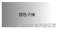
看一下效果图
直接上代码
<!DOCTYPE html>
<html>
	<head>
		<meta charset="utf-8">
		<title></title>
	    <style>
		    #box {
			    width: 200px;
			    height: 100px;
			    text-align: center;
			    line-height: 100px;
			    background: linear-gradient(to right,pink,rgba(255,255,255,0));
		    }
	    </style>
    </head>
	<body>
		<div id="box">银色子弹</div>
	</body>
</html>
2.渐变背景动态切换
看一下效果图
直接上代码
<!doctype html>
<html>
	<head>
		<meta charset="utf-8">
		<title></title>
		<style>
			body {
				margin: 0;
				width: 100%;
				height: 100vh;
				display: flex;
				justify-content: center;
				align-items: center;
				color: white;
				background: linear-gradient(-45deg, #ee7752, #e73c7e, #23a6d5, #23d5ab);
				background-size: 400% 400%;
				animation: gradientBG 10s ease infinite;
			}
			@keyframes gradientBG {
				0% {
					background-position: 0% 50%;
				}
				50% {
					background-position: 100% 50%;
				}
				100% {
					background-position: 0% 50%;
				}
			}
		</style>
	</head>
	<body>
		<h1>第二名意味着你是头号输家</h1>
	</body>
</html>
单边阴影
box-shadow: 0px -7px 7px -7px red //上阴影
box-shadow: 0px 7px 7px -7px red //下阴影
box-shadow: 7px 0px 7px -7px red //右阴影
box-shadow: -7px 0px 7px -7px red //左阴影
内阴影
box-shadow: inset 0px 0px 26px 0px rgba(0, 145, 255, 1);色彩的差值混合
color: #fff;
mix-blend-mode: difference;


 3537
3537


 被折叠的 条评论
为什么被折叠?
被折叠的 条评论
为什么被折叠?
 到【灌水乐园】发言


