


html代码
<div class="container">
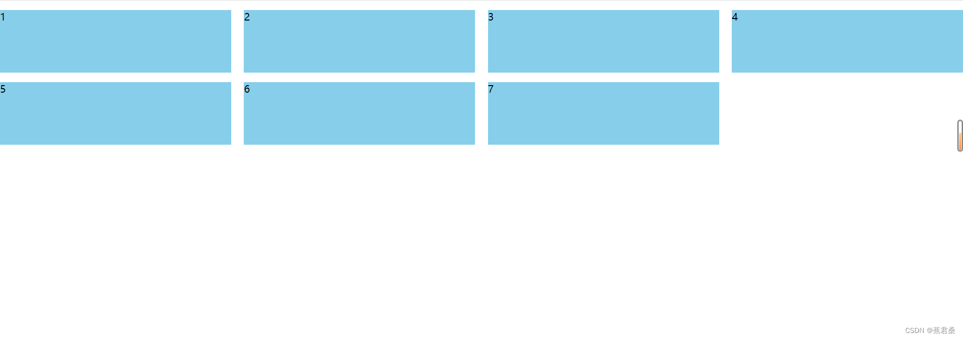
<div class="list">1</div>
<div class="list">2</div>
<div class="list">3</div>
<div class="list">4</div>
<div class="list">5</div>
<div class="list">6</div>
<div class="list">7</div>
</div>方法一
列数确定的情况下
.container {
    display: flex;
    flex-wrap: wrap;/* 开启换行 */

}
.list {
    width: 24%;
    height: 100px;
    background-color: skyblue;
    margin-top: 15px;
}
/* :nth-child(4n)中的4n表示索引(这里的索引是从1开始)是4的倍数的元素,此处表示4,8,12这些元素将被选中 */
/* :not()表示不是括号中的元素 */
/* 所以此处表示不是4倍数的元素设置margin-right值 */
.list:not(:nth-child(4n)) {
    margin-right: calc(4% / 3);/* margin-right值自动计算剩余百分比空间 */
}
方法二
同样也是确定列数的情况下
.container {
    display: flex;
    flex-wrap: wrap;/* 开启换行 */
    justify-content: space-between;/* 两端对齐 */
}
.list {
    width: 24%;
    height: 100px;
    background-color: skyblue;
    margin-top: 15px;
}
/* last-child表示选择最后一个元素 */
/* 如果最后一行是3个元素 */
.list:last-child:nth-child(4n - 1) {
    margin-right: calc(24% + 4% / 3);/* 此值表示一个元素的宽度加一个元素的margin-right值 */
}
/* 如果最后一行是2个元素 */
.list:last-child:nth-child(4n - 2) {
    margin-right: calc(48% + 8% / 3);/* 此处括号内也可以写48% + 4% / 3*2,表示两个元素宽度加两个margin-right值 */
}
/* 如果最后一行是1个元素 */
/* 只有一个元素justify-content: space-between就可以自动对齐了 */


 238
238


 被折叠的 条评论
为什么被折叠?
被折叠的 条评论
为什么被折叠?
 到【灌水乐园】发言


