


布局方式
实现效果:

浮动
- 两栏布局
html代码:
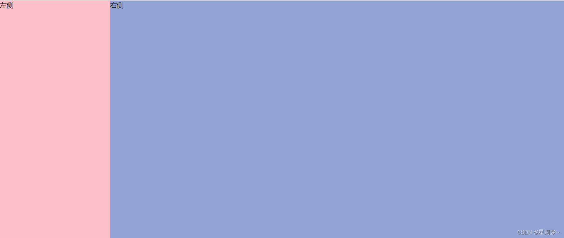
<div class='wrap'>
    <div class='left'>左侧</div>
    <div class='right'>右侧</div>
</div>
css代码:
/* 公共部分 */
body,html,.wrap{
    height: 100%;
    padding: 0;
    margin: 0;
}

/* 1、浮动,左侧左浮动,右侧自适应 */
.left{
    width: 200px;
    height: 100%;
    background-color: pink;
    float:left
}
.right{
    height:100%;
    background-color: rgb(145, 162, 212);
    margin-left: 200px;
}
- 三栏布局
<div class="left">左边</div>
<div class="right">右边</div>
<div class="middle">中间</div>
/* 公共部分样式 */
body,html,.con{
    height: 100%;
    padding: 0;
    margin: 0;
}
/* 1、浮动布局: 左栏左浮动,右栏右浮动,中间栏自适应(中间栏放最后)*/
 .left{
    float: left;
    background: lemonchiffon;
    width: 100px;
    height: 100%;
}
.right{
    float: right;
    background: lightblue;
    width: 200px;
    height: 100%;
}
.middle{
    height: 100%;
    background: lightslategray;
    margin:0 200px 0 100px;
}
绝对定位
- 两栏布局
css代码:
/*2.绝对定位,左侧设置绝对定位,右侧用margin撑开距离 */
.left{
    width: 200px;
    height: 100%;
    background: pink;
    top:0;
    left:0;
    position: absolute;
}
.right{
    height:100%;
    background: rgb(145, 162, 212);
    margin-left: 200px;
}
- 三栏布局
<div class="left">左边</div>
<div class="middle">中间</div>
<div class="right">右边</div>
/* 2、绝对定位布局:左右两边的使用绝对定位,中间栏用margin撑开左右距离 */
.left,.right{
    position: absolute;
    height:100%;
    top: 0;
    background: #ff69b4;
}
.left{
    left: 0;
    width: 100px;
}
.right{
    right: 0;
    width: 200px;
}
.middle{
    height: 100%;
    margin:0 200px 0 100px;
    background: chartreuse;
}
flex布局
- 两栏布局
/* 3、flex布局,外部容器设置为弹性盒子,左侧设置定宽 ,右侧flex为1*/
.wrap{
    display: flex;
}
.left{
    width: 200px;
    height: 100%;
    background-color: pink;
}
.right{
    height: 100%;
    background-color: rgb(145, 162, 212);
    flex:1;
}
- 三栏布局
/* 3、flex布局:外部容器设置为flex弹性盒子,左右栏定宽,中间栏设置flex为1 */
.con{
    display: flex;
}
.left{
    width: 100px;
    background:lightsteelblue;
}
.right{
    width: 200px;
    background:lightyellow;
}
.middle{
    flex:1;    /*相当于flex:1 1 auto;————>只设置了中间栏的flex:1  所以中间栏占据所有的剩余空间*/
    background: palegreen;
}
table布局
- 两栏布局
/* 4、table布局,外部容器设置为table,内部div设置为table的列,设置左栏宽度,右栏自适应 */
.wrap{
    display: table;
    width:100%
}
.left{
    width: 200px;
    height: 100%;
    background-color: pink;
    display: table-cell;
}
.right{
    background-color: rgb(145, 162, 212);
}
- 三栏布局
 /* 4、table布局:外部容器设置为table,内部div设置为table的列,分别设置左右两栏的宽度,中间栏自适应 */
.con{
    display: table;
    width: 100%;
}
.con div{
    display: table-cell;
}
.left{
    width: 100px;
    background: palegreen;
}
.middle{
    background: palevioletred;
}
.right{
    width: 200px;
    background: paleturquoise;
}
Grid网格布局
- 两栏布局
 /* 5、grid网格布局,外部容器设置为网格,并且设置行高,以及左栏列的宽 */
.wrap{
    display: grid;
    width: 100%;
    grid-template-rows: 100%;
    grid-template-columns: 200px auto;
}
.left{
    background-color: pink;
}
.right{
    background-color: rgb(145, 162, 212);
}
- 三栏布局
/* 5、grid网格布局 */
.con{
    display: grid;
    width: 100%;
    grid-template-rows: 100%;  /*设置行高*/
    grid-template-columns: 100px auto 200px;  /*设置列*/
}
.left{
    background: palevioletred;
}
.middle{
    background: papayawhip;
}
.right{
    background: powderblue;
}


 898
898


 被折叠的 条评论
为什么被折叠?
被折叠的 条评论
为什么被折叠?
 到【灌水乐园】发言


