


CSS的flex常用布局
CSS的flex左边固定右边自适应例子
<!doctype html>
<html>
<head>
    <meta charset="utf-8">
    <meta name="viewport" content="width=device-width, initial-scale=1, shrink-to-fit=no">
    <title>css flex 左边固定右边自适应例子</title>
    <style>
        body {
            padding: 5px
        }
        #boxs {
            width: 80%;
            height: 100px;
            border: 1px solid #333;
            display: flex;
        }
        .left {
            width: 200px;
        }
        .right {
            flex: 1;
            /*
            flex-grow:1;
            flex-shrink:1;
            */
        }
    </style>
</head>
<body>
<div id="boxs">
    <div class="left" style="background-color:#ffc5c5;">左边固定宽度</div>
    <div class="right" style="background-color:#7171f7;">右边自适应宽度</div>
</div>
</body>
</html>
结果

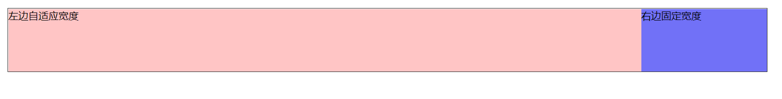
CSS的flex左边自适应右边固定例子
<!doctype html>
<html>
<head>
    <meta charset="utf-8">
    <meta name="viewport" content="width=device-width, initial-scale=1, shrink-to-fit=no">
    <title>css flex 左边自适应右边固定例子</title>
    <style>
        body {
            padding: 5px
        }
        #boxs {
            width: 80%;
            height: 100px;
            border: 1px solid #333;
            display: flex;
        }
        .left {
            flex: 1;
            /*
            flex-grow:1;
            flex-shrink:1;
            */
        }
        .right {
            width: 200px;
        }
    </style>
</head>
<body>
<div id="boxs">
    <div class="left" style="background-color:#ffc5c5;">左边自适应宽度</div>
    <div class="right" style="background-color:#7171f7;">右边固定宽度</div>
</div>
</body>
</html>
结果
CSS的flex两边固定中间自适应例子
<!doctype html>
<html>
<head>
    <meta charset="utf-8">
    <meta name="viewport" content="width=device-width, initial-scale=1, shrink-to-fit=no">
    <title>css flex 两边固定中间自适应例子</title>
    <style>
        body {
            padding: 5px
        }
        #boxs {
            width: 90%;
            height: 100px;
            border: 1px solid #333;
            display: flex;
        }
        .dwidth {
            width: 150px;
        }
        .center {
            flex: 1;
        }
    </style>
</head>
<body>
<div id="boxs">
    <div class="dwidth" style="background-color:#ffc5c5;">左边固定宽度</div>
    <div class="center" style="background-color:#b9f;">中间自适应宽度</div>
    <div class="dwidth" style="background-color:#7171f7;">右边固定宽度</div>
</div>
</body>
</html>
结果

CSS的flex上下固定中间自适应例子
<!doctype html>
<html>
<head>
    <meta charset="utf-8">
    <meta name="viewport" content="width=device-width, initial-scale=1, shrink-to-fit=no">
    <title>css flex 上下固定中间自适应例子</title>
    <style>
        body {
            padding: 5px
        }
        #boxs {
            width: 90%;
            height: 300px;
            border: 1px solid #333;
            display: flex;
            flex-direction: column
        }
        .dheight {

            height: 50px;
        }
        .center {
            flex: 1;

        }
    </style>
</head>
<body>
<div id="boxs">
    <div class="dheight" style="background-color:#ffc5c5;">上边固定宽度</div>
    <div class="center" style="background-color:#b9f;">中间自适应宽度</div>
    <div class="dheight" style="background-color:#7171f7;">下边固定宽度</div>
</div>
</body>
</html>
结果

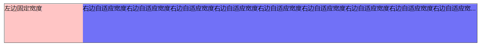
CSS的flex单行省略号
<!doctype html>
<html>
<head>
    <meta charset="utf-8">
    <meta name="viewport" content="width=device-width, initial-scale=1, shrink-to-fit=no">
    <title>css flex 1 单行省略号</title>
    <style>
        body {
            padding: 5px
        }
        #boxs {
            width: 80%;
            height: 100px;
            border: 1px solid #333;
            display: flex;
        }
        .left {
            width: 200px;
        }
        .right {
            flex: 1;
            min-width: 0;
            white-space: nowrap;
            overflow: hidden;
            text-overflow: ellipsis;
        }
    </style>
</head>
<body>
<div id="boxs">
    <div class="left" style="background-color:#ffc5c5;">左边固定宽度</div>
    <div class="right" style="background-color:#7171f7;">
        右边自适应宽度右边自适应宽度右边自适应宽度右边自适应宽度右边自适应宽度右边自适应宽度右边自适应宽度右边自适应宽度右边自适应宽度右边自适应宽度右边自适应宽度
    </div>
</div>
</body>
</html>
结果
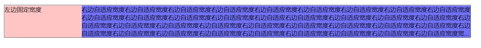
CSS的flex多行省略号
<!doctype html>
<html>
<head>
    <meta charset="utf-8">
    <meta name="viewport" content="width=device-width, initial-scale=1, shrink-to-fit=no">
    <title>css flex 多行文本省略号</title>
    <style>
        body {
            padding: 5px
        }
        #boxs {
            width: 80%;
            height: 84px;
            border: 1px solid #333;
            display: flex;
        }
        .left {
            width: 200px;
        }
        .right {
            flex: 1;
            max-height: 84px;
            display: -webkit-box;
            -webkit-line-clamp: 4;
            -webkit-box-orient: vertical;
            overflow: hidden;
        }
    </style>
</head>
<body>
<div id="boxs">
    <div class="left" style="background-color:#ffc5c5;">左边固定宽度</div>
    <div class="right" style="background-color:#7171f7;">
        右边自适应宽度右边自适应宽度右边自适应宽度右边自适应宽度右边自适应宽度右边自适应宽度右边自适应宽度右边自适应宽度右边自适应宽度右边自适应宽度右边自适应宽度右边自适应宽度右边自适应宽度右边自适应右边自适应宽度右边自适应宽度右边自适应宽度右边自适应宽度右边自适应宽度右边自适应宽度右边自适应宽度右边自适应宽度右边自适应宽度右边自适应宽度右边自适应宽度右边自适应宽度右边自适应宽度右边自适应宽度右边自适应宽度右边自适应宽度右边自适应宽度右边自适应宽度右边自适应宽度右边自适应宽度右边自适应宽度右边自适应宽度宽度右边自适应宽度右边自适应宽度右边自适应宽度右边自适应宽度右边自适应宽度右边自适应宽度右边自适应宽度右边自适应宽度
    </div>
</div>
</body>
</html>
结果


 2万+
2万+


 被折叠的 条评论
为什么被折叠?
被折叠的 条评论
为什么被折叠?
 到【灌水乐园】发言


