


一、前言
明天就是圣诞节了,抓紧时间写一个代码来庆祝。写什么好呢?就用HTML实现一个动态的圣诞树吧。我能想到也就是有圣诞树了😅
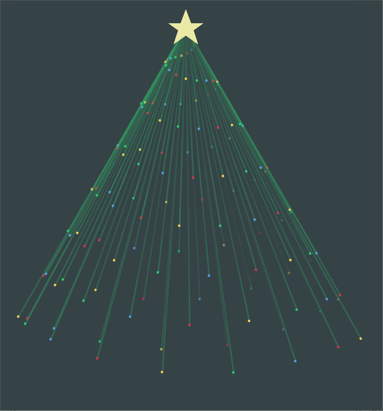
二、效果展示
三、实现步骤
首先,我们把body默认margin和padding设为0,并把背景设为墨绿色。为了让圣诞树展示好看,再给body添加一个flex布局,让圣诞树展示在页面中间。
        * {
            padding: 0;
            margin: 0;
            list-style: none;
        }

        body{
            display: flex;
            height: 100vh;
            justify-content: center;
            align-items: center;
            background-color: rgb(54,66,70);
        }
该下来实现圣诞树,可以分为两部分,第一部分树顶的星星,第二部分旋转的12条线(12个小 li)
星星部分用div实现,线条用li标签,外面套上一个ul标签
<ul class="tree">
        <dis class="star"></dis>
</ul>

<----------------->
    .tree{
            position: relative;
            width: 500px;
            height: 700px;
            display: flex;
            justify-content: center;
        }
li 一会用script动态添加
星星实现思路:
我们可以给div一个大小,50x50,这样成一个正方形。然后对齐添加clip-path属性裁剪成星星形状
    .star{
            width: 50px;
            height: 50px;
            position: absolute;
            background-color: rgb(236,234,167);
            z-index: 999;
            margin-bottom: 40px;
            clip-path: polygon(50% 0,65% 40%,100% 40%,72% 60%);
        }
树干实现思路:
因为要有12条树干,要写12个li标签,为了省事我们可以用JavaScript动态生成
    let tree = document.querySelector('.tree');
    for(let i = 0;i<128;i++){
        let li = document.createElement('li');
        li.style="--i:"+i;
        tree.appendChild(li);
    }
然后在css中对其添加动画效果,树干上的小点用::before来写。
完整代码在下面获取
四、编码实现
<!DOCTYPE html>
<html lang="en">
<head>
    <meta charset="UTF-8">
    <meta http-equiv="X-UA-Compatible" content="IE=edge">
    <meta name="viewport" content="width=device-width, initial-scale=1.0">
    <title>ChirstmasTrees</title>
    <style>
        *{
            padding: 0;
            margin: 0;
            list-style:none;
        }
        body{
            display: flex;
            height: 100vh;
            justify-content: center;
            align-items: center;
            background-color: rgb(54,66,70);
        }
        .tree{
            position: relative;
            width: 500px;
            height: 700px;
            display: flex;
            justify-content: center;
        }
        .start{
            width: 50px;
            height: 50px;
            position: absolute;
            background-color: rgb(236,234,167);
            z-index: 999;
            margin-bottom: 40px;
            clip-path: polygon(50% 0,65% 40%,100% 40%,72% 60%,
                                85% 100%,50% 75%,15% 100%,28% 60%,0 40%,35% 40%);
        }
        .tree li{
            position: absolute;
            top:25px;
            width: 2px;
            background: linear-gradient(rgba(46,204,113,0),rgba(46,204,113,.25));
            transform-origin: 50% 0;
            animation:swing 4s ease-in-out infinite;
            height: calc(var(--i)*4px);
            animation-delay: calc(var(--i)*-0.23s);
        }
        @keyframes swing{
            0%,
            100%{
                transform: rotate(-30deg);
            }
            5%,45%{
                opacity: 0.25;
            }
            0%,45%,100%{
                opacity: 1;
            }
            50%{
                transform: rotate(30deg);
            }
        }

        .tree li::before{
            content: '';
            position: absolute;
            left:-1px;
            bottom: 1px;
            width: 3px;
            height: 3px;
        }
        .tree li:nth-child(4n)::before{
            background-color: #d8334a;
        }
        .tree li:nth-child(4n+1)::before{
            background-color: #ffce54;
        }
        .tree li:nth-child(4n+2)::before{
            background-color: #2ecc71;
        }
        .tree li:nth-child(4n+3)::before{
            background-color: #5d9cec;
        }

    </style>
</head>
<body>
    <ul class="tree">
        <dis class="start"></dis>
    </ul>
</body>
<script>
    let tree = document.querySelector('.tree');
    for(let i = 0;i<128;i++){
        let li = document.createElement('li');
        li.style="--i:"+i;
        tree.appendChild(li);
    }
</script>
</html>


 144
144


 被折叠的 条评论
为什么被折叠?
被折叠的 条评论
为什么被折叠?
 到【灌水乐园】发言


