


html代码
<!DOCTYPE html>
<html>
<head>
<link rel="stylesheet" href="css/style.css" type="text/css" />
<meta charset="utf-8" />
<title>CSS3悬停放大图片两边模糊显示 - 站长素材</title>
</head>
<body>
<br><br><br>
<div class="wrapper">
<div class="box">
<div class="product">
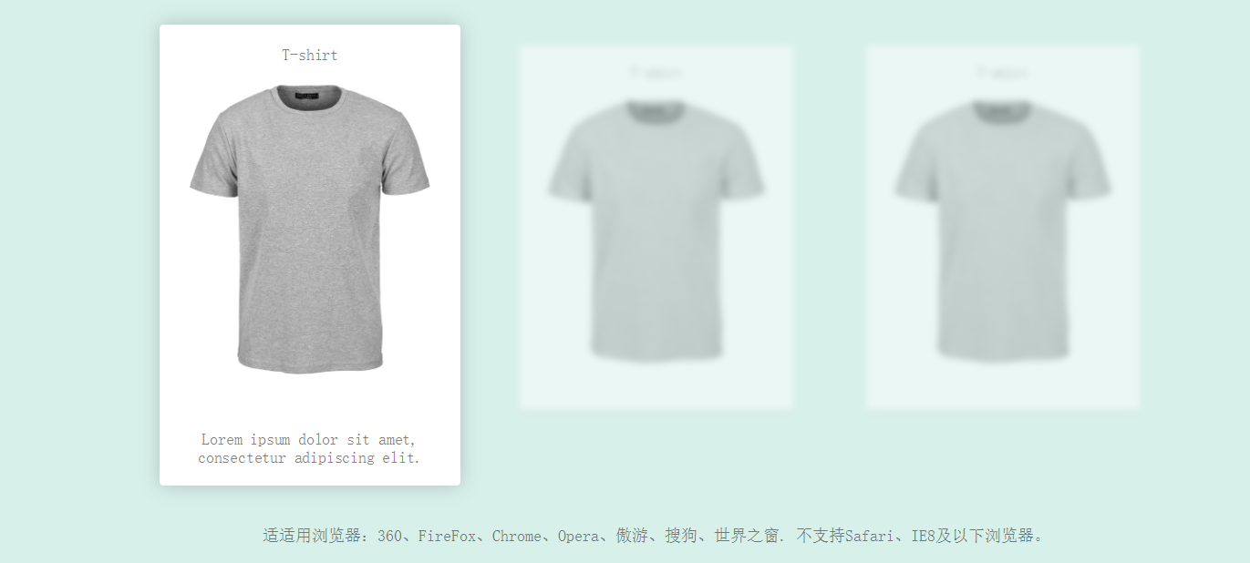
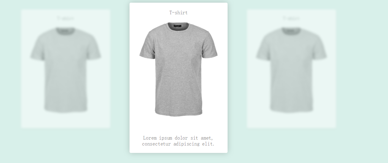
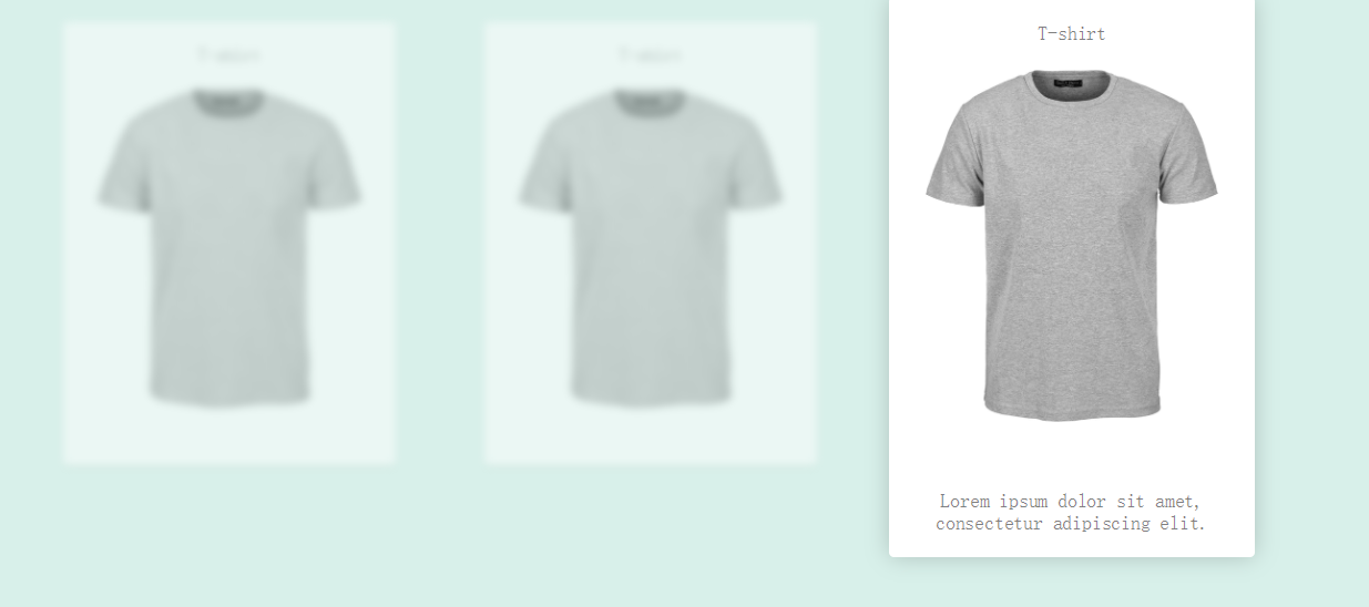
<span class="name">T-shirt</span>
<span class="description">Lorem ipsum dolor sit amet, consectetur adipiscing elit.</span>
</div>
</div>
<div class="box">
<div class="product">
<span class="name">T-shirt</span>
<span class="description">Lorem ipsum dolor sit amet, consectetur adipiscing elit.</span>
</div>
</div>
<div class="box">
<div class="product">
<span class="name">T-shirt</span>
<span class="description">Lorem ipsum dolor sit amet, consectetur adipiscing elit.</span>
</div>
</div>
</div>
<div style="text-align:center;margin:50px 0; font:normal 14px/24px 'MicroSoft YaHei';">
<p>适适用浏览器:360、FireFox、Chrome、Opera、傲游、搜狗、世界之窗. 不支持Safari、IE8及以下浏览器。</p>
<p>来源:<a href="http://sc.chinaz.com/" target="_blank">站长素材</a></p>
</div>
</body>
</html>
css代码
body {
margin: 0;
background: #d8f0ea;
}
h1, p, span {
font-family: monospace;
font-weight: 300;
text-align: center;
color: rgba(0, 0, 0, 0.5);
}
h1, h1 + p {
margin: 2rem 1rem;
}
.wrapper {
max-width: 60rem;
margin: 0 auto;
display: -webkit-box;
display: -webkit-flex;
display: -ms-flexbox;
display: flex;
-webkit-box-align: center;
-webkit-align-items: center;
-ms-flex-align: center;
align-items: center;
-webkit-box-pack: center;
-webkit-justify-content: center;
-ms-flex-pack: center;
justify-content: center;
margin-bottom: 3rem;
}
.box {
width: 15rem;
height: 20rem;
padding: 0 2rem 3rem;
-webkit-transition: opacity 0.5s linear 0.3s,
-webkit-transform 0.3s linear 0s,
-webkit-filter 0.5s linear 0.3s;
transition: opacity 0.5s linear 0.3s,
-webkit-transform 0.3s linear 0s,
-webkit-filter 0.5s linear 0.3s;
transition: transform 0.3s linear 0s,
filter 0.5s linear 0.3s,
opacity 0.5s linear 0.3s;
transition:
transform 0.3s linear 0s,
filter 0.5s linear 0.3s,
opacity 0.5s linear 0.3s,
-webkit-transform 0.3s linear 0s,
-webkit-filter 0.5s linear 0.3s;
/*transform-origin: top center;*/
}
.product {
position: relative;
width: 100%;
height: 100%;
border-radius: 0.2rem;
background-image: url(../img/shirts.jpg);
background-color: #fff;
background-position: top 3rem center;
background-size: 80%;
background-repeat: no-repeat;
box-shadow: 0 0.1rem 0.2rem rgba(0, 0, 0, 0.1);
-webkit-transition: box-shadow 0.5s linear,
height 0.1s linear 0s;
transition:
box-shadow 0.5s linear,
height 0.1s linear 0s;
}
.name {
display: block;
padding: 1rem 0.5rem;
}
.description {
position: absolute;
bottom: 1rem;
left: 0;
right: 0;
display: block;
padding: 0 1.5rem;
opacity: 0;
-webkit-transition: opacity 0.1s linear 0s;
transition: opacity 0.1s linear 0s;
}
.wrapper:hover .box:not(:hover) {
-webkit-filter: blur(3px);
filter: blur(3px);
opacity: 0.5;
}
.box:hover {
-webkit-transform: scale(1.1);
transform: scale(1.1);
-webkit-transition: opacity 0.1s linear 0s,
-webkit-transform 0.3s linear 0.3s,
-webkit-filter 0.1s linear 0s;
transition: opacity 0.1s linear 0s,
-webkit-transform 0.3s linear 0.3s,
-webkit-filter 0.1s linear 0s;
transition: transform 0.3s linear 0.3s,
filter 0.1s linear 0s,
opacity 0.1s linear 0s;
transition:
transform 0.3s linear 0.3s,
filter 0.1s linear 0s,
opacity 0.1s linear 0s,
-webkit-transform 0.3s linear 0.3s,
-webkit-filter 0.1s linear 0s;
}
.box:hover .product {
height: 23rem;
box-shadow: 0 0 1rem rgba(0, 0, 0, 0.2);
-webkit-transition: box-shadow 1s linear,
height 0.3s linear 0.5s;
transition:
box-shadow 1s linear,
height 0.3s linear 0.5s;
}
.box:hover .description {
opacity: 1;
-webkit-transition: opacity 0.3s linear 0.75s;
transition: opacity 0.3s linear 0.75s;
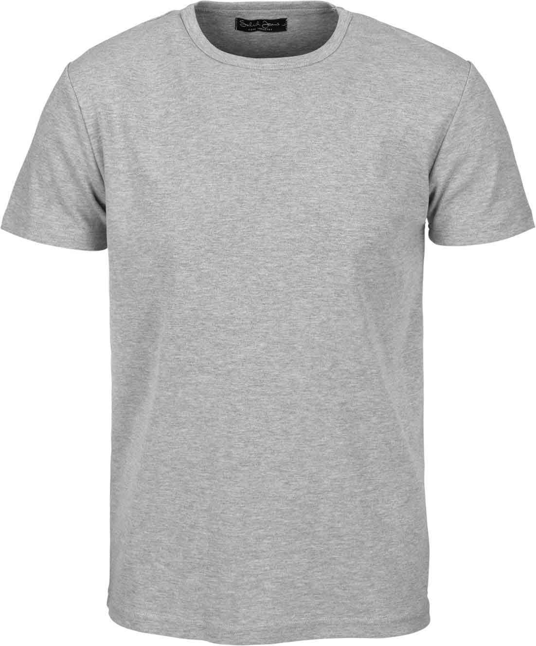
}底图:
效果图


 2万+
2万+


 被折叠的 条评论
为什么被折叠?
被折叠的 条评论
为什么被折叠?
 到【灌水乐园】发言


