


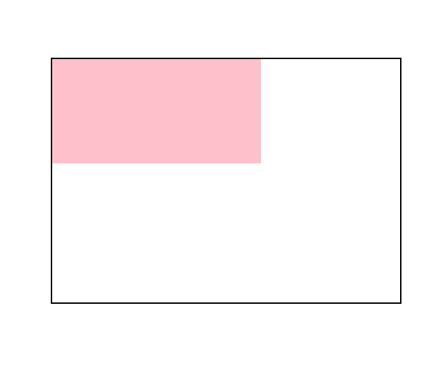
代码:平移
<!DOCTYPE html>
<html lang="en">
<head>
    <meta charset="UTF-8">
    <meta http-equiv="X-UA-Compatible" content="IE=edge">
    <meta name="viewport" content="width=device-width, initial-scale=1.0">
    <title>Document</title>
    <style>
        .father{
            width: 500px;
            height: 350px;
            margin: 200px auto;
            border: 2px black solid;
        }
        .son{
            width: 300px;
            height: 150px;
            background-color: pink;
             /* 从A状态变化到B状态使用的时间 */
            transition: all 0.5s;
        }
        .son:hover{
            /* 像素单位取值 */
            /* transform: translate(0,100px); */

            /* 百分比取值 */
            /* transform: translate(50%,0); */

            /* 单方向设值 */
            transform: translateY(100px);
            /* transform: translateX(100px); */
        }
    </style>
</head>
<body>
    <div class="father">
        <div class="son"></div>
    </div>
</body>
</html>
效果图:
代码:旋转
<!DOCTYPE html>
<html lang="en">
<head>
    <meta charset="UTF-8">
    <meta http-equiv="X-UA-Compatible" content="IE=edge">
    <meta name="viewport" content="width=device-width, initial-scale=1.0">
    <title>Document</title>
    <style>
        img{
            transition: 2s;
        }
        img:hover{
            /* 顺时针旋转 */
            transform: rotate(360deg);
            /* 逆时针旋转 */
            transform: rotate(-360deg);
        }
    </style>
</head>
<body>
    <img src="./images/rotate.png" alt="">
</body>
</html>
效果图:

代码:旋转改变原点
<!DOCTYPE html>
<html lang="en">
<head>
    <meta charset="UTF-8">
    <meta http-equiv="X-UA-Compatible" content="IE=edge">
    <meta name="viewport" content="width=device-width, initial-scale=1.0">
    <title>Document</title>
    <style>
        img{
            display: block;
            width: 200px;
            border: 2px black solid;
            margin: 300px auto;
            /* transform-origin: x y */
            /* 方位词  像素值  自身百分比 */
            transform-origin: -10px -10px;
            transition: all 2s;
        }
        img:hover{
            transform: rotate(360deg);
        }
    </style>
</head>
<body>
    <img src="./images/rotate.png" alt="">
</body>
</html>
效果图:
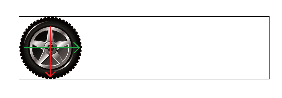
代码:旋转+平移
<!DOCTYPE html>
<html lang="en">
<head>
    <meta charset="UTF-8">
    <meta http-equiv="X-UA-Compatible" content="IE=edge">
    <meta name="viewport" content="width=device-width, initial-scale=1.0">
    <title>Document</title>
    <style>
        .box{
            width: 800px;
            height: 200px;
            margin: 200px auto;
            border: 2px black solid;
        }
        img{
            width: 200px;
            transition: all 1s;
        }
        img:hover{
            transform: translateX(600px) rotate(360deg);
        }
    </style>
</head>
<body>
    <div class="box">
        <img src="./images/tyre1.png" alt="">
    </div>
</body>
</html>
效果图:
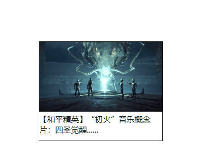
代码:缩放
<!DOCTYPE html>
<html lang="en">
<head>
    <meta charset="UTF-8">
    <meta http-equiv="X-UA-Compatible" content="IE=edge">
    <meta name="viewport" content="width=device-width, initial-scale=1.0">
    <title>Document</title>
    <style>
        *{
            padding: 0;
            margin: 0;
            box-sizing: border-box;
        }
        .box{
            width: 250px;
            height: 200px;
            border: 1px #000 solid;
            margin: 200px auto;
        }
        img{
            width: 100%;
        }
        .pic{
            position: relative;
        }
        .pic::before{
            position: absolute;
            content: "";
            background: url(./images/play.png);
            width: 58px;
            height: 58px;
            left: 50%;
            top: 50%;
            transform: translate(-50%,-50%) scale(5);
            transition: 1s;
            /* 元素整体透明化 */
            opacity: 0;

        }
        .box:hover .pic::before{
            transform: translate(-50%,-50%) scale(1);
            opacity: 1;
        }
    </style>
</head>
<body>
    <div class="box">
        <div class="pic">
            <img src="./images/party.jpeg" alt="">
        </div>
        <p>【和平精英】“初火”音乐概念片:四圣觉醒......</p>
    </div>
</body>
</html>
效果图:


 1万+
1万+


 被折叠的 条评论
为什么被折叠?
被折叠的 条评论
为什么被折叠?
 到【灌水乐园】发言


