css实现环形百分比图表
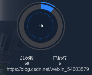
实现效果
实现代码
<template>
  <div id="percentageEcharts">
    <div class="box">
      <div class="loading-border">
        <div class="ld-left"></div>
        <div class="ld-right"></div>
      </div>
      <div class="light-bac"></div>
      <div class="loading">
        <div class="progress">
          <span class="value">{{getPercentage}}</span>
          <div class="circle-dash"></div>
        </div>
        <div class="left"></div>
        <div class="right"></div>
      </div>
    </div>
    <div class="percentage-tage">
      <div class="tage">
        <span>{{percentage1.txt1}}</span>
        <span class="num1">{{percentage1.num1}}</span>
      </div>
      <div class="tage">
        <span>{{percentage1.txt2}}</span>
        <span class="num2">{{percentage1.num2}}</span>
      </div>
    </div>
  </div>
</template>

<script>
import $ from "jquery";

export default {
  name: "percentageEchart",
  data(){
    return {
      selfPercentage:''
    }
  },
  props:['percentage1'],
  computed:{
    getPercentage(){
      let newPercentage= parseInt( (this.percentage1.num2 / this.percentage1.num1) * 100) ;
      return newPercentage;
    }
  },
  mounted() {


    $(function () {
         let deg = parseInt($(".value").html());
          console.log("占比是:"+deg)
      let appendStr, appendStr1, appendStr2, appendStr3;

      if (deg >= 50) {
        appendStr = "<style>.left:after{transform-origin: right center;transform:rotateZ(-" + (360-deg*3.6) + "deg)}</style>";
        $(".left").append(appendStr);
        appendStr1 = "<style>.ld-left:after{transform-origin: right center;transform:rotateZ(-" + (360 - deg * 3.6) + 'deg)}</style>';
        $(".ld-left").append(appendStr1);

      } else {
        appendStr = "<style>.right:after{transform-origin: left center;transform:rotateZ(-" + (50 - deg) * 3.6 + 'deg)}</style>';
        $(".right").append(appendStr);
        appendStr1 = "<style>.left:after{transform-origin: right center;transform:rotateZ(180deg)}</style>";
        $(".left").append(appendStr1);

        appendStr2 = "<style>.ld-right:after{transform-origin: left center;transform:rotateZ(-" + (50 - deg) * 3.6 + 'deg)}</style>';
        $(".ld-right").append(appendStr2);
        appendStr3 = "<style>.ld-left:after{transform-origin: right center;transform:rotateZ(180deg)}</style>";
        $(".ld-left").append(appendStr3);
      }
    })
  }

}
</script>

<style scoped lang="scss">
$big-circle-size:10rem;            //最大的圆
$halfBig-circle-size:5rem;
$small-circle-size:9rem;          //和最大的圆差1rem
$halfSmall-circle-size:4.5rem;
$bac-circle-size:7rem;               //和第二大差2rem
$dash-circle-size:5.2rem;           //和bac  差2rem   再加0.2rem
$lightBac-size:9.6rem;                //比bac大2.6rem
$width-bac:#3E4046;
$light-bac:#2D84FD;
$main-bac: #131F31;
  #percentageEcharts{
    position: relative;
    text-align: left;
    width: 85%;
    height: 95%;
    .percentage-tage{
      position: absolute;
      bottom: 5%;
      left: 30%;
      color: #D8D9DB;
      font-size: 15px;
      .tage{
        margin-bottom: 1rem;
        display: inline-block;
        margin-right: 4rem;
        span{
          display: block;
          text-align: center;
        }
        span:last-of-type{
          font-size: 13px;
        }
      }
    }
  }
  .box{
      position: absolute;
      display: inline-block;
      left: 50%;
      transform: translateX(-50%);
    .loading-border{
      margin: 0 auto;
      width: $big-circle-size;
      height:$big-circle-size;
      position: relative;
    .ld-left,.ld-right {
      width: $halfBig-circle-size;
      height: $big-circle-size;
      overflow: hidden;
      position: relative;
      float: left;
      background-color: #3E4046;
    }
    .ld-left {
      border-radius: $big-circle-size 0 0 $big-circle-size;
    }
    .ld-right {
      border-radius: 0 $big-circle-size $big-circle-size 0;
    }
    .ld-left:after,.ld-right:after {
      content: "";
      position: absolute;
      display: block;
      width: $halfBig-circle-size;
      height: $big-circle-size;
      //background-color: white;
      border-radius: $big-circle-size 0 0 $big-circle-size;
      background-color: $light-bac;
    }
    .ld-right:after {
      content: "";
      position: absolute;
      display: block;
      border-radius: 0 $big-circle-size $big-circle-size 0;
    }
    }
    .loading {
      width: $small-circle-size;
      height: $small-circle-size;
      position: absolute;
      top: 50%;
      left: 50%;
      transform: translate(-50%,-50%);
    .left,.right {
      width: $halfSmall-circle-size;
      height: $small-circle-size;
      overflow: hidden;
      position: relative;
      float: left;
      background-color: $width-bac;
    }
    .left {
      border-radius: $small-circle-size 0 0 $small-circle-size;
    }
    .right {
      border-radius: 0 $small-circle-size $small-circle-size 0;
    }

    .left:after,.right:after {
      content: "";
      position: absolute;
      display: block;
      width: $halfSmall-circle-size;
      height: $small-circle-size;
      background-color: $width-bac;
      border-radius: $small-circle-size 0 0 $small-circle-size;
      background-color: $light-bac;
    }
    .right:after {
      content: "";
      position: absolute;
      display: block;
      border-radius: 0 $small-circle-size $small-circle-size 0;
    }
    .progress {
      position: absolute;
      width: $bac-circle-size;
      height: $bac-circle-size;
      background-color:$main-bac;
      border-radius: 50%;
      left: 1rem;
      top: 1rem;
      line-height: $bac-circle-size;
      text-align: center;
      z-index: 22;
    span{
      color: white;
    }
    .circle-dash{
      width:$dash-circle-size;
      height: $dash-circle-size;
      border-radius: 50%;
      border: 2px dotted #0C4484;
      position: absolute;
      top: 0.7rem;
      left: 0.7rem;
    }
  }
}
.light-bac{
  width: $lightBac-size;
  height: $lightBac-size;
  background-color: $main-bac;
  border-radius: 50%;
  position: absolute;
  top: 50%;
  left: 50%;
  transform: translate(-50%,-50%);
}
}
</style>
总结
- 通过js动态添加伪类:可以通过获取要添加的元素,将伪类样式直接添加到该元素中
- 使用jquery进行操作相对简单


 3306
3306


 被折叠的 条评论
为什么被折叠?
被折叠的 条评论
为什么被折叠?
 到【灌水乐园】发言


