


from pyecharts.charts import Bar,Timeline
from pyecharts.options import *
from pyecharts.globals import ThemeType
#读取数据
f=open(“G:/1960-2019全球GDP数据.csv”,“r”,encoding=“GB2312”)
data=f.readlines()
f.close()
#删除第一条数据
data.pop(0)
#将数据转化为字典的形式
#格式{年份:[国家,GDP],年份:[国家,GDP]…}
data_a={}
for i in data:
year=int(i.split(“,”)[0]) #年份,使用split进行逗号分割,0号元素代表年份,使用int转换
country=i.split(“,”)[1] #国家
gdp=float(i.split(“,”)[2]) #GDP,利用float转化整理科学计数法的数值
#判断字典里面如果没有key,使用异常捕获
try:
data_a[year].append([country,gdp]) #如果列表中存在年份year则追加他的国家和gdp
except KeyError:
data_a[year]=[] #如果不存在,则创建一个空表,然后追加年份 国家和gdp
data_a[year].append([country,gdp])
#创建时间线
timeline=Timeline({“theme”:ThemeType.LIGHT}) #设置主题
#排序年份
data_b=sorted(data_a.keys())
for year in data_b:
data_a[year].sort(key=lambda element:element[1],reverse=True) #使用匿名函数进行年份排序
#取出这一年前8
year_data=data_a[year][0:8]
#构建空列表
x_data=[]
y_data=[]
for z in year_data:
x_data.append(z[0]) #添加x国家
y_data.append(z[1] / 100000000) #添加y轴gdb数据 ,以亿为单位
#构建图对象
bar=Bar()
bar.add_xaxis(x_data)
bar.add_yaxis(“GDP亿”,y_data,label_opts=LabelOpts(position=“right”))
#反转x y 轴
bar.reversal_axis()
timeline.add(bar,str(year)) #添加时间线年份,转化为字符串
#for循环每一年的数据,基于每一年的数据,闯进啊每一年的bar
#在for中,将每一年的bar添加到时间线中
#设置标题
#设置时间线自动播放
timeline.add_schema(
play_interval=1000, #自动播放速度,单位毫秒
is_timeline_show=True, #是否显示时间线
is_auto_play=True, #是否自动播放
is_loop_play=False, #是否循环播放
)
#绘图
timeline.render(“1960-2019全球GDP国家前八.html”)
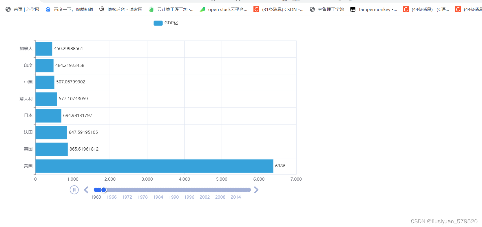
结果:


 3845
3845


 被折叠的 条评论
为什么被折叠?
被折叠的 条评论
为什么被折叠?
 到【灌水乐园】发言


