banner轮播图以及nav导航栏Jquery

轮播图是非常常见的,主要方法是利用了*setInterval()*定时器。隔一段时间就自动显示下一张图片。

首先制作导航栏
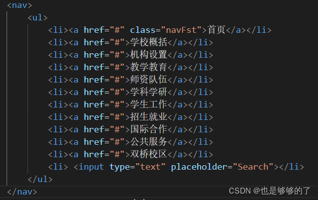
导航栏的制作非常简单。一般在写导航栏时,都是使用li+a标签的方式。

简单的设置它的样式。在其中加入动画,效果:鼠标移动到的时候,增加选中的效果。使用transition效果更流畅丝滑。

 nav {
            position: relative;
            bottom: 450px;
            /* 0.8是它的透明度*/
            background-color: rgba(10, 63, 137, 0.8);
            /* background-color: #0a3f89; */
            height: 80px;
            line-height: 80px;
        }
        
        nav li {
            float: left;
            margin-left: 10px;
            font-size: 17px;
        }
        
        nav li a {
            display: inline-block;
            text-align: center;
            width: 100px;
            height: 80px;
        }
        
        nav ul {
            margin-left: 280px;
        }
        
        nav ul input {
            color: #f0e5e5;
            background: transparent;
            border: 1px solid #ffffff;
            border-radius: 10px;
            height: 30px;
            padding-left: 10px;
        }
        
        
        nav li a:hover {
            font-size: 19px;
            display: inline-block;
            background-color: #4b53ac;
            transition: all 1s;
        }

这是导航栏的效果
在这里插入图片描述

制作轮播图
第一步先将需要轮播的图片导入。
一般在轮播图的下方会有对应图片的指定按钮,一个按钮对应一张轮播图,在点击它后,会显示相应的图片。

   <header>
        <!--这里是logo-->
        <div class="topIn">
            <img src="./top_logo.png" alt="">
            <img src="./top_kh.png" alt="">
        </div>
         <!--这里是需要进行轮播的图片-->
        <ul>
            <li><img class="bannerImg" src="./banner1.jpg" alt=" " srcset=" " style="width: 1920px;height: 590px;"></li>
            <li><img class="bannerImg" src="./banner2.jpg" alt=" " srcset=" " style="width: 1920px;height: 590px;"></li>
            <li><img class="bannerImg" src="./banner3.jpg" alt=" " srcset=" " style="width: 1920px;height: 590px;"></li>
        </ul>
        <!--这里是指定按钮-->
        <ul class="btnUl">
            <li class="btn1"></li>
            <li class="btn2"></li>
            <li class="btn3"></li>
        </ul>
    </header>

注意一下几点:在最外面的header标签设置一个相对定位,让框框固定好。
相对定位在移动的时候是相对于它原来的位置,并且原来在标准流地位置继续占有,后面地盒子仍然以标准流的方式对待他。

logo和按钮都设置为绝对定位,绝对定位在移动的时候是相对于他的祖先元素来说的,如果没有祖先元素或者祖先元素没有定位,则以浏览器为准定位。 重要的是,绝对定位不占有原先的位置,脱离标准流。原先的位置会被后面的元素占据。
就是说,因为他们是一直都显示的,让他们浮在轮播图上面。
css:

header {
            width: 100%;
            /* 相对定位 */
            position: relative;
            height: 590px;
            
        }
        
        .topIn img {
            /*绝对定位 */
            position: absolute;
            /* 值设置大一点,保证它显示在最上面一层*/
            z-index: 99;
        }
        
        .topIn img:nth-child(1) {
            left: 330px;
        }
        
        .topIn img:nth-child(2) {
            right: 200px;
            top: 50px
        }
        
        header ul li {
            position: absolute;
            /* left: 0; */
        }
        
        header ul li img {
            /* 先隐藏所有的轮播图图片 */
            opacity: 0;
            transition: all 1s;
        }
        
        /* 再设置 一开始时第一张的图片可见*/
        header li img:nth-child(1) {
            opacity: 1;
        }
        
        .btnUl {
            display: flex;
            justify-content: space-evenly;
        }
        
        .btnUl li {
            bottom: 20px;
            /* left: 200px; */
            width: 40px;
            height: 10px;
            border-radius: 30%;
            border: 2px solid rgba(92, 88, 88, 0.5);
            box-shadow: 1px;
            z-index: 99;
            background-color: #f6f6fc;
            /* 鼠标移到时 会显示为手型鼠标*/
            cursor: pointer;
            transition: all 0.5s;
        }
        
         /* 设置 一开始时第一张的图片的按钮为选中状态*/
        header ul .btn1:nth-child(1) {
            background-color: #c6c6ca;
            margin-left: -200px;
        }
        
        header ul .btn2 {
            margin-left: -25px;
        }
        
        header ul .btn3 {
            margin-left: 150px;
        }

js:
在使用Jquery需要先导入它。
使用定时器setInterval(执行内容,间隔的时间),它返回一个值,将这个值传给clearInterval()就停止了计时器的运作。
获取到一个轮播图的数组,设置一个变量
index
当作数组的索引,然后开始自加1,每次操作就先将所有的图片隐藏,再将index所匹配的图片设置为可见状态
在增加到最大的时候,要进行判断,不能让index一直增加,当他等于图片的数量时候,又要从头开始,从而达到一个循环的状态。因为index是从0开始的,所以比较时候要把数组的length-1

<script>
    $().ready(
        function() {
            var index = 0;
            //计时器
            setInterval(function() {
            //
                if (index >= $('.bannerImg').length - 1) {
                    index = 0;
                    // console.log(index);
                    $('.bannerImg').css("opacity", "0");
                    $('.bannerImg').eq(index).css("opacity", "1");

                } else {
                    index++;
                    // console.log(index);
                    $('.bannerImg').css("opacity", "0")
                    $('.bannerImg').eq(index).css("opacity", "1")
                }
                $('.btnUl>li').css("backgroundColor", " #f6f6fc")
                $('.btnUl>li').eq(index).css("backgroundColor", " #c6c6ca")

            }, 2000)

            $('.btnUl>li').click(function() {
                console.log($('.btnUl'));
                //获取到当前点击的按钮的索引值
                index = $(this).index();
                console.log("点击了" + index);
                $('.bannerImg').css("opacity", "0")
                //显示相对应的图片
                $('.bannerImg').eq(index).css("opacity", "1")
                //此时全部按钮是未选中状态
                $('.btnUl>li').css("backgroundColor", " #f6f6fc")
                //然后设置当前按钮为选中的状态
                $('.btnUl>li').eq(index).css("backgroundColor", " #c6c6ca")

            })
        }
    )
</script>

结果:
在这里插入图片描述

以下是一个基本的响应式网页框架,包括页头、菜单导航栏banner图、中间内容板块和页脚等部分。同时,添加了JS特效来实现图片轮播和下拉菜单等功能。 ``` <!DOCTYPE html> <html> <head> <meta charset="UTF-8"> <meta name="viewport" content="width=device-width, initial-scale=1.0"> <title>响应式网页框架</title> <style> /* 全局样式 */ body { margin: 0; padding: 0; font-family: Arial, sans-serif; font-size: 16px; line-height: 1.5; color: #333; } /* 页头样式 */ .header { background-color: #f5f5f5; padding: 20px; text-align: center; } /* 导航栏样式 */ .navbar { background-color: #333; color: #fff; display: flex; flex-direction: row; justify-content: space-between; align-items: center; padding: 10px 20px; position: sticky; top: 0; z-index: 999; } .navbar-brand { font-size: 24px; font-weight: bold; text-transform: uppercase; } .navbar-menu { display: flex; flex-direction: row; } .navbar-menu li { list-style: none; margin: 0 10px; position: relative; } .navbar-menu li:hover .dropdown-menu { display: block; } .dropdown-menu { display: none; position: absolute; top: 100%; left: 0; background-color: #333; padding: 10px; min-width: 100%; z-index: 999; } .dropdown-menu a { color: #fff; text-decoration: none; display: block; padding: 5px; } /* Banner样式 */ .banner { background-image: url("banner.jpg"); background-size: cover; background-position: center; height: 500px; position: relative; } .banner-overlay { background-color: rgba(0, 0, 0, 0.5); position: absolute; top: 0; left: 0; width: 100%; height: 100%; display: flex; flex-direction: column; justify-content: center; align-items: center; text-align: center; } .banner-title { font-size: 48px; font-weight: bold; color: #fff; margin: 0 0 10px; } .banner-subtitle { font-size: 24px; color: #fff; margin: 0 0 20px; } /* 内容板块样式 */ .content { padding: 50px; display: flex; flex-direction: row; flex-wrap: wrap; justify-content: space-between; align-items: flex-start; } .content-box { background-color: #f5f5f5; box-shadow: 0 0 10px rgba(0, 0, 0, 0.1); padding: 20px; margin-bottom: 20px; flex-basis: calc(33.33% - 20px); } .content-box h2 { font-size: 24px; font-weight: bold; color: #333; margin: 0 0 10px; } .content-box p { font-size: 16px; line-height: 1.5; color: #666; margin: 0; } /* 页脚样式 */ .footer { background-color: #333; color: #fff; padding: 20px; text-align: center; } .footer p { margin: 0; } /* 响应式样式 */ @media screen and (max-width: 768px) { .navbar-menu { display: none; position: absolute; top: 50px; left: 0; background-color: #333; padding: 10px; min-width: 100%; z-index: 999; } .navbar-menu li { margin: 0; } .navbar-menu li:hover .dropdown-menu { display: none; } .navbar-menu li:hover .navbar-menu { display: flex; } .navbar-menu li:hover .navbar-menu li { display: block; margin: 10px 0; } .content-box { flex-basis: calc(50% - 20px); } } </style> </head> <body> <!-- 页头 --> <div class="header"> <h1>响应式网页框架</h1> </div> <!-- 导航栏 --> <nav class="navbar"> <a href="#" class="navbar-brand">Logo</a> <ul class="navbar-menu"> <li><a href="#">Home</a></li> <li><a href="#">About</a> <ul class="dropdown-menu"> <li><a href="#">Company</a></li> <li><a href="#">Team</a></li> <li><a href="#">Contact</a></li> </ul> </li> <li><a href="#">Services</a></li> <li><a href="#">Blog</a></li> <li><a href="#">Contact</a></li> </ul> </nav> <!-- Banner --> <div class="banner"> <div class="banner-overlay"> <h2 class="banner-title">响应式网页框架</h2> <p class="banner-subtitle">一个基本的响应式网页框架</p> </div> </div> <!-- 内容板块 --> <div class="content"> <div class="content-box"> <h2>内容板块1</h2> <p>这是内容板块1的内容。这是内容板块1的内容。这是内容板块1的内容。</p> </div> <div class="content-box"> <h2>内容板块2</h2> <p>这是内容板块2的内容。这是内容板块2的内容。这是内容板块2的内容。</p> </div> <div class="content-box"> <h2>内容板块3</h2> <p>这是内容板块3的内容。这是内容板块3的内容。这是内容板块3的内容。</p> </div> <div class="content-box"> <h2>内容板块4</h2> <p>这是内容板块4的内容。这是内容板块4的内容。这是内容板块4的内容。</p> </div> <div class="content-box"> <h2>内容板块5</h2> <p>这是内容板块5的内容。这是内容板块5的内容。这是内容板块5的内容。</p> </div> <div class="content-box"> <h2>内容板块6</h2> <p>这是内容板块6的内容。这是内容板块6的内容。这是内容板块6的内容。</p> </div> </div> <!-- 页脚 --> <div class="footer"> <p>版权所有 © 2021 响应式网页框架</p> </div> <!-- JS特效 --> <script src="https://code.jquery.com/jquery-3.5.1.min.js"></script> <script> // 图片轮播 var slideIndex = 1; showSlides(slideIndex); function plusSlides(n) { showSlides(slideIndex += n); } function currentSlide(n) { showSlides(slideIndex = n); } function showSlides(n) { var i; var slides = document.getElementsByClassName("banner"); var dots = document.getElementsByClassName("dot"); if (n > slides.length) {slideIndex = 1} if (n < 1) {slideIndex = slides.length} for (i = 0; i < slides.length; i++) { slides[i].style.display = "none"; } for (i = 0; i < dots.length; i++) { dots[i].className = dots[i].className.replace(" active", ""); } slides[slideIndex-1].style.display = "block"; dots[slideIndex-1].className += " active"; } // 下拉菜单 $(".navbar-menu li").hover(function() { $(this).find(".dropdown-menu").stop(true, true).fadeIn(200); }, function() { $(this).find(".dropdown-menu").stop(true, true).fadeOut(200); }); </script> </body> </html> ``` 希望这个响应式网页框架对您有所帮助。如有任何问题,请随时向我提问。
评论
添加红包

请填写红包祝福语或标题

红包个数最小为10个

红包金额最低5元

当前余额3.43前往充值 >
需支付:10.00
成就一亿技术人!
领取后你会自动成为博主和红包主的粉丝 规则
hope_wisdom
发出的红包
实付
使用余额支付
点击重新获取
扫码支付
钱包余额 0

抵扣说明:

1.余额是钱包充值的虚拟货币,按照1:1的比例进行支付金额的抵扣。
2.余额无法直接购买下载,可以购买VIP、付费专栏及课程。

余额充值